Hail and farewell

I have decided to cease my weekly blog, at least for the time being, so this is my last one.

I have been demonstrating to my class on line for some time now and this is the conclusion of the current exercise.  The purpose of the demonstrations was to show that, by putting in all the shadowed areas in French Ultramarine first and letting it dry, subsequent colouring could be done more easily.  The blue naturally darkened the colour introduced on top while the adjacent white showed the colour in sunlight.

Here is the painting  complete with imagined background.

Any of my students following this blog post will see that I have seriously dropped the horizon.  I’ve got away with it because I took the reference photo from a lower level than the crowd so it just looks like I was sitting down to do this painting!  The blue sky emphasises to while shirts and hats and harmonises with the shadows.

Thank you for joining me over these last few years.   Your interest and comments have been welcome and constructive.


Verona

I think this is as far as I go to rescue this painting!

The buildings have more windows and balconies,  more definition generally, though how much to put in is one of those imponderables that can only be resolved by practice.  Looking at it, I think the details further back are too strong.  Since the foreground figures are also stronger , they are not overcome by looming architecture.  The highlights on the heads and shoulders, added with gouache, also bring them forward.

This enterprise has been enjoyable in a frustrating sort of way.  The sheer size of the paper  was a new experience, and following Hazel, thus understanding how to work on a larger stage, has been very rewarding.  The sequence she chose to follow this time  differed from that used in her videos, again useful.  The colours she delights in  are a joy to the eye.

As a teacher, it has been salutary to be a student again!


Verona continued.

Hazel had specified many “lifting” colours in her palette for this painting which is proving to be more than helpful.  If you re-wet the offending areas, and pat with a clean rag, most of the colour will go.  Then you can re-paint with a clear conscience!

I’ve tidied up the Blue side of the street where the brush had been too enthusiastic, removing much of the central figures that were so unconvincing (not yet reinstated), the figures on the right (wrongly placed), and the car (now more recognisable).  The tall gent has a good pair of shoulders on him now while the three figures to the right of his girl friend have heads correctly placed.

Once I paint the central figures with some  confidence, I will feel more content – well, content enough to “dress” the buildings.  The street looks empty without more windows with their attendant  balconies and flowers.  Those blue doorways need variation, and the distant buildings just a little more definition.


A street in Verona

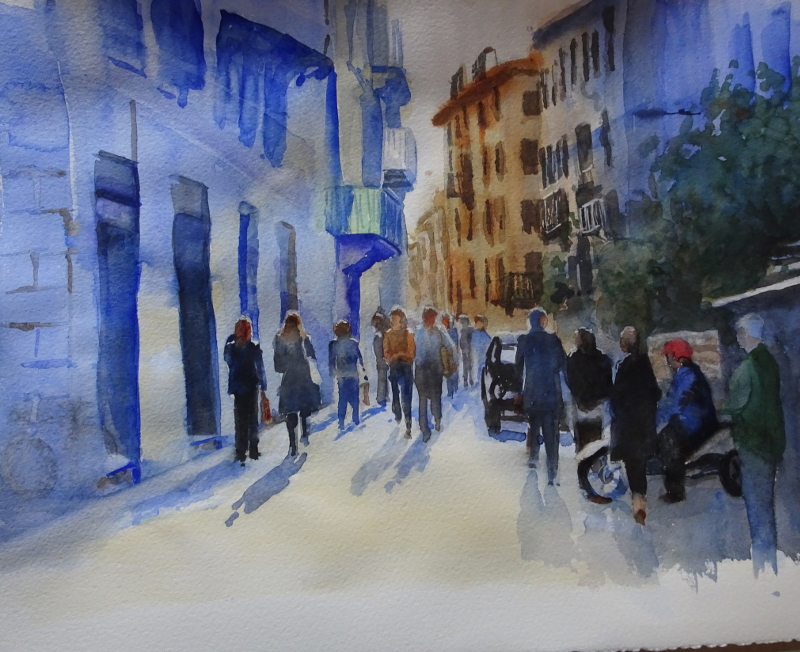
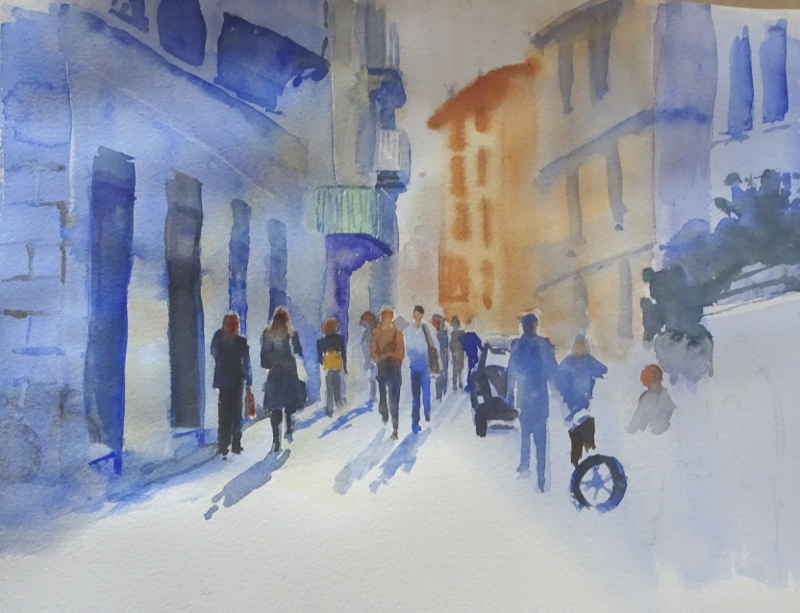
Hazel Soan’s workshop last Saturday took this photo as the source of her painting.  As you can see, it’s a busy street in Verona, lots of people, lots of architecture, lots of back lighting!

The size of her  painting was about 11 x 17 inches, probably necessary for a meaningful demonstration of technique.  The format of the course was the standard one – a period of demonstration, during which Hazel painted, explained what  she was doing, and more important, why, followed by a short question time; this alternating pattern was repeated over the three hour session.  The option for the students was either to paint along with Hazel, or to try to catch up during the question time.  Neither are entirely successful.  If you paint along you miss half the instruction, and the question sessions were not long enough to catch up!  I don’t know the answer to this one.

First the drawing.  Hazel found the centre of her (rough watercolour) paper and the centre of her image.  Starting from there, she expanded her drawing, only putting those lines necessary to guide the brush.  The figures were placed but not fully drawn.  As Hazel said, if you were doing this outside, the people wouldn’t wait for you!    It would be different people by the time you got to paint!

After masking out the high lights on head and shoulders, Hazel wet the area of the buildings and floated in their basic colourings, dropping in the darker windows, eaves, balconies etc while the paint was wet so that the edges blurred slightly.  If an area dried out too much to allow this to happen, she left it to dry completely, then re-wet it to finish the job.  These passages took about a hour.

Next she tackled the people, either singly if alone, or as a group, persons and cast shadows together.  All are back lit, so each silhouette was created in mid-tone ultramarine then “dressed”.  Aim at approximation and don’t fiddle!

A final passage over the street surface and the addition of any final details  that the PAINTING told you were useful completed the workshop.

It was very instructive to work with Hazel on a large painting in real time, something DVDs can’t do, the rhythm of thought and execution so affirming,  so encouraging, so positive.

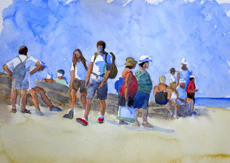
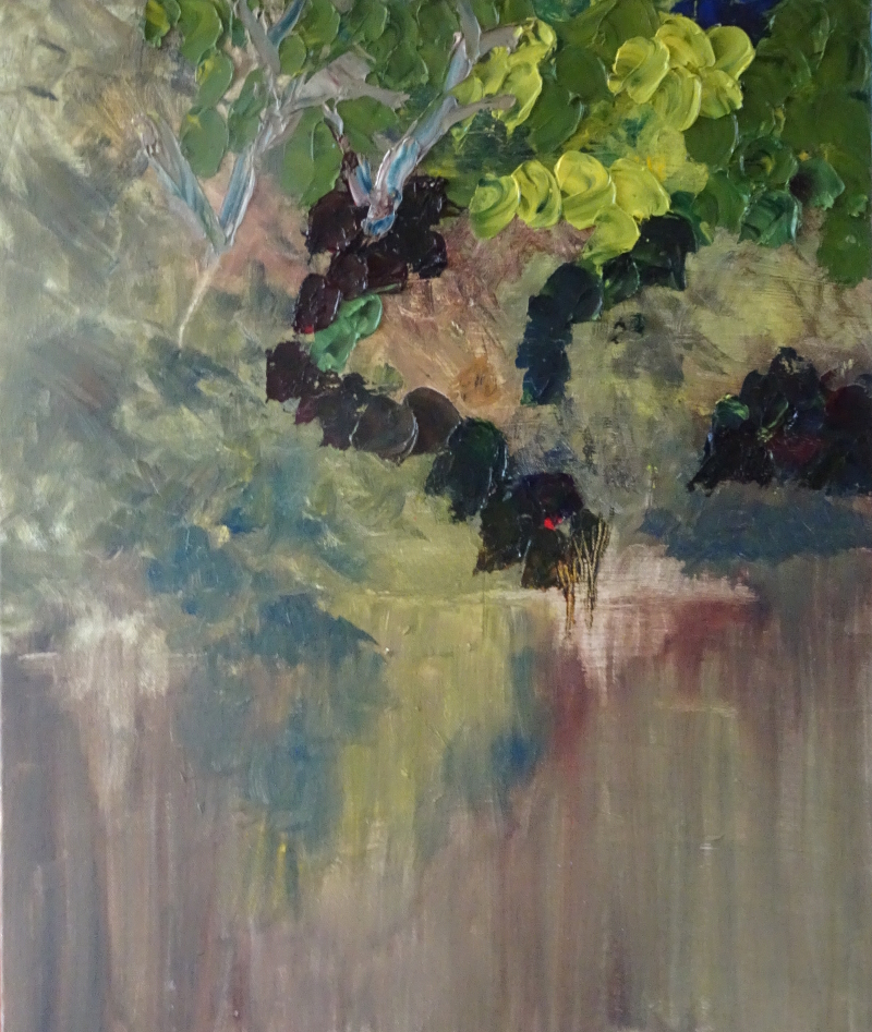
Here is my (unfinished) painting.


Splodge complete?

I think I’ve finished.  I’ll need to leave it visible for a week or two, but there will not be any major changes.

The water has “worked”.  I’m surprised as still water reflections are smooth and this technique is made of discrete parts.  I’ll admit the sky reflected in the water is laid on, more like water lilies.  Within the  limits of this painting, that is acceptable.

Attempting this technique has increased my respect for this artist and my enjoyment of the painting itself.  To see a scene in such clear, shaped colours, while retaining the atmosphere of the sunny, carefree day, is no mean achievement.  Nor is the painter a “one trick pony”, as we own another, also created with a palette knife, of flowers.  It couldn’t be more different.

I love them both.

Water splodge 01

As you can see, I’ve made a start on the water, using modified splodges.  One of the more thought provoking aspects of this technique is working out the sequence of the marks.  If I want to retain their integrity,  they need to be arranged so that I don’t disturb the shape.   The shapes in the water themselves are pulled downwards, so the lower edge can be covered with the next stroke.  The mental acrobatics required to mirror the trees while also working out the sequence are tiring!

Looking at the photo, I’m quite pleased with the result so far.   The water does look to be a different texture to the trees.  However,  there is a huge reflection of the sky to be painted.  Normally, I complete the reflections,  leave them to dry, then  slash in the light over the top.  That will not be possible this time.


Splodges continued

I’ve carried on splodging, but, as usual, there is more to this than meets the eye.

Nearly every splodge on the original is a different colour, and they are all more dragged than mine.  The colouring, though very varied, is harmonious.  Mine look like stacked plates falling over!

They are also very less varied.  I find that I become more adventurous when I paint every day.  Despite lockdown, that hasn’t happened recently. I lose my vision and nerve through lack of practice! Quite a few of my projects are reaching fruition, and I’m turning to painting once again – frustrated only by poor light.  The coming Hazel Soan workshop will provide even more impetus!

Though this is not a style I would want to adopt,  by doing this exercise, I am learning so much about the painting we own.  The skill of the artist in choosing colours and tones, and in seeing the scene in this way, is  impressive, and my pleasure in looking at the painting is enhanced.

It’s fun to do, so I shall continue the experiment, trusting that I improve my rendition in view of the comments above.  The water is going to be interesting, for there is a a big patch of reflected light as well as the reflections in the water itself.   Which blues go with those greens, yellows and russets, I wonder.

Splodgy oils

Over the years, we have collected a number of paintings, largely oils, in a wide variety of styles.  In fact we reckon to have at least one painting of some kind that appeals to every visitor.   As my painting skills improved, I have studied them carefully.   As ever, I wanted to know “How he, it’s usually but not always “he”, did it.   Repainting the bedroom means changing pictures to those that benefit from the new colour scheme, and that means you see each painting anew. This is one of those rediscoveries.

Its appeal is in the joyous splodges that entertain the eye.  The cloud race by; that’s definitely a willow on the far bank; how does the splodgy water look so wet?  Those splodges need a closer look.

They are nearly all rounded at the top and then dragged down a little.  The tool is a palette knife, certainly, but which shape?  I experimented with my dozen or so and discovered that my very first palette knife was the best at recreating that shape.  Its rounded end actually fitted the splodges on the painting.

I had begun an oil some time ago. in fact it is the subject of “Back to oil painting”  in the post of July 30th 2020.  So much has happened since then that I never had a chance to complete it.   I decided to take it off in a new direction and make it the basis of my splodges.

Paint is loosely mixed on the palette, then a splodge sized amount is taken on the knife and carefully squished in place  – very satisfying.

This is as far as I have gone to date.  I need to awaken my “interesting colour choice” brain, but the enterprise is just right for lockdown!

The eyes have it!

After working on my portrait of Higgy, I thought that separate practise of eyes, noses and mouths might help me create a living face.  The medium is watercolour pencils, since I can use them in any room in the house. There is also the possibility that they would militate against being too detailed.  My collection is for landscapes so I have a limited choice and that may be a good thing as  well.  So here are some of them.

These are all taken from photographs, since the only model I have at present is me, and there is a limit to how long I want to look at me, even when in analytical mode.

The colouring is crude since I haven’t used the pencils enough to get the measure of them. Number three looks like two different people, or a fellow with a slowly closing black eye!  But what I have learnt is that I usually try to put in too much detail and that life comes not from micro-accuracy, but from a few well observed shapes.  I have promised myself to try again in watercolour paint, and in oils, too.


Art of a different kind

My big lockdown project wasn’t a painting, or even a group of paintings.  As part of redecorating my bedroom, I have installed new curtains and I wanted a bedspread which agreed with them but wasn’t wholly of the same cloth.  You can have too much of a good thing!  From surplus cloth I cut a motif of a flower and two birds.  These were not twitchy little things – one repeat of the pattern,  i.e., a branch of magnolia with only three flowers on it – practically went from floor to ceiling.

This motif I attached to the plain fabric of the aforesaid bedspread.  The original idea of using the zigzag stitch on my sewing machine, not surprisingly,  didn’t work, as there was far too much cloth to wrestle with.  It would have to be attached by hand.

Now, I loath plain hand stitching but occasionally enjoy embroidery, so opted for embellishment.  The fabric frayed prodigiously so there was going to be lots of buttonhole stitch.  I also wanted to see which other stitches would inhibit fraying. As you can see the original design is a watercolour writ large.  Each bird is a handspan in height.  Embroidery would change that.  Certainly, I didn’t want to paint with a needle, using long and short stitch to reproduce the design.

Here is what I managed.  The edge of the petals was buttonholed, but I did that in white and whipped the top of the stitch in a dark brown.  The centre of the flower is made of detached chain stitch, French knots and straight stitch, a not very close approximation of the real thing.


And here are the birds.  I don’t know what you would call this stitch but I discovered it on one of my Mam’s tray cloths.  They are altogether more substantial than their cousins on the curtains.


The finished piece looks like this .