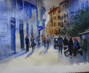
 I think this is as far as I go to rescue this painting!
The buildings have more windows and balconies, more definition generally, though how much to put in is one of those imponderables that can only be resolved by practice. Looking at it, I think the details further back are too strong. Since the foreground figures are also stronger , they are not overcome by looming architecture. The highlights on the heads and shoulders, added with gouache, also bring them forward.
This enterprise has been enjoyable in a frustrating sort of way. The sheer size of the paper was a new experience, and following Hazel, thus understanding how to work on a larger stage, has been very rewarding. The sequence she chose to follow this time differed from that used in her videos, again useful. The colours she delights in are a joy to the eye.
As a teacher, it has been salutary to be a student again!

Yes, I can see that some of the back may be a bit more definite than you would otherwise like, but you’ve made sense of the car and the scooter, both of which I couldn’t make sense of in the photo at all!