Emerging …

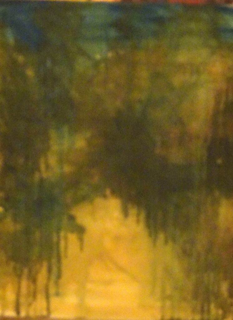
This is the fascinating stage, “fishing” for the picture.  By dint of adding true darks and some lights, the image is called from the background. The underpainting supplies the mystery, while various splodges deepen shadows or splash the light.  It is essential that nothing is created whole, superimposed on the background.  Just by pushing and pulling the tones, the trees leap forward, or fade into view, thereby allowing you into the painting .

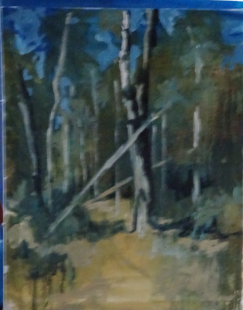
It’s so much more exciting than painting trees and makes for a more integrated picture –  concentrated work, especially if one starts without drawing.  With something like this, atmosphere wins over accuracy, so drawing is not necessary.  In any case, being an oil painting, anything “wrong” can be scrapped off or painted out.


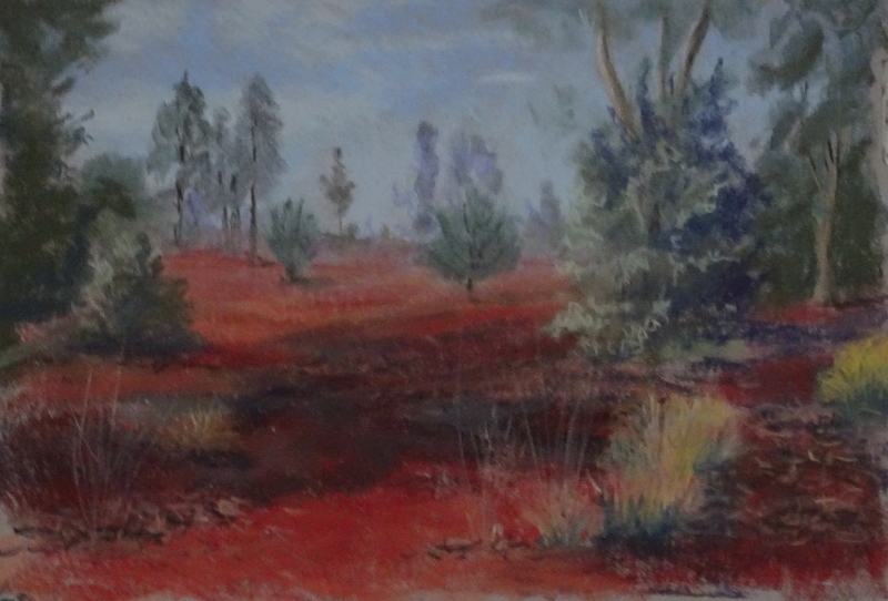
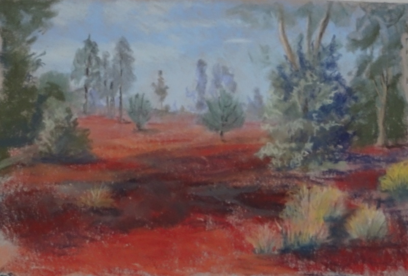
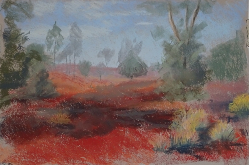
I felt the image was a little “cold” so I introduced the Burnt Sienna unmixed with blue on one of the trunks and on the ground.  I also warmed up some of the darks by making them more brown than blue.

The greens in the foreground are quite bright,  but I didn’t want to do them too soon.  More pale, more muted  greens make a good base for brighter colours and add to the variety of tone which in turn adds interest to the picture.  Sometimes I have darkened the background allowing the underpainting to provide the trunks, a great way to create an impenetrable forest!  still lots to do – and I haven’t even started on the foreground yet.

Forest beginnings

Back to oil painting!  Believe it or not, this is a good start to my next painting –  an underpainting using very dilute oil paint, suggesting the tonal layout of a forest glade near Darwin.  A very user-friendly  part of the forest, I hasten to add, but by cutting out the helpful board-walk, I achieve something a little wilder.

I have restricted my palette to Prussian Blue, Raw Sienna and Burnt Sienna, since these will give me the colours and tones needed.  I may add others later as the picture progresses, perhaps purples and crimsons in the shadows.

Using dilute colour makes for a very loose beginning while giving great intensity to the painted surface.  Any misplaced runs can easily be covered.  Allowing the restricted colours to collide/mix gives texture and interest, and certainly adds to the fun.  Deciding which bits to retain and which to obliterate, discovering  Serendipity in fact, is bliss.

Red desert completed

Not a lot has changed since last week, but the added (and subtracted) details have done wonders to the finished result!

As well as the bushy clumps of “grass”  there are occasional spindly grass stems rising to knee height.  They are very thin but their presence – foreground centre and left – seem to push the desert back a mile or two.  Very gratifying.   I think the dark patch is the result of controlled burning some time ago, for the shed bark of the eucalyptus  litters the ground.  Putting it in has anchored the foreground which again helps to create distance.  Finally, I have removed one of the brighter clumps – they were a bit even – and feel that the composition is better for it.

Red Desert continued

Now to introduce some detail.  The initial painting has given me the essential painting, and it is possible to leave it at that.  That feels like the easy way out – insufficient rigour.  Right now, I want tidy up and tighten up, do justice to the huge impression this enormous red desert made on me.  This scene, so near the hotel in Uluru, has far more vegetation in it than we saw on the journey to Darwin,  most of it grey-green or straw in hue.

The air is clear so the distant trees look nearer than they truly are.   The option of a pale grey-green to distance them was ineffective as similar tones on the lit side on nearer trees confused the eye.  I tried mauve but that was too pale, so I darkened them with the very lightest touch of umber.

I have also ironed out some of the “hills” that had appeared in the background, while the left hand side of the painting is showing the trees and the rough, grass-like tufts in more detail .  These last sprinkle the desert so that it is scrub rather than sandy desert.  The bushes in the middle distance really are that strange shape, but not as flat as they appear here.

More to do as there are some light tonal values in the wrong place.  In fact I never know when the painting is finished until I get there!

New project awaits

I took a number of carefully composed photos with paintings in mind when I was in Australia last year and have done little about them.  There seemed to be so much going on in the latter half of the year.  New Year has given me a quiet space to make plans.  Thus I am embarking on a series of Australian paintings based on those photos, with a possible exhibition  in mind.  We will see how they turn out, but more painting will be a Good Thing.

This is the second picture, (remember the Gum trees?) and is of Uluru, not the usual view of the rock itself but rather of  the land nearby, just outside the hotel.

Of course this is far from finished but it does convey the redness of the gritty sands.  It is very difficult to describe how very red it is, or for the mind to encompass the extent  it covers. On this island, we have no single view that lasts for days as you travel through it, nor one that is such a startling colour.

I’m using pastel – I felt it best exemplifies the landscape, and these initial colour washes work well together.  The scene is a bit hilly at present but that can be addressed as I begin to work up the detail.  A good start to the New Year!