Thoughts on the present discontent

The discontent is not the current Solitude.  It concerns the rediscovery of a Layflat Sketch Pad I bought a month or two after the publication of my book “The Bridges of Dee”, when I was feeling artistically rudderless.  I had been painting the bridges pictured therein for some years, a very strong focus, and now I had none.  Being somewhat circumscribed by caring responsibilities, I couldn’t go as far as thought might take me (my other river, the Tyne? more bridges? Chester?).

Inspired by a article in either “The Artist” or “Leisure Painter”, I decided to make a painterly record of the garden.    The advantage of the layflat layout is that you can paint/draw across the fold so a painting could grow sideways if necessary, and gardens do grow.  Unfortunately I hit a “only painting rubbish” phase and was inhibited by the acres of white paper, and the idea of a rubbish painting trapped in a book!  I’m no better off now either.  As soon as I saw it, the old doubts reappeared, even though my paintings, currently, are not rubbish.

What to do?  Displacement activity required.  How about starting with the title page – it is a book, after all?  What do I call it?  The Garden, My Garden, Garden, Gardening Notes, Flowers in my Garden, Heaven on Earth? (eek! I say,steady on). And what font?  and where to put the title?  Up high on the page with wisteria drooping from it? In the middle surrounded by a wreath of summer flowers? Bottom right, alone?

Some decisions have been made, title – My Garden;  font – my own handwriting, which isn’t neat but probably has a closer affinity to the garden than a more formal font.  I’m not an accomplished flower painter, so although I’m attracted to the wisteria idea (the crossbar of the pergola would be a good place to sign) I’m a lot nervous about launching into flowers on page one.   Come on, Steve! You’ve got to start somewhere!

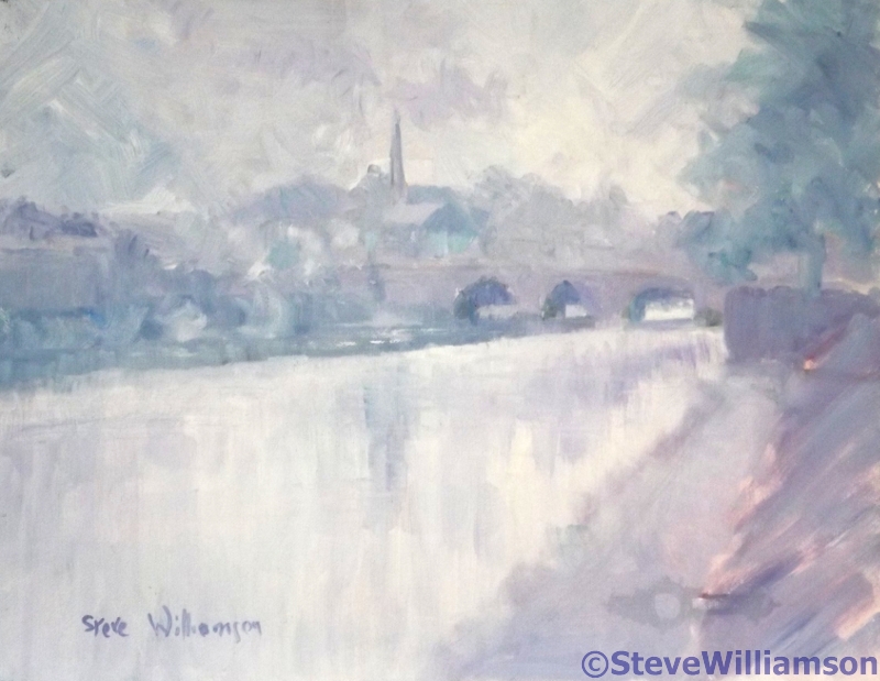
Because I don’t like a post without a picture, I’ve included one from the book.  It’s the Old Dee Bridge on a misty morning.

Banksia spinulosa

These striking “candles” are about man-high, borne on woody branches with thick needle leaves, close to the ground , for all the world like part of a giant’s  Christmas tree.  The colour  is bright, especially in shade, while the tiny flower stalks growing at right angle to the stem give a bristly appearance.  This is a return to watercolour, and it must have worked or I wouldn’t be showing it to you!

When I first painted in watercolour, I used a flat brush as the shape was familiar to me coming as I did from oil painting.  This seemed an ideal subject to return to that brush since everything is so angular.  The colour palette is Indian Yellow, Aureolin, and Burnt Sienna for the flowers and Prussian Blue with Aureolin for the leaves. Burnt Sienna was added for the real darks.  The composition works because of the strong contrasts so that the “candles” sing out, and the light, brushing their tops, is emphasised.  But painting is unfinished  – the sides are too clean-cut.We need the bristles!

I have scratched out the bristles with a craft knife, taking care to make my scratches at right angles except for the tops where they curve outwards.  They are only slight but show wonderfully against the dark background.   Some tiny horizontal taps of Burnt Sienna ruffle up the body of the “candle”, while the spiky needles have added darks all using the flat edge of the brush.  Played for and got, I would say!

Homage to Vincent

I was quite taken with the effectiveness of the directional strokes in the last painting and they led me naturally to Vincent Van Gogh.  I’ve attempted to copy his painting of the old peasant in his straw hat and blue smock twice, once in oils to try and work out how he painted (there is such vigour, such vitality in his brush strokes, and it’s not so easy to do as it looks), and once in watercolour (!) as part of my Meander Treasures (September 2017).   And I had a photo of A Hat …….

This is yet another example of so little saying so much.   Like Van Gogh, I have eliminated all background detail, and attempted no variation in tone either, the perfect foil for a simple image.  The hat and sunglasses, face, scarf and blouse are all simple shapes in block colour.   A warm, browny-red background thrusts the figure forward and sings beautifully with  cool greens and blue/white.  Lilac cream hat and green scarf  frame the half shadowed face.  Despite the eyes being lost in shadow (I didn’t even attempt them), there is no doubt she is looking at you in a friendly fashion.

The counter-change, the contrast of strongly dark and light tones invest the image with a presence of its own.  It ate up a lot of oil pastel, but I’m not repining, for I find to my surprise that this is a good medium to work in.

Looking down the Yarra

Here is another painting for my possible Australian Exhibition – I might even have them all done if this Solitude continues!  It is of three of us standing on a bridge in Melbourne looking down the Yarra river.  This is late July there, so Winter-time but sunny.

I’m using oil pastels.  I have been exploring what I can do with them to keep ahead of those of my students interested in this medium!  I’ve tried blending them, but my preferred painting method is to retain brush, knife or pastel marks.  I like the vigour they impart to a picture.  This image is nicely chunky so strong marks are exactly right, and the three people are very individual in colour and pose, the obvious focus .

The painting is done on mid green mount board.  I think it helps as there are no unintended bits of white to distract the viewer.  Strange, isn’t it!  I love those flecks of white in watercolour, but find them bothersome in any other medium.  The midtone disappears happily into the other tones.

The buildings and sky are blocks of colour, the pastel used firmly in one direction only (this is the sky, these are buildings,so there).   My new oil pastels go on thickly enough if I push hard    Looking at them again I think the white should be calmed down a bit so that the white hair stands out.  But the buildings are there merely to provide context and some perspective.  I haven’t put the windows in – oil pastels and me don’t do detail.    The figures are created in blocks of colour too, with high contrasts to suggest the sunlight.  Such blending as has occurred is the natural result a working one pastel over another.   How little one needs to define an image!  I recognise these people though there are no details to help; my most successful oil pastel to date.