A pot of flowers

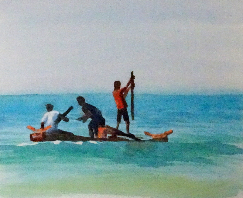
Something of an experiment, this one – I liked the profusion of flowers, the colour against the stone, but wondered how best to display them.  so there are two attempts fused into one painting.  The colour, after much cogitation and mixing, resolved itself as Ruby Red and Ultramarine Violet, on the left hand side as blobs of colour and on the right as more diffuse shapes dropped into spaces in a green squiggle .  The left hand is nearer to the actual flowers,  but the diffuse side is a bit more exuberant perhaps.

Then I stopped thinking before painting.  The pot was cast cement, white ag
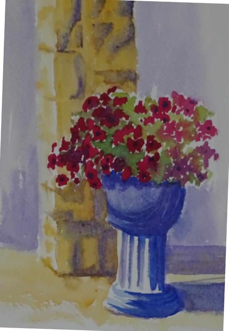
ainst the creamy stone.  White in shadow is frequently shown as blue, so I painted it using Ultramarine Blue, quite forgetting that I already had Ultramarine Violet in my palette.  I could just about have got away with that if I hadn’t added the pillar behind the pot – in Yellow Ochre.  Blue shadow in yellow tends towards green, too cold for this warm stonework,   so I used Violet.  Now the pot stood out like a sore thumb, its blue modelling vying for attention with the flowers.  I was able to wash out most of the blue and rework it using violet though the blue still shows through.  Thought before action required.

Gone Fishing

As part of my efforts to encourage incipient painting thoughts, I am, as usual, looking to Hazel Soan for guidance.  It was pouring with rain, so I looked through my photos for a townscape with people in it to create a monochrome tonal sketch and found …..  Honestly, trying to discipline myself to follow the path I have agreed with myself is like trying to herd cats.

Colour – I can’t resist it.  Isn’t this a glorious turquoise?    All thoughts of monochrome townscapes fled as I plunged into the deep blue sea.

It’s Manganese Blue – a non-staining, semitransparent colour which I discovered in Zoltan Szabo’s book “Color-by-Color”.  It just sings off the page, orangy-reds being the perfect accompaniment.   Over washed with Viridian for the swell that lifts the shallow boat, still it glows through.  That’s no small achievement as Viridian is not a shy colour.  I’m truly pleased with that wave.  This is letting the brush do the work.  This is watercolour.

So, no townscape; no monochrome;  but perhaps I can claim in self defence that the figures are virtually silhouettes.

A tonal study 2

And finish it I did.  A bit clumsy in places, but maybe I’m nit-picking!

I like the freshness of the Cobalt, a beautiful warm blue.  Dilute Burnt Sienna  on the stonework adds its mite to the glow, while the mix gives me a dark which is not too great a contrast to the other tones.  Working this size is a blessed relief as more recent attempts have been a quarter of this size.    The idea of working small was to relieve the pressure of “making a painting”.  Frankly, I can “not make a painting” on any size of paper ….. it’s a skill I have been developing lately .  So maybe I should stick  to larger sketch pads in future.

This size has allowed me to indicate some of the intricate carving so characteristic of Lisbon architecture of this period.  You have to see it to believe it.  Think of baroque decoration then add more baroque decoration on top!  Every decorative carving is itself decorated.  Even at this size, it’s not possible to show all. Tiny shadows, flecks of light, must suffice.

Erddig Gardens

For our third sketching and painting day we met at Erddig, a country house not far from Wrexham.  It was a bit chill and rainy, but there were plenty of nooks, quite spacious ones in fact, to avoid the wind and showers.  The cars, carriages, bikes, trikes, etc., I decided could wait for a brighter day when the displays would be less gloomy, so I headed for the gardens.  Plenty of greens about, but it was the interplay of structure and planting which seemed to respond best to the uncertain light.

I was happy with the sketch I did in the morning.  I had found a relatively cosy seat with places to put my paints and water and was encouraged to dive straight in without any preliminary drawing.

It’s amazing what you can do if you try!   Brick and sandstone abound here, making a pleasing combination of colours.  I remember being attracted to them years ago when I first painted in these gardens.  The simple structures of these pillars with their distinctive banding got me off to a flying start and it was just a case of working outward from that firm foundation.  Through the gate, the garden was laid in with dull greens and reds.  These receded under the force of the brighter tones before the gate,  neat box hedging topped by a bright green creeper.  A rather shaky gate completes the sketch.  Considering that I was struggling to find the courage to lift a brush two weeks ago, I feel satisfied with progress.