Sitting on the wall

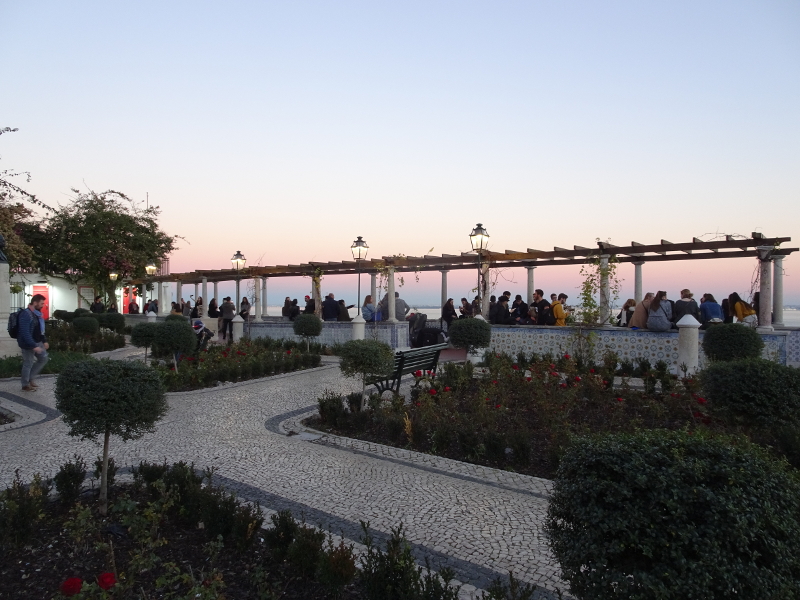
When faced with a containing image like this – all the action is under the pergola – the instinct is to draw in the pergola first, so as to set the parameters of the image.  The same thing happens when the image is a vase of flowers.  You put the vase in first.  I don’t advise it!   It is actually a very unhelpful thing to do.

The focus of the picture is the people (or the flowers), so you start with them and show only as much of the “container” as you need.  If you do this you will find your picture comes under your hand more easily.

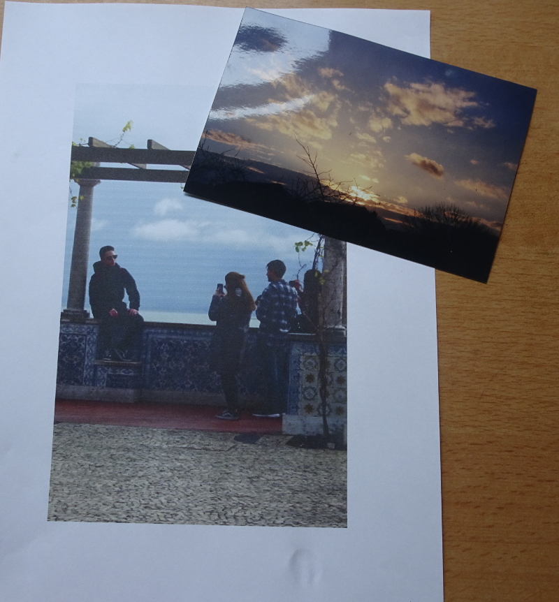
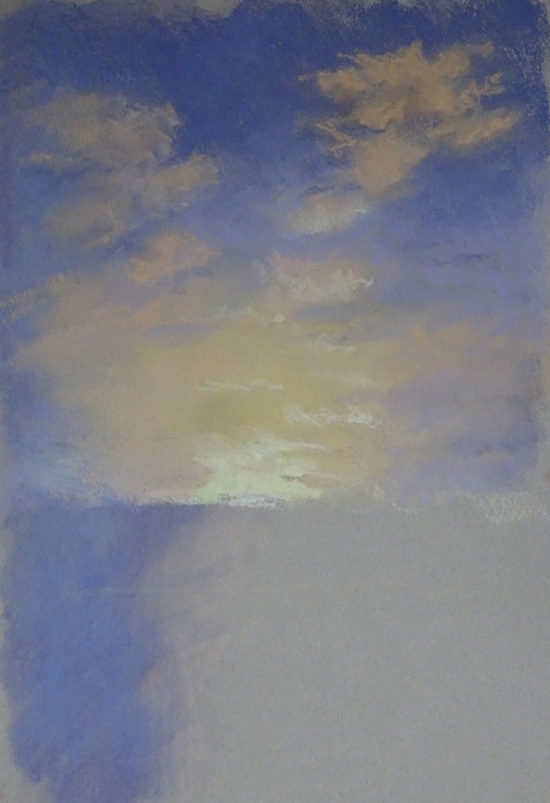
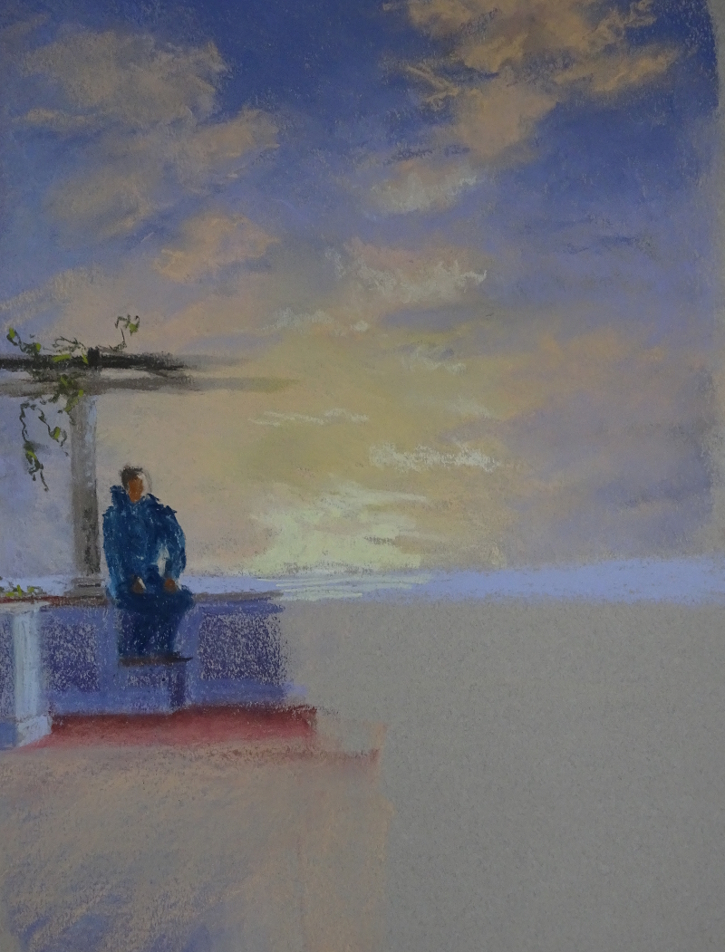
I was interested in the negative shape between the figure and the pillar, so my first mark was the lower part of the pillar.  The pillar base and his behind gave me the top of the wall, thence to his legs and the small step he has his feet on.  These are strong marks with no attempt at modelling.  There is light around but he is practically in silhouette.  His height gave me the height of the pillar and the beginnings of the pergola.  I have lightened the spar that is further away to lessen the impact of the two very straight lines across the paper, and “grown” the wisteria a little bit which also breaks up the line.

The very bright sunset will be framed by the figures, as his three friends are close to the other pillar, taking his photo.    I intend to lighten, indeed may only partially insert, the spars of the pergola as they cross the bright sun.  Looking directly at a bright light can have that effect,  and it’s a useful way of dealing with a fence, wall, or hedge that is blocking  access to the painting.    I’ve done just that in one of the Bridges, the Holt/Farndon   bypass.

Someone else’s pergola

I have been trying to make a satisfactory painting of this pergola for some time. 

I’ve cropped it in various ways.  I’ve tried watercolour.  I’ve tried soft pastel. I am unhappy with the results.  The atmosphere eludes me.   So I’m trying another tack.  I searched through my photos for a more active sky.  I don’t want it too active for that defeats the mood I’m trying to recall, but I can calm it down.  What I find difficult is creating an imaginary sky.

Here is one of my cropped images and my chosen sky.  I am working in Canson Moonstone with soft pastels.  I hope they will conspire to give me that dreamy, end-of-a-happy-day feeling.  This cropping is too severe, I think, but I’m going to start the sky first then ease up to the composition as I see how it goes.  What I won’t do is finish the sky before I start on the pergola, and if I like it I may not put the pergola in at all, just find another sky for it!  Below is my third attempt!

I have looked at the photo again and have cropped the image a bit wider to include the wisteria (it’s there but it’s a winter photo) and the decorative lamp post.  This is Lisbon, so there are all those decorative tiles and some of their decorative pavement.  How much of that detail will I show?  I don’t know.  Certainly the wisteria could grow a bit.

The Arch

I’ve done more pencil work on this and then added both watercolour and just water.

First, I continued the garden on the right hand side in watercolour pencil.  The deep shadow at the foot of the arch anchored it to the earth while the flowering bush was a welcome contrast to the very green border on the other side.    The absence of any distance beyond the trellis fence emphasises that this is my garden, with only the oak as a borrowed landscape.

The addition of water to the pencil marks increases their density so that they are darker or brighter than the untouched marks. It’s a very entertaining thing to do – It feels a bit like those e-cards growing colour before your very eyes!  I was able to thin the branches of the spindly lilac on the left.  I had added dark blue pencil to increase the depth of the shadow.  it scarcely showed until water was added.  The lawn and the oak foliage were watercolour paint laid in with a brush.

I’m reasonably pleased with it.

“My Garden”

I’ve edged up to this one.  I am surprised how daunted I still am about painting “in a book”.  I remember being very taken with a painting journal a friend of mine would do during every holiday, her text and her illustrations.  Even lines of washing have a different resonance when waving in an Italian breeze.  I loved the idea but never attempted it myself.

Something structural, then – it’s always easier with straight lines defining areas.  I have a rather pleasing photo on an arch leading into a little paved part of my garden.  It has a classic shape, with simple bushy mounds around and a flat lawn in front.  A few sketched lines gave me a map of the design and I started tentatively with watercolour pencils.  The plan seems to have worked since I got something down and am not staring at a blank page.

I began with the terracotta pot in the foreground.  That worked so I was encouraged to grow the painting from there, gradually rising through the bushes to the woodwork itself.  The old oak beyond the fence shows signs of being successful. Colours and tones are limited, but will blend later when/if I add brushwork.  I’m not thrilled with the greenery so I hope I can rescue it with a brush!