More Wow!

Day two, and no let up in the speed of production!

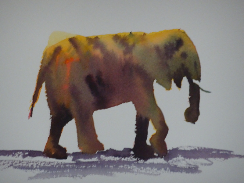
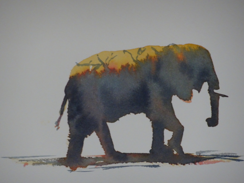
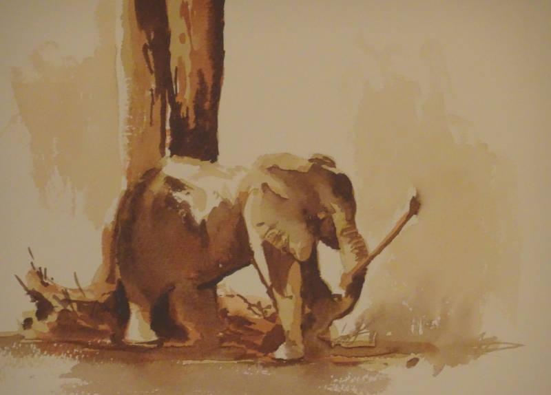
We worked on more Hazel “ellies” as some people had missed out on it the previous day, then we painted this charmer.  The technique was the same but this time we used browns, Raw and Burnt Umber and Burnt Sienna.  A light wash of Raw Umber covered all areas where we didn’t want to retain white paper, followed by Burnt Sienna, then Burnt Umber for the real darks.  Hazel pointed out that these were “lifting” pigments so it was no disaster if we inadvertently put paint where we didn’t want it!  This little elephant was having fun with his stick, and we were having fun painting him.

Then life got complicated as we moved on to a cafe scene, with big shady parasols and bright sunlight.  Hazel works her miracles by thinking ahead, and simplifying the scene.  So, you work out which pigments you need to create the painting – most colourful ones you can do by mixing, using three or four colours, though accents of brights might need small amounts of other single colours.  This way you create harmony within the painting, and save yourself from trying to match the exact hue.

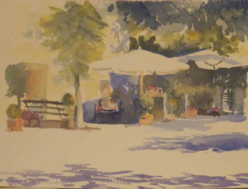
First we used Aureolin to show sunlight catching foliage, etc, carefully leaving white shapes, then indicated shadows with Ultramarine.  Any transparent colour painted over that blue will show a darker version of itself.  Touches of pink added sparkle, then shapes and tones in the central area finished the painting.  I understood the principles applied but fell apart somewhat in execution, as my colours became muddy.  More concentration needed.

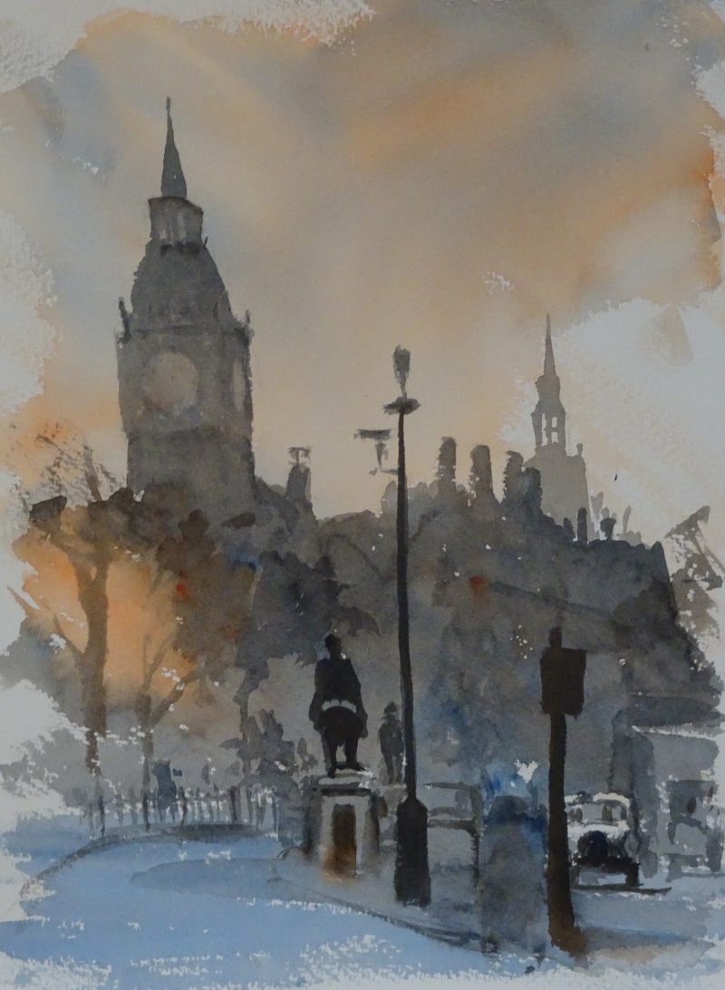
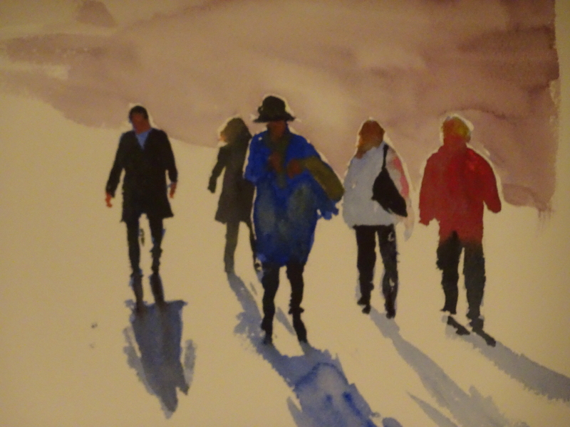
Finally, we essayed back-lit people, again something that Hazel has demonstrated often.  We were running out of time, and I didn’t finish my background, but here it anyway.

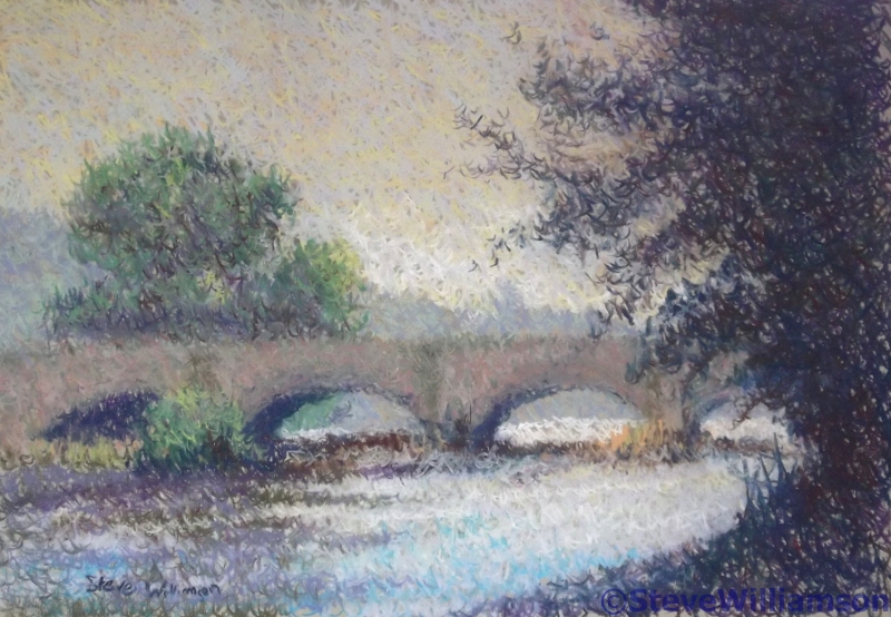
I have learnt so much – it’s still swirling round in my head – and greatly appreciate such a informative weekend.

Wow!

I have just returned from a two day watercolour course with my favourite painter, Hazel Soan.  She is just as good a teacher as she is in her DVDs but the addition of her driving energy and high expectations made all twelve of us make more paintings in two days than I would have thought possible, at least eight full pictures each.

All the sessions showed how to simplify the scene, how to achieve results quickly and easily, so that the spontaneous nature of the medium was not compromised.  Each focused on a different aspect, beginning with the importance of  of tone to show perspective.  The London shot of Big Ben silhouetted against an evening sky (transparent orange and ultramarine blue only) encouraged deepening tones as we moved forward.  I was chuffed with the taxi!

Then we moved on to tone creating three dimensions – wet in wet  and wet on dry, soft and hard edges.  I think we all did pretty well on this exercise as the scene wasn’t complicated, each rock having its own attention.


On again,  this time to lemons ripening on the tree, more rounded forms and a plethora of leaves .  This time the paints were aureolin, indian yellow, violet and prussian blue.  The fruits were relatively easy, wet in wet, using the two yellows and violet.  I came apart on the leaves, losing the freshness, battling with the age old conundrum of pigment to water ratio.

Finally, released in to ele-land!  These three-colour elephants were one of the first things I tried when I discovered Hazel’s DVD’s. It is sheer magic to watch the pigments merge on the paper and give you a credible grey or brown beast.  And it doesn’t just have to be elephants!

First we created the shape in the chosen yellow, anything from ochre to lemon, introduced the chosen red into the wet wash , alizarin to cadmium, from the ground so that it bled upwards, then introduced the blue in the same way, prussian, ultramarine, whatever!  Finally just as it was just damp, a mix of all three indicated the final shapings.  Of course the chosen three colours will serve to create the background too.

So ended the first day.

Other ways with pastel

I’ve been working in pastel quite a lot recently, almost always rewarding.   There are so many ways of using them; the immediacy of the colour in your hand lends itself to experimentation.  I recalled one in my book “The Bridges of Dee” that I had particularly liked and hope you do too.

Look closely and you will see that it is composed of hundreds of tiny crosses.    I’d seen an article in a magazine about working in this way which sounded productive.

The sky is a mixture of pale blue, apricot, yellow and mauve laid over each other at random, and quickly, even paler ones near the horizon.   The juxtaposition of these complementary colours  creates luminosity.  The essence of the technique is to work at speed so that the crosses don’t become neat and laboured.

The bridge is a mixture of separately applied greens and reds, purples being added for the underside of the arches.  Turquoises  in the water sparkle against the orangy reeds (more complementaries), while the nearest tree is an exuberant mix of all the darks available.

It’s a lovely noisy technique, and comes highly recommended!


Gum trees completed.

A quiet half hour allowed me to finish this painting.  The main change has been a weakening of the shadow cast across the path in the foreground.  The other changes have been very minor, a strengthening of a highlight or shadow here or there, an extension of the path itself behind the trees in the background, the right tone and detail to edge the path, little things in themselves, but with an effect beyond their size.  I must have liked it for I have signed it!