Carrog Bridge – pastel

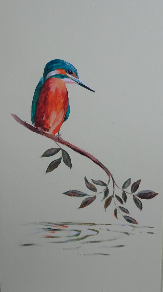
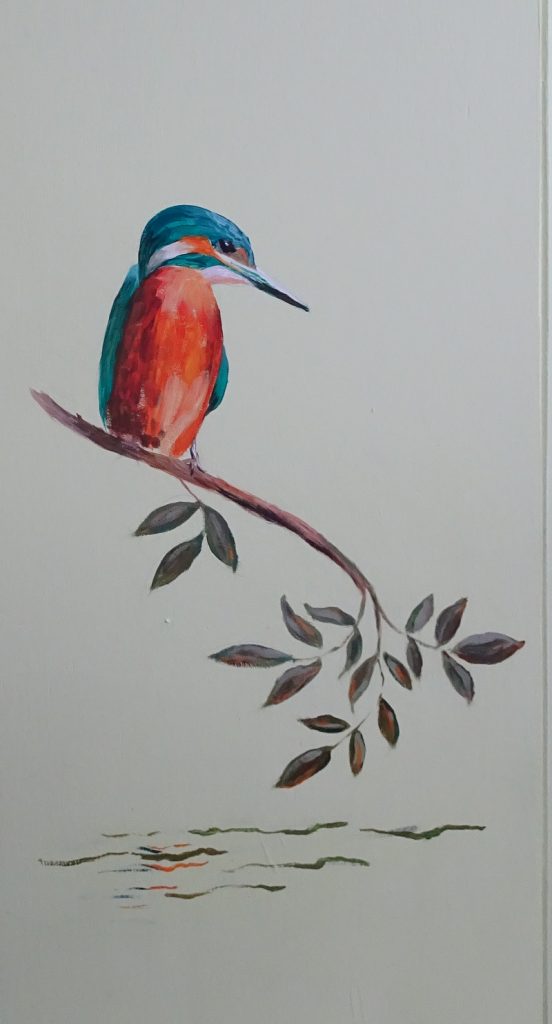
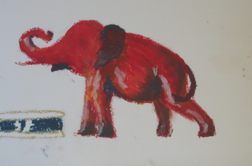
You will remember I found this unfinished painting when tidying the studio.  It seemed like a good start, more dreamy that the oil I did for the book, more softly coloured.   However it is practically impossible, even in pastel where exactly the same colours and tones are to hand, to recall the prevailing mood of myself and my audience – this was a demonstration – and, in addition, I have acquired new pastels and been through uncertain times painting-wise.

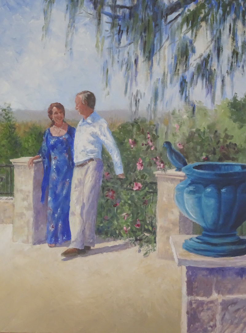
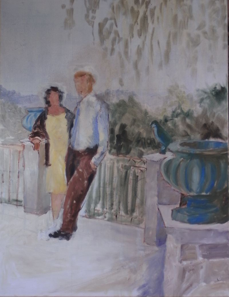
This is how I continued.    
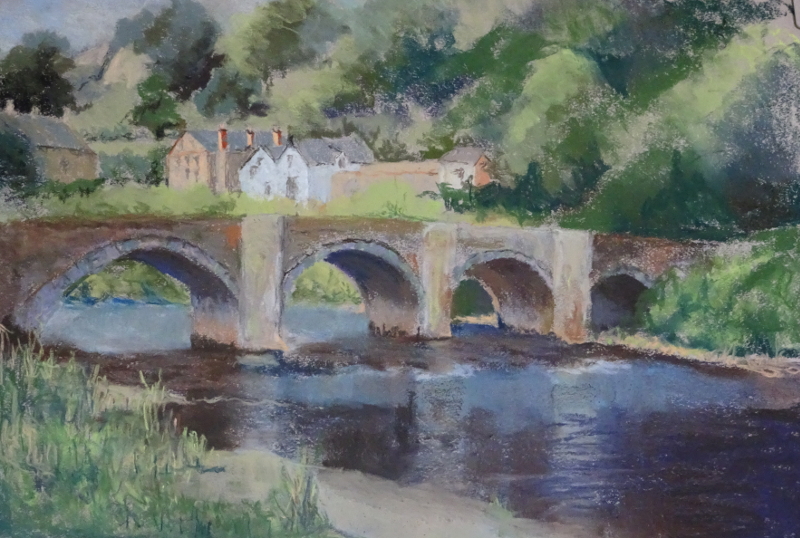
I breezed along forming the right hand trees, inserting the nearside bank, titivating the bridge, having fun.  When I sat back to look, I was thoroughly displeased with myself.  It’s not clear from this photo but the new trees  almost sock you in  the eye, the greens are so different and far too bright; the river looks like a canal; and I am decidedly unhappy about the grasses on the near bank.  They look like sausage fingers, despairingly climbing high to gain authenticity.    I seem to have used the same technique for ages and it’s time I found a new one.

I took a serious brush to the recalcitrant parts and removed the lot.  It’s not an improvement but it did wonders for my frustration.

Now  I tried matching the colours and tones I had originally used for the trees, and am thinking about grass.

Kingfisher

I have a fire screen in my sitting room that I had decorated with a kingfisher(as you do) painted in acrylic.  This is the third or fourth incarnation of the screen as it changes every time we paint the walls a different colour.  It’s been pale yellow, peach, bluey-green, deep crimson and now lime green.  The  designs have varied with the decor,  gold chrysanthemums stencilled on the crimson being memorable.

This design was free hand, originally done when I was struggling to find the sweet spot in painting, and I was never happy with it.  The kingfisher herself was fine but the branch she sat on was just wrong.   I’d  shown a stem rising from the water, meeting her perching branch at right angle(?!) that then tailed off in an unconvincing way.

Lock down (I prefer “Solitude” as it sounds like I chose it!) led me to the garage for gardening purposes but also provided a tin secreting the remains of lime green paint.   Paint out the old and paint in the new.


This is my first try.  The awkward branch rising from the waters is gone  and the weak end of it now more vigorous.  But it looks cramped at the bottom – I hadn’t painted out the water and the final leaf is pointing the wrong way.  It is an improvement,  at least the leaves have the strength to balance the bird.  But the composition is still faulty.


This is better.  Compositionally the new leaf takes the eye back into the painting.  I think the water is less convincing, but I’m going to stop while I’m winning!

Incidentally, the bird is huge, about 10 inches high, and would frighten the socks off any fish below.  But the macaws on the curtains are not trivial and she needed to stand up to them!


Look what I found!

I was tidying the studio after finishing the big picture and found two efforts that need finishing.  One was fairly recent since it is one of my Australian paintings.  Do you remember the Sandstone cliffs I painted with a palette knife last October?  I mentioned the twisted tree perched on the cliff edge that I was dithering about.  I reckoned that I would leave it till the canvas was dry.  That way I could wash it out if I didn’t like it.

  I tried to introduce it using a palette knife, but it was in the wrong place and looked clumsy.  So,I washed it out with turps, just like I said I would.    If I’d done it with a knife when the paint was wet, like the grasses,  it would probably have worked.  A brush worked over the bumps of dry paint, and by introducing purples and blues and maroons throughout the battered, little tree, I was able to integrate the addition into the whole.  Then I darkened the sea at the horizon .  The tree seems to have improved the composition by linking the grasses on this cliff top we are standing on with the more distant ones.

The other finding was a pastel I started as a demonstration for an Art Group in Carrog.  Naturally, I chose to paint Carrog Bridge.  It’s such a landmark in the area.  In fact it was the first bridge I painted in my “Painting the bridges of Dee” saga.  This is a view from above the bridge looking downstream from a stony beach.

The pastel view is from the other side below the bridge looking upstream.  Different weather, different view, different medium so we have a different painting.

Lots to do.

In the sunshine – at last!

So this is what it looks like now.  And I declare it finished.

It’s a far cry from its beginnings way back in May 2017.  I remember enjoying returning to a big canvas – 4 ft tall and 3 ft wide.  It’s drifted out of focus as life took over.  There is a big gap in working on this between September 2017 and September 2019.  That I don’t remember, though I do remember the doldrums when no paintings worked.   Then  it received a huge boost when I was able to photograph the pair on the spot myself, relaxing in the June sunshine.

Here is how I started it just after my successful exhibition of “The Bridges of Dee” – the book is still available if anyone would like one, see the website – so there is a certain feeling of freedom about it all. Trawling through the blog posts about it was instructive for me as well as entertaining.   “Keep right on till the end”  has done me proud here.

The wave in oil pastels

There is a small hiatus with “In the sunshine” called ‘waiting for the paint to dry’, so I’m experimenting with my new oil pastels.   Tim had done a red pepper as his introduction to the medium so I thought my very red elephant would be a good venture.

These Sennelier pastels are very soft in comparison with the others, of both kinds,  which I tried last time.  I reckon I was over excited and used far too much pastel initially and blended (with my finger) too enthusiastically.  This produced a messy paper with little dots and smudges from my mucky fingers and any detail  I achieved – not much – was lost.  It’s all too clumsy.

So I tried again, using “Stormy weather” as my source.  this is altogether a better attempt.  I found if I broke my (new!) pastels and used the side, I achieved a lighter mark (in terms of pastel mass) but more even coverage.  I was then able to blend, using the white pastel with quite subtle effects since my underlying colours blended with each other and with the white.  The rocks responded well to this method.  I also found that an old store card  helped to scrap off oil pastel when the surface was getting over loaded.  It also enabled me to straighten lines like the top of the wave by pushing the pastel towards the wave itself.

I now have vague memories of a session or two using oil pastels with my tutor many moons ago.  He was very keen on showing marks, not blending them, so maybe there is a way forward there.