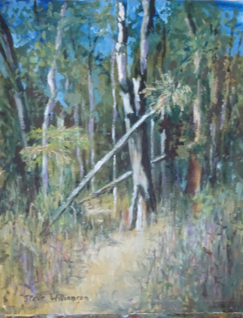
We are standing on the shores of Australia looking south to the Antarctic in bright sunshine, in the teeth of a horizontal wind of great force. It’s a good thing that wind is blowing off the sea, or we would be over the cliff in no time!
This pastel painting is about the sky, especially that white cloud, so I’m taking it slowly, and working on the sky only at first. I work at an easel with the paper vertical before me. It’s big, 30 inches wide and 22 inches deep, so the easel helps. Also, by working so, one is less likely to smudge passages already done, and any pastel dust falls to the floor (cover it!). It’s a natural angle for me as I started as an oil painter.
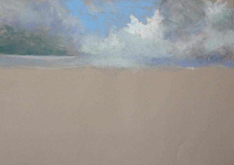 I began by identifying the areas of light and dark, blue and grey, just grazing the paper with the pastel (always Unison) so as not to fill the “tooth” too soon. I worked into the greys with blue-greys, mauves, even greens, light over dark and dark over light to achieve the subtle variations of cloud tone that give them volume, gradually increasing the pressure of the pastel. By the time I came to the blue sky and white cloud, I was digging deep. (That’s OK, for the board is padded with newspaper). It really sings out, partly because of the strong contrast it makes, but also because it is the only area with a sharp clear edge.