Where next?

It’s all very well to try someone else’s technique, but apart from the fun one should explore it to see what, if anything, one can do with it from one’s own inspiration.  I loved the looseness of the style – the blending, swirling, bleeding,  thinning of the watercolour paint are integral to its magic.

I think in last week’s effort, I tried to define the picture too soon.  The straight line of the water’s edge was too definite, and since it crossed the page from edge to edge, was far too dominant.  The real dominance should be the brooding cloud and the bright sea.  Then again, the lighter hillside was in advance of the darker one, and while that is not necessarily a design fault, in this case, I think it is .  And finally. I think the Indigo needed a bit of warmth added.

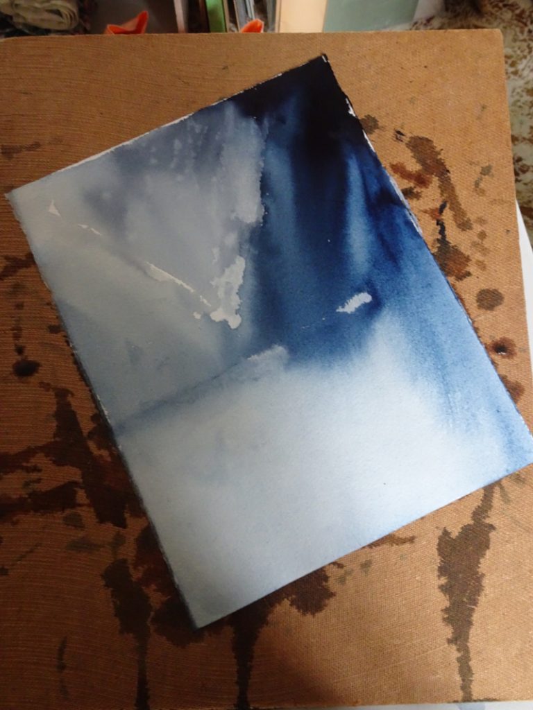
Taking that analysis as my starting point, I tried again.  Certainly, start with deep Indigo in the top corner, but instead of clean water  as my diluent I used Ultramarine Blue, again stopping the diagonal flow but allowing the darker Indigo to cross it.  Lots of water near the shore line,  then introduce Manganese Blue fairly strongly in the middle without defining that shore line for its full length.  It’s hard to resist the impulse to fiddle as you can see from the bottom of the painting!    But I feel this is an improvement on the last one.  It allows for the addition of a few details when the painting is completely dry.

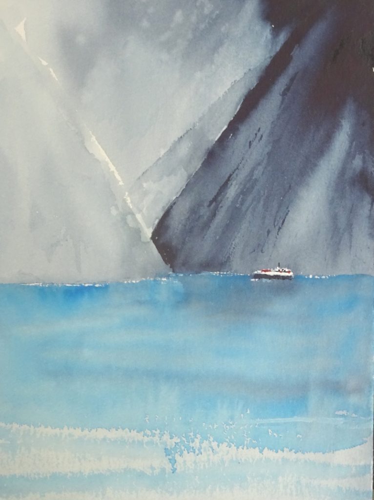
Duly added.    I think this is a reasonable result.  I introduced more Ultramarine Blue in the sky and put in the steamer.  I also defined the plunging mountain more carefully so that the lighter one does go behind it.  There is a very fine line defining the shore in front of the boat . The painting is not as dark as the first image suggests so I lightened the photo and this  has enhanced the image!  There’s a feeling of moving towards the light.

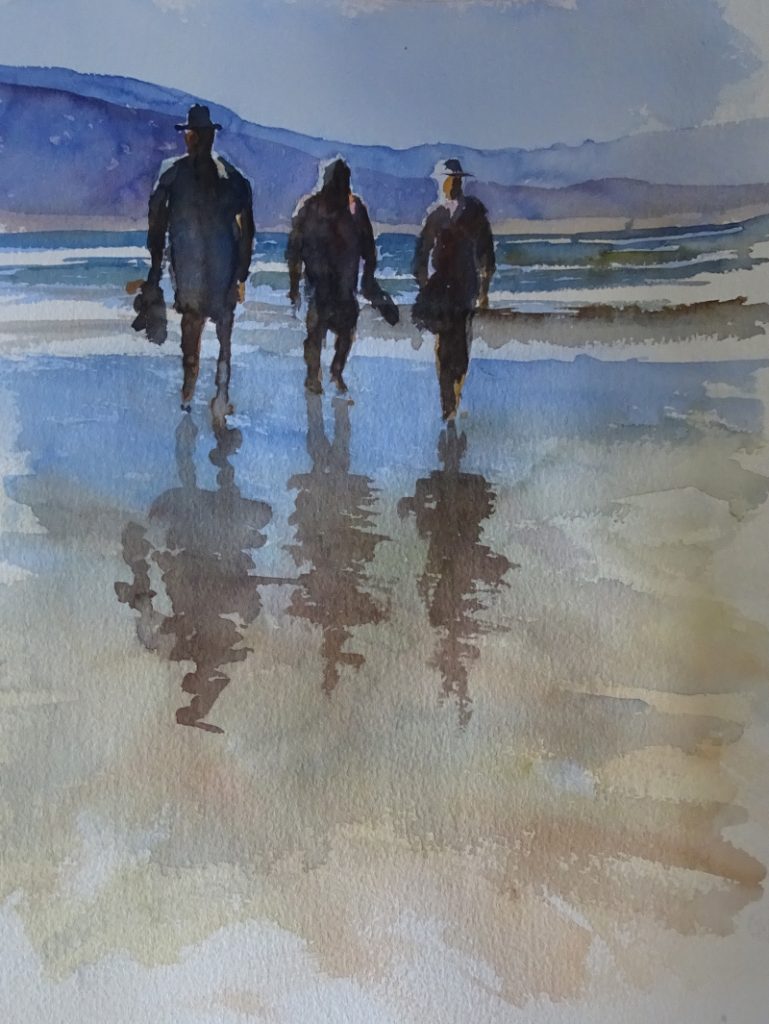
I’m going to explore further next week but I’m using one of my photos from Australia.  I’ll look for something less gloomy.


The threatening storm

This is fun, just the job for a rainy afternoon.  It’s a bit of a mash up, derived from the third and final painting in the watercolour class and  from a DVD I have by Jean Haines, “Watercolour Passion”.    Both tutors were using very wet paint,  Mike to create an atmosphere and Jean to loosen the mind and hand/arm in watercolour exercises which might, or might not be useful later.

The image for the course painting was of Milford Sound in New Zealand, with steep slopes and lowering clouds, a bright sea and a small steamer.  Mike was mixing his colours on the palette to achieve his vision, but Jean’s use of intense neat colour in the presence of copious amounts of water appealed to the colourist in me.

I set the board at an acute angle about 45 degrees, and the paper at an angle on the board, as you can see.  The intention is to encourage the paint to run diagonally down the paper.  Using my squirrel mop, I started in the top corner using neat Indigo,just a few strokes fanning out.  Then I loaded the cleaned brush with  clean water stroking some at the edge of my paint strokes and some in the dark wet Indigo so that it ran in varying strengths but always diagonally.   I had a picture to paint (!) so I stopped  the careering paint with a stroke of clean water in the opposite direction defending the dry paper behind it which  later had pale colour added.   About half way down the paper I needed to make room the sea,  so I laid a piece of clean cloth across the paper and mopped up the excess water.   I laid damp brush strokes of clean water across the sea horizontally, letting the mountains bleed a bit.  I did enjoy that!

Let it dry thoroughly.

I used Manganese blue for the water, turning the paper to an upright position and using it quite intensely near the mountains, adding water as  I  approached the bottom of the paper.  At this board angle you don’t get cauliflowers!  Some dry brush strokes added craggy detail to the mountains.  Again let it dry thoroughly.   Finally I put in the steamer to give scale to the mountains and give humanity to the painting.  Though it’s not a masterpiece, it was exhilarating.  I think I prefer stage one to the finished result.

Waterfall – Brecon Beacons

This is a very busy scene with three waterfalls, a dark cave, spring sunshine and a very rock-strewn stream.  This is my third attempt – one, a disaster, two, Disneyland, three, flattered by the photograph!  From choice, I would have painted this in pastel, either soft pastel or oil ones giving help to the many textures.  But it was the subject of my second Zoom lesson, so watercolour it had to be.

In this one, I began with the sunlit rocky hillside, dropping in the ochres, siennas and muted greens.  Then I introduced more detail with stronger versions of those colours and finally laid in the darks to give form.   On the cave side, the introductory washes were darker, as you can see on the nearer rock face.   After it had dried, I re-wet the part where the cave was going to be, being careful to give a crisp edge on the right hand side.  At that point I dropped in very strong Indigo, letting it bleed into the wetted area and introducing Burnt Sienna, then Raw Sienna as the paint moved to the  left.

At this stage I thought I was heading for Attempt Four,  but before I despaired, I put in the water, and life got better.   The form of the central rock went in using ochres and Ultramarine Blue, the exposed stream bed  being muted tones of the same colours.  Dry brush strokes gave depth to the falls, and I will admit to white gouache to save the day in places.

Painting with Zoom

For the next three weeks I shall be attending an on line watercolour painting course on Zoom.  It’s always interesting to see how other artists tackle a subject and I wanted to get to know the teacher, or at least learn something about his methods, since I will be attending one of his courses in person soon.  That will be about “painting outside”, something I have very little experience of,  as circumstances have dictated that I work mainly from my own photographs.  It turns out that he paints very like I do, which means I only have to cope with “outside”!

Teaching via Zoom requires a different approach to face to face lessons. For one thing, he had 100 students from all over the world, some painting after a day’s work, and others up before breakfast.   Some were absolute  beginners while the rest had varying  painting skills.  With this  set up, the usual demo followed by personal advice as class members work at their own paintings would be impossible.  In the event, he painted a passage, then the students essayed the same (we were all working from the same photo). Then we proceeded to the next passage.

As you can see, it is a fairly simple image of three figures on a beach, backlit and with reflections on the watery shore.  We started with the sky and the distant hills, working through the sea onto the wet sand in the foreground strengthening the tones at the second pass.  The figures are virtually silhouettes, the light catching the shoulders thrown up by the darker background and the silhouetted shapes.  the reflections were placed on a damp surface.

The inevitable start-stop nature  of the lesson took some getting used to both for him and for me.  Working to someone else’s brief was a useful experience.  Next week we are painting a waterfall.