In the sunshine – closing stages

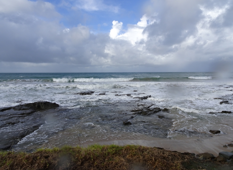
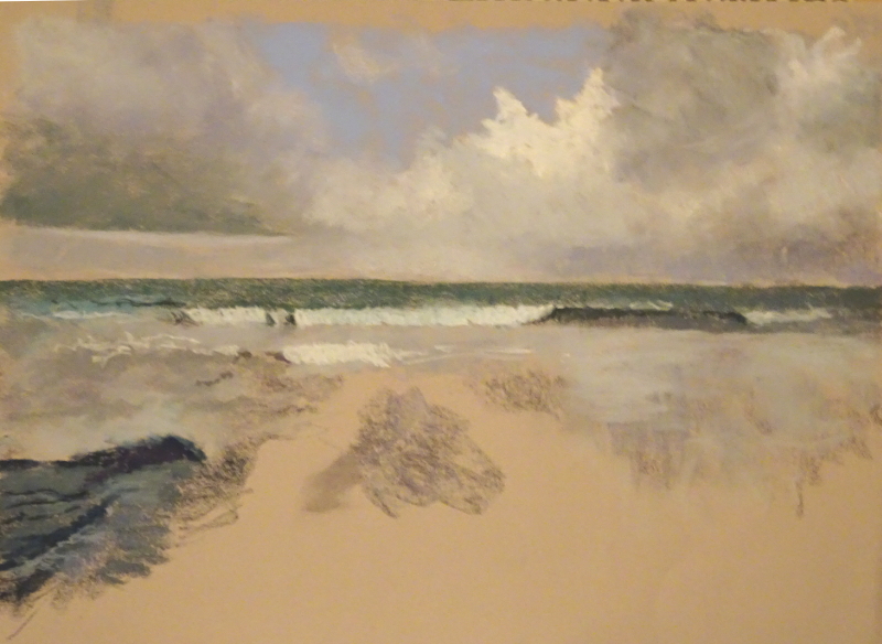
Now I have uninterrupted time, I’m hoping to finish this.  I’ve said that before, but this time I can see no excuse.  And I don’t need one either because I’m so much happier about the painting since I resumed action.

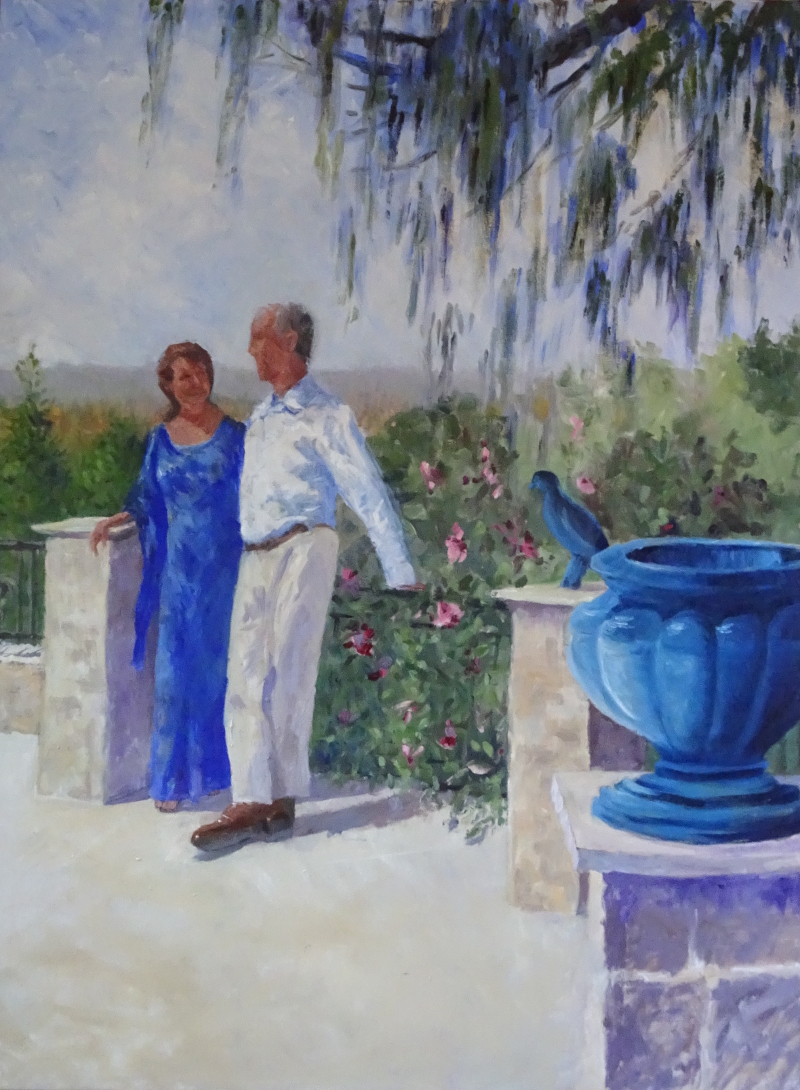
The trees behind the lady have grown; the faces are nearer completion;  I’ve made his head smaller; the railings are emerging shyly from the flowering bush; there is more texture on the walls; and more work on his shirt.  All these things are progressing as if on wheels.  But ….  I could scream with frustration.

I have also worked on his shoes.  I had them right – I HAD THEM RIGHT! Then I fiddled to make them more right.  How many times have I told my students “Don’t fiddle!”  Why don’t I listen to me?  The paint is still wet.  I think I’ll wash the work off with turps.  It will mess up the paving but that’s not difficult to put right.

Done.


Oil Pastel Exploration

Well!  They’re here.  The SAA never take long to deliver.  I only ordered these yesterday.

It’s official.  The more waxy pastels are the real thing, not the ones I used in the Lorikeet.  What those were, I don’t know except that they were sold to me as oil pastels. They weren’t dusty but they did throw a sediment which slid floorwards.

To pastures new ….

The book, ” A Beginner’s guide to Painting with Oil Pastels”  is highly informative and very easy to follow.  I don’t know how far I’m going with  this medium. The list of possible additional materials and tools numbers 23!   Nor do I know if  they will dent my love affair with soft pastels – somewhat unlikely, I should think.

A quick glance through the book told me what I know from other art materials.  There are varying degrees of quality in the pastels themselves.  Tim Fisher, the author, uses Sennelier (hurrah, that’s what I bought) which are more malleable.  The good news is that the pastels work on most surfaces –  including plywood, canvas and aluminium panels  – but Tim prefers Framers mount board.

However, before I launch into this new medium, I must answer the call from “In the sunshine”  and re-visit the south of France.


Lorikeet

This was an adventure!   I have used oil pastels very rarely and with no real success and I’m not sure that I used oil pastels this time either.  I have two boxes which purport to be such but they are totally different in feel and application.  One set (donated) is  waxy, like wax crayons, and one (bought in the distant past about 45 years ago when I thought, from no knowledge, that oil pastels were the natural progression from oil paints ) is like an extraordinarily  firm ordinary pastel.  The two kinds didn’t mix.  So I was left with one starter kit or the other of about a dozen bright colours.  The picture is bright so  I used what I had, but am resolving the issue by buying some new ones (Sennelier).

Here is the result.  It looks a bit like a stuffed toy but I may get a more satisfactory result from the new pastels when I get them.   I discovered that I couldn’t put lighter colours, particularly white, over other colours.  So I had to reserve lighter areas or do them first. However, the sky  came up beautifully when I scrubbed white on top of the mid-tone blue I had.  The brighter colours of the bird speak for themselves, the grey a mix of white over black.

I enjoyed the performance enough to explore the medium further and am impatient to receive my new ones.

Stormy weather

That was fun!  I’ve spent some time edging this painting to fruition.

It’s a happy stage as the picture is entirely present and only needs adjustments to burst into song, a blurring here, a sharp edge there.  I don’t consult the photo very much.  I’m not after a close copy, and the painting itself is telling me where to work.

I have brought the tones in the rocks closer together so that it looks all of a piece, and attended to the shape of the edges, both internally and where the sea attacks them.  I’ve muted the red brown sand at the very front so that it doesn’t fight with the rest of the painting, and extended the dark rocks on the right hand side to support the lower edge on that side.

I will admit to taking a ruler to the horizon – it had a distinct hill in it!  I have also introduced more colour into the dark wave to suggest some translucence.  The turmoil between the wave and the rocks was exciting.  The waves needed to advance but I also had to keep a horizontal mode going as well.

I signed it so I must be content!

Now, while I’m in a pastel mood,  I’m going to tackle this photo in oil pastels – clear shapes, clear bright colours – should be good.

Rocks abounding

Time to attack the rocks in the foreground …

The thing to remember here is that it’s not a heap  of rocks, but just one, sea-worn  rock, so never, in the search for detail, lose sight of  that homogeneity.   With this in mind, I began by ghosting in the dark shape, using deep blues and purples. Looking at it now, I think I should have included dark greens in there as well.  This would have aided the overall colour balance of the painting.

Then I began to introduce the details, working across the image.  first the strong darks to give shape and strength, then the little lights that contrast and point up the folds and ridges. The rocks are backed on the landward side by reddish sand – I missed out the grassy stretch right at the front as being irrelevant  – but when I put that in, and stood back, I found that it upset the whole picture.  Dark green rode to the rescue.  By overlaying but not entirely obscuring the sandy colour,  I achieved another texture and melded the sand into the whole painting.  Defining the rocks also included more detailing on the rough water just above them. The more you look, the more you see.

As you can see, in concentrating on the rocky detail,  I have also achieved the semblance of a rocky sea travelling at right angles to the waves!  All is not lost. I need to draw together the tones over most of the surface so that there is less contrast, while not losing the little interesting details.  I reckon that there is another four to six hours bliss working over the whole painting before reluctantly agreeing with it that it is finished.  I find the end  arrives quite suddenly, but it always the painting that tells me it is so.

Chilly seas

We move on.   I don’t think that the sky is finished but one needs to see the whole picture to assess and adjust colours and tones.

The sea is very dark at the horizon, and all frothing waves near the beach.  This hugely enhances the white cloud, and the white, breaking wave  centre stage.  A single pass of very dark green across the whole paper, covered by a pass of turquoise creates the distant sea – how easy!  I love pastels.

The wave deserves some attention.  Of course white foam is going to be unmissable, but I am asking you to look at the whole wave in the photo I am using as my source,  and analyse its different parts.

That wave runs across the picture, a single wave but at different stages of breaking.  on the left there is a welter of water being drawn into the body of the wave, then some tentative breaking followed by the real thing.  Then we have the unbroken water rearing itself up, and  smaller, more grey than white foam.  Even at this size you can see how the rearing part is darker at the top, and that darkness follows the foam down at an angle and runs along the front of the advancing white water.  What else can you see?

This wave, and the white cloud are the stars of the show,  much more important than the rocks in the foreground, though we can have fun with them next week.