Colour mixing

My tutorials for my class this term have started with colour mixing.  This is a perennial request, and trying to devise a way of making the mixes easy to remember or some system of charting that is accessible has been occupying my mind for some time.    It is not something that I, personally, have had many problems with, and, of course, time and practice will solve the matter eventually.  So, “What to Do” –  I find the charts that have 20 colours across the top and down the side, with the appropriate mix where the lines cross, very off putting, but splodges of paint side by side is even less appealing, and not something you would want to return to..  So I have invoked the use of a colour wheel,  reducing the colours under study to three.

This week we are looking at Raw Sienna, Burnt Sienna and Ultramarine Blue.  I’m being very fussy about clean water, clean brush, freshly squeezed paint, so that the finished pieces tell the truth and shame the devil!

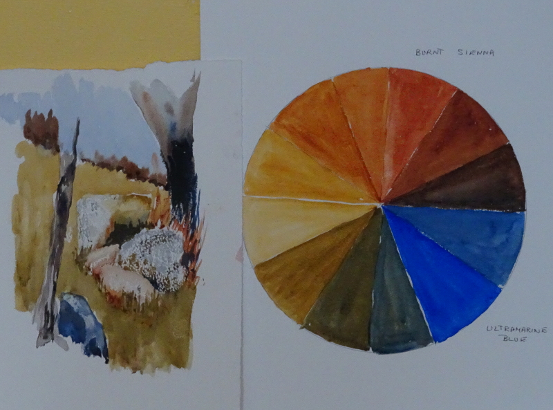
No surprises here, but see how strong Burnt Sienna is, and Ultramarine runs it a good second.  Poor Raw Sienna has a tough time coping with them.

The little sketch was done using just the three colours under study.

Thinking it out again

Returning to my big painting “In the sunshine” after about a year has left me in a bit of a state.  There seems to be so much wrong with it.  When I left it last year, I though it was nearly finished, but now I can see bad drawing and awkward concepts all over.  Still, on the positive side that means I can attack it with gusto, rather than dabbing at the faces with the aim of achieving a likeness.  This time, though, I need to keep the momentum going to the end – I don’t want another period of re-entry like this one!

It’s mainly, but not entirely the figures.  One of those things which happen when you are struggling with a painting is that the area under attack “grows”, so that properly proportioned figures become ridiculously long limbed or large-headed, and the area around grows a halo of mismatched colour are you seek to make correction.  Both the figures and also the pillar beside them have grown in length and halo.

Since correcting her legs,  I have become dissatisfied with her pose, while his arm is miles too long and bent in a funny place.  I don’t like his legs either.   The two pillars are no longer aligned, and the pristine paving has a bad attack of measles.  (All these points may have appeared because I am observing more clearly these days, so maybe that’s a positive too).

Here you can see some of my corrections.  I’ve lifted the whole of the right hand pillar by quite a bit, but it now lines up with the far pillar.  This necessitated altering the ironwork, as well.  I also lifted the belt of his trousers as his torso had grown longer and longer, and changed the bend in his arm.  She is better proportioned too.  However,  her legs are like tree trunks, and his legs look like he wants to go somewhere in a hurry!   The return on the pillar base near the figure is too acute, and I am now wondering if I should have altered the far pillar instead of the near one.  Maybe I should wash off those corrections with turps right now while the paint is wet, and think  again.

Further preparations

We were looking through old photos to do with Rachel’s “100 hearts” needlework (blog.virtuosewadventures.co.uk/wordpress/) when I came across a small one of my two friends taken forty years ago with the sunlight in exactly the right place!  OK they were younger but at the size I am painting them, that will not be a problem, and most people don’t mind looking younger, anyway.  So I tried another sketch using this new information.

That’s more like it – not a likeness yet but the shadows and highlights are better.  Her left eye should be a trifle higher, perhaps.   The tilt of the head is characteristic.  It took me two hours to achieve this much, I have so much to learn!  I used a charcoal pencil, which is a new tool to me, so even the medium was an experiment.  I think I have more control over the marks than I do with a charcoal stick, more precision, anyway.   However, I think this could be the basis for painting.  Now to tackle him.

I don’t think the introduction of white has improved his appearance any!  But light and shade, now observed rather than imagined are better,  if rather heavy handed.

If time permits I will try again in pencil to see if I can achieve a likeness.  I remember reading recently that if you don’t achieve a likeness in line, try again, because shading cannot correct an inaccurate drawing.   This is a great incentive to observe more closely.

HGC resplendent

The final leg of this mini epic project to have a dragon wreathed around my lamp is accomplished.  Coping with a dragon, however benign, with five visible legs (and one invisible, of course), and a long neck, and a long tail, required two pairs of hands and a lot of patience.  My thanks to Rachel for invaluable assistance.

Honourable Giver of Contentment comes in three parts (like ancient Gaul), which did make  him easier to assemble.  First we decided exactly where his head should be, marking the place with a tiny cross.  Next his legs were bent appropriately and strengthened with a bracing strip, while the middle part of his body had legs similarly attached.  All four feet were then (PVA) glued in place, four sets of fingers restraining his desire to stray.

So far, so good.  Greater security suggested that his midriff should be glued down, and one whisker strengthened.  At the back of the middle section is a great body curl, designed as the principal place of  attachment,though  before we did that, the tail section, with its strengthened leg,  needed to be placed so as to give the impression of following on.  The fronds at the tip were determined to curl outwards – persistence won out.

Here he is, prowling among the eucalyptus (!) leaves, spreading peace and contentment all round.

P.S.,  I have a spare dragon’s tail if anyone wants one.