Portrait progress

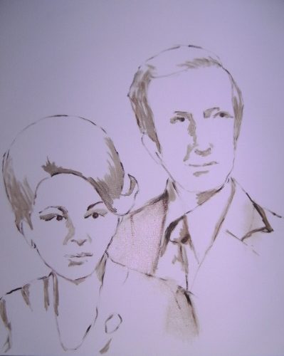
Things started well.  I began by painting the darker areas using Sepia and Chrome Green to give some variation and depth, suggesting  shadows where one figure overlapped the other as well as the facial ones already indicated.  A few marks represented folds in clothing, etc.  By working over the whole painting in this way, I am able to maintain the integrity of a joint portrait.  I was enjoying the process and happy with the result.

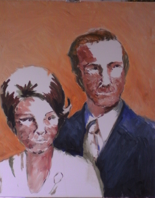
The next visit was a mistake – hurried and thoughtless, more interested in moving the painting on than in doing so successfully! and this is the result.  I could have wept.  
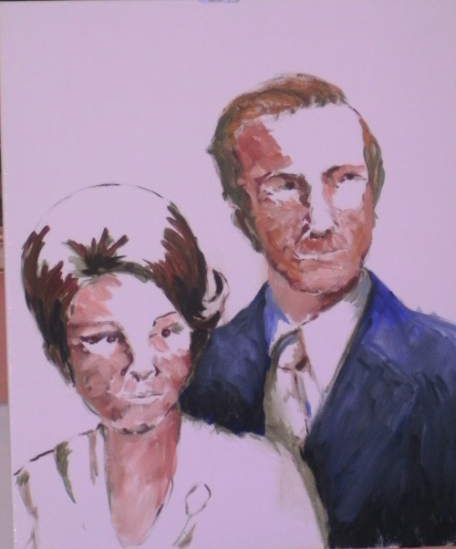
They look as if they have a serious skin complaint!  On the up side, his jacket looks the right colour, and I haven’t obliterated all the careful drawing, but that was a definite lesson in not trying to hurry because there is only a short time available at this moment. Better to leave it and tackle it when things are more serene.  So that is what I did – and was rewarded by an altogether kinder painting.

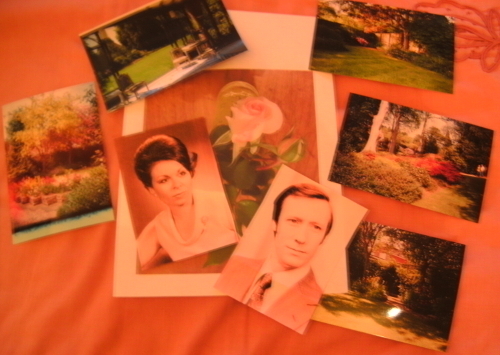
I started by painting the background, partly to paint myself in and partly to reduce the amount of white canvas glaring at me.  I may have used too bright a colour, but I can adjust that in time, and it does the job right now.  The painting looks better even without working on the faces, so it has encouraged me to continue.  Indeed, I rarely bin anything until it’s finished – sometimes you can surprise yourself!

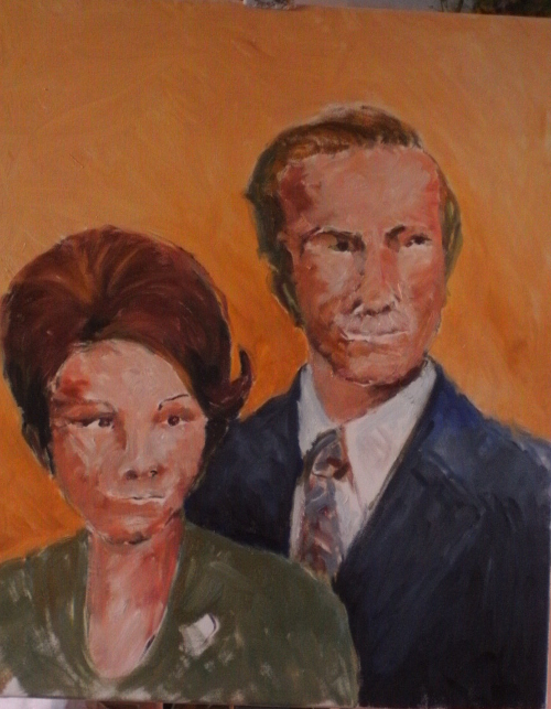
Then I tried again on the faces and hair.  I feel much happier now.  They are still a bit spotty but altogether warmer, more friendly.  The shading is better balanced and the eyes of both  are good for this stage.  Her nose is twisted! and both mouths sulky, so more work there.  Her muted green dress fits the colour scheme, his shirt less inclined to dominate the picture.  Progress.


The New Year work begins – Two portraits

You may remember these two photos in my New Year post.  They are of my friends when young!  At the time, they didn’t know each other and even if they had, I don’t think they would have thought of a painted portrait.   However shortly after, they met and married, and are still joyfully and happily married.

So my idea was to paint a joint portrait to celebrate that splendid day (and all the intervening years) by putting the two together.  There are some concerns – the photos are not the same scale, and I needed to find a way of stitching the two photos together.  I have chosen a conventional pose.  As they are both facing the same way it seemed the best answer, and he really is taller than her even allowing for the bouffant hairdo!

I then marked a vertical line for the centre of each face about 10 inches long and drew the outline of the head and shoulders, so as to equalise the scale, in using sepia paint and a small thin brush.  A quick scrub of dilute paint marked in the main shadows – I’m using the lighting on her photo as his is pretty washed out – and I think I have made a good start .

Double portrait
Double portrait

Pastel Portrait – Maria

Maria
Maria

It was this cheerful Lady who made me want to try portrait painting again.  She has such a wonderful smile.  Her neck scarf is light and diaphanous, her head scarf is brightly coloured and patterned and the light on her face so attractive that she cried out for me to make the attempt.

I use pastels for portraits quite often.  It’s something to do with the immediacy of pastel painting, no brush, no water, no oil, between you and the tone in your hand and on the paper.  With that immediacy comes an intimacy between  you and your subject unbroken by the need mix colour.  If, as I do, you collect the pastels you use on a separate tray, then your tonal range is to hand.  It makes life so much easier!

I began by lightly drawing the layout with a pastel pencil so that I knew I had the proportions correctly placed, then drifted in the darks.  Her eyes are quite deep-set, as are the smile lines round her mouth.  The shadow under her chin, the result of top lighting, defined the face beautifully.  A quick splash of colour on the scarves set the colour balance.  Even that much painting brought her face alive – to the extent that I was reluctant to proceed.

Fortunately, when I looked at her the next day,  she drew me in, so I worked on the midtones of her face, softening the contours, trying to tease out the smile.  The eyes have it, though, for if they don’t smile, no amount of “grin” will help.  I have a tendency  to overwork eyes in a concentrated effort to get them “right” so I made a conscious decision to do as little as necessary and am happy with the result.  A mouth  with teeth is another trap for the unwary, but this isn’t the first grin I have painted.  The trick is to paint it in patches of colour and tone so that it appears, rather than drawing “a mouth” and “teeth” as if they were separate from the rest of the face.

The highlights on her cheeks, chin and brow were quickly completed.  Then there was only the finishing off to do, the light on her bottom lip,  the tip of her nose, and the bag strap, stronger colouring on the neck scarf, and patterning on the headscarf.

I hope Maria would show the same happy smile if she saw her portrait.


The New Year – new plans to lift the heart.

I gave up New Year Resolutions years ago, but I am making a new one this year.  I am going to get to grips with my poor drawing skills by doing at least one short drawing every day without using a rubber.  I’ve failed already because I didn’t do one on January 1st, but I am going to keep trying! However, I do have other plans and these photos represent my ambitions.

New Year plansThe rose in the centre will make a beautiful watercolour and will help me overcome my inhibitions about painting flowers;  I achieved my second acceptable effort in June last year which you can see in my second blog post, so this isn’t something I am hurrying!    The garden photos are also destined to be watercolour – it’s good to think of Summer in January here in the UK.  Two portraits – actually they will make one painting as they a photos of my friends when young, before they met and married, so this is something of a nostalgic enterprise.

Collage, Colour & Texture

Then there are other directions I wish to explore.  I ventured into mixed media last year, not very far in, but enough to see that its not a doubtful means of attaining a result, but a means of expression in its own right.  One of my students has produced beautiful pictures following the guidance of this book, so much so that I have bought my own copy to study before attempting something of my own.  I like the way the image appears as if rising from the paper itself, a bit like sculptures are said to the in the stone waiting to be freed.


De Leivin
De Leivin

This painting has been on our walls for years – the photo doesn’t do it justice at all.  I spend many passing moments wondering how the artist used his paint to such silky effect.  The surface is very smooth, the details are precise, the control is awe-inspiring.  Finally, I have one or two ideas, and am looking forward to creating my own silky paintings.

I must not forget my Meander book which is needing seven small masterpieces for its tiny pockets.  Painting small is another of my bugbears.  Happy 2017!

PS  Just received my “Paint” magazine from SAA – and they are running a drawing Challenge this year.  how Serendipitous is that!