Belem Cathedral

This is a rather hilarious attempt at the Cathedral.  There is no way that a person with my lack of patience with fiddly detail is going to do justice to this building.   You will remember when I was discussing the Belem Tower window  that I was wrestling with the “decoration on decoration” that is the norm for this period of Portuguese  history.  The Cathedral takes this style into overdrive.  But I liked the monochrome simplicity of the colour enough to give it a go.

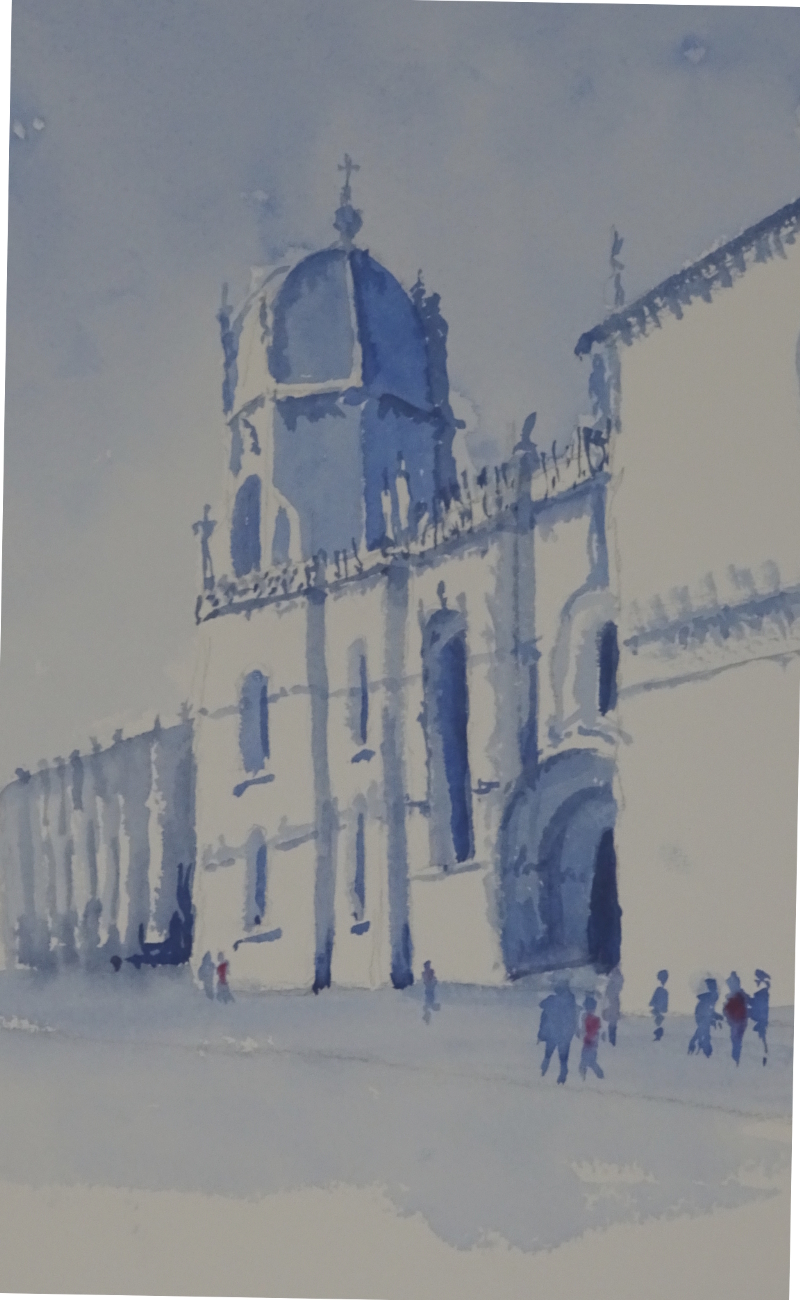
I used Ultramarine Blue for the sky, the added Indigo to the mix to tone it down a bit.  Bearing in mind Hazel’s dictum ” shape first, detail later”,  I gave form to the dome, windows and door, and the returns in the wall.  I had fun trying to leave out the white flying buttresses in front of the dome and the attached ones on the distant building; and there were the decorative spikes on top of the walls.    Then it was a case of entering as much detail as I could before my patience ran out!

The few people give scale to the building.  I gave one or two of them red coats to spice up the blue.

A copper pot

This pot is in Lisbon near the river at Belem – you may remember the window of the tower at Belem I painted a short time ago.  There is a restaurant which claims that its Pastel da Nata with a special Belem twist is superior to all others.  As we were addicted to these pastries – and that doesn’t begin to describe their deliciousness – we had to try them.  To be honest, we’d have tried them anyway.  As expected,  since you can’t improve on the best, we couldn’t tell the difference.    But in this restaurant was this pot.

Isn’t it a cracker!  My frequent response to “where shall I begin?” is “with the bit you like best” so I started with the pot which, I am delighted to say, fell off the brush.  Fortuitously, the restaurant furniture was a lovely blue, just what the orangey copper tones loved.  Floor and plinth were a cool white and the light dancing on the greenery (which liked the copper, too) completed the picture.

A pot of flowers – completed

The first task was to complete the flowers. I used the same colours and technique as before.   It truly was a mass of exuberant colour so I didn’t try to differentiate the individual flowers too much, relying of light and shade to give vitality.

The pillar now looked too mauve in comparison to the pot and its stand, but that was soon corrected by a light wash of the Ultramarine Violet and Yellow Ochre mix and the introduction of that mix in a deeper tone in the darkest of the shadows.

I thought about making more of the setting, but decided against it.  It was sufficiently indicated to provide a backcloth to the main actors.

I’m reasonably pleased with this – flowers were never my favourite thing, and this is a more coherent attempt than the first one I showed you.

A pot of flowers again

So I tried again.  This time I gave myself a rough outline of pot, flowers and pillar, then ghosted in a wash of yellow ochre with Ultramarine in the shadows. This has defined my painting for me, and even in these early stages reads well.  I should have indicated the shadowy areas on the flowers, but that has just occurred  to me and this stage is long gone.


Next I tackled the some of flowers.  I remembered a small tube of Cobalt Violet I had bought ages ago, and thought it would be a good colour for them.  It’s an opaque colour but the bright colour opaques provide should work. Using it to create massed shapes of flowers, as well as blobs of paint, I approximated what I saw in the photo over the more sunny side, shadowed flowers as thicker paint.  The green, a mix of Ultramarine Blue and Aureolin gave me the complimentary to make the violet tones sing.  There is the odd splodge of Ruby Red  among the violets.  This is very concentrated work so I gave myself some light relief by turning the the pillar and  pot.

Decision time – how much detail do I put on the pillar?  It’s a creamy limestone, I think, roughly shaped into building blocks, and immensely attractive in its own right.  Side lit, it showed great texture – indeed, it was this that had first attracted me.  I re-wetted the pillar and cautiously suggested the various lumps and bumps in a mix of Ultramarine Violet and Yellow Ochre, emphasising the deeper shadows as the paint dried.  Shadows cast by pillar and pot were darked too.  This passage of painting didn’t seem to overwhelm the flowers so I supported them using the same mix (no blue!) to create the more formal shapes on the pillar and bowl.