Art of a different kind

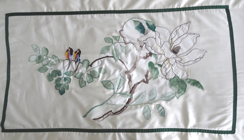
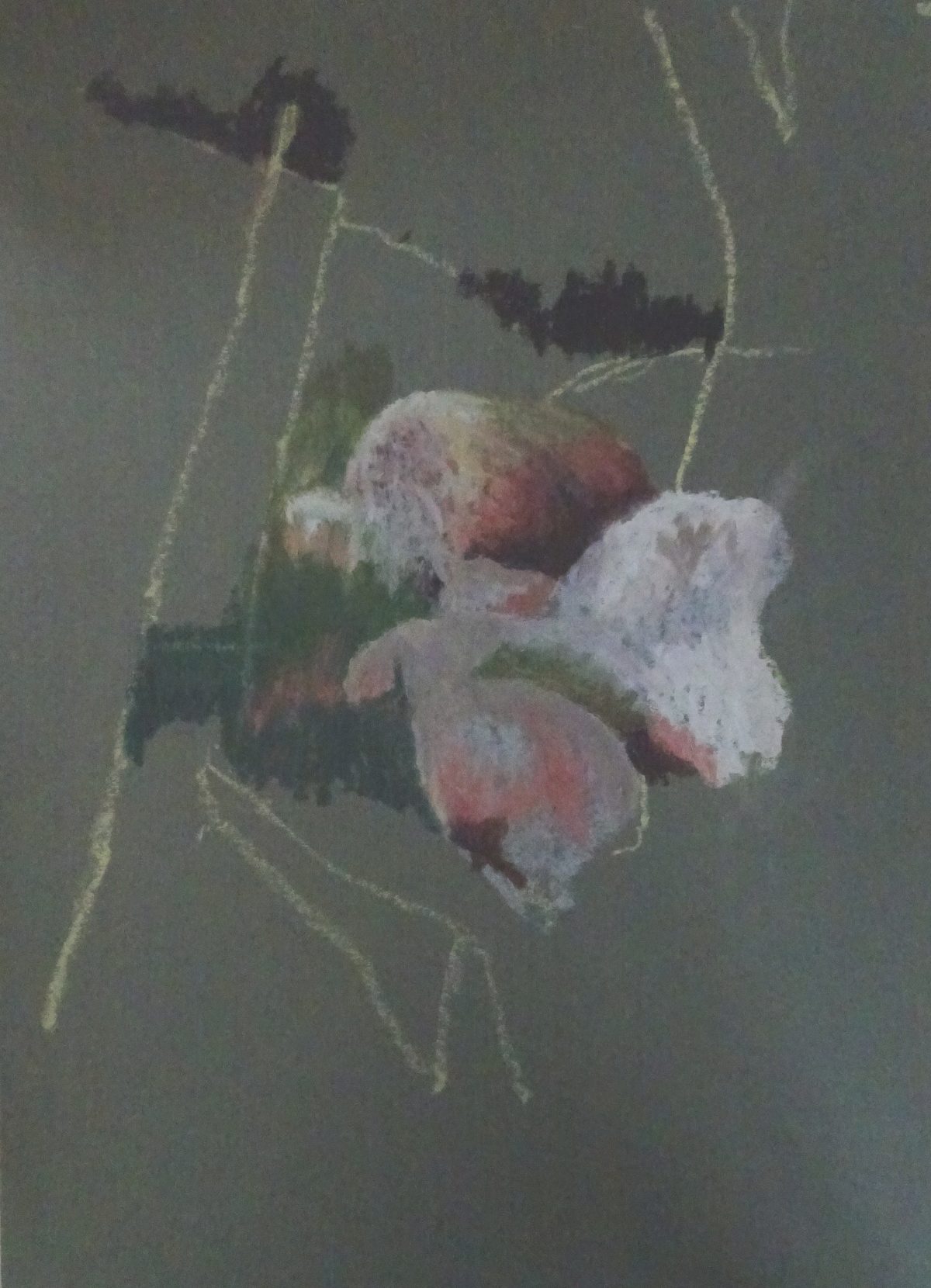
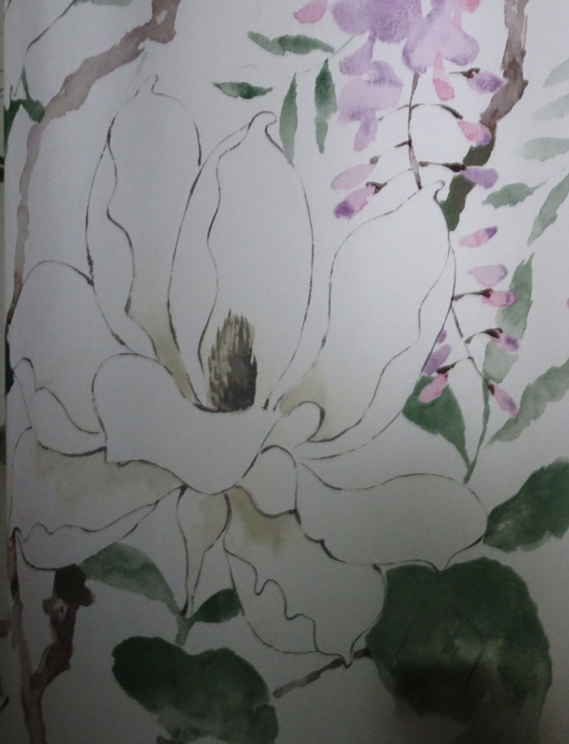
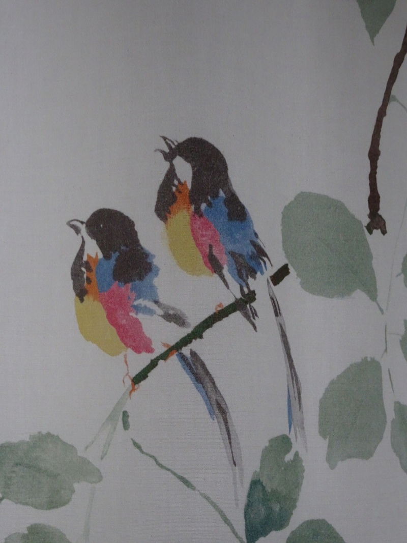
My big lockdown project wasn’t a painting, or even a group of paintings.  As part of redecorating my bedroom, I have installed new curtains and I wanted a bedspread which agreed with them but wasn’t wholly of the same cloth.  You can have too much of a good thing!  From surplus cloth I cut a motif of a flower and two birds.  These were not twitchy little things – one repeat of the pattern,  i.e., a branch of magnolia with only three flowers on it – practically went from floor to ceiling.

This motif I attached to the plain fabric of the aforesaid bedspread.  The original idea of using the zigzag stitch on my sewing machine, not surprisingly,  didn’t work, as there was far too much cloth to wrestle with.  It would have to be attached by hand.

Now, I loath plain hand stitching but occasionally enjoy embroidery, so opted for embellishment.  The fabric frayed prodigiously so there was going to be lots of buttonhole stitch.  I also wanted to see which other stitches would inhibit fraying. As you can see the original design is a watercolour writ large.  Each bird is a handspan in height.  Embroidery would change that.  Certainly, I didn’t want to paint with a needle, using long and short stitch to reproduce the design.

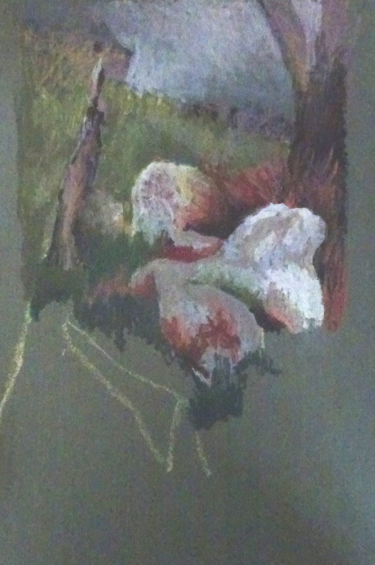
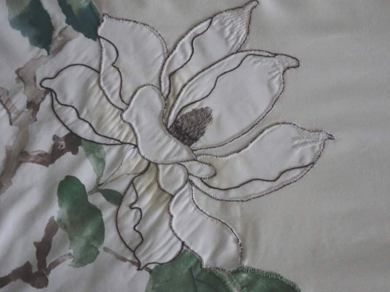
Here is what I managed.  The edge of the petals was buttonholed, but I did that in white and whipped the top of the stitch in a dark brown.  The centre of the flower is made of detached chain stitch, French knots and straight stitch, a not very close approximation of the real thing.


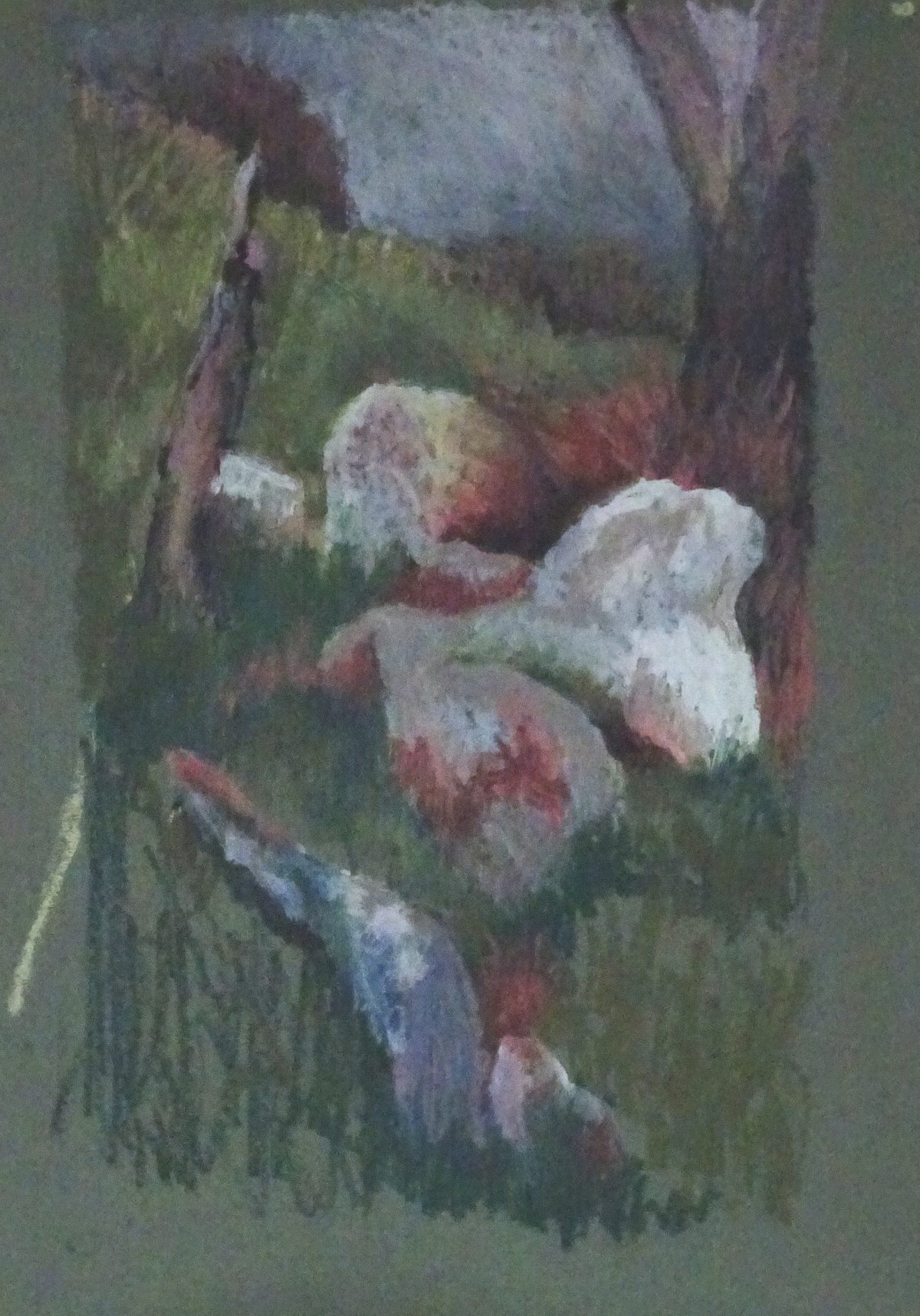
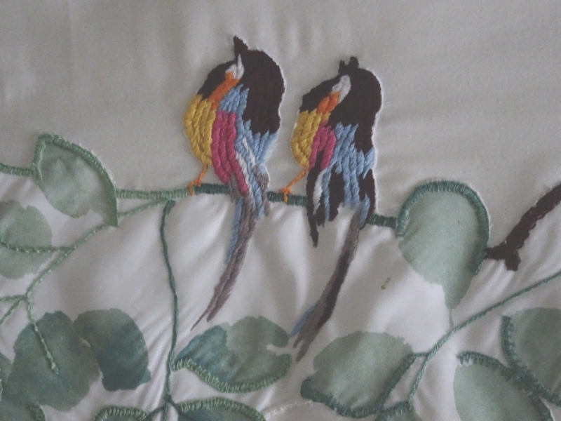
And here are the birds.  I don’t know what you would call this stitch but I discovered it on one of my Mam’s tray cloths.  They are altogether more substantial than their cousins on the curtains.


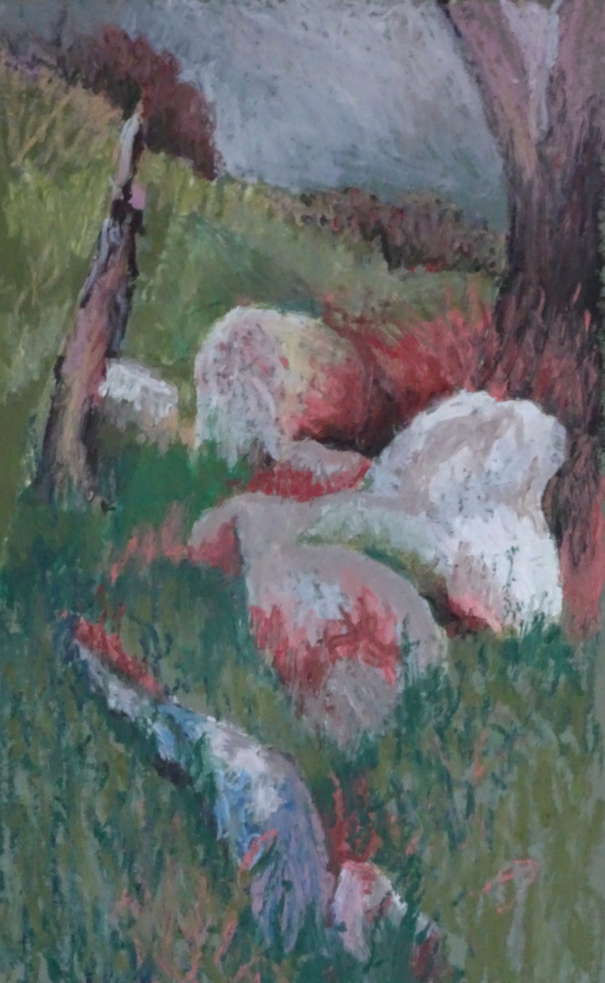
The finished piece looks like this .

A portrait of Higgy

Rob Wareing’s book on portrait painting has arrived from SAA,  and it’s going to be useful.  it is a “How t0” book but discusses much more  about portraits than just paint on canvas – pose, lighting, using photographs or not, brush strokes, preliminary sketches, layout, paint selection, and, crucially,  aims and intentions of both sitter and artist.  In my innocence, I had assumed that the sitter wanted a likeness that showed them in a kindly light, and the artist wanted to paint a recognisable  human being!  The book needs careful study, but this fool wants to rush in!  When will I ever learn???

In this painting there is no dilemma as I’m working from an old and not very good snapshot. But Higgy of blessed memory had an interesting face and a plethora of expressions.  Needless to say I dived in without any sketching or close examination of the snap.  I did use charcoal, as suggested by Rob Wareing, to lay out the drawing on the toned canvas, and liked the ease of correction, then blocked in the main tonal areas.


I stood well back to introduce more detail, trying not to blend too much, to have the courage to paint the light in stronger tones than the photo which was very lacklustre.  The warmer tones are helping too.


Well, it’s vigorous and sketchy.  The clothes are good!  The mouth is not too bad, but the heavy expression in not Higgy, a big generous man with an impish sense of humour.  His eyes have climbed up his face as I worked on them, and, I now realise that both eyes and nose are too far to the left.  There is no room for the side of his head.  The thing about oil paint is that you can scrape it down and start again.  Out came his eyes and nose!

and I tried again.  This is better.  There is even amusement in his expression – how did I achieve that!?  There is a mountain to conquer here but I am enjoying the foot hills.

Oil Pastel Portraits

Since I had bought a portrait set of oil pastels, I thought I’d better try one (or two).  This is the second attempt to paint these two from two photos of them in their twenties before they even met.  The lighting on each was different, so some creative shading was required.  Having looked at both paintings, I’m sure this one is an improvement.  The overall colouring of the picture is more subtle, and the contouring of the faces is better.  He looks distinctly more human  – his head is such a weird shape in the oil painting.  I’ll show it here for comparison’s sake.

Putting him on the left has made for a better balance, and  the green background is less strident.  My observation of a face  shows improvement.   Both pictures were painted over several sessions.  I had a real problem with the need to remix tones in oil painting when returning to the canvas after a week, while the oil pastels didn’t change, but were waiting patiently for me when time allowed.  Incidently, the oil canvas now looks like this!

So, an improvement, but room of plenty more.  Even in the improved painting, the people are not vital, not alive.  More study required. But Hazel Soan is writing a book about portrait painting, and I have ordered Rob Wareing’s new book from saa!

More Oil pastels

Oil pastel and people seem to work well, but how about landscape? This painting is based on some rocks and a battered fence post in the wilds of Wales.

 Again, I worked on green mount board and lightly drew the outline of the lay of the land. These rocks are more rounded shapes, giving me something new to work on. I soon regretted using the lemon yellow pastel for drawing – it persisted in showing itself long after I needed it. The rocks are the focus so I began with them. I had more pastels to chose from this time as I had invested in the Sennelier Portrait Set, not because I was thinking of doing portraits but because there was very little overlap between the two sets, and the new colours gave added subtlety to the range.

 So I had a variety of grey blues, and an extra much needed white to describe the boulders, introducing purples and russets where needed. I kept the pastel strokes as far as I was able, but the pastel melts a little in a warm hand so some blending is inevitable. I included the grassy area between them so that the painting would grow from the starting place. It’s so easy to think, “I have the right colour for lots of areas in my painting so I’ll do them first” but the result is dispiriting as one’s efforts are like currants in a bun. Instead, I keep the pastels I’m using in a box lid, looking there first and only introducing a new pastel where no other will do.

The grass led to the stake, a very battered one, using a variety of browns, greys, blues and black to show weathering. The grasses lighten as we get higher in the painting. Again I put the greens and lemon over each other, allowing the brighter tones to predominate near the sky line. There are no strong shadows so the grey blue sky fits nicely with scene. The tree trunk on the right balances to post and echoes its colouring.

Moving to the foreground, we see a large blueish rock half hidden by the grass. Using the deeper blues here connects rock and sky, useful compositionally while the darker tones in the grasses anchor the rocks in the landscape. It was when I reached this point that I became aware of how clumsy the grass strokes were, and found by scribbling into them with my trusty old store card, I could influence their size and direction! I had found early on that mistakes could be scrapped out by the sharp edge of the plastic, but this was creative! Look at the grasses near the tree trunk, for instance.

There were just the nearer grasses to finish, and the skyline to vary then the painting was finished. This is a good way to take oil paints outside, or on holiday, provided it’s not too hot, without all the extra equipment that would involve. I’ve enjoyed exploring this medium which is new to me and am sure there are more surprises for me as I use it more.