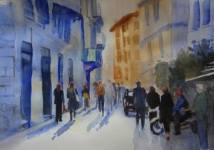
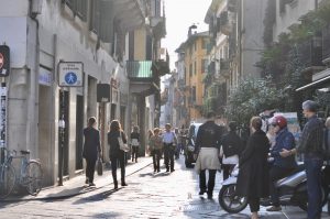
 Hazel Soan’s workshop last Saturday took this photo as the source of her painting. As you can see, it’s a busy street in Verona, lots of people, lots of architecture, lots of back lighting!
The size of her painting was about 11 x 17 inches, probably necessary for a meaningful demonstration of technique. The format of the course was the standard one – a period of demonstration, during which Hazel painted, explained what she was doing, and more important, why, followed by a short question time; this alternating pattern was repeated over the three hour session. The option for the students was either to paint along with Hazel, or to try to catch up during the question time. Neither are entirely successful. If you paint along you miss half the instruction, and the question sessions were not long enough to catch up! I don’t know the answer to this one.
First the drawing. Hazel found the centre of her (rough watercolour) paper and the centre of her image. Starting from there, she expanded her drawing, only putting those lines necessary to guide the brush. The figures were placed but not fully drawn. As Hazel said, if you were doing this outside, the people wouldn’t wait for you! It would be different people by the time you got to paint!
After masking out the high lights on head and shoulders, Hazel wet the area of the buildings and floated in their basic colourings, dropping in the darker windows, eaves, balconies etc while the paint was wet so that the edges blurred slightly. If an area dried out too much to allow this to happen, she left it to dry completely, then re-wet it to finish the job. These passages took about a hour.
Next she tackled the people, either singly if alone, or as a group, persons and cast shadows together. All are back lit, so each silhouette was created in mid-tone ultramarine then “dressed”. Aim at approximation and don’t fiddle!
A final passage over the street surface and the addition of any final details that the PAINTING told you were useful completed the workshop.
It was very instructive to work with Hazel on a large painting in real time, something DVDs can’t do, the rhythm of thought and execution so affirming, so encouraging, so positive.
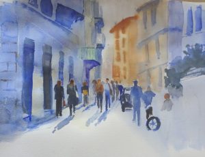
Here is my (unfinished) painting.

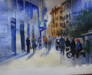 I think this is as far as I go to rescue this painting!
