Back to oil painting

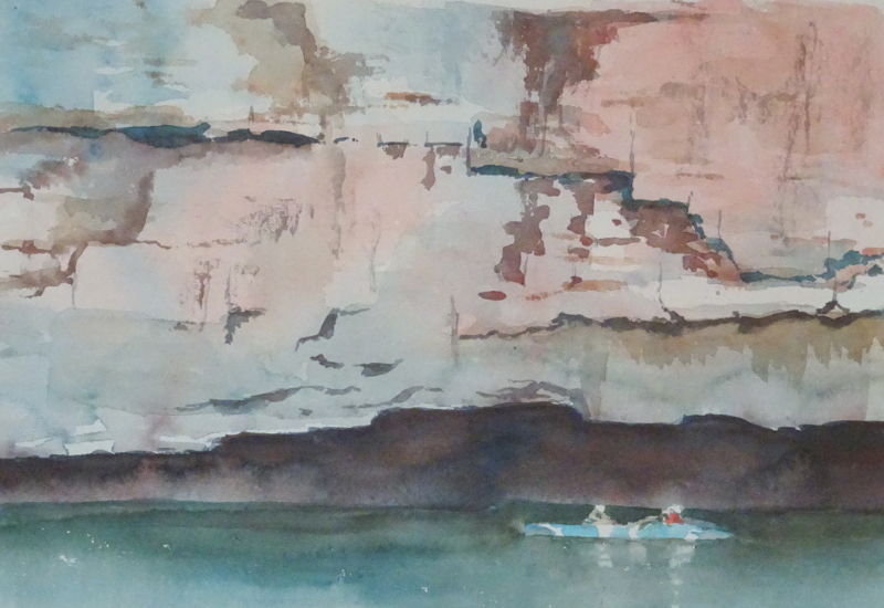
I’ve returned to oils for this painting.  It’s a view of the Yarra upstream of Melbourne and is the type of scene I enjoy painting in oils.

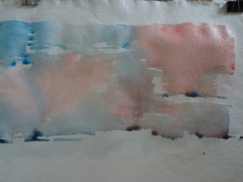
It never ceases to amaze me how much you can say with a  mishmash of colours and tones and stroke directions.  I do like to get the picture on the canvas as  soon as possible for after that,  you are only pulling out detail and refining strokes.  This took all of 15 minutes.    It is ” hold your breath and concentrate hard” sort of stuff.

The trees and bushes are laid in with scribbles of paint matching the tones in my source without worrying about what they represent, aiming for as much variation in colour as I can find, dark over light and vice versa.  When I arrived at the water line, brush strokes became strictly vertical, echoing the colours and tones above without being too pedantic about it.  Then the bright reeds and a couple of tree trunks were sketched in with a turpsy rag.  Reflections of the sky do strike across the water but that’s for a later date.

The secret is to be as loosely accurate (!) as you can with your tones.  You don’t have to be precise about the shapes of the tones, but they should be, broadly speaking, in the right place!

Canoeing – Katherine Gorge 2

The water makes such a difference, providing both context and contrast.

You can see the depth of the overhang and the scale of the cliff in comparison to the canoeists.  The overhang casts a very strong shadow, the counterchange with the cliff making it appear even stronger.  The water is in shadow too, the only relief there being the canoe itself.

The palette is very restricted, only Prussian Blue and Cadmium Red, their pale presence visible in the cliff face.  These two, mixed richly together give a vibrant black.  Dilute the mix and you get varying greys and browns.   The river was created by wetting the area, avoiding the canoe and people, then adding a strong Prussian Blue stroke where it meets the cliff.  The Prussian Blue bled into the watery glaze, lightening as it went.  Just before it dried, I ran strong Cadmium Red into the Strong Prussian Blue, that bled just enough to blacken the area under the cliff, but not advance into the lighter water.

Canoeing – Katherine Gorge

I’m back in Australia, where I was a year ago today, though this scene is from later in the holiday.

Part of the holiday was a train ride on The Ghan – my bucket list isn’t very big, but this trip was definitely on it.  We started in Alice Springs (see “the Red Desert” from January of this year) and The Ghan took us North, eventually  to Darwin.  On the way, we spent half a day gliding down Katherine Gorge, cool on the water.  Lots of Geology! and here is some of it.

I love the colours in the rock, this sheer cliff face faceted and patterned, crying out for watercolour.  I had an idea that the myriad undercuts would work well using the deeper colour which gathers at the base of a stroke as the defining technique.

As you can see, the idea had merit, but … there is always a but! I left the piece to dry unattended, the paper cockled, and my beautiful undercuts cauliflowered, every one.  “I think I’d better think this out again.”  The answer seemed to be to put in the deep undercuts by hand and run a wet brush underneath them when they were damp but not watery.  I hope that description makes sense.  It  probably will when you see the next photo.  Then I used dry brush to indicate the lesser variations .

If you look just above my painting you will see the photo I’m working from.  At the bottom of the painting you can just see the shape of the two canoeists passing a very deep overhang, and the water itself is still to come.

Sunset, Lisbon

The pergola does not dominate as I had feared it might.  Many things have contributed to this – the lamp , the wisteria, the clouds rising up from the sunset, and the faded central section, the strong tones of the figures.   There is a friendly atmosphere, the phone cameras make it very contemporary while the pergola and ornamental lamp offer an anchor in the past.

I’m not sure this is finished – a few more tweeks, perhaps, but nothing that materially alters the painting. Photographs can help one to see indiscretions that are missed in a bigger picture.   There is another option, of course, which would be to really go for the detail.  The wall tiles are beautiful, as is the characteristic paving of small stones.  Maybe pastel is not a good medium to use that way.

His friends

As you can see, his friends busy photographing him with their phones, have arrived.  If you look closely, you can see another person just beyond the group also busy with a phone.

First, I estimated how far the second pillar was from the first and drew a light line.  The top and bottom of the wall can also be indicated.  Then I wiped a line in the pastel with my finger to suggest where the spars of the pergola were.    That sited the group with the first girl half hidden by the pillar and the others in advance of her.    These figures have been sketched in and the walls extended.  There is a lovely curling wisteria to put in, climbing the  new pillar from this side of the nearer wall .  It has a lot more greenery on it, while beyond the far wall and to the right of the new pillar you will see the tops of bushes.  All these thing break up the very definite lines of the structure.