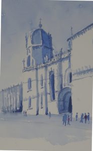
This is a rather hilarious attempt at the Cathedral. There is no way that a person with my lack of patience with fiddly detail is going to do justice to this building. You will remember when I was discussing the Belem Tower window that I was wrestling with the “decoration on decoration” that is the norm for this period of Portuguese history. The Cathedral takes this style into overdrive. But I liked the monochrome simplicity of the colour enough to give it a go.
 I used Ultramarine Blue for the sky, the added Indigo to the mix to tone it down a bit. Bearing in mind Hazel’s dictum ” shape first, detail later”, I gave form to the dome, windows and door, and the returns in the wall. I had fun trying to leave out the white flying buttresses in front of the dome and the attached ones on the distant building; and there were the decorative spikes on top of the walls. Then it was a case of entering as much detail as I could before my patience ran out!
The few people give scale to the building. I gave one or two of them red coats to spice up the blue.

It certainly suggests the detail, even if it isn’t shown in detail. And it’s astonishing how the warmth and the sunlight are revealed in the shadows and highlights.