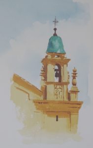
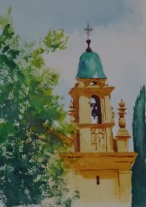
Just one of those moments when you see something paintable – and you have your camera with you. Everything was just right, the colouring, the shapes, the sunlight.
 Since the dome is strikingly bluey-green (I used Viridian neat with Ultramarine Violet for the darker places) it seemed sensible to use dilute Prussian Blue for the sky, laid in on previously dampened paper. Then I HAD to do the dome, such an exciting colour, such a neat shape. The building was painted warm golden yellow, so Raw Sienna was called into play, and the bright sun gave me crisp, fairly simple decorative details, (certainly more simple than the extravagances of Belem Cathedral). More intense mixture of Raw Sienna defined the shadows in this bright sunny painting, with the addition of Ultramarine Violet for the really dark places.
At this stage, I took a photo – in case I ruined the whole painting by inserting the trees. It works fine as it is but element of surprise, of just a glimpse of colour, adds to the story.  In the event, I think the trees are indeed an interesting addition providing context and colour balance. All the colours are in the yellow/blue sector of the colour wheel. You don’t have to have opposites to make a good painting. The darker tree is Viridian with the addition of Ultramarine Violet, while the lighter, in both colour and texture is Viridian this time with Aureolin.

This is gorgeous, and for me, very evocative. I much prefer it to the architecture of the Belem tower which although magnificent is rather soulless. This has warmth and reminds you of the south of France. The trees have a very positive and framing effect giving you the feeling that you have glimpsed something perfect.
Yes, with the trees around it, this beautifully captures that sense of delighted surprise that made it so paintable.