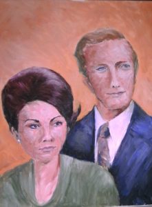
Well, here it is. I am almost sure I have finished. I will put it up in the studio for a week or two before I sign it in case something jumps out at me. I have to say his eyes look very strange in the photo, but not in the painting itself. A critique from a friend would be useful!
However – there is always an however – I am dissatisfied that I couldn’t make more of it. It’s OK as far as it goes, not without input from me, especially in the colour sense, but I would like to try again and make it less representational. I think I will try mixed media, using “Collage, Colour and Texture in Painting” by Mike Bernard and Robin Capon, mentioned in my New Year post, as my guide. I am hoping to make something with more atmosphere, more mystery, something less obvious. This will not be a quick exercise as I will be well into personally uncharted territory. Wish me luck!


I will certainly wish you luck! I think it looks better in real life than in the photo, but I’m really very intrigued by your plans for a mixed media version!
Hi Stevie… it’s difficult to comment just by looking at the screen and it’s really hard to paint a portrait from just photographs. You have done all the working out with this version to get a good likeness and to achieve all the correct proportions, now you can use all that information and allow yourself to be more playful.