Line and Wash 2

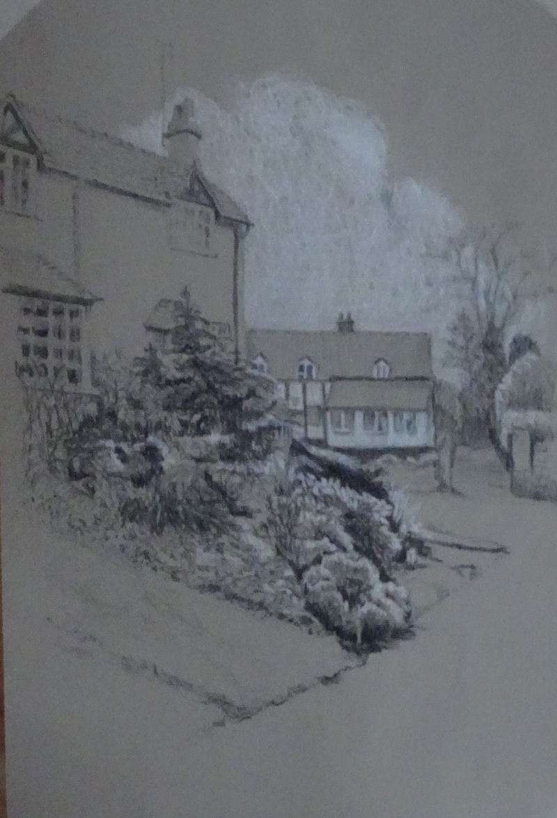
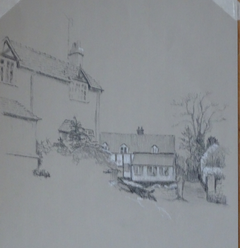
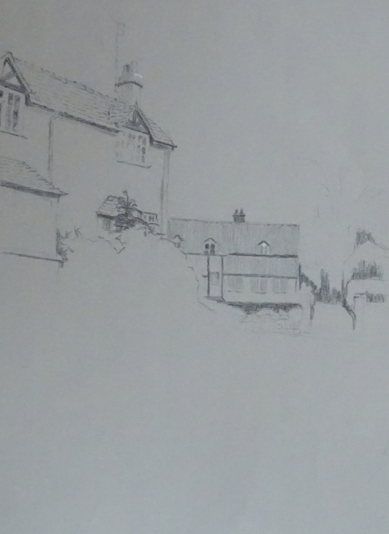
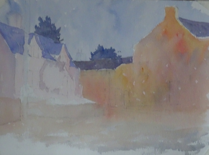
I found this quite difficult to do as I felt a need to respect the lines.  It was quite inhibiting.  So there are areas where I should have taken more care and didn’t because I was fighting to paint loosely.  Conversely, there are areas where I could have taken more liberties and didn’t because I was constrained by the lines.  Sigh.

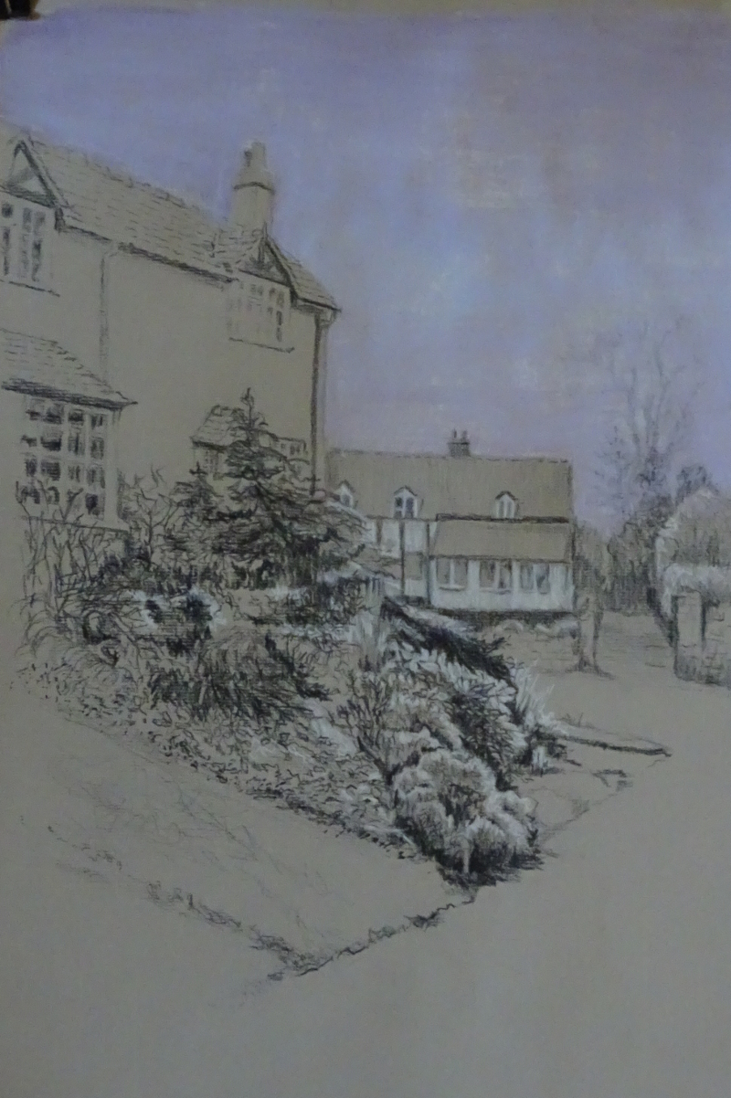
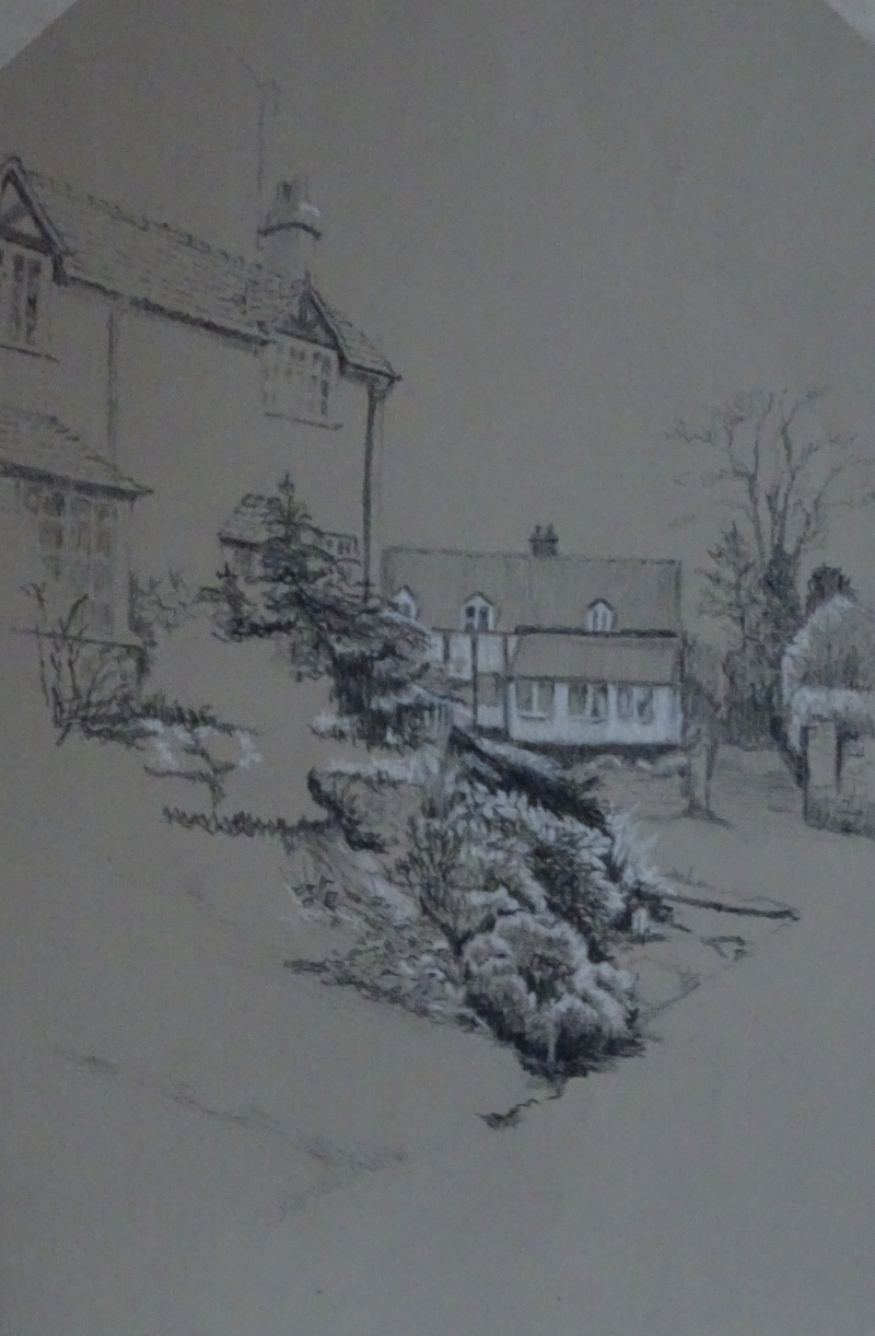
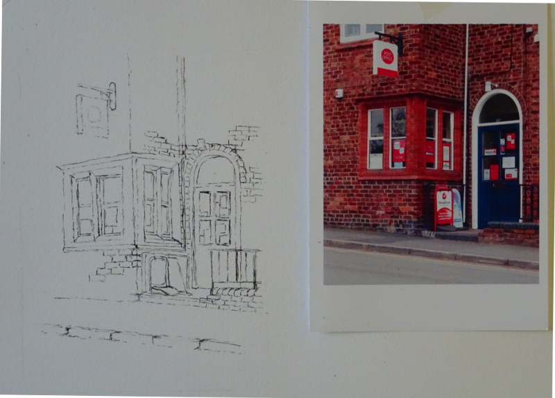
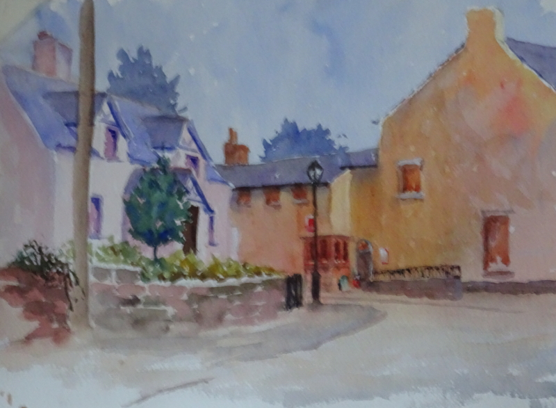
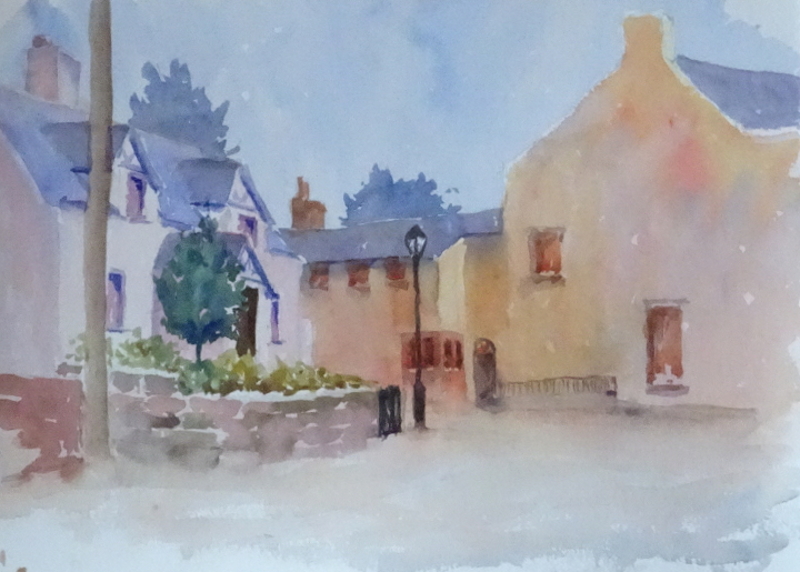
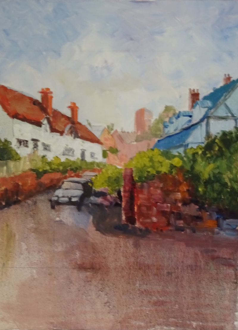
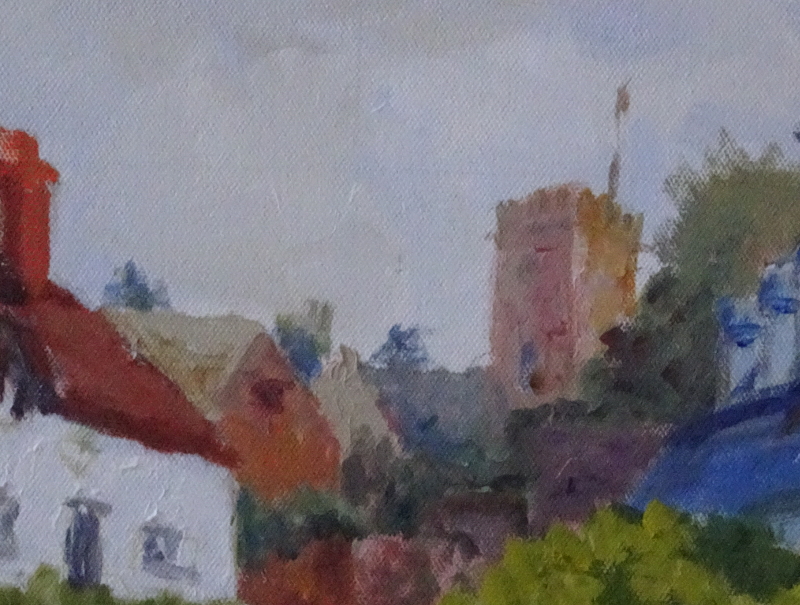
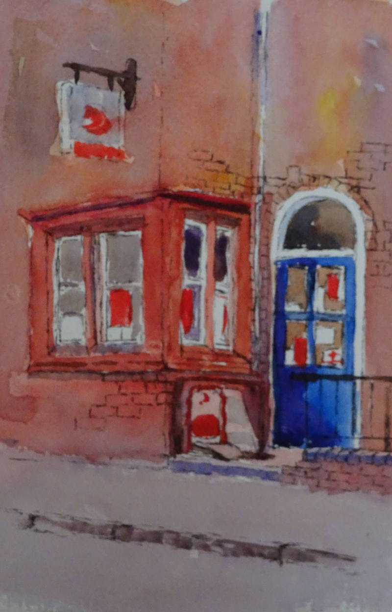
When I remembered how to paint, the picture came alive – the door for instance.  What I was doing including the narrow white pipe at the corner near the door, I don’t know, while the wall to the left of it should be a bit darker to mark the return.  I like the brickwork , just enough to show that the wall is brick built but not too much so as to overwhelm with detail.  The Ruabon bricks and mouldings are a good colour, too.

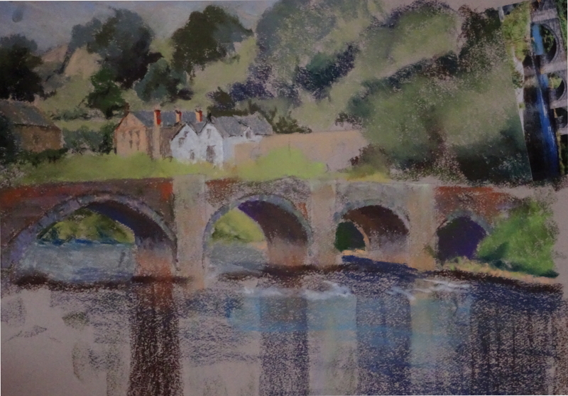
Somehow, the painting doesn’t yet say why I wanted to paint it – more work this week.  But seeing a photo of it has given me clues on what needs correction.

Line and Wash 1

This is where a new found interest in drawing gets you!  I have done line and wash before – in fact there is one in my book “Bridges of Dee” – but such paintings have always been more wash than line as I had no confidence in my line.  There are lots of ways of using this method – I have opted for doing all the line in ink before adding the wash, diving in the deep end, so to speak.

You may remember my recent watercolour of Farndon in which this window appears.  After all the years of living in the village  (38 years to be precise), I became very interested in the window.  It’s quite an expensive window, Victorian, red Ruabon brick, if I’m not mistaken, and built around a corner.   There are lots of textures and shapes.  I think the detail responds well to line, the moulding around the panes of glass, different sorts of brick and paving, the adverts.  The drawing is not a howling success, but it’s far better than I could have achieve two months ago.  Let’s see what colour does for it.

Black and White again

When I finished the garden, I felt I had to do something to the sky.  The grey sky and the grey house next to it looked unfinished to me, but it’s a large area to fill with pencil.  At least it seemed so to me.  So I tried a cloud.  Well,  that looked pretty awful.  It certainly differentiated the house and sky, but the execution of same cloud is very amateur!  No shading – I didn’t have a reference – and I don’t think clouds do that.

In a bit of a panic – I’ve ruined it! – I tried shading the whole sky in white pencil but a blank white sky was even worse.  I even contemplated running a wet brush over the area in an attempt to unify it but this is pastel paper and it would cockle.

Then I found I could rub out the white pencil to some extent, though not enough to remove it completely.  Something would have to be done.  Pastel paper equals pastels?  And I different medium may mean adding colour.  So I tried a soft graduated mauve.  I’m still in two minds about this.  I think it’s an improvement on the last two efforts but maybe I should have kept to grey and white.

In the throes of recounting these disasters, I have overlooked the finished garden, and I have to say I am pleased with the way that part has gone.  But I am still hovering over changing the sky yet again.

The bridge at Carrog


I was looking through my portfolio, searching for paintings I might want to frame, when I came across this unfinished pastel of Carrog Bridge.  It was begun as a demonstration piece on using pastels, done about the time I was painting all those bridges of the Dee.  This is not the view which made it into the book, but it’s still a good composition.

The tonal blocks were laid in a pleasing (to me!) chunky manner, so that the scene was revealed in its essentials within an hour or so.  There is rich colouring in the stonework of the bridge itself, while the pattern of darks and lights in the trees is lively, invigorating even.  A sweep of a pastel announced the reflections.  With all that in place, I had then started on the details on the houses.  I must suppose that time had run out then, but I think there is a good basis for  further work should time allow.  It will be a new experience to paint a Dee bridge as a stand alone image, and it has  encouraged me to re-visit my photographic archive to see what other treasures I can find.


Black and White progress

I am finding this a very satisfying project despite the lack of colour.  I must admit I am aching to introduce colour but this is a tonal exercise so I’ll stick to black and white.

I have made a bit more of the distant cottage and even more distant trees, so I must concentrate on the garden in the foreground.  It’s very dark in the the photo, but I have invested in a very portable LED light so can see more of the subtle shading.

I have pushed those shades to a more extreme point, since I am not yet able to create them as they are.  However, I think what I have done is reasonably OK.  Choosing when and how to introduce White is exercising my mind somewhat!   And the sky as a great blank – is that all right or will I need to add a cloud?

No decision yet so I continued to eat away at the garden to see what happened.  This is very uncharted territory for me.  I may have overdone the white, so I’ll use it a bit more sparingly now.  The bit that’s left is more shadowed anyway.


Farndon in watercolour 3

I hope this new-found confidence stays.  The painting is complete and still rather watercoloury!   I have done more work on the building at the back of the picture, sorting out the return of the wall and giving it its sandstone plinth.  The ramp is now further forward, which is a good thing as you would have to have been a very skinny person to use it  before.  The sandstone colour has reduced the impact of the railing,too.

The addition of the kerb edges  entertains the foreground  and washes on the pavements and road add weight without fuss.  Then there is just general strengthening and defining to windows, roof line and doors.  I added the advertising displays for a splash of colour.  They make the painting more lived in, less chocolate box.

I am interested in the corner window – it’s worth a painting of its own so I shall use it a the subject of a line and wash.  Aren’t I getting brave with my drawing!

Farndon in Watercolour 2

The buildings in the middle and to the right are where most of the painting was done this time.  I had got the light coming from two different directions last time so I have begun to correct that.  It’s still not right but I didn’t want to mess with it too much at one time.

Then I began to define the windows and the door.  There is a lot of white woodwork here which looks sharp and clean but the atmosphere I was seeking was softer so I’ve indicated shadows and left  low “highlights”, if you see what I mean.  There is a red Ruabon moulded window on the corner of the building by the door which intrigues me.  It’s not a new feature, and it’s an expensive shape with only a pillar at the corner itself.  I’m planning to do that in more detail in another painting.  At the moment, I’ve shown where it is though it doesn’t sit happily yet.

Using a real dark and a small brush, I’ve intensified some points in the left hand building, tiny marks just to increase the contrast in places .  Next week should see it finished.

Two for the price of one!

I’ve been busy this week!  The demonstration watercolour is coming along at my Wednesday class, and I’ve been experimenting with the black and white watercolour pencils.

First the painting – the initial washes were well dry as it was a week since I worked on this painting.  This method of working strings out the painting time, but, adding up the actual time engaged comes to about 2 hours per painting, and that includes watching the paint dry.  It doesn’t extend one’s powers of concentration, though.

The work is mainly on the cottage on the left.  Using a darker tone of the cottage pink (Alizarin) and the browny orange of the other building , I indicated the windows, and introduced an idea of the Cheshire sandstone blocks in the wall at the front.  A bit of “Calligraphy” drew in the eaves, the lamp post and  the door, while the garden was splashed in using Viridian and Burnt Sienna in the tree and Viridian and Aureolin for the planting.  This is turning into a watercolour as opposed to a painting in watercolour!

Now for the black and white drawing.  I am thrilled to inform you that I did this freehand in the black watercolour pencil without any preliminary work in ordinary pencil first.  It’s another view of Farndon (I can see another project coming on!) looking across the little lane which figured in my recent oil.  Early days, of course,  and I don’t know how this paper will be when I introduce water, but I am revelling  in my new found freedom with pencils.  I’ve started to use some white but think that most white will be in the garden.  What about a cloud?  I like the texture on the left hand roof, and am adventuring with the dark tree in the foreground.


Farndon in Watercolour

I’m on Cloud nine!  I have just completed the preliminary drawing for my new, rather complicated, demonstration watercolour – freehand! – and it looks accurate, and the quality of the line delights me.  When I started sketching at least once a week with my students, I never thought that I would achieve this skill level so quickly.   At least, it feels quick.  I think it’s taken eighteen months, but when I remember that most of my life has been weighed down with a fear of drawing, with the conviction that I can’t draw, that is the blink of an eye.  Now to add the paint.

I started with the sky as usual, painting loosely rather than a formal wash, and taking it down over the roofs.  That avoids a sharp edge where the sky meets the roof and seems to add positively to the general atmosphere.   I introduced the pink cottage, created the roof and trees in a darker shade of the sky colour, allowing the roof to bleed into the pink cottage on the shady side.  Then I introduced some of the colours one sees in bricks into the wash of the more distant building.  Individual bricks would be time-consuming, and rather boring, and counter-productive at this distance.  But the varied colours and tones are a delight.  Again, I avoided a hard edge where the building meets the pavement. I’ve painted over the windows which are largely darker than the walls, hoping to lift the paint for the white areas.  It won’t matter if some of the paint remains there (I hope!) as a stark white would be too eye-catching.


Farndon Cottages 2

We are making progress! As you can see,  I have done some work on the white cottages on the left of the picture.  I’m still painting loosely, indicating rather than defining.   Some of the underpainting is showing through particularly near the guttering.  The roofs are tiled rather than slate, so that zing of red balances the warm tones on the wall under the timber framed cottage.  I put in the car – fortuitously it was there when I took my photographs – for I think it gives life and warmth to the painting.  It won’t be quite so “important” when I’ve finished, but, after all,  villages are lived in.  And I found a fence I hadn’t noticed.   All those diagonal lines should lead the eye to the church tower, but maybe the whiteness of the cottages enhanced by the red roofs can win the day.  We’ll see.

Now it was the turn of that tower and the buildings in the background.  It makes a rather charming picture on its own!  I have used a small brush and added dabs of “near miss” colour to trees, houses and the tower, keeping the same tonal value.  This just breaks up the surface so adds interest without drawing huge attention to itself.  Only when someone stays to look more carefully will such detail be noticed, giving secret pleasure.  It’s a sort of reward  for stopping to look at my painting; and it’s reward to me for I take such pleasure myself in painting like this.

There’s lots more to do, about another 4 hours I reckon, so further progress will be slow but satisfying.