Oil pastels again

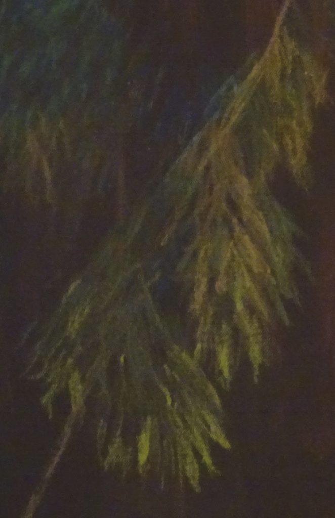
I have changed the surface I work on this week (and next) to a loose canvas sheet stained with acrylic paint.  I decided to use a photo of bamboo I had painted, very successfully (by which I mean that I was thrilled with the result), in soft pastels.   I had painted the leaves in sharp downward stabbing motions so I thought the image might lend itself to oil pastels.

I have to say that this is an improvement on the previous attempt.  Certainly there is better adhesion and the fall of the leaves is engagingly presented.  The image is dark because I chose to tint the canvas in a warm dark brown and much more work needs to be done to create depth and light.  I feel encouraged to continue with this experiment – and it occurs to me that the crosses I used in painting “Shimmering in sunlight” ( page 29 in my book ” The Bridges of Dee” for those of you who have a copy!) would also work well.  Note to self:  find a new image and try it!

Oil Pastel experiments

For the next few weeks, I will be trying out some oil pastels I have been given.   Now I love soft pastels for their immediacy and for the variety of effects I can find.  I’ve seen some engaging paintings done in oil pastel, and wondered if they were a good substitute  for those who cannot tolerate the dust created when using soft pastels, or who don’t like the feel of them.

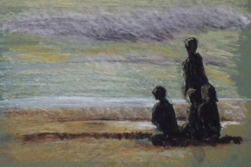
Well, of course, no medium is a substitute for another.  What was I thinking of!  Each has its own strengths and challenges.  At this early stage of exploration, I could find no correlation between the two, apart from the fact that you have the colour in your hand.  I’m using  mid-toned green mount board for my substrate for this first attempt.  Such work as I have seen used a firm coloured surface to work on.  I had been given two sets of oil pastels, and both are rather ancient, but I found an immediate difference in texture between them.

One set, the larger of the two named “Holbein”, were very oily, almost waxy when applied, and the surface was too smooth to accept the pastel evenly.  Also I had to scrub hard to increase the brightness, and ended by pushing off the pastel already applied.  The smaller un-named set were more granulated and adhered to the surface with less effort.  Further work discovered  a wide range of oiliness to granulation within each set depending on the colour.  Clearly there is a lot to learn about the pastels themselves, never mind how to apply them.

You can see the uncertain adherence of the pastel.  This could be because the surface was too smooth (or the pastels were too oily!)  so next week I’ll be using pre-stained canvas to work on.


Watercolour works!

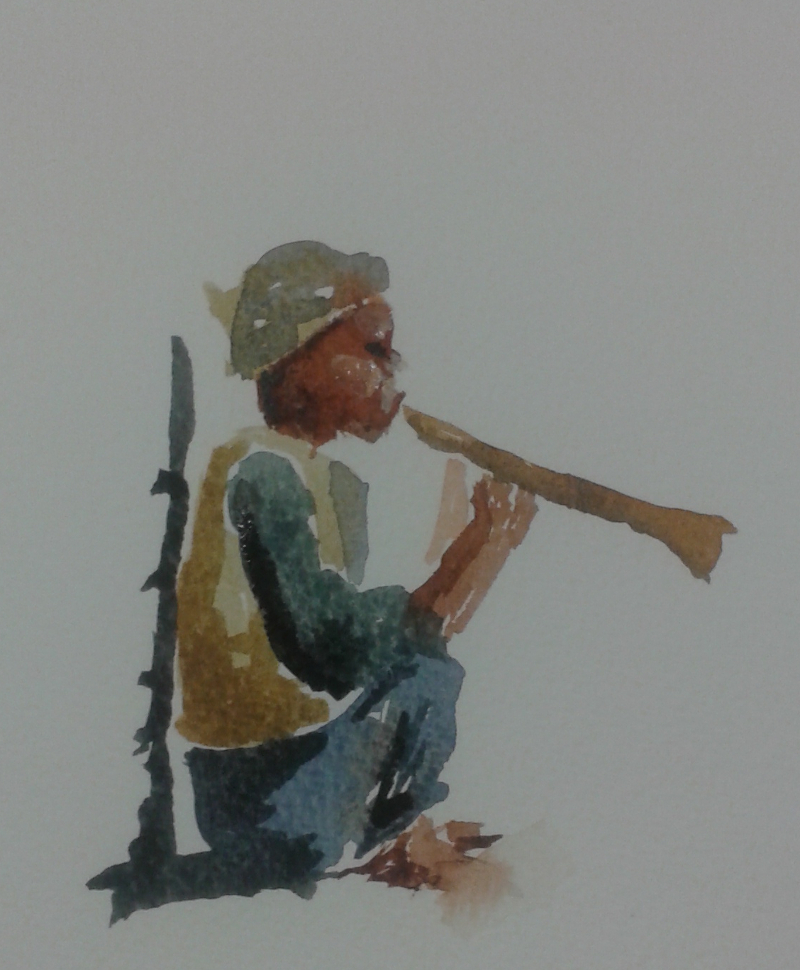
Isn’t he charming!  No, this isn’t one of mine – it was painted by a student in my class this week.  She is working on a project in needlework related to the Amarna dig between the two World Wars – http://www.blog.virtuosewadventures.co.uk/wordpress/ the Dreams of Amarna  –  and finds painting helps to define and refine her images.

As always in painting, it’s not what you paint, but how you paint it that matters.  This was done without preliminary drawing, often the best way to achieve a vital painting. A painter friend of mine once said “You have to hype yourself up to paint in watercolour!”  Certainly it requires total concentration to work without an initial sketch.

The first pass in pale colour established the position and attitude of the figure, using both the tip and the body of the brush to win the shapes.  The brush strokes which followed established the solidity of the figure, shadows revealing the curve of back and buttocks.  Notice how some are wet in wet and some wet on dry.  It is the varied handling of  brush and paint which makes it work so well.  The variety is appealing, suggesting both the relentless sun and the passing of a moment.  Lost and found edges cast their spell and draw you in.

Well done, that girl!

Is this progress?

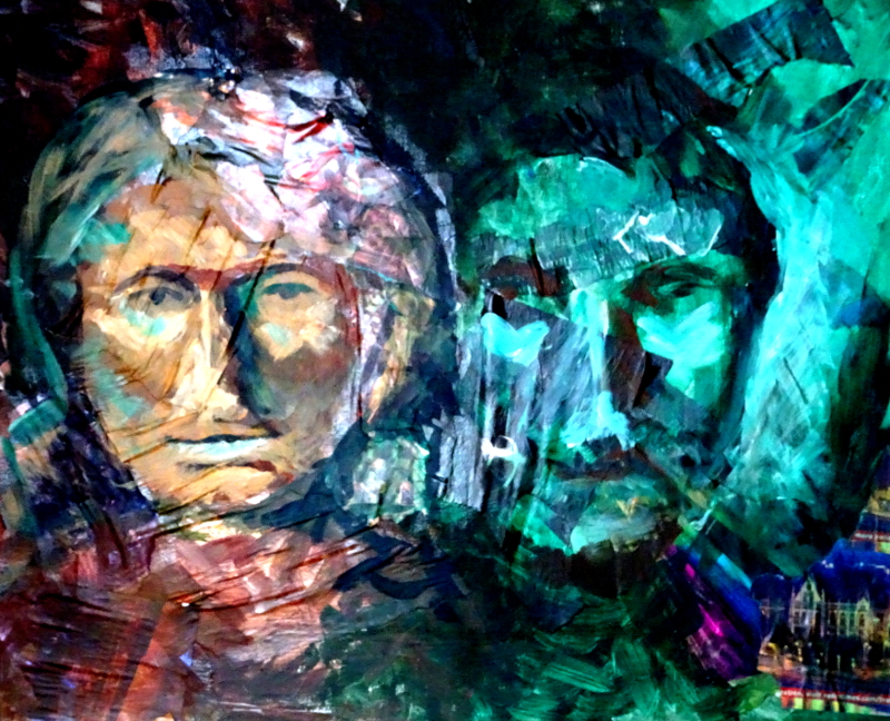
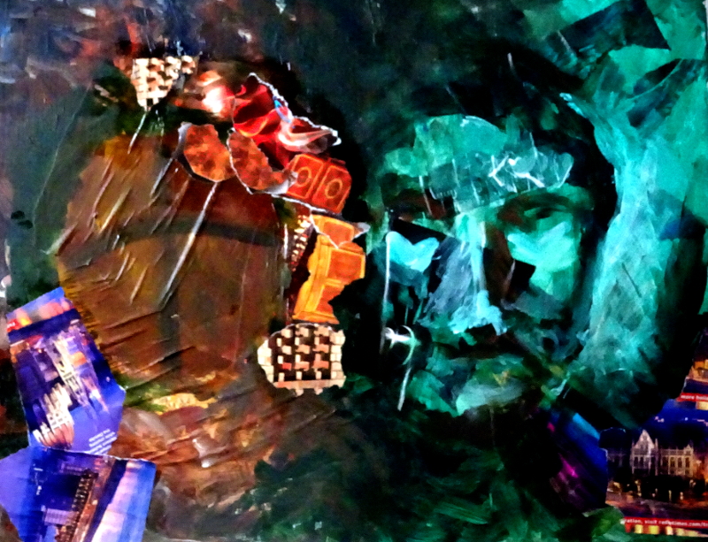
Well, progress of a kind.  I’m told he looks like a Roman emperor, and I think she now looks like a Red Indian, but at least they both pass as people.

As far as my brief is concerned, it is a bit like the curate’s egg.  There are places where the textures are driven by the underlying collage, though overall there is too much reliance on paint.  They both look rather menacing too, which was neither the original intention nor in character.

I’m considering whether I can learn any more from this experiment.  Maybe portraits were beyond my capabilities at this stage, given that I have not succeeded in painting a satisfactory portrait in oils as yet (much greater success rate in pastel) and a landscape or townscape would have provided  a better result.  I’m sufficiently intrigued to try the technique again, to see if I can take it past the  stage of working with someone else’s methods into something I can acknowledge as my own.


Where now?

This is truly advancing in the dark!

His face seemed reasonable for this stage.  In fact I love the luminous green lights. But hers was less clearly defined.  Unfortunately I found myself resorting to  paint to obliterate the offending passages,so that the carefully placed papers disappeared, and I might as well have just used paint from the beginning.

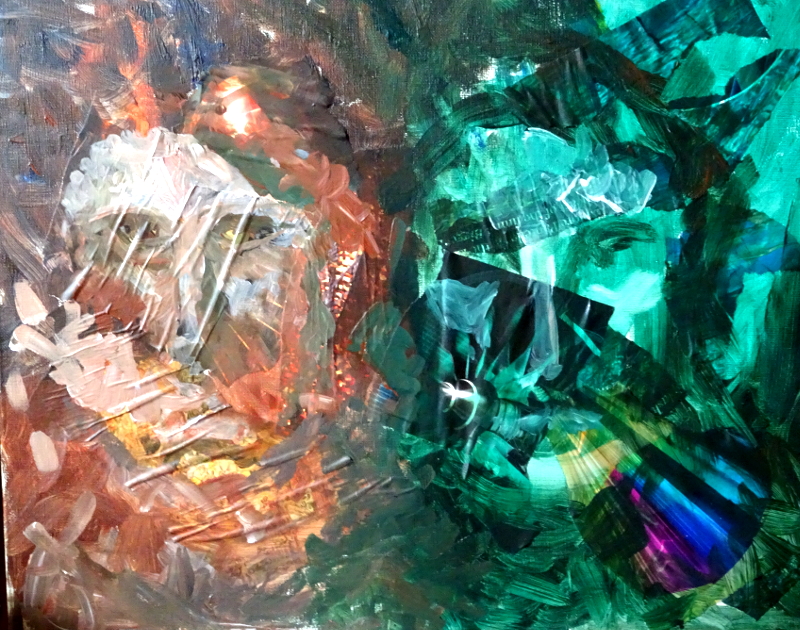
My corrections did not resolve the case, in fact it made things worse.  In frustration, I scribbled my brush over the new work.  That action dredged up from my memory a film about the Flying Dutchman in modern times starring James Mason and Ava Gardner.  He had painted a portrait of her, which she scribbled out with one of his brushes.  The next time we see the painting  he had turned the face into an oval with a contoured cross on it – So I did the same!  An improvement!

I had painted some warm shadows on his face, but felt the need to add more torn paper to recreate the textures in her hair and in the background.

I have to say I’m getting a lot of enjoyment out of this exercise.  Don’t ask what the painting means – it doesn’t mean anything.  I’m not in a dark mood or working out a trauma of my youth (I had a good one, anyway).  And it’s got nothing to do with Hallowe’en.  Just Having a Go!

The enquiry continues

There is a song that goes”I know where I’m going”.  This is not the situation in which I find myself.  I think I’ve stepped off a cliff, and I hope the parachute is going to work ……

2ndStage

……which it has to some extent!  The “warm colours”need more yellows in them and I am losing the luminous effect in that area too.  I may look for more “paper” colours.  I like the effects on her hair.  He is swimming up beside her beautifully.

I think the two sides need to be married together, so maybe touches of warm colours on him and cool greens on her would do it.  I must look at the painting over the next week and cogitate.

A new line of enquiry.

For the next three or four weeks, my students will be wrestling with collage plus.  I hasten to add that this is a new idea for me too,  so how we will all get on is to be revealed as the weeks progress.

I’m taking a double portrait as my theme – part of my plan to know my faces  for “In the sunshine” better. It is also the case that I am using a book I mentioned two years ago “Collage, Colour and Texture in painting” as my guide, and I didn’t want unintentionally to create a copy  of any of the paintings illustrated.   At no point did the artist paint a portrait so I will need to understand his creative thinking rather than lean on what he did in similar situations.

I discussed the layout and how I came to the final design as these line drawing show.  I rejected using portrait orientation as neck and shoulders  would then become part of the design.  The painting  was not seen (in my mind’s eye) as a traditional portrait.  Both images face forward, so my vision was that they will appear at the same level, but he will be darker than her so will seem to recede.

Then we talked of colour, using our recent work on restricted palette as reference.  Again, my thoughts have varied over the two years I have been thinking about the painting.  My first thoughts were to use warm creams and cooler violets, but that seemed a bit sad, so I imagined earth colours with blues and greens.  Finally I settled on earth colours and Viridian as being both friendly and lively.

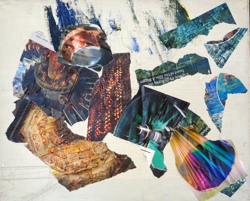
Tearing shapes of suitably coloured magazine pages I arranged them on the canvas to suggest textures and colours approximately where I expected to find them in the finished painting.  I have no idea how this is going to end …..

More colours

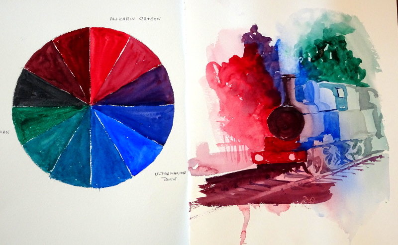
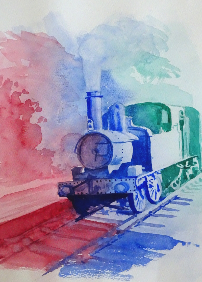
This week we were working with Alizarin Crimson, Viridian, and Ultramarine Blue.  These are big beasts, especially the first two, so the plan was that they would fight each other successfully, ending in a draw!

As you can see, that’s more or less what happened.  Surprisingly, since we all “know” that red and green make brown, Alizarin and Viridian make a beautiful but subdued purple, and of course Alizarin and Blue make a beautiful intense one.  I did the little painting in about 20 minutes, but I enjoyed the result so much that I thought it demanded another go.

I spent a bit more time on this one, and, although no railway buff would applaud the result,  I still like the effect.

I have not forgotten “In the sunshine”, and am quietly drawing trousered legs to achieve a relaxed pose.  Right now his shoes are too big and clumsy, so they will have to come out.  The trouble with improved drawing ability is that last year’s effort isn’t good enough.

Colour mixing

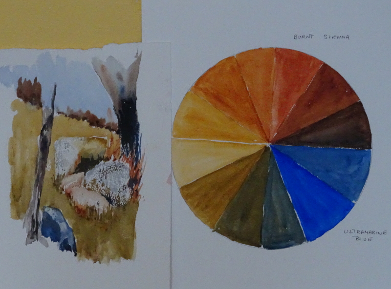
My tutorials for my class this term have started with colour mixing.  This is a perennial request, and trying to devise a way of making the mixes easy to remember or some system of charting that is accessible has been occupying my mind for some time.    It is not something that I, personally, have had many problems with, and, of course, time and practice will solve the matter eventually.  So, “What to Do” –  I find the charts that have 20 colours across the top and down the side, with the appropriate mix where the lines cross, very off putting, but splodges of paint side by side is even less appealing, and not something you would want to return to..  So I have invoked the use of a colour wheel,  reducing the colours under study to three.

This week we are looking at Raw Sienna, Burnt Sienna and Ultramarine Blue.  I’m being very fussy about clean water, clean brush, freshly squeezed paint, so that the finished pieces tell the truth and shame the devil!

No surprises here, but see how strong Burnt Sienna is, and Ultramarine runs it a good second.  Poor Raw Sienna has a tough time coping with them.

The little sketch was done using just the three colours under study.

Thinking it out again

Returning to my big painting “In the sunshine” after about a year has left me in a bit of a state.  There seems to be so much wrong with it.  When I left it last year, I though it was nearly finished, but now I can see bad drawing and awkward concepts all over.  Still, on the positive side that means I can attack it with gusto, rather than dabbing at the faces with the aim of achieving a likeness.  This time, though, I need to keep the momentum going to the end – I don’t want another period of re-entry like this one!

It’s mainly, but not entirely the figures.  One of those things which happen when you are struggling with a painting is that the area under attack “grows”, so that properly proportioned figures become ridiculously long limbed or large-headed, and the area around grows a halo of mismatched colour are you seek to make correction.  Both the figures and also the pillar beside them have grown in length and halo.

Since correcting her legs,  I have become dissatisfied with her pose, while his arm is miles too long and bent in a funny place.  I don’t like his legs either.   The two pillars are no longer aligned, and the pristine paving has a bad attack of measles.  (All these points may have appeared because I am observing more clearly these days, so maybe that’s a positive too).
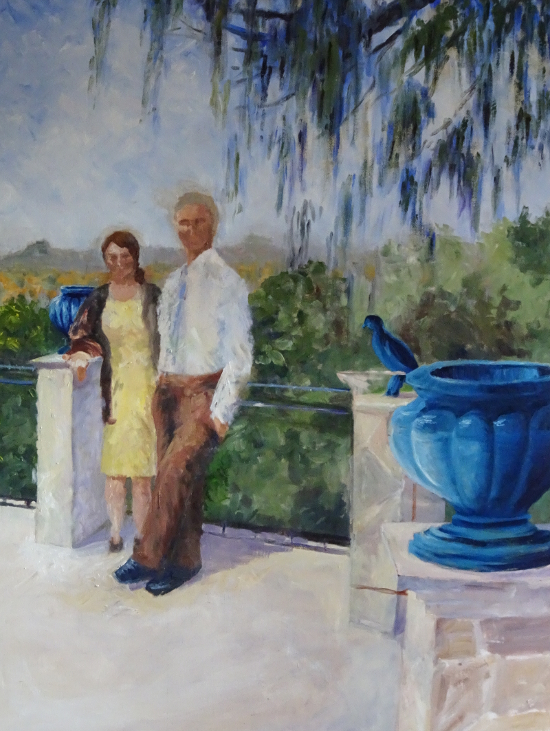
Here you can see some of my corrections.  I’ve lifted the whole of the right hand pillar by quite a bit, but it now lines up with the far pillar.  This necessitated altering the ironwork, as well.  I also lifted the belt of his trousers as his torso had grown longer and longer, and changed the bend in his arm.  She is better proportioned too.  However,  her legs are like tree trunks, and his legs look like he wants to go somewhere in a hurry!   The return on the pillar base near the figure is too acute, and I am now wondering if I should have altered the far pillar instead of the near one.  Maybe I should wash off those corrections with turps right now while the paint is wet, and think  again.