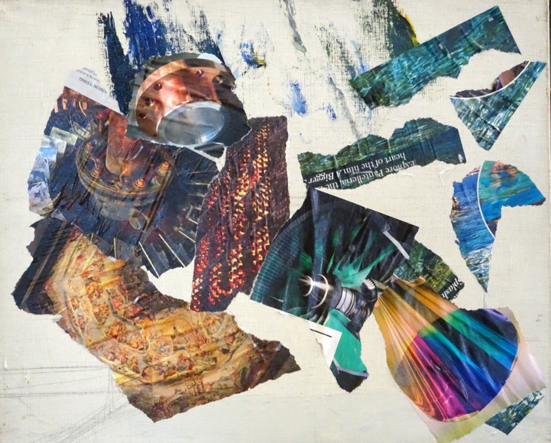
For the next three or four weeks, my students will be wrestling with collage plus. I hasten to add that this is a new idea for me too, so how we will all get on is to be revealed as the weeks progress.
I’m taking a double portrait as my theme – part of my plan to know my faces for “In the sunshine” better. It is also the case that I am using a book I mentioned two years ago “Collage, Colour and Texture in painting” as my guide, and I didn’t want unintentionally to create a copy of any of the paintings illustrated. At no point did the artist paint a portrait so I will need to understand his creative thinking rather than lean on what he did in similar situations.
I discussed the layout and how I came to the final design as these line drawing show. I rejected using portrait orientation as neck and shoulders would then become part of the design. The painting was not seen (in my mind’s eye) as a traditional portrait. Both images face forward, so my vision was that they will appear at the same level, but he will be darker than her so will seem to recede.
Then we talked of colour, using our recent work on restricted palette as reference. Again, my thoughts have varied over the two years I have been thinking about the painting. My first thoughts were to use warm creams and cooler violets, but that seemed a bit sad, so I imagined earth colours with blues and greens. Finally I settled on earth colours and Viridian as being both friendly and lively.
Tearing shapes of suitably coloured magazine pages I arranged them on the canvas to suggest textures and colours approximately where I expected to find them in the finished painting. I have no idea how this is going to end …..


It’s an exploration, after all….!
…..and we shall enjoy watching!!!