In the sunshine 03

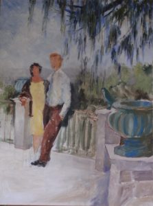
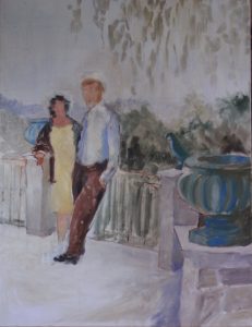
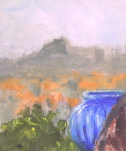
I’m working on the distant and middle ground.  The distant hills are not, in fact, that distant!  The very pale lilac I have used so far gives the impression the the hills are miles away, but they are barely one mile distant.  I’ve deepened the tone of the hills, given them more shape and introduced colour into the hillside.  Those brighter colours are working well with the turquoise vase, and the darker tones bring the hillside a little nearer.
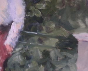
Railing detail.

I’ve indicated the top of the railings more as a line in the wet paint than as a separate painted element, so it’s green rather than black.  That’s fine as it is present but not strident, and I am delighted that some of the random brush strokes look like leaves – serendipity again!

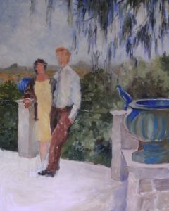
 

Making progress.

In the sunshine 02

This is such fun.  I’m enjoying this happy picture. I’ve started to give more energy and colour to the sky. Originally, I had intended only a thin wash of pale blue without any texture as there seemed to be so much else going on, but correcting the size of the heads had introduced thicker paint there, so I decided to repaint the whole sky, largely blue I agree but showing the occasional fluffy cloud perhaps.  I think this makes a better balance.

I think the tree must be a member of the larch family. Its needle-like leaves fall from the branches like lazy hands trailing in the water. I have built up the perspective there by  using different colours and tones as I passed over the area, first Ultramarine Blue, then Ultramarine Violet, then Viridian with the addition of Burnt Sienna.

I strengthened the painting without altering the tone of the distant hills, then turned my attention the the garden.  Since we are raised above it, only the tops of the trees and bushes show, so a mixture of dark and light green suffice.  I’ve gone in with strong darks behind his shoulder and legs, enjoying the contrast with his white shirt.  These darks will hide some of the metalwork he is resting against beautifully.

Canal boats 04

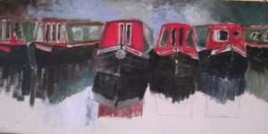
So the canvas is largely covered.  I have extended the blue area behind the boats.  I may have overdone it.  In fact I’m sure I have.  The light reflecting off the side of the cabin of the middle boat loses impact against the light background.  However, there is just some of the water on the right hand side to rough in now, so I can see how the painting will turn out.  I’m very pleased with the composition.  With a bit of work, this is going to turn into a good painting.  Boats are fascinating.  There are so many lines and angles.  They catch the light in so many unexpected places.

I have started to clarify the painting of the middle boat, and for some reason the reflection looks wonky!  I didn’t notice this when I was painting, so the photo has done me a service. For a start, the reflection of the prow is at the wrong angle, and where the prow becomes the side (a nebulous place!) also needs a little more definition.  Although the red of the cabin wall has been calmed down with the addition of a little Burnt Sienna, it seems to glow even more.


Canal boats 03

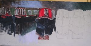
I roughed in the background to help the define the upper edge of the boats and to set the atmosphere.  It’s a bit dark, though the blue positively glows in contrast.  I’ll think about that while I cover the canvas.

The boats themselves are also roughly painted.  I do like to cover the whole canvas as quickly as possible especially when I haven’t toned down the white prior to drawing the image.  Toning down is not quite what I do, for I frequently paint the whole canvas bright orange, such a cheerful colour!  Well, I didn’t do it this time so need to accommodate the dominating white as I chose my tones.

This photo show you how very sketchy the painting is at this stage.  Part of this is the need to cover the canvas, but it also allows me to choose how much detail I want to add later, besides giving me confidence that the drawing is largely correct.  Sometimes I catch just the right brush stroke at this early stage, like the reflection of the side of the green boat,  and can let it be part of the final painting – one of those pieces of serendipity I mentioned when I started writing a blog.

In the Sunshine 01

This is a big painting – it’s nearly as big as me!  Now and again, I like to use my shoulders when painting.  It’s very satisfying.

My friends are relaxing on their rooftop terrace not long after they had finished it, so there is a certain amount of relief in their pose.  The ceramic pots adorning the pillars are a brilliant turquoise which I am eager to paint.  The pillars themselves are built in rough pale stone.  The shady garden crowding his shoulder shows dark greens, while the distant landscape is, I’m told, “very Cezanne”, no pressure there, then.

I am delighted to report that I actually drew this freehand, so my regular sketching is beginning to pay off.  When the basic colours and tones were painted in, I saw that I had made both heads too big for their bodies, such a common mistake which I should be able to avoid by this time, and I’m not sure about his legs.  I made the necessary adjustment to the heads – oil paints are so forgiving.    This first pass of colour and tone, which took about an hour, sets the painting going and allows gross errors to be eliminated early.  Now I can concentrate characterising the differing textures and tones.

Canal boats 02

This term my painting group are examining canals as they wanted to improve on trees and water, and I wanted to add  some interesting shapes.

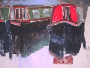
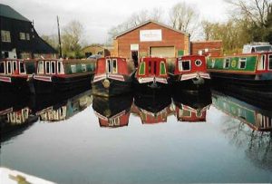
The second boat painting, in acrylic this time, concentrates on the boats and their reflections.  My starting image is a reasonably good composition, though I would want to fade the sheds as they are rather dominant and detract from the collection of narrowboats.

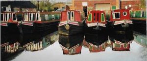
However, my canvas is long and thin, and that encouraged me to crop the image top and bottom and lose most of the boat on the right.  This will place the boats and their reflections in sharp focus.

When I come to painting, I intend to blur the shed, trees etc using the tones to show or hide the cabins.  It’s all drawn up ready for action.

Canal boats 01

I suppose it’s a small journey from bridges over a river to canal boats!  A watery theme perhaps?

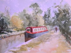
Water colour paper has a big influence on how a painting appears.  I am trying some new paper, much recommended by Hazel Soan, one of my favourite painters.  It’s called Khadi paper and I found it in Jackson’s on-line Catalogue.  This is hand-made in India, so each sheet is separately produced rather than in a continuous roll using 100% cotton rag.  It’s acid free, and has a texture all its own.

As you can see, it works beautifully for dry brush work, making it easy to create all those broken edged trees and bushes, yet it is possible to produce a smoother wash as in the canal itself.  It bellied quite a bit when I used a very wet wash but reverted to its former self as it dried.

There is more to do – the shadows are too pale for a start – but I like the way it takes the paint.


The “Bridges of Dee” Private View

After all the painting, all the planning, all the panics, and all the brilliant ideas, collectively we made it.  Setting up took a mere two hours, partly because some of the paintings are rather big, and partly because we had actually thought about it beforehand.


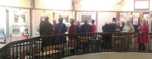
As you can see, we had a goodly crowd at the Private View.  It was great to see so many of my friends and to meet those I have only met on-line before.  There were many pleasing comments (well, they were my friends, after all),  and sales were healthly too!

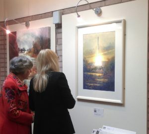
Among our guests were the Mayor and Mayoress of Llangollen on what turned out to be their last official engagement of their year of office.  I expected a quarter of an hour visit, but they were both interested in painting and stayed for over an hour.  This photo shows the Lady Mayoress (with the beautiful blonde hair which goes with the picture) and me (in red).  The picture is called “Flintshire gold” and show the last and latest bridge over the Dee near Flint.  Just beyond it is “Inundation”  showing the Dee in Flood in Farndon.


“The Bridges of Dee” Exhibition

Well, here we are!  Finally I have an exhibition of all the paintings in my book “The Bridges of Dee”.  We have lots of guests coming to the private view, and many others coming during May.

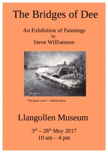
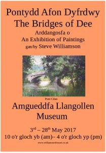
This time we have done lots of advertising, much more than I have done in the past.  For the exhibition is not in my home area, and the book sales have been nation wide.  It will be interesting to see if the increased advertising pays off, but I don’t mind if it doesn’t as it has been a fascinating experience.  Besides Art Magazines and the local press, we have spread posters up and down the valley,  bi-lingual ones too. The paintings encompass the whole valley and there are many people, especially in the upper valley,  where Welsh is the mother tongue.  So this is what it looks like in Welsh and English.

We have printed the sales cards in Welsh and English too, and have separate Welsh and English Catalogues.

The Private View is on the day this post is published, and we have the Mayor and Mayoress of Llangollen coming.   I hope to bring news of the launch party next week.

(Black and White) and Colour Mark 2

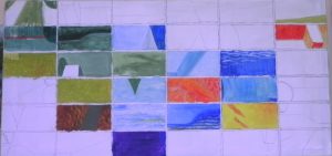
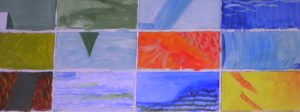
I decided that the best thing to do was introduce one colour at a time and see what happened.  Orange was my first choice, a good, strong, cheerful colour.  That’s him near the middle of the canvas.  Now orange partners well with turquoises and blues, so I tentatively surrounded my orange tile with bluish ones trying always to keep to the tones in my corresponding reference. The lemon yellow tile was my next offering, which in turn suggested a grey-green.  I used this on quite a number of tiles on the left hand side, though I think the sharper green tiles are a mistake, taking too far from my original blues.

Then I stood back and looked at it for a while.  The juxtaposition of oranges blues and greens made me think of a fish pond  so I explored that idea by introducing textures on some of the tiles.  There are some ripples on the blue tiles and some scaly shapes on the orange ones.  I don’t think the detail should dominate or over-complicate matters, and I haven’t worked out what sort of detail I should suggest on the green Lilypad!  Work in Progress!