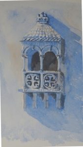
 And finish it I did. A bit clumsy in places, but maybe I’m nit-picking!
I like the freshness of the Cobalt, a beautiful warm blue. Dilute Burnt Sienna on the stonework adds its mite to the glow, while the mix gives me a dark which is not too great a contrast to the other tones. Working this size is a blessed relief as more recent attempts have been a quarter of this size. The idea of working small was to relieve the pressure of “making a painting”. Frankly, I can “not make a painting” on any size of paper ….. it’s a skill I have been developing lately . So maybe I should stick to larger sketch pads in future.
This size has allowed me to indicate some of the intricate carving so characteristic of Lisbon architecture of this period. You have to see it to believe it. Think of baroque decoration then add more baroque decoration on top! Every decorative carving is itself decorated. Even at this size, it’s not possible to show all. Tiny shadows, flecks of light, must suffice.

Beautiful effect. The earlier stage was ethereal and floating; now it is definitely attached to a building. Given the frenzy of the Portuguese style I think you would need a canvas the size of the balcony itself to get every detail in!
I think Ann is onto something when it comes to the canvas size necessary to do justice to Manueline architecture!
I like this – as you say, Cobalt creates a lovely warm effect.