Wow!

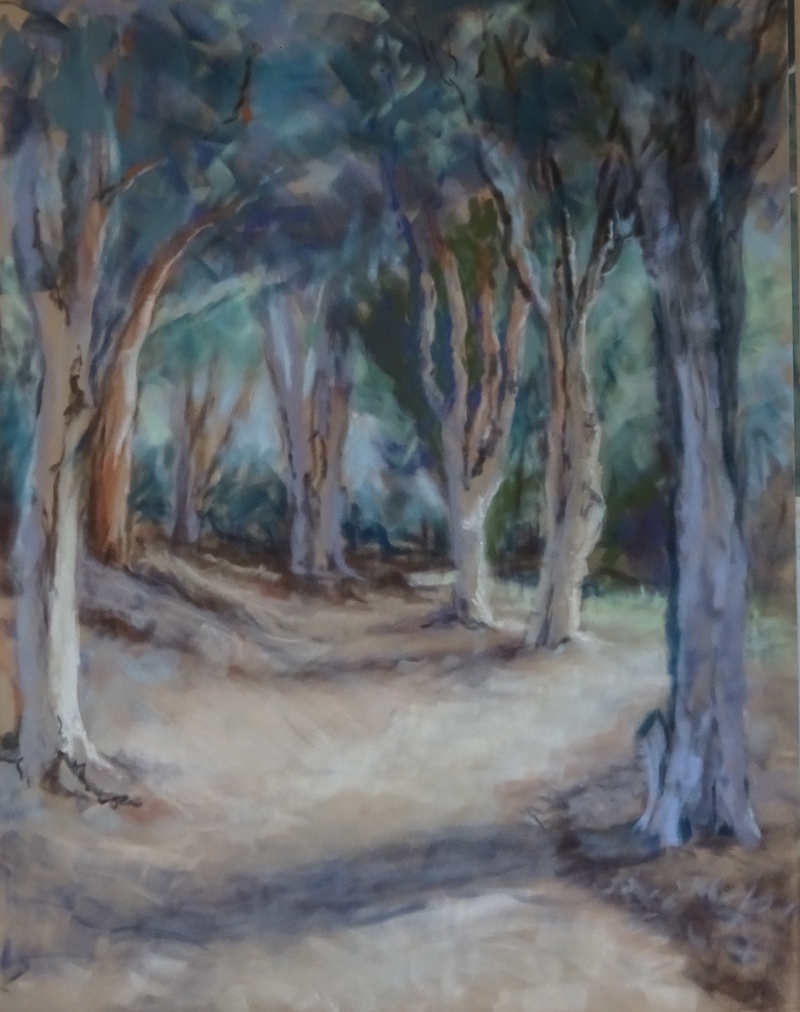
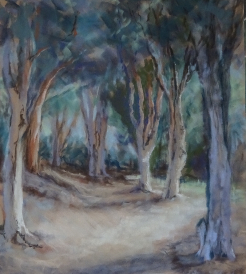
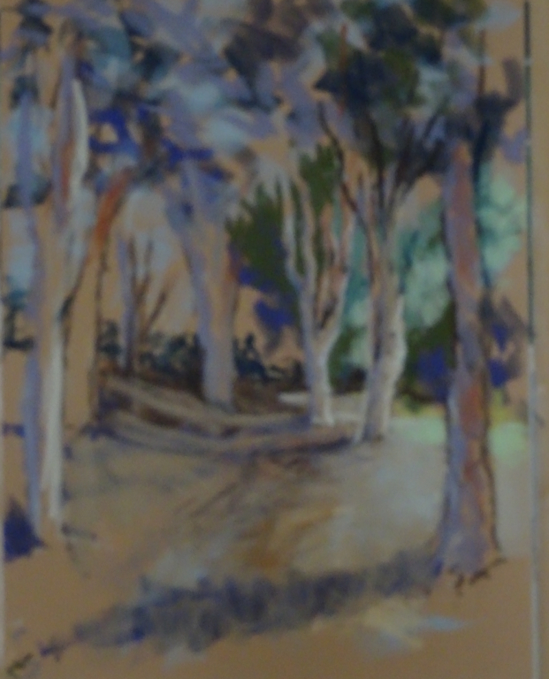
I have just returned from a two day watercolour course with my favourite painter, Hazel Soan.  She is just as good a teacher as she is in her DVDs but the addition of her driving energy and high expectations made all twelve of us make more paintings in two days than I would have thought possible, at least eight full pictures each.

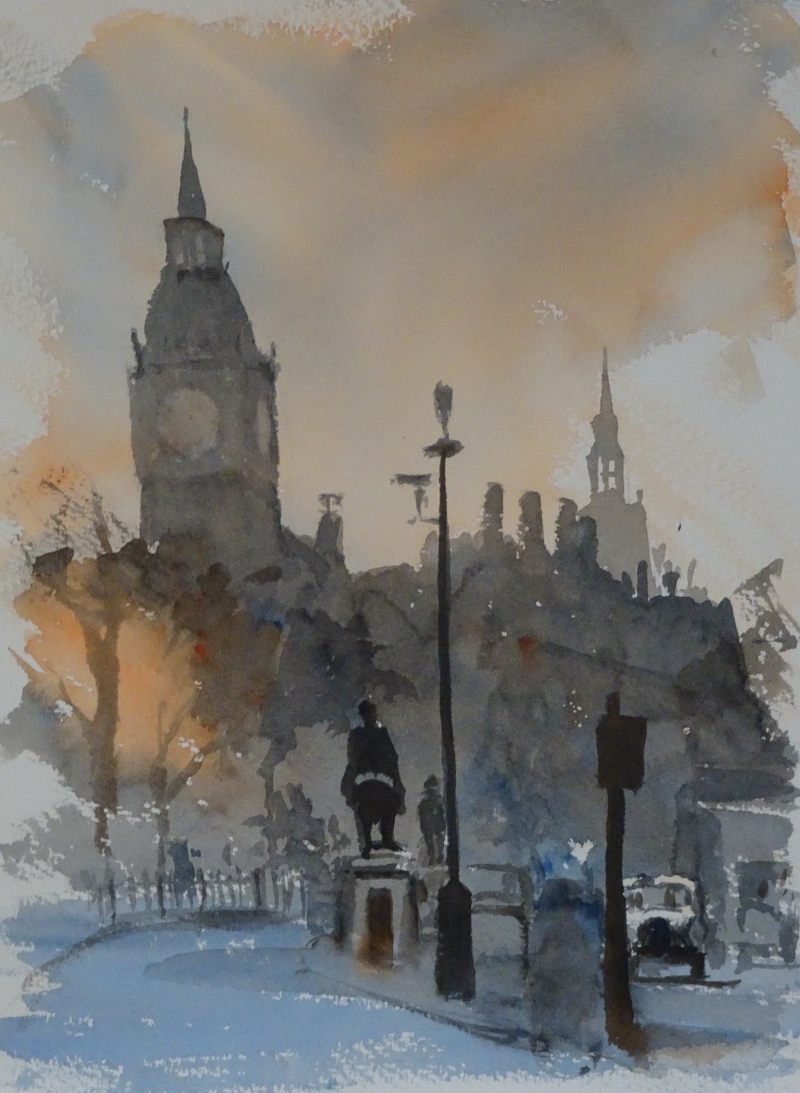
All the sessions showed how to simplify the scene, how to achieve results quickly and easily, so that the spontaneous nature of the medium was not compromised.  Each focused on a different aspect, beginning with the importance of  of tone to show perspective.  The London shot of Big Ben silhouetted against an evening sky (transparent orange and ultramarine blue only) encouraged deepening tones as we moved forward.  I was chuffed with the taxi!

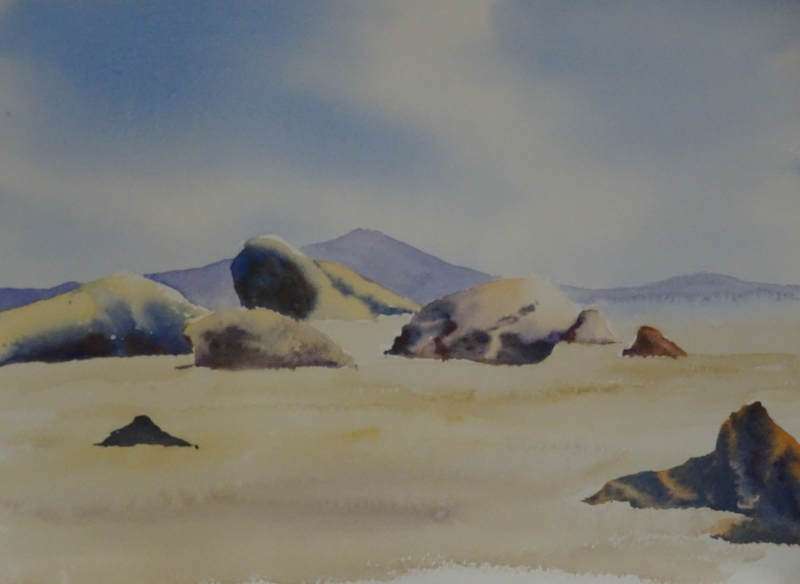
Then we moved on to tone creating three dimensions – wet in wet  and wet on dry, soft and hard edges.  I think we all did pretty well on this exercise as the scene wasn’t complicated, each rock having its own attention.


On again,  this time to lemons ripening on the tree, more rounded forms and a plethora of leaves .  This time the paints were aureolin, indian yellow, violet and prussian blue.  The fruits were relatively easy, wet in wet, using the two yellows and violet.  I came apart on the leaves, losing the freshness, battling with the age old conundrum of pigment to water ratio.

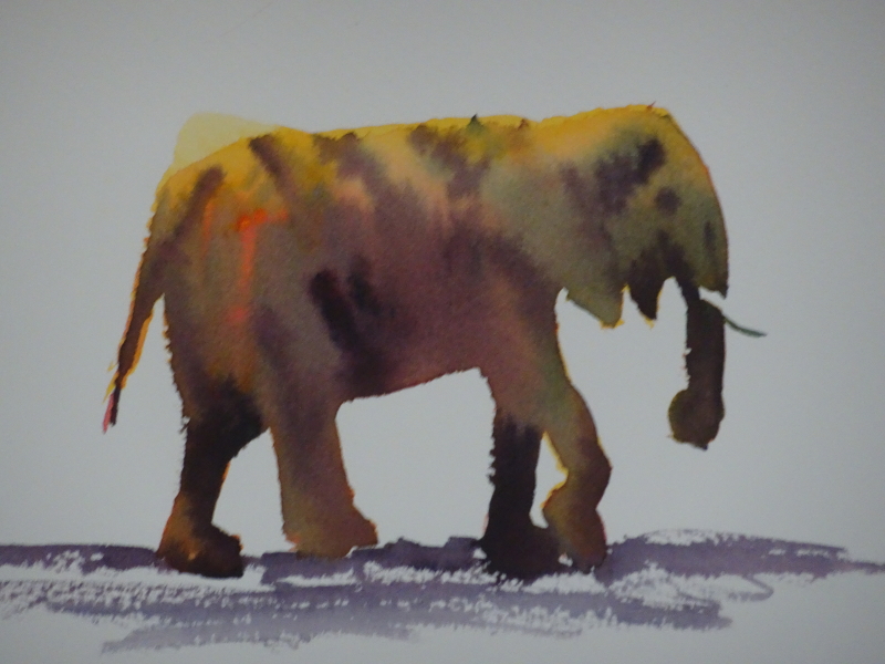
Finally, released in to ele-land!  These three-colour elephants were one of the first things I tried when I discovered Hazel’s DVD’s. It is sheer magic to watch the pigments merge on the paper and give you a credible grey or brown beast.  And it doesn’t just have to be elephants!

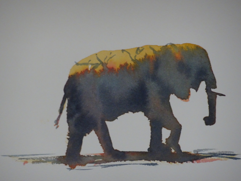
First we created the shape in the chosen yellow, anything from ochre to lemon, introduced the chosen red into the wet wash , alizarin to cadmium, from the ground so that it bled upwards, then introduced the blue in the same way, prussian, ultramarine, whatever!  Finally just as it was just damp, a mix of all three indicated the final shapings.  Of course the chosen three colours will serve to create the background too.

So ended the first day.

Other ways with pastel

I’ve been working in pastel quite a lot recently, almost always rewarding.   There are so many ways of using them; the immediacy of the colour in your hand lends itself to experimentation.  I recalled one in my book “The Bridges of Dee” that I had particularly liked and hope you do too.

Look closely and you will see that it is composed of hundreds of tiny crosses.    I’d seen an article in a magazine about working in this way which sounded productive.

The sky is a mixture of pale blue, apricot, yellow and mauve laid over each other at random, and quickly, even paler ones near the horizon.   The juxtaposition of these complementary colours  creates luminosity.  The essence of the technique is to work at speed so that the crosses don’t become neat and laboured.

The bridge is a mixture of separately applied greens and reds, purples being added for the underside of the arches.  Turquoises  in the water sparkle against the orangy reeds (more complementaries), while the nearest tree is an exuberant mix of all the darks available.

It’s a lovely noisy technique, and comes highly recommended!


Gum trees completed.

A quiet half hour allowed me to finish this painting.  The main change has been a weakening of the shadow cast across the path in the foreground.  The other changes have been very minor, a strengthening of a highlight or shadow here or there, an extension of the path itself behind the trees in the background, the right tone and detail to edge the path, little things in themselves, but with an effect beyond their size.  I must have liked it for I have signed it!

Sandstone cliffs complete?

I am not 100% sure I have completed this painting, but I think I’ve caught the appearance of a blustery, sunny day .   The cliffs have three dimensions now, though refining the detail might please me more!  The real fun was creating the wiry grasses on the cliff edge in the foreground.

I splurged down shapes of all the darks on my palette, greens, blues  maroons and ochres, in the approximate places of tonal value, then scratched the thin shafts of grassy tufts out of the wet paint back to the canvas.  The differing darks have added interest and pushed back the cliffs.  The spray at the leading edge of the cliff was put in by finger.

There is a wind battered, fighting tree perched in among those grasses which I am in two minds about.  It’s a wonderful twisted shape, and would break the horizontals and add to the drama.  I’ll wait until this is thoroughly dry.

Sandstone Cliffs

This week I started an oil using palette knives, something I haven’t done for ages, and it didn’t go well.  My image was in portrait mode; I was re-using a half worked canvas, the disappearing painting being in landscape configuration.   Unthinkingly, I set up the canvas as per the existing painting, so not much room for the sky and sea, and too much room across the painting.  I soldiered on, but by the end of the session I was so disgusted with my efforts that I scraped off the paint and rub the surface clean.  What do you think of my Turner?

So, I started again, this time with image and canvas  agreeing.  My first sky had been very stormy and active, but I remember the day as being sunny but with a very strong wind off the sea.  You can get a very smooth finish with palette knives if you think of icing a cake, so this time the sky is friendlier and less active.  The strata of the cliffs were beautifully colour coded, creamy, chocolatey, and I regret, muddy, while the sea sang in turquoise green.

Feet

Our pair have now been provided with the wherewithal to stand on  – with mixed results.

I am rather pleased with her foot as it peeps from under her long dress.  The sunlight is just catching the tips of her toes, while tidying the edge of that dress and adding the cast shadow has grounded her nicely.  She does need the vestige of another foot in the shadow but that’s not difficult.

His feet have always been problematic.  His legs are crossed at the ankles, so the shoe is at an angle and I can see the sole. The other shoe is largely hidden.   I turned this upside down to do it and think the shoe is believable but a little too big.  You can judge for yourself in this picture.

This could be an easy fix, or one of those things you never get right.  Time will tell, and meanwhile I’ll get on with finishing the other details.

Gum Trees

Meanwhile, progress is apparent among the gum trees.  Most obvious is the light on the path and some of the trees  The curve of the path round the nearest tree on the right is satisfying but more thought is needed on the middle ground where there is dip in the ground but also a camber on the path.  Until I get that sorted the light on the path is fighting the direction of shadows.

Looking a  painting in reduced form as in a photograph does help to pinpoint unhappy areas.  The sky is too bright a blue, creating energy where quiet is required.  I have something of a conundrum here, as using a lighter blue will undermine the light on the path, while greys will reduce the impact of the trees.  Even so I think the latter is the way to go as the light is a more important feature of the painting.

I have worked on the canopy.  This is not the focus of the picture but it still should present a more complete image.  It’s largely dark green but such greens are more effective if other darks, blues, purples, (even Alizarin Crimson if appropriate)   are added to the mix.  This has filled out the canopy and emphasised the  bright light beneath.  I have also lightened the bank on the left hand side but this has still not resolved the unhappy path.   I tried cropping the picture to see if removing the foreground would help ……..

but I think that reduces the impact of the height of the trees.  Thinking caps required!

In the sunshine – on the home straight

Well, what a surprise!  Since I resumed work on this large painting, I’ve been pussyfooting around with tentative dabs of paint trying to edge the picture towards completion, focussed mainly on the heads (and Feet!). Today – rain, so no gardening –  with a unexpected feeling of calm, I donned my kit, laid out all (!) my paints and spent a blissful two and a half hours working over the whole canvas.  In truth, I didn’t know it was blissful until I put down my brushes, but now I feel I own the painting again.   I don’t need to say that I am pleased with the results.

As you can see,  I’ve darkened the shadows of the pillars, thereby increasing the sunshine; I am thrilled to bits with his pants, and his shirt is better too; Her dress is more shapely and glowing in the light, while her head and shoulders are beginning to resemble her, and her arm has more substance;  a little wall has crept in on the left hand side; pink flowers and green leaves are pushing through the railings;  even the relationship of the two pillars on the right is more convincing.

OK, I chickened out on his shoes.  I’m going to draw them until I know them well enough to paint them.  They are dark on light, but are not, repeat not, the focus of the picture.

The pinks will be picked up  by traces of that colour in her gown.  The railings should figure in places.  The faces need a little more shaping without returning to portrait definition.  I think the orangy/greeny  background behind her head should be lower and more shaped. but all that’s for next time – soon I hope.

Small advances on two fronts

This week I have worked on both current paintings, though one of them has been “current” for some time.

Having changed the pose of my figures in the oil painting, and liked the new atmosphere the changes have created, I made a start on the man’s head.  I have to say that it looks like him! and is exactly how I have wanted the figures to appear.  I said all along that I didn’t want to paint a portrait, but only a recognisable figure.  We can recognise people from a distance by the way they carry themselves, so detail is not necessary to create a likeness.  This is much easier to catch, too.

The pastel also is gaining shape and perspective.  I had intended to work on the two trees just in from the right hand side, and did start there.   Inevitably the background was called into play for one shapes the other.  I seem to have lost the path which curves among the trees, but the blue-greens of Australia  are apparent.  The sunshine catching the right side of those trees will also illuminate the nearest tree on the left so that the path (when I find it again) and the shadows  will be balanced by the strong verticals of the sunlit trees.

Australian Trees

A new term opens and I am using a photo taken in Australia when on my holiday there.  The photo was taken a day or two after my arrival, and a first sight “a path through trees” may seem  a tad ordinary.  However these are gum trees, a source of endless fascination, their differing varieties, their pealing bark, their resilience, and I am hoping that I manage to get the colouring right.  There are blue tones in the foliage in many trees, even as far south as Melbourne, (It’s winter, by the way) part of the subtle visual “otherness” I shall be seeking to pin down.

I’m using velour  pastel paper which takes pastel strokes beautifully, and as I like the strokes to show, it collaborates with all its might.  A light drawing in pastel delineated the trees – it was the placing of the trees which made this an appealing composition – then I indicated roughly, with as many darks as I could find, the foliage and the “stitching line” of darks in the near distance.   With a few slashes of light on the trunks and  darks for the shadows, the picture begins to emerge.