Meander Treasures 3

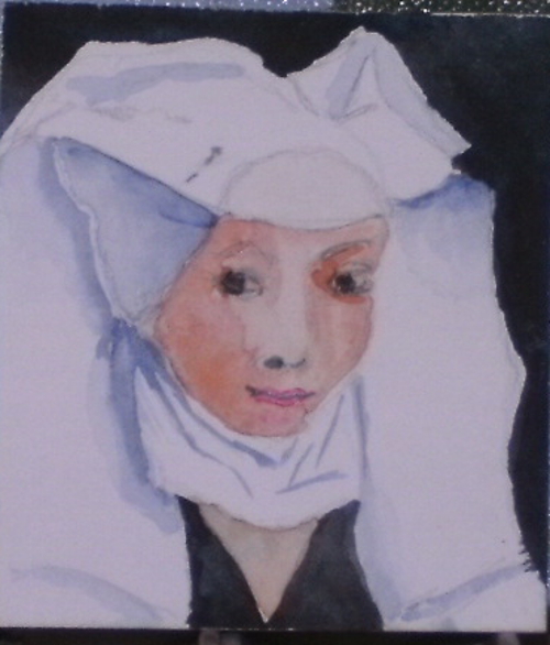
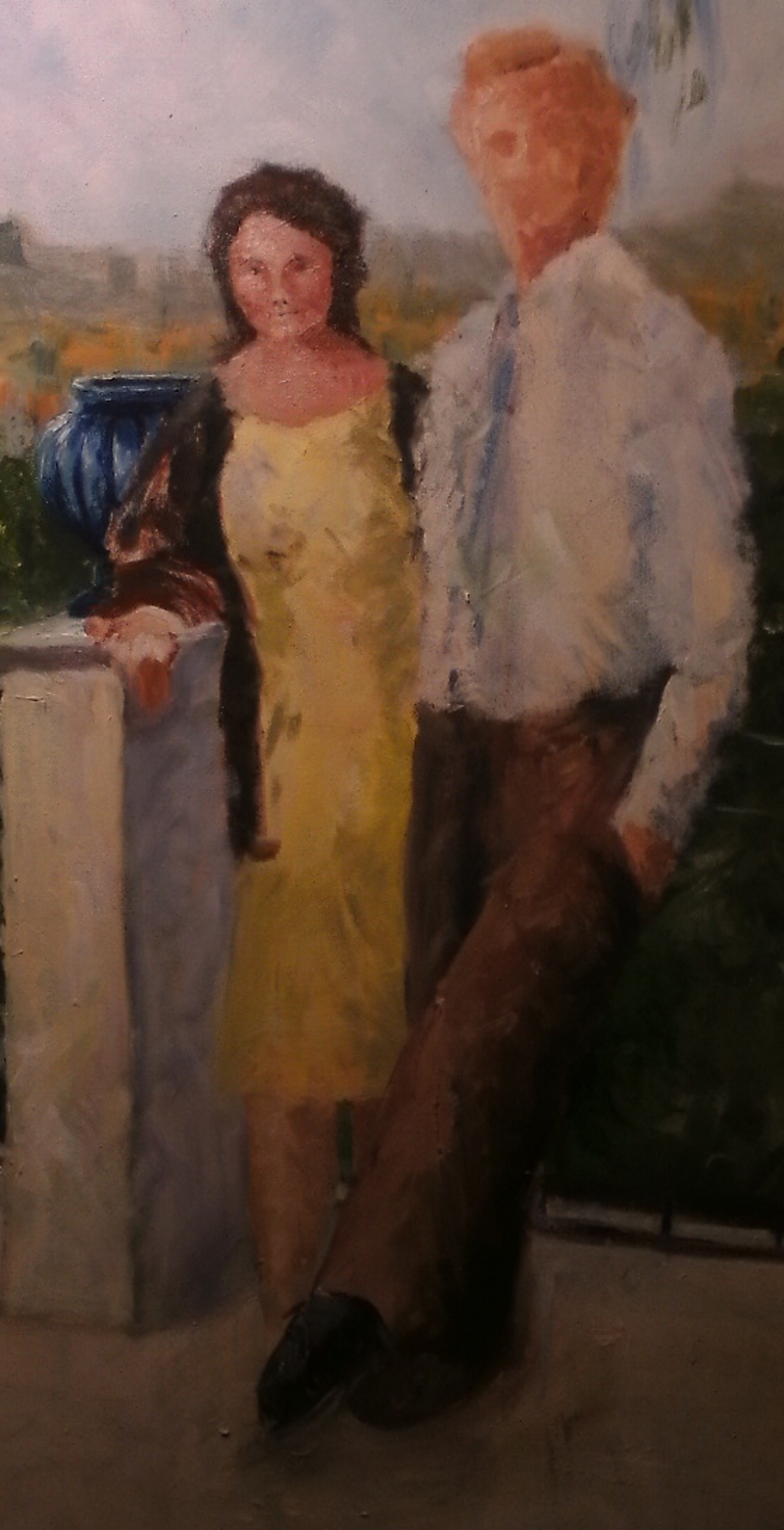
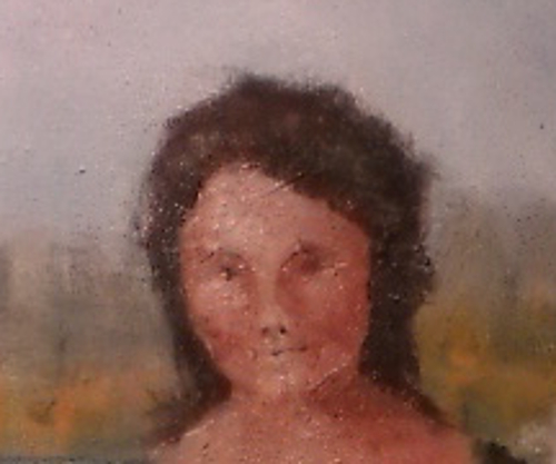
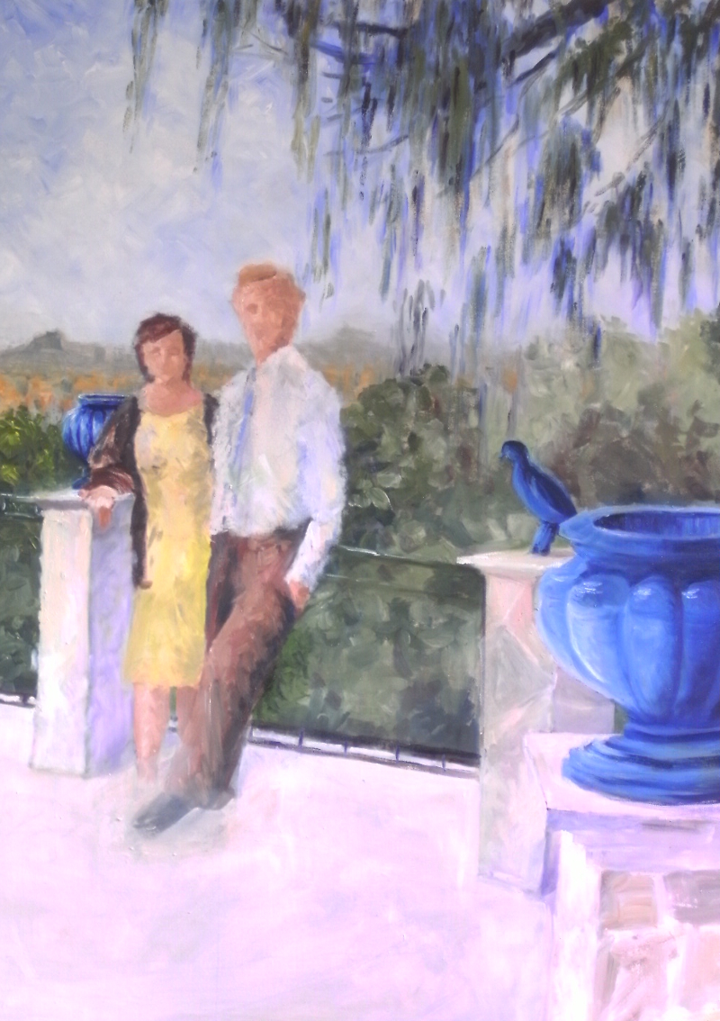
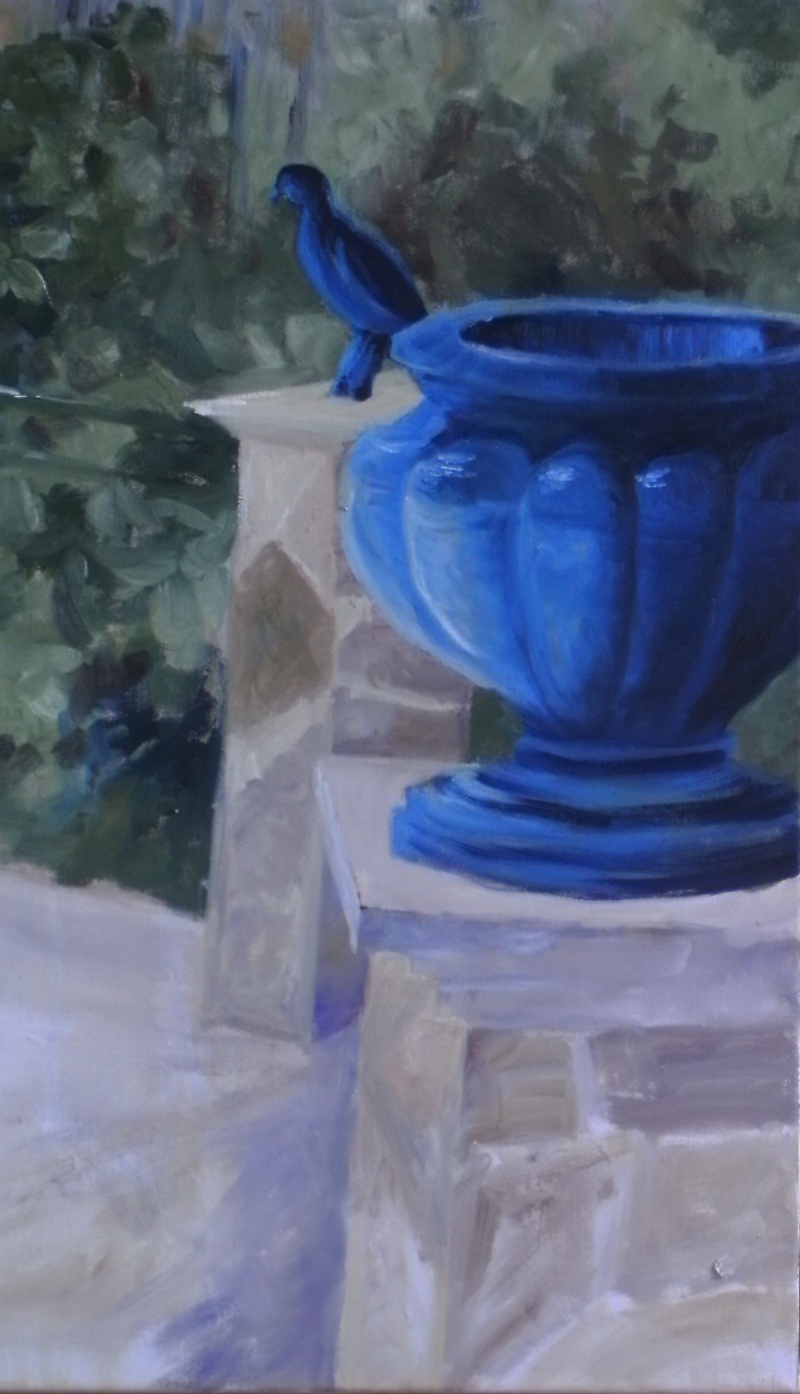
I was getting a bit fed up painting portraits with a black background.  I had managed dark brown in the Shrimp Girl but this time I’ve managed blue!

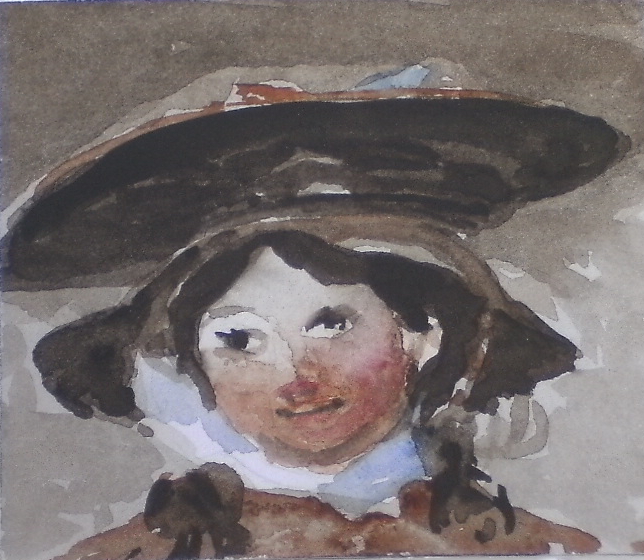
This is from a painting by Peter Paul Rubens.  It’s been called “Le Chapeau de Paille” though the hat isn’t straw at all.  Rubens girl is shy, indeed rather timid.  My lassie is altogether more knowing, and older, so I may have another go at her, time permitting.

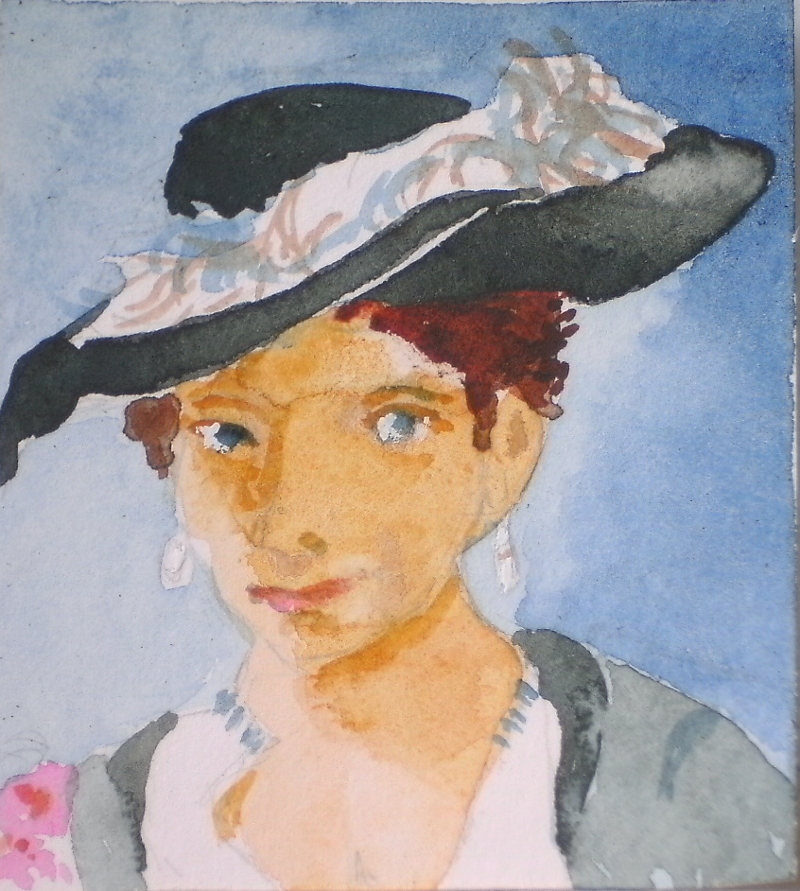
I like the tilt of the hat, the touch of pink and the blue background but the modelling on face (almost non-existent in the original painting) is heavy.  I don’t know why it appears to be blotchy in the photo, but it seems smoother in actuality.  Maybe if I wash out the face and try again, I’ll do better.

However, the next copy portrait I am going to attempt is Van Gogh’s Old Peasant – a truly cheery picture,  and I’m keen to see what happens.

Meander Book Treasures 2

Do you remember this lady?  It’s a good while since I attempted to do some portrait “treasures” for my meander book.  The small size is a good focus, however, and a chance to paint in watercolour again.

I am bothered about the faces in my “big” picture, trying to work out how much detail I need to put in them.  Then I remembered William Hogarth’s  “The Shrimp Girl”.  The vitality of her face is caught with so few brush strokes.  I felt sure she would aid me in my dilemma.

So, I made her the next “treasure”, knowing that the close observation required to paint her in minature  would be a great study.  I made a careful drawing, just enough to delineate the areas of tone, then, using very dilute Sepia I washed the paper except for her face and frilly cap. A light wash of dilute Burnt Sienna over the face completed this stage.

The Shrimp Girl

I darkened the underside of her tray, her hood and hair, leaving thin strips where the light catches the edges.  She has a rosy glow to her face except where it is in the shadow of her tray, and her clothes also show warmth, so in with Burnt Sienna  touched by Permanent Rose.   Her eyes are very simply done, just a flick of dark added to the dark irises and a very slight shadow under the eye.  Her happy smile is really only two tiny blobs joined by a line.  Add blue for the shadows in her white cap and on the “shrimp” measure at the front of her tray, and she is done.  She looks more modern than Hogarth’s girl, and I’ve managed to tilt her head slightly so she doesn’t look quite so happy.  Evenso, I have to say I’m pleased with her.  As a bonus, those “big” faces look more manageable now.

In the Sunshine 7

All my photos are turning out dark at the moment, whether I use flash or not, But I think the basic shapes are visible.

After a hard stare at the painting and at the photo of a stand-in, I came to the conclusion that his back leg wasn’t supporting his weight.  When I think how many times I have corrected this error in my students’ work, I cringe that it took me so long to spot it in my own!  Still, he looks more comfortable now, and she has somewhere to stand. Even so, her legs are now too long, and a bit like tree trunks.

It is less clear that I have done some work on the faces.  There are difficulties here.  The painting is very loose, so I don’t want to make the features too precise, but a reasonable likeness is essential.  Moreover the size of each face is only 9 or 10 cms so the inclination is to use a small brush which in turn can lead to finicky brushwork precluding happenstance.


In need of repair

Some years ago, I began this painting of a very dilapidated house.  All around it, the houses were pristine, elegant, expensive!  This relict of another time was in urgent need of assistance.  The case looked terminal, though television shows of buildings in a far worse state being reborn offer hope.

I was painting in oils.  I added buildings on the left to even up the view and enjoying myself with colour and brush-strokes.  Indeed, all was going well until circumstances interfered with my painting time.  When I came back to it,  I had forgotten my original intentions and couldn’t find my way back into the picture.  I hung it on the wall in my studio and largely ignored it.   Then, after my recent exhibition, I was reorganising the studio and my interest was rekindled.

Rather than dive straight in, I thought I would attempt it first in watercolour, taking the unaltered photo as my guide and limiting my palette to Prussian Blue, Raw Sienna and Burnt Sienna.  The mood is muted,  elegiac even.  The Photo has turned out rather dark . so none of this is clear!   I’ll try for a better one later.

A broken wash of Raw Sienna with a tiny amount of Burnt Sienna in the mix gave me the building on the right, while the admixture  of a touch of Prussian Blue, dirtied it nicely for the invalid.  A splash of pale Prussian Blue on the old shutters and on the road completed this first phase.

When it was dry I added other broken splodges to suggest dilapidation before adding the darker details of windows, shutters and doors.  This one isn’t finished either, but I feel I know the view better and can make progress in both.  Result!

In the sunshine 6

After last time’s poor effort, I decided to “play small” and attempt some detail on the figures.  I rather like them the way they are but they do need to be more detailed as they are the focus.  Maybe confining myself to a small area will increase my confidence again.  So faces and feet are my tasks for this session.

I don’t want to put her feet in till I have his leg right.  His left leg is too long (or his right leg is too short!) so I tackled that first.   I re-drew the leg, straightening it and shortening it, making more of the fall of the trousers.  It looked better so I ventured in with paint. The foot is rather balletic.  However, attempting to insert the other foot showed up my erratic drawing skills.  This foot is on the load-bearing leg but putting it centrally, in line with his chin so to speak, left the other foot floating.

Frustrated, I turned to her face and am reasonably content with the result so far.   Tiny dabs of paint inch the face towards  likeness – not there yet, but enough done to enable me to work on the dress next time, then over to him again.  Could do with some serendipity but hard graft may bring it on!


In the sunshine 05

This is a pretty torrid time for me – everything I try to paint turns out badly.  Watercolour, pastel, even my faithful oils, troup past me, one failure after another.  On the bright side – this has happened before.  I reach the stage when I almost decide to give up painting altogether.  But I have the memory of other times when everything goes brilliantly, when everything I touch is painting magic.  So I don’t give up….. yet.

I have just spent and hour and a half on “in the sunshine” and have washed out (with turps) most of what I have done.  It seemed to consist of wrong tones in the wrong place, poorly applied paint, light source undetermined, etc., etc..  Ugh!  About all I have achieved is the correction of the original drawing.  Still that’s better than no progress at all.

They do look more comfortable now that the posts have something substantial to rest on.  The bottom bar of the railings now shows up against the extended floor that has also provided that solidarity for the pillars.  Not a lot to show for an hour and a half ……

Study in Blue

It rained!

One of the paintings in my recent Exhibition in Llangollen Museum that I could have sold many times over was this little watercolour of rainy Llangollen.  It didn’t seem to matter which part of the United Kingdom you lived in, this was the one you wanted.   This was unexpected, to say the least, so no prints and no cards, and I don’t do repeat paintings.  I don’t greatly care for commissions either as I find it difficult to create a painting when other people’s expectations are riding on it.

However,  I did agree to attempt my local bridge “in the same style”.  I thought “nice little watercolour – I know the bridge very well – I only have to paint it in blue – shouldn’t take long!”   Wrong, wrong, wrong!  After six attempts I was desperate.  Nothing worked. Painting the bridge in blue wasn’t difficult.  The problem was that each effort lay on the page – dead;  lifeless and without vitality;  nothing I would put my name to.  Goodness knows I’ve seem the bridge in the rain countless times – I’ve even seen it in the dark!

Inspiration!  Moonshine on the water!  What do you think?  I love it.


More Pastel work

Isn’t it wonderful how a few squiggles of pastel can say so much!  I have been working on this picture as a demonstration for my class, so the whole thing has taken, in total, about an hour and half to paint.

Most of the  trees have been indicated by sideways strokes of the pastel with pinks and yellows varying the summery greens.  Scribbled dark green, blues, purples and  maroons form the right-hand trees with open fencing allowing light to dapple the path.

DIGITAL CAMERA

The slowly moving, muddy water of the canal reflects the trees darkly,  depicted by vertical strokes of the sides of the pastels.  Late evening sun casts long shadows, warming the trees and unusually, catching the inside of the arch, a natural focus of the scene.  Two little boats snuggle into the bank, but even the brightly coloured one cannot take precedence of that arch.


In the sunshine 04

Now I’m working on the figures.  The light is coming from the left and slightly behind the figures.  His shirt is a little tidier and his right shoulder  more visible.  She now has two legs to stand on ( but no feet)  and her cardigan somewhat reduced near his right shoulder.  A suggestion of modelling on the dress is an improvement, and her hair is more like that of the girl I know.  I have made a start on the faces, still very much at the early stage, his face now turned to look at the viewer.

There is still much to do here before I start to attend to details – his legs are wrong, she needs feet, the pillar should be longer and the edge of the terrace sticks out further behind the pillar.  All these things will be sorted.

I’ve also been working on the big vase in the foreground and am very pleased with progress!   It such a wonderful colour (it’s more turquoise in the painting), I’ve been aching to paint it.  The shape is intricate so this is only the beginning but the colours, tones and textures around it make a perfect setting, contrasting rough stonework with smooth ceramic, dark blues and greens and lighter creamy browns.

Canal boats 05

The reflections of the three central boats made for an interesting hour or two.  The colours and tones are muted but the water is so still that it is almost a mirror reflection.  In fact, if I turn it upside down …

… they look very much the same as the real boats!

I have worked at the hulls of each one.  They may be painted black but age, reflected and natural light, introduce a variety of grey tones which create the shape of all those curves and angles.  Darkening the background behind the first boat has allowed me to bring out the shiny surface of the long cabin.

The long thin format of the painting is playing games with my usual plan of attack. Uncertainty is uncomfortable and I haven’t worked out what is so strange about the “letterbox”.  I trust that I will come up with a riposte soon.