A pot of flowers again

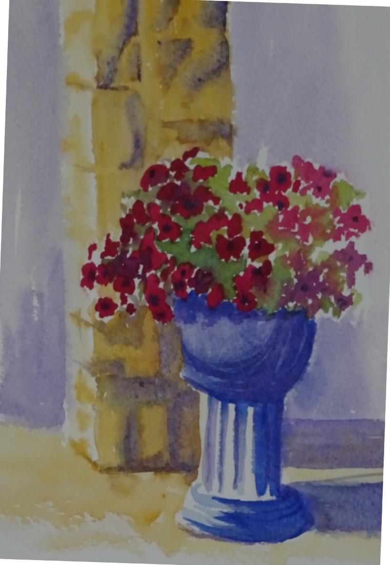
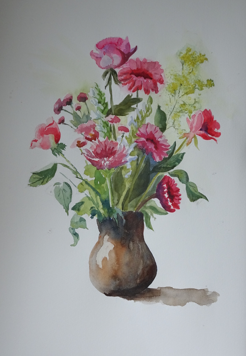
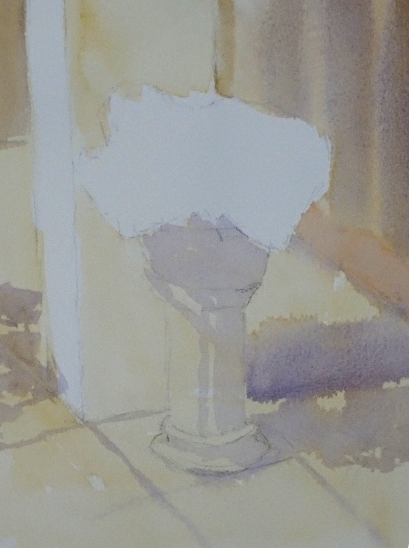
So I tried again.  This time I gave myself a rough outline of pot, flowers and pillar, then ghosted in a wash of yellow ochre with Ultramarine in the shadows. This has defined my painting for me, and even in these early stages reads well.  I should have indicated the shadowy areas on the flowers, but that has just occurred  to me and this stage is long gone.


Next I tackled the some of flowers.  I remembered a small tube of Cobalt Violet I had bought ages ago, and thought it would be a good colour for them.  It’s an opaque colour but the bright colour opaques provide should work. Using it to create massed shapes of flowers, as well as blobs of paint, I approximated what I saw in the photo over the more sunny side, shadowed flowers as thicker paint.  The green, a mix of Ultramarine Blue and Aureolin gave me the complimentary to make the violet tones sing.  There is the odd splodge of Ruby Red  among the violets.  This is very concentrated work so I gave myself some light relief by turning the the pillar and  pot.

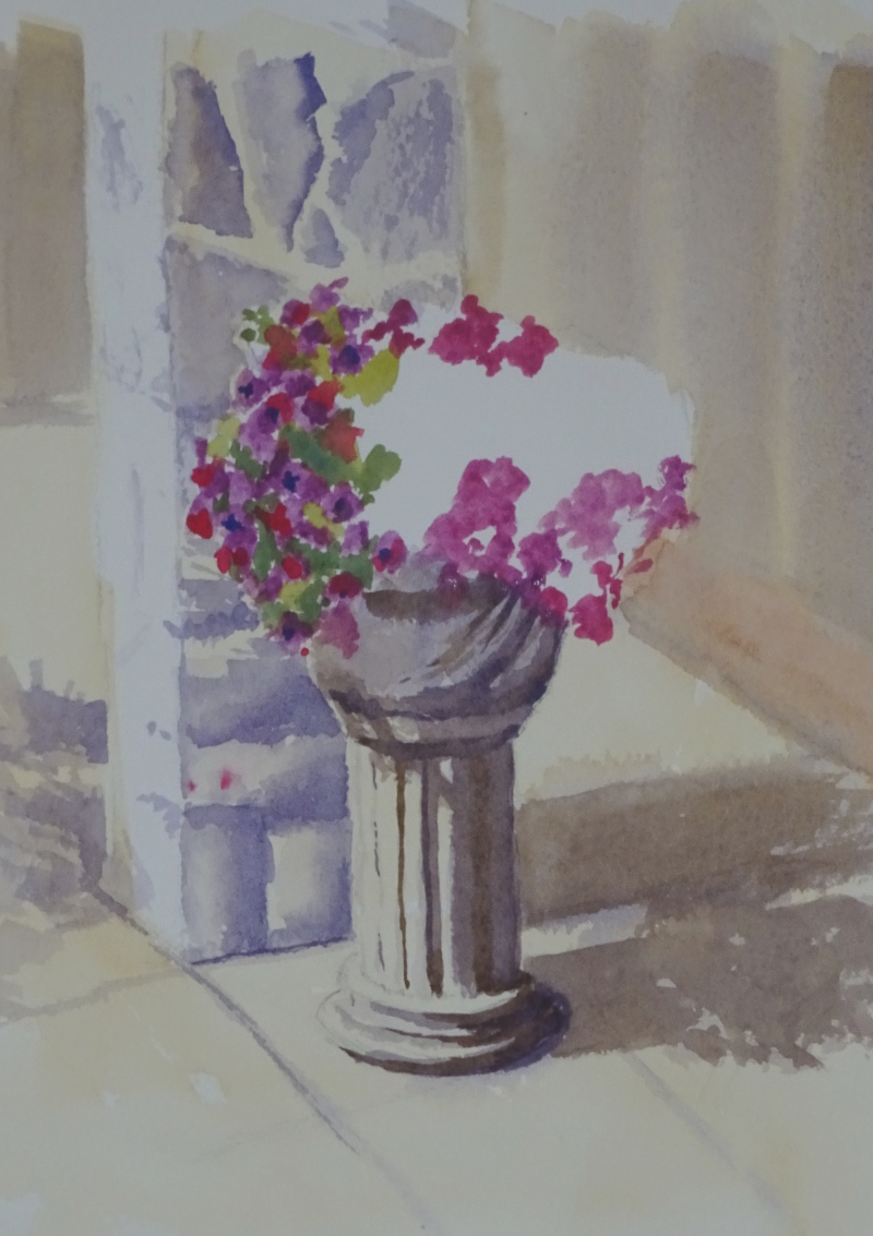
Decision time – how much detail do I put on the pillar?  It’s a creamy limestone, I think, roughly shaped into building blocks, and immensely attractive in its own right.  Side lit, it showed great texture – indeed, it was this that had first attracted me.  I re-wetted the pillar and cautiously suggested the various lumps and bumps in a mix of Ultramarine Violet and Yellow Ochre, emphasising the deeper shadows as the paint dried.  Shadows cast by pillar and pot were darked too.  This passage of painting didn’t seem to overwhelm the flowers so I supported them using the same mix (no blue!) to create the more formal shapes on the pillar and bowl.


A pot of flowers

Something of an experiment, this one – I liked the profusion of flowers, the colour against the stone, but wondered how best to display them.  so there are two attempts fused into one painting.  The colour, after much cogitation and mixing, resolved itself as Ruby Red and Ultramarine Violet, on the left hand side as blobs of colour and on the right as more diffuse shapes dropped into spaces in a green squiggle .  The left hand is nearer to the actual flowers,  but the diffuse side is a bit more exuberant perhaps.

Then I stopped thinking before painting.  The pot was cast cement, white against the creamy stone.  White in shadow is frequently shown as blue, so I painted it using Ultramarine Blue, quite forgetting that I already had Ultramarine Violet in my palette.  I could just about have got away with that if I hadn’t added the pillar behind the pot – in Yellow Ochre.  Blue shadow in yellow tends towards green, too cold for this warm stonework,   so I used Violet.  Now the pot stood out like a sore thumb, its blue modelling vying for attention with the flowers.  I was able to wash out most of the blue and rework it using violet though the blue still shows through.  Thought before action required.

Gone Fishing

As part of my efforts to encourage incipient painting thoughts, I am, as usual, looking to Hazel Soan for guidance.  It was pouring with rain, so I looked through my photos for a townscape with people in it to create a monochrome tonal sketch and found …..  Honestly, trying to discipline myself to follow the path I have agreed with myself is like trying to herd cats.

Colour – I can’t resist it.  Isn’t this a glorious turquoise?    All thoughts of monochrome townscapes fled as I plunged into the deep blue sea.

It’s Manganese Blue – a non-staining, semitransparent colour which I discovered in Zoltan Szabo’s book “Color-by-Color”.  It just sings off the page, orangy-reds being the perfect accompaniment.   Over washed with Viridian for the swell that lifts the shallow boat, still it glows through.  That’s no small achievement as Viridian is not a shy colour.  I’m truly pleased with that wave.  This is letting the brush do the work.  This is watercolour.

So, no townscape; no monochrome;  but perhaps I can claim in self defence that the figures are virtually silhouettes.

A tonal study 2

And finish it I did.  A bit clumsy in places, but maybe I’m nit-picking!

I like the freshness of the Cobalt, a beautiful warm blue.  Dilute Burnt Sienna  on the stonework adds its mite to the glow, while the mix gives me a dark which is not too great a contrast to the other tones.  Working this size is a blessed relief as more recent attempts have been a quarter of this size.    The idea of working small was to relieve the pressure of “making a painting”.  Frankly, I can “not make a painting” on any size of paper ….. it’s a skill I have been developing lately .  So maybe I should stick  to larger sketch pads in future.

This size has allowed me to indicate some of the intricate carving so characteristic of Lisbon architecture of this period.  You have to see it to believe it.  Think of baroque decoration then add more baroque decoration on top!  Every decorative carving is itself decorated.  Even at this size, it’s not possible to show all. Tiny shadows, flecks of light, must suffice.

Erddig Gardens

For our third sketching and painting day we met at Erddig, a country house not far from Wrexham.  It was a bit chill and rainy, but there were plenty of nooks, quite spacious ones in fact, to avoid the wind and showers.  The cars, carriages, bikes, trikes, etc., I decided could wait for a brighter day when the displays would be less gloomy, so I headed for the gardens.  Plenty of greens about, but it was the interplay of structure and planting which seemed to respond best to the uncertain light.

I was happy with the sketch I did in the morning.  I had found a relatively cosy seat with places to put my paints and water and was encouraged to dive straight in without any preliminary drawing.

It’s amazing what you can do if you try!   Brick and sandstone abound here, making a pleasing combination of colours.  I remember being attracted to them years ago when I first painted in these gardens.  The simple structures of these pillars with their distinctive banding got me off to a flying start and it was just a case of working outward from that firm foundation.  Through the gate, the garden was laid in with dull greens and reds.  These receded under the force of the brighter tones before the gate,  neat box hedging topped by a bright green creeper.  A rather shaky gate completes the sketch.  Considering that I was struggling to find the courage to lift a brush two weeks ago, I feel satisfied with progress.


A tonal study

This is an attempt to start painting again by  studying of observational skills, and I think it’s working.  I got the idea of doing this from Hazel Soan’s latest book, “Light and Shade in Watercolour”.  It’s the very first exercise she suggests.

I’ve painted this window before and was not impressed with the result, but this one is going better – not completed yet, but promising.

I’m using Cobalt and Burnt Sienna on A3 Kahdi paper, so it’s quite big.  The intention is to give room to develop the various tones, and concentrating on the relationship of the tones has taken my mind away from whatever was spooking me.  In fact, I’m rather pleased with it,  but I’m even more pleased that I am keen to finish it.


The Zoo again

There were far more children there today than I expected mid-week, but I had forgotten about school parties.  It made seeing  the more popular animals rather  a more crowded experience.

I had taken a few pastels this time to see if it made capturing movement easier.  Certainly, whole body shapes were done in moments.  Thinking about it in the quiet of the evening, the matter of scale is important – using pastels, I should have attempted bigger shapes, easily possible, and also easier to add form and some detail.    My best attempts were a 3 minute elephant and  a two minute buffalo.  Taken as animal sketches, they were just about adequate, but I would have been happier with a larger 10 to 15 minute effort.  So size in relation to medium was lesson number one today.

From about 3.30 pm onwards, as the school trips and families went home to tea, the Zoo became quieter and the animals showed themselves more readily.  Rhinos stood proud on top of the hill,

an elegant crane paraded along the fence,


and the red panda had a good scratch.

Since I have a season ticket, my plan is to drop in about 3 pm occasionally and try for a larger, more careful drawing.

Visiting the Boat Museum

We certainly had a good day for it! – sunny, with a slight breeze, so it was pleasant to be outside for the group’s first attempt at painting and drawing in the open air.

There was plenty to see, and all kinds of intricate machinery, pleasing buildings and boats, of course.   The site is extensive, so the group soon dispersed to find that certain thing to get them going.  I drew a series of interlocking roofs  with reasonable success, then I decided on some lock gates.  There are plenty of them to choose from, but like the lions at the Zoo, no sooner had I started to draw, when they moved, not of their own volition, just a narrow boat wanting to use them.

The angles are all important, and difficult to get right, but the other thing about canals and canal boats is the sheer length of pieces.  Those huge timbers  are twice as long as I’ve drawn them, though I am quite pleased with the angles.

Finding a comfortable painting position took time.  I found standing free to paint impossible, too many things to hold at the correct angle (those pesky angles again), but those huge timbers made a good table.

I was able to make a stab at the canal bridge –  again the boats moved as soon as I was settled!  The painting “reads”, the colours rather subdued considering the bright sunshine. Most of my painting to date has, of necessity, been indoors where it is possible to use which ever technique works best for the image you are painting.  The fast drying conditions needed extra thought – why this was a surprise, I don’t know – if the chosen method was going to be effective.  I had to really slosh the water on to achieve “wet-in-wet” so the page of my sketch book curved, (memo to self – take a painting block next time) but it dried fast so wet on dry became immediately possible.

It was an interesting and educational day!


Flowers again

Have you ever tried to finish a painting from a photograph, that you started live?  Most of my paintings to date have been from photographs, partly from necessity, and partly, (as I have recently discovered) from a lack of faith in my drawing abilities, so I haven’t needed to cope with this.  It hadn’t occurred to me that the transition required a new set of skills.

In using a photograph, I found the background, even though I wasn’t using it,  confused the flower shapes in a way I hadn’t noticed when painting from life.  This doesn’t happen when I start with a photo, probably because I have already mentally  simplified the image at the outset.  Then, there was the colour change.  I “know” my printer produces blued images, but as I rarely use the photo as more than an initial sketch,  I was not awake to the change.  My first attempts to complete the painting were more pink than the initial work.

If at first you don’t succeed ….

and I can’t claim this as success.  How wooden and solid the additions seem!  There is none of the airy, “leap of the page” lightness about them.  There is a lesson here if I can only fathom it.

The Zoo

I took myself to Chester Zoo to attempt some animal sketching.  It was very entertaining to discover how unco-operative  most of the animals were.  It was afternoon, and a warm day, so most of the animals were sleepy, even the more active ones were standing or strolling around. Perfect, you would think.

Well, no.  The sleepy ones were sunk into indeterminate woolly heaps, with no visible arms, legs or head.  I think they had been taking lessons from the hedgehogs.  The lions didn’t, of course.  I came upon the pride stretched out on a sandy patch quite near the fence blinking in the sun, or in his case stretched out on his side.  I set to, but the minute I put pen to paper, he opened one eye, yawned, stood up and flopped down again.  Whether he was irritated by all the people watching him, or  genuinely had an itch, I don’t know but he never settled after that and his ladies were no better.

One of the giraffes was steadily patrolling the side of his house, but I had barely drawn the head and neck, when he went indoors, and all his family with him.  The elephants were shy too.   The onagers were more co-operative, and I managed one or two sketches of them.  There is a theory that you can use other members of a herd to complete a sketch, but these fellows had no knowledge of that.  Nonetheless, I enjoyed the afternoon battle.

The upshot of all this is that I will be taking my watercolours next time – yes, there is going to be a next time – as one brushstroke can say more than half a dozen lines, so I may be more successful.