Where now?

This is truly advancing in the dark!

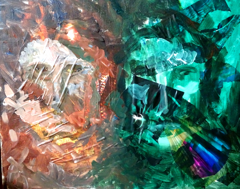
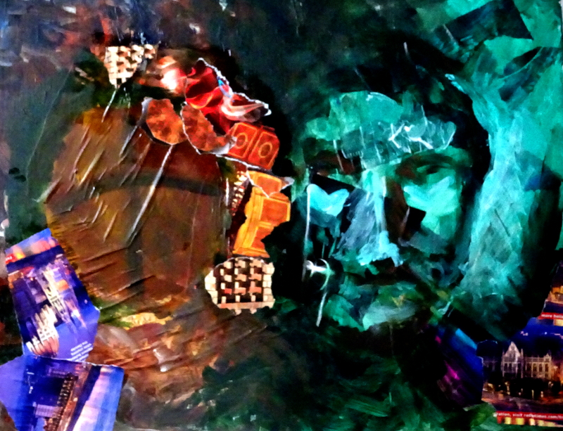
His face seemed reasonable for this stage.  In fact I love the luminous green lights. But hers was less clearly defined.  Unfortunately I found myself resorting to  paint to obliterate the offending passages,so that the carefully placed papers disappeared, and I might as well have just used paint from the beginning.

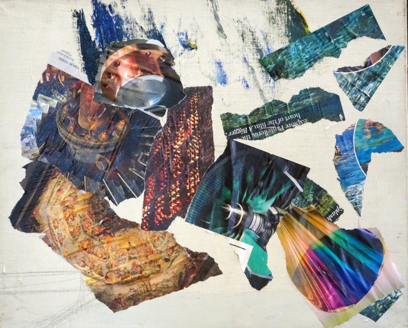
My corrections did not resolve the case, in fact it made things worse.  In frustration, I scribbled my brush over the new work.  That action dredged up from my memory a film about the Flying Dutchman in modern times starring James Mason and Ava Gardner.  He had painted a portrait of her, which she scribbled out with one of his brushes.  The next time we see the painting  he had turned the face into an oval with a contoured cross on it – So I did the same!  An improvement!

I had painted some warm shadows on his face, but felt the need to add more torn paper to recreate the textures in her hair and in the background.

I have to say I’m getting a lot of enjoyment out of this exercise.  Don’t ask what the painting means – it doesn’t mean anything.  I’m not in a dark mood or working out a trauma of my youth (I had a good one, anyway).  And it’s got nothing to do with Hallowe’en.  Just Having a Go!

The enquiry continues

There is a song that goes”I know where I’m going”.  This is not the situation in which I find myself.  I think I’ve stepped off a cliff, and I hope the parachute is going to work ……

2ndStage

……which it has to some extent!  The “warm colours”need more yellows in them and I am losing the luminous effect in that area too.  I may look for more “paper” colours.  I like the effects on her hair.  He is swimming up beside her beautifully.

I think the two sides need to be married together, so maybe touches of warm colours on him and cool greens on her would do it.  I must look at the painting over the next week and cogitate.

A new line of enquiry.

For the next three or four weeks, my students will be wrestling with collage plus.  I hasten to add that this is a new idea for me too,  so how we will all get on is to be revealed as the weeks progress.

I’m taking a double portrait as my theme – part of my plan to know my faces  for “In the sunshine” better. It is also the case that I am using a book I mentioned two years ago “Collage, Colour and Texture in painting” as my guide, and I didn’t want unintentionally to create a copy  of any of the paintings illustrated.   At no point did the artist paint a portrait so I will need to understand his creative thinking rather than lean on what he did in similar situations.

I discussed the layout and how I came to the final design as these line drawing show.  I rejected using portrait orientation as neck and shoulders  would then become part of the design.  The painting  was not seen (in my mind’s eye) as a traditional portrait.  Both images face forward, so my vision was that they will appear at the same level, but he will be darker than her so will seem to recede.

Then we talked of colour, using our recent work on restricted palette as reference.  Again, my thoughts have varied over the two years I have been thinking about the painting.  My first thoughts were to use warm creams and cooler violets, but that seemed a bit sad, so I imagined earth colours with blues and greens.  Finally I settled on earth colours and Viridian as being both friendly and lively.

Tearing shapes of suitably coloured magazine pages I arranged them on the canvas to suggest textures and colours approximately where I expected to find them in the finished painting.  I have no idea how this is going to end …..

More colours

This week we were working with Alizarin Crimson, Viridian, and Ultramarine Blue.  These are big beasts, especially the first two, so the plan was that they would fight each other successfully, ending in a draw!

As you can see, that’s more or less what happened.  Surprisingly, since we all “know” that red and green make brown, Alizarin and Viridian make a beautiful but subdued purple, and of course Alizarin and Blue make a beautiful intense one.  I did the little painting in about 20 minutes, but I enjoyed the result so much that I thought it demanded another go.

I spent a bit more time on this one, and, although no railway buff would applaud the result,  I still like the effect.

I have not forgotten “In the sunshine”, and am quietly drawing trousered legs to achieve a relaxed pose.  Right now his shoes are too big and clumsy, so they will have to come out.  The trouble with improved drawing ability is that last year’s effort isn’t good enough.