Undergrowth advances

It was time to bring the foreground to the same level of finish as the rest of the painting.  In my reference, the dry grass is well flattened but I was aiming for a wilder look.  Doing long wispy grass required some thought.  overdoing the individual fronds would look mannered, and great splodges would look, well, splodgy!

Overlays using different effects, tones and colours is the plan, and this is the first pass.
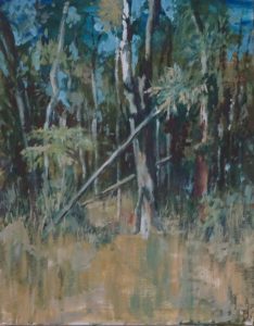
I began with a broad brush, using mid tones of grey green to add depth to the grasses, pulling the brush upwards, and lightening the weight of the stroke as it reached the tree line. Repeating this technique using mid tones of ochre, then paler tones of grey green and of ochre, has begun to suggest the standing grasses.  what you can’t see from this photo is the end of each stroke as the paint just catches the canvas threads as they cross over each other, and the lighter (in weight) use of the same technique among the trees.

I used the same colours and tones on the foreground foliage, and for the odd sparkle among the more dense forest.

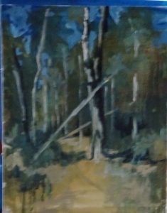
Emerging …

This is the fascinating stage, “fishing” for the picture.  By dint of adding true darks and some lights, the image is called from the background. The underpainting supplies the mystery, while various splodges deepen shadows or splash the light.  It is essential that nothing is created whole, superimposed on the background.  Just by pushing and pulling the tones, the trees leap forward, or fade into view, thereby allowing you into the painting .

It’s so much more exciting than painting trees and makes for a more integrated picture –  concentrated work, especially if one starts without drawing.  With something like this, atmosphere wins over accuracy, so drawing is not necessary.  In any case, being an oil painting, anything “wrong” can be scrapped off or painted out.


I felt the image was a little “cold” so I introduced the Burnt Sienna unmixed with blue on one of the trunks and on the ground.  I also warmed up some of the darks by making them more brown than blue.

The greens in the foreground are quite bright,  but I didn’t want to do them too soon.  More pale, more muted  greens make a good base for brighter colours and add to the variety of tone which in turn adds interest to the picture.  Sometimes I have darkened the background allowing the underpainting to provide the trunks, a great way to create an impenetrable forest!  still lots to do – and I haven’t even started on the foreground yet.

Forest beginnings

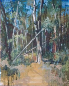
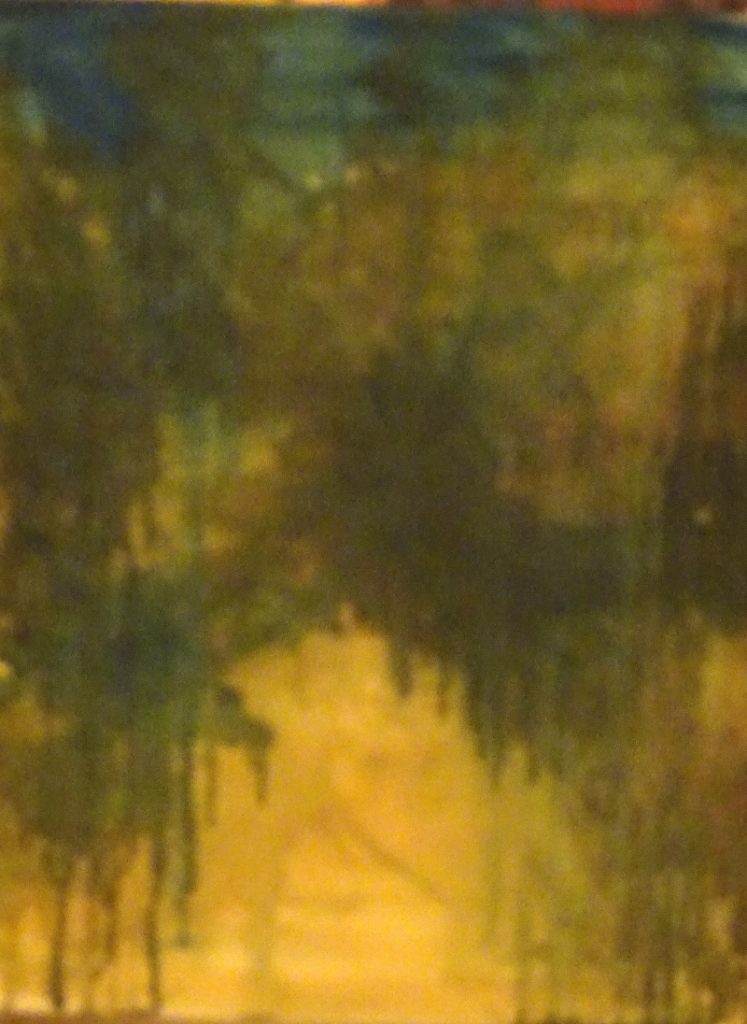
Back to oil painting!  Believe it or not, this is a good start to my next painting –  an underpainting using very dilute oil paint, suggesting the tonal layout of a forest glade near Darwin.  A very user-friendly  part of the forest, I hasten to add, but by cutting out the helpful board-walk, I achieve something a little wilder.

I have restricted my palette to Prussian Blue, Raw Sienna and Burnt Sienna, since these will give me the colours and tones needed.  I may add others later as the picture progresses, perhaps purples and crimsons in the shadows.

Using dilute colour makes for a very loose beginning while giving great intensity to the painted surface.  Any misplaced runs can easily be covered.  Allowing the restricted colours to collide/mix gives texture and interest, and certainly adds to the fun.  Deciding which bits to retain and which to obliterate, discovering  Serendipity in fact, is bliss.

Red desert completed

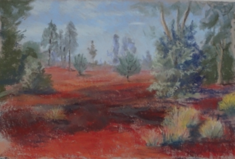
Not a lot has changed since last week, but the added (and subtracted) details have done wonders to the finished result!

As well as the bushy clumps of “grass”  there are occasional spindly grass stems rising to knee height.  They are very thin but their presence – foreground centre and left – seem to push the desert back a mile or two.  Very gratifying.   I think the dark patch is the result of controlled burning some time ago, for the shed bark of the eucalyptus  litters the ground.  Putting it in has anchored the foreground which again helps to create distance.  Finally, I have removed one of the brighter clumps – they were a bit even – and feel that the composition is better for it.

Red Desert continued

Now to introduce some detail.  The initial painting has given me the essential painting, and it is possible to leave it at that.  That feels like the easy way out – insufficient rigour.  Right now, I want tidy up and tighten up, do justice to the huge impression this enormous red desert made on me.  This scene, so near the hotel in Uluru, has far more vegetation in it than we saw on the journey to Darwin,  most of it grey-green or straw in hue.

The air is clear so the distant trees look nearer than they truly are.   The option of a pale grey-green to distance them was ineffective as similar tones on the lit side on nearer trees confused the eye.  I tried mauve but that was too pale, so I darkened them with the very lightest touch of umber.

I have also ironed out some of the “hills” that had appeared in the background, while the left hand side of the painting is showing the trees and the rough, grass-like tufts in more detail .  These last sprinkle the desert so that it is scrub rather than sandy desert.  The bushes in the middle distance really are that strange shape, but not as flat as they appear here.

More to do as there are some light tonal values in the wrong place.  In fact I never know when the painting is finished until I get there!

New project awaits

I took a number of carefully composed photos with paintings in mind when I was in Australia last year and have done little about them.  There seemed to be so much going on in the latter half of the year.  New Year has given me a quiet space to make plans.  Thus I am embarking on a series of Australian paintings based on those photos, with a possible exhibition  in mind.  We will see how they turn out, but more painting will be a Good Thing.

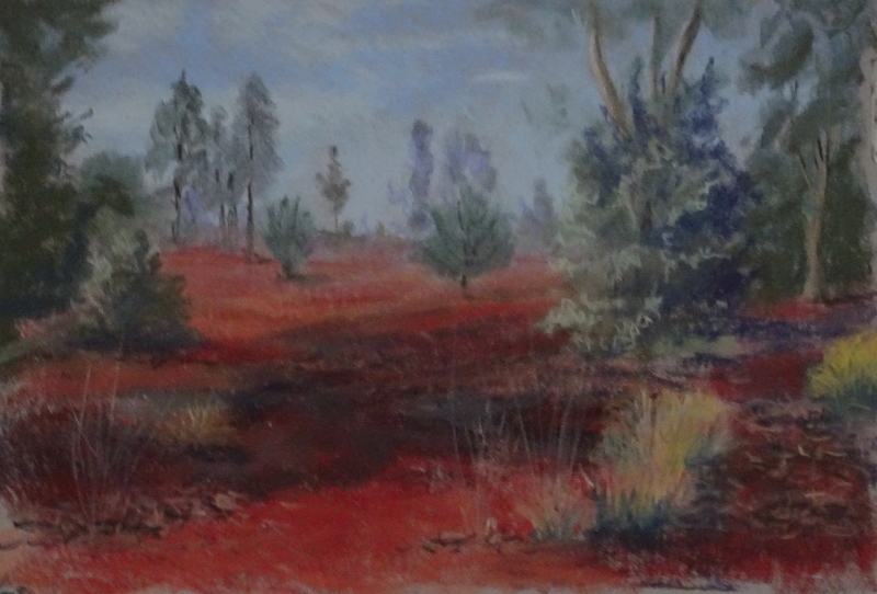
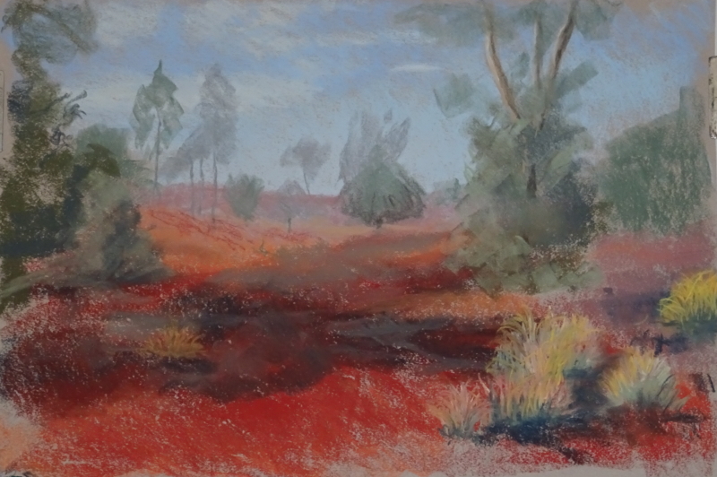
This is the second picture, (remember the Gum trees?) and is of Uluru, not the usual view of the rock itself but rather of  the land nearby, just outside the hotel.

Of course this is far from finished but it does convey the redness of the gritty sands.  It is very difficult to describe how very red it is, or for the mind to encompass the extent  it covers. On this island, we have no single view that lasts for days as you travel through it, nor one that is such a startling colour.

I’m using pastel – I felt it best exemplifies the landscape, and these initial colour washes work well together.  The scene is a bit hilly at present but that can be addressed as I begin to work up the detail.  A good start to the New Year!

Lost in admiration

I’m wrestling with the aftermath of a heavy cold which has left my head full of mucus, and my painting thoughts decidedly stultified.  The best course seemed to visit the past and find a useful painting I can talk about.

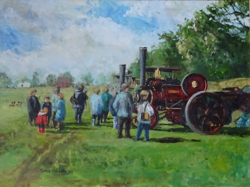
This seemed a good one, on the face of a picture full of interest with splendid machines and a lively crowd.  Actually there are two pictures here and the dual focus is destroying the composition.  The title is “Lost in admiration”.

Just for a moment put your hand over the little girl in red and her friends and family.  Now the focus is on the traction engines and their admiring crowd especially the boy in the white jacket.  Deep maroon paintwork, the sun of the brass and the tyres, the long shadows, the crowd with their backs to the autumn sun, form an agreeable whole, and satisfy the eye.

Now hide that part of the painting and concentrate on the group of friends.  This is a good assembly, people of differing sizes and mutual interest except of the little girl who is “lost in admiration” of the mud squelching round her red wellies.  We focus on her, her red coat and boots, her bright hair, her serious concentration.

We have contending foci and an uncomfortable painting.  This is quite an old painting. Because they were all in the photo, they are all in the painting.  I could change her clothes to green or blue so as to avoid drawing the eye,  –  but I still like it the way it is and since it’s oil on stretched canvas I’m not going to do anything about.

MathsJam is here again!

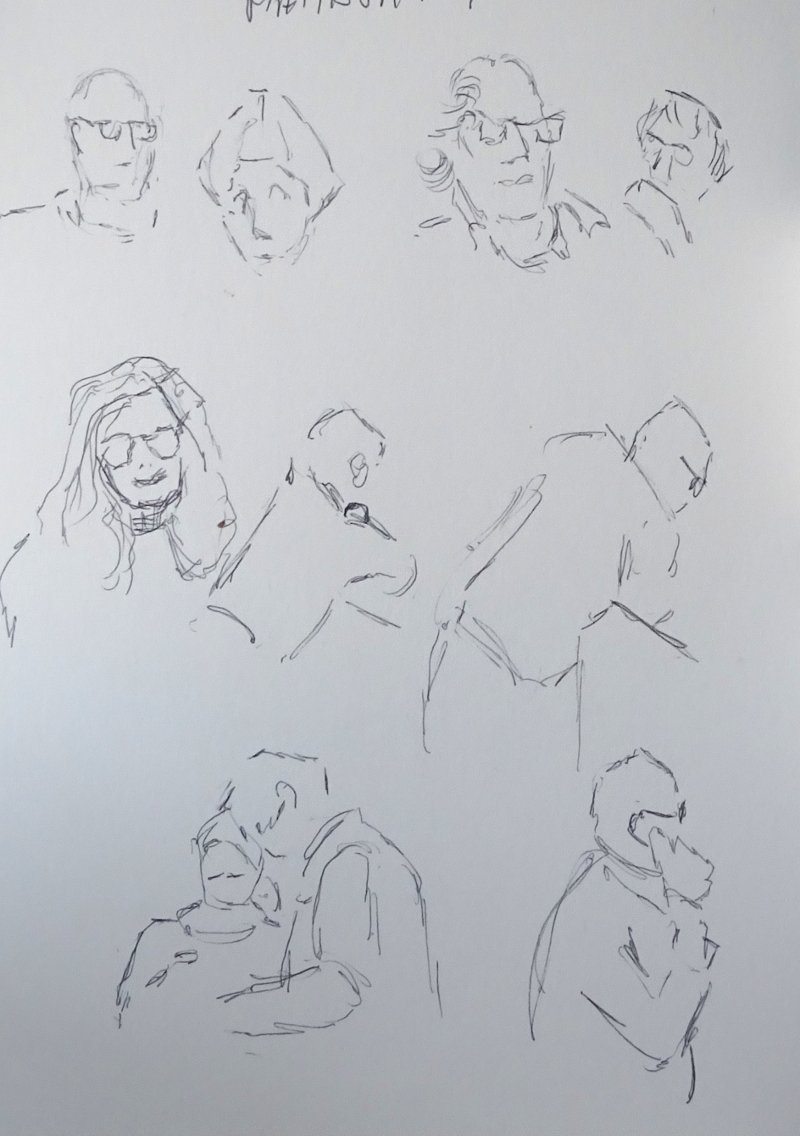
I enjoyed the MathsJam I attended last year, but this year was better.  For one thing it wasn’t as cold outside (and there is some open air walking to be done), and, of course, I knew more faces.   Added to that, the talks, limited to 5 minutes – yes really! – were mostly more digestible for a non-mathematician.  I could follow the argument, though not reproduce it, join in the ever-present hilarity, engage in problem solving.   AND I got eight of the mathematicians , all of them “I can’t drawers”, drawing beautifully.  One of them even displayed lovely free-flowing line! and at least two wanting to know more.  Result.

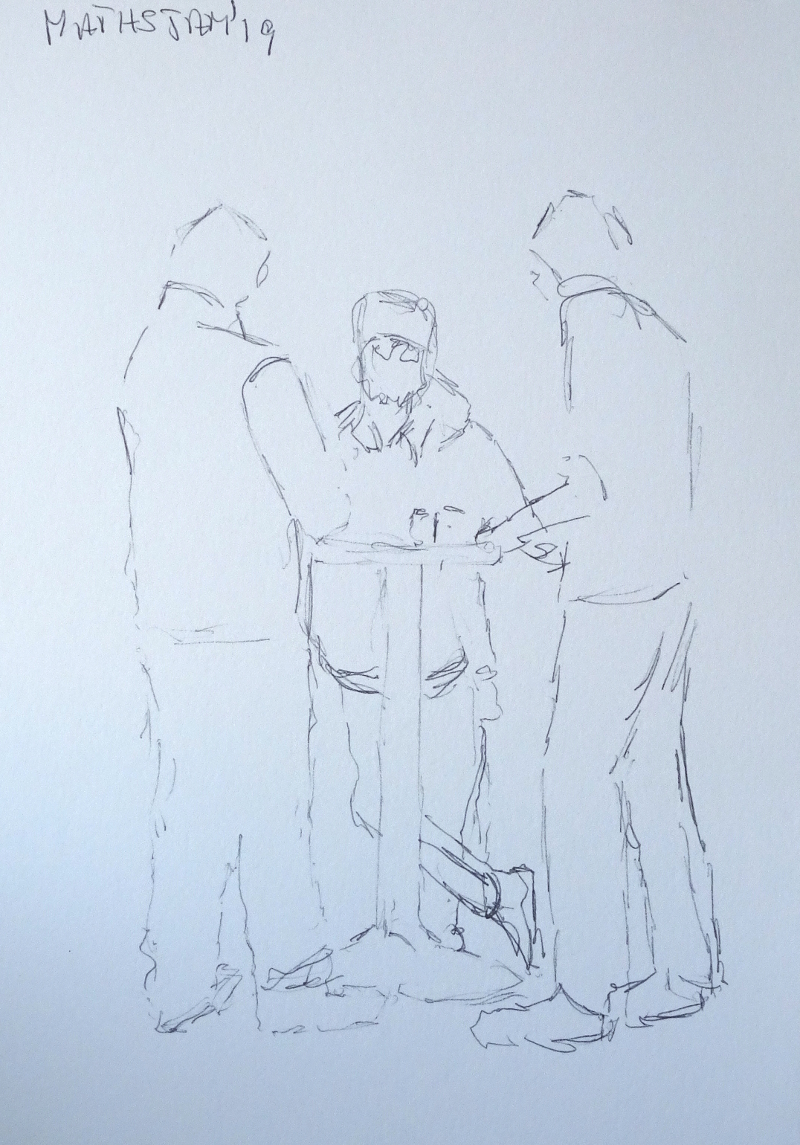
I pootled about sketching people when they were engaged in puzzling, pondering, deep discussion, or just having a good time.   Bottom left sketch on this page is MathsJam to a T; the folk leaning over the balcony had been attracted by jingling bells (there was a Christmas Fair on downstairs).  Since you rarely have more than 30 seconds to get something down, it’s a good exercise in isolating the important lines.  Somehow nearly every time I started a face, someone stood in front of the victim or engaged them in conversation.

I was luckier with this group at one of the stand up tables in the coffee area.  They were very interested in the topic under discussion and apart from restless legs as they got to grips with said topic, they stayed put for five minutes!


More Wow!

Day two, and no let up in the speed of production!

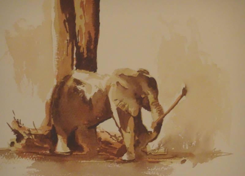
We worked on more Hazel “ellies” as some people had missed out on it the previous day, then we painted this charmer.  The technique was the same but this time we used browns, Raw and Burnt Umber and Burnt Sienna.  A light wash of Raw Umber covered all areas where we didn’t want to retain white paper, followed by Burnt Sienna, then Burnt Umber for the real darks.  Hazel pointed out that these were “lifting” pigments so it was no disaster if we inadvertently put paint where we didn’t want it!  This little elephant was having fun with his stick, and we were having fun painting him.

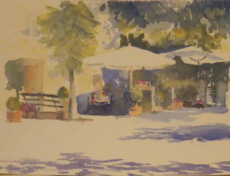
Then life got complicated as we moved on to a cafe scene, with big shady parasols and bright sunlight.  Hazel works her miracles by thinking ahead, and simplifying the scene.  So, you work out which pigments you need to create the painting – most colourful ones you can do by mixing, using three or four colours, though accents of brights might need small amounts of other single colours.  This way you create harmony within the painting, and save yourself from trying to match the exact hue.

First we used Aureolin to show sunlight catching foliage, etc, carefully leaving white shapes, then indicated shadows with Ultramarine.  Any transparent colour painted over that blue will show a darker version of itself.  Touches of pink added sparkle, then shapes and tones in the central area finished the painting.  I understood the principles applied but fell apart somewhat in execution, as my colours became muddy.  More concentration needed.

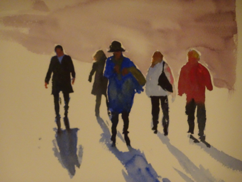
Finally, we essayed back-lit people, again something that Hazel has demonstrated often.  We were running out of time, and I didn’t finish my background, but here it anyway.

I have learnt so much – it’s still swirling round in my head – and greatly appreciate such a informative weekend.