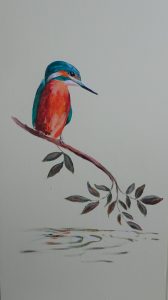
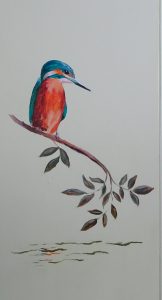
I have a fire screen in my sitting room that I had decorated with a kingfisher(as you do) painted in acrylic. This is the third or fourth incarnation of the screen as it changes every time we paint the walls a different colour. It’s been pale yellow, peach, bluey-green, deep crimson and now lime green. The designs have varied with the decor, gold chrysanthemums stencilled on the crimson being memorable.
This design was free hand, originally done when I was struggling to find the sweet spot in painting, and I was never happy with it. The kingfisher herself was fine but the branch she sat on was just wrong. I’d shown a stem rising from the water, meeting her perching branch at right angle(?!) that then tailed off in an unconvincing way.
Lock down (I prefer “Solitude” as it sounds like I chose it!) led me to the garage for gardening purposes but also provided a tin secreting the remains of lime green paint. Paint out the old and paint in the new.
This is my first try. The awkward branch rising from the waters is gone and the weak end of it now more vigorous. But it looks cramped at the bottom – I hadn’t painted out the water and the final leaf is pointing the wrong way. It is an improvement, at least the leaves have the strength to balance the bird. But the composition is still faulty.
This is better. Compositionally the new leaf takes the eye back into the painting. I think the water is less convincing, but I’m going to stop while I’m winning!
Incidentally, the bird is huge, about 10 inches high, and would frighten the socks off any fish below. But the macaws on the curtains are not trivial and she needed to stand up to them!


Oh, definitely better! And I’m with you about “Solitude”, too – much better than “lockdown”!
It is extraordinary what a marvellous difference just changing the angle of those few leaves has made.
Agreed! Lockdown, lockout, lockin – disturbing.