Pastel – Monte Bianchi

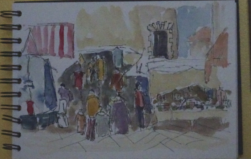
It was so good to see all my friends at the Zoom demonstration.  I do miss our weekly meetings in Holt – maybe next year?

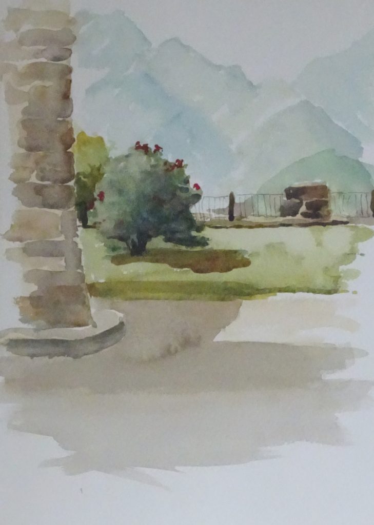
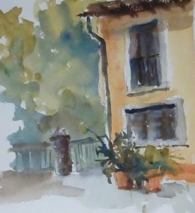
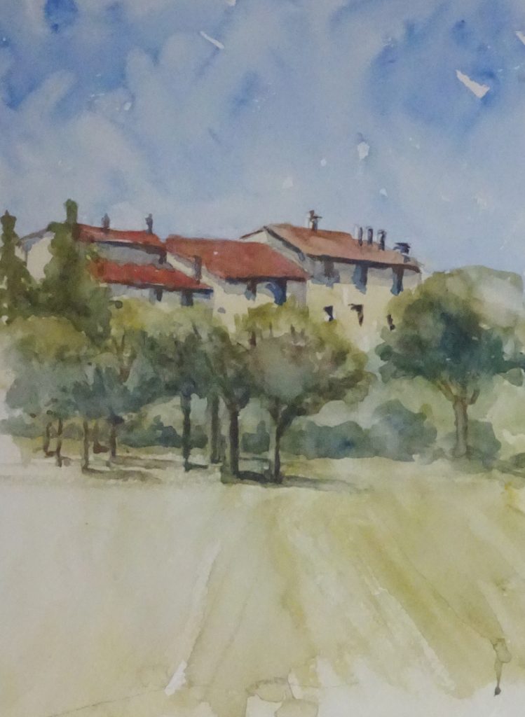
This week I was working with a vertical board, standing somewhat constrained by the camera at my right elbow.

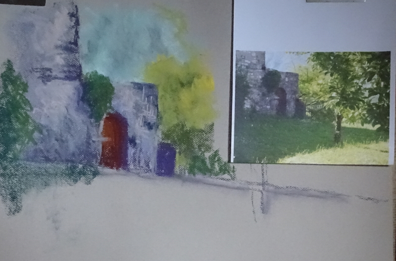
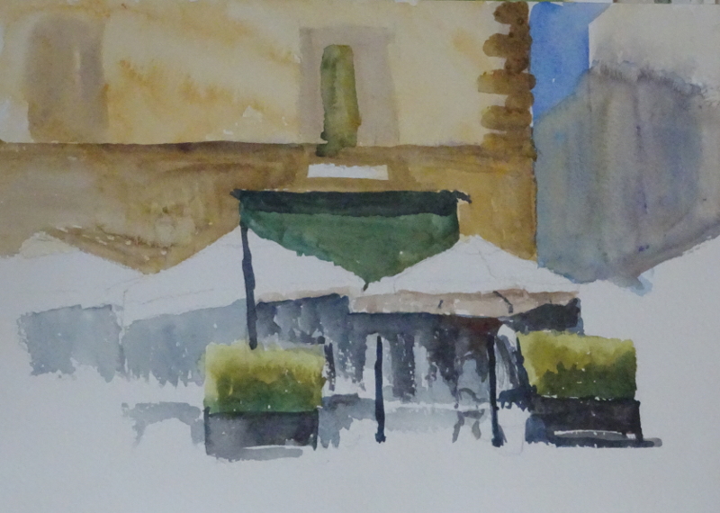
Now I can stand back and assess the result of this stage in the painting, I can see, as can you, from the juxtaposition of the photo and the painting that the tonal values are in the right place so that the picture can be “read”.

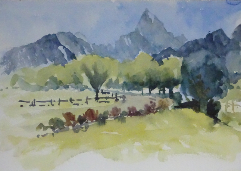
The distant mountain is too close, the colour too bright, too glowing.

I like the purple shadows, though they need to be modified, perhaps towards to blue end of purple, and it needs something warmer still in the lighter areas of the building.  I’m not aiming to match the photo, but to recreate the feeling of the place, mid-morning on a very hot day in a very quiet place on one side of a deep valley.

The strength of the building is there already, and the gentle slope of the hill before it takes a nosedive just over the fence is suggesting the charm of the place.

Italy – final day

We spent the day in a tiny hilltop  village of Monte Bianchi.  It’s very picturesque so the inhabitants are used to painters, and just carried on, greeting us pleasantly but incurious about our efforts.  There were splendid views all round from both  the grassy lawn in front of the church at one end of the village, and the modern hotel and restaurant at the other.

Full of confidence, I went straight in with paint!    It was such a simple view -the distant, tree-covered mountains covered with early morning mist, the grass green lawn with its little tree, then the pillar of the church porch.  We were given 20 minutes to capture this view.  There was a slender palm tree with a mop on top  on the right hand side that would have balanced the composition , but time ran out.

We repaired to the restaurant where we well provided for, and sat in the shade finishing the carafe of wine.  Perhaps that was an incautious thing to do, for we another painting  to do, this time the view from the hotel terrace.

In view of what I have just said, you will understand that this is less than perfect.  The mountains, the trees and the drive are OK, but that large dark green cotton wool ball on the right is not one of my most memorable paintings.

It was a splendid holiday and taught me much.  I don’t think I’ll be going out painting as Autumn and Winter approach,  but I’ll be out there come the Spring.

Italy – Day 5

Today we were whisked off to the ruins of an old monastery, closed down in the 1500s I think, and now privately owned and run as a wedding venue.  The Cloisters were still intact and made a cool and complex place to paint.  Again, they had been opened for us only.  The interest lay in the interweaving of the curves of the ceiling and the patterns of sunlight and shadow.

I think I lost the plot here, as the colours look cold and uninviting.  Painting from life on this occasion gave me a more grey palette than I would have used, had I thought about it a bit more.  Had it been a photo, I would have used Ultramarine Violet as my base for the shadows.   This would have helped to differentiate the blue grey flags in the courtyard, and pillars, too.  The floor was much warmer too, being faded red tiles, some of them whitened with age.    It’s a difficult drawing, though, and I think I won there.


We had a splendid picnic, beautifully laid out in the loggia of the monastery  taking in the sun and the wonderful views, then returned to the Mill  to paint a “personal choice”.  I returned to the river, where the rushing milky water and the exposed pebbles had interested me on our first visit there. 

I’d learnt some sense by this time and the equipment I carried was considerably reduced – my smallest water pot that sat neatly in my paintbox, (I’d taken out the holder for paint pans), half a dozen tubes , two brushes, my watercolour paper pad, a paint rag, and an easel.  I hadn’t appreciated how much I used the paint rag to control the amount of water in the brush, and found a convenient place for it at the top of the easel, both hands being fully occupied.  I enjoyed this experience but had to stop after an hour and a half as my concentration slid away.

More Italian paintings

We visited a town clustered around a castle called Verracola that presented a myriad of painting opportunities.  Mike suggested this view, standing with our backs to the castle with the bridge over the stream/river below us.  You could see this becoming a raging torrent in winter, but the colouring was pleasant, the day was warm, and I had an easel to rest my pad on!

This took the morning to do, and I was beginning to remember technique though still uncomfortable with too much equipment.  The organisation of paint, paint tubes, water pot, brushes,  seemed to be a juggling exercise  though the easel did improve things.  I’m reasonably happy with this painting.  The view through the bridge  needs sorting.  I stopped because I lost concentration.  So I’ve learned two things:  I need an easel, and two hours is the maximum I can paint for in such a concentrated fashion.

That afternoon, after a splendid lunch in a restaurant in Verrucola that opened specially for us, (the outcome of the contacts The Watermill had built over the years), we returned to the Mill to paint a waterfall viewed from the grounds.  This was a very different plein air experience! We trekked through a small wood to the river carrying our equipment.  The footing was unsure for we were standing on cobbles in the river bed.  The easel stood sensibly as the legs were adjustable but juggling everything else (I still had too much!) and doing a sensible painting  took some determination – not easy after a morning’s concentrated painting and a good lunch.  Then it started to rain, and in good earnest, so we retired to the studio.  The trees kept most of the rain off so we weren’t drenched.  The watercolour elves have been at this one, which improved as I slept.

Koala – perhaps

I thought the first attempt at a Koala had much going for it, but it didn’t look like a Koala, so I tried again.

As you can see, I attempted the same loose style.  This is the best way I know for learning how to judge the water/paint ratio.  You start with a mark of strongly toned paint then use water to guide it where you want it to go.  If the mark is in the wrong place, you can heavily dilute it to make it vanish, while the addition of more strongly toned paint will restore or increase the required contrast.  The very visible brush marks add movement  and  continually dampening the edges softens them.

This painting does look more like a Koala, but it has lost the energy of the first attempt, repeated here for comparison.  I know Koalas are reputed to be sleepy animals, though the first one I saw was galloping round its enclosure in a real strop!   However, a painting needs its own energy to connect with the viewer.  This is the perennial problem of repeating a painting.  I rarely achieve a truly satisfying result at the second attempt.  Correction – I never achieve a truly satisfying result at the second attempt.

More Italian Sun

The nearest town, walled, of course, is Fivizzano, and we spent the day there.  There was a fairly busy, fully masked, market in the town square where I did my least successful painting, in fact I didn’t even finish it, not because I was dissatisfied but because I ran out of time!   The photo enhances the painting,  and I will finish it from the photo I took, though that is not ideal.

I discovered I can’t paint happily with my pad on my knees.  I need a wall or an easel as support.  My quick sketch was more lively.  The sketch was done in situ in pen, and the paint added later.

After lunch we migrated to the city walls, and attempted the valley below.  Here I had a wall to rest on so was able to work more comfortably.  It was a difficult view for me with my very young drawing skills, looking down on all those lines and angles, though right up our tutor’s street!  I still found mixing colour problematic, forgetting all my knowledge about aerial perspective, never mind wrestling with the terrestrial kind.   Gradually I dredged up my old skills.  Painting out of doors is not just a matter of turning up and painting the view.  Even the things I do almost instinctively when in the studio have to be adjusted to changing light and unhelpful colourings.  But some kind of satisfaction was achieved.

Italian sunshine

The above diary doesn’t begin to explain the deep delight of a painting holiday at The Watermill in Posara, near Pisa in Italy!  Just seven small pictures chronicle seven days of adventure with brush and paint in the great outdoors.

My purpose was to find out what was needed to successfully paint outside,  and indeed I fulfilled that purpose, due in no small part to the comprehensive but unobtrusive organisation and care of our hosts, and the focussed help of our tutor.    It was a working holiday – there was no doubt about that – two paintings at different sites every day, and the sites so varied, mountains, sea side, villages, cloisters, hill towns, fast flowing rivers.    But such was the level of planning, that the biggest non-painting decision I had to take was whether to red or white wine at dinner, real bliss to be able to concentrate on painting alone.

Day one, and we were painting in the courtyard of the Mill itself.   This is the corner of one of the buildings that surround it, a beautiful golden render (Quinacridone Gold and a touch of Orange) with big shuttered windows.  It was a baptism of fire, straight in, no drawing, don’t spend too long at it – exhilarating.  I did more than one but this is the best of the bunch.

Then, after  lunch, we were up a grassy alley to paint some of the houses of the village.  Here is a longer view, a more considered painting.  I think you can see I was struggling to cope with water, paint brush, paper and easel! In fact, I forgot how to paint!  Colour mixing ideas went out of the window, brush strokes didn’t exist.  Nothing seemed to be where it usually was when painting at home.  It took me a day or so to  realise that I had taken too much equipment with me.    By the end of the week, a big pocket, rather than a big bag would hold most of what I needed.

Koala – sort of!

I have to say, I’m rather pleased with this.  It doesn’t look much like a Koala – the eye is too big for the size of the head –  more of a rat or squirrel with long hairy ears, but the loose style, especially for an animal, is a new achievement for me.  The beast, whatever it is, looks alive!   I’d never have got here if it hadn’t been for the experimentation I’ve been doing lately.  My thanks to Mike Wildridge and Jean Haines.

I started with the eye and sighted the nose from there.  A little modelling to join them up, just light spots of colour whisked away by wetted brush.  Next I tried to define the shape of the head at the top, again whisking the rather darker paint away following the fall of the hair on the ears.  I’ve lost his chin (Hazel Soan: form first then texture, why don’t I remember?) and needed to resort to Opaque White to find his ruff, but it is certainly worth another go.

This is an excellent example of my new mantra, “If you want to paint loosely, you must learn to draw accurately”!


The Ghan

This is altogether a brighter image.  It’s the usual shot of the front and side of the engine, referred to by railway photographers as a “three quarter wedge”.    I’m using paints fairly new to me, Quinacridone Red and Indanthrene Blue.  These are carbon colours, transparent, making a beautiful purple when mixed together.

This time I started with the Engine itself, free hand, straight in with the paint.  I wanted the image to be crisp, rising out of the blur of ground, under carriage and sky.  Then I sloshed in the sky allowing it to blend with the red as it came towards the ground,  thought “this isn’t going well!”, left it to dry and found the watercolour elves had been at it.  It has possibilities, after all.

It looks too much like a bus but the vestiges of an undercarriage will help.  Neither colour alone will give a very dark tone, but the two mixed together at their most intense are blissful.

Working on the dry surface, I tried vigorous strokes of intense blue alone, and mixed with red to give energy to the motion of the train, and completed details of the nose to express the immense height of the beast.

The drawing is not up to scratch but there is some sense of the train arriving at speed.  Certainly I have a painting, not a copy of a rather uninspiring photo but I still haven’t truly understood how to translate such a hard edged image into a painting I’d want to sign.  So I’m going to try a Koala next.


Where next?

It’s all very well to try someone else’s technique, but apart from the fun one should explore it to see what, if anything, one can do with it from one’s own inspiration.  I loved the looseness of the style – the blending, swirling, bleeding,  thinning of the watercolour paint are integral to its magic.

I think in last week’s effort, I tried to define the picture too soon.  The straight line of the water’s edge was too definite, and since it crossed the page from edge to edge, was far too dominant.  The real dominance should be the brooding cloud and the bright sea.  Then again, the lighter hillside was in advance of the darker one, and while that is not necessarily a design fault, in this case, I think it is .  And finally. I think the Indigo needed a bit of warmth added.

Taking that analysis as my starting point, I tried again.  Certainly, start with deep Indigo in the top corner, but instead of clean water  as my diluent I used Ultramarine Blue, again stopping the diagonal flow but allowing the darker Indigo to cross it.  Lots of water near the shore line,  then introduce Manganese Blue fairly strongly in the middle without defining that shore line for its full length.  It’s hard to resist the impulse to fiddle as you can see from the bottom of the painting!    But I feel this is an improvement on the last one.  It allows for the addition of a few details when the painting is completely dry.

Duly added.    I think this is a reasonable result.  I introduced more Ultramarine Blue in the sky and put in the steamer.  I also defined the plunging mountain more carefully so that the lighter one does go behind it.  There is a very fine line defining the shore in front of the boat . The painting is not as dark as the first image suggests so I lightened the photo and this  has enhanced the image!  There’s a feeling of moving towards the light.

I’m going to explore further next week but I’m using one of my photos from Australia.  I’ll look for something less gloomy.