
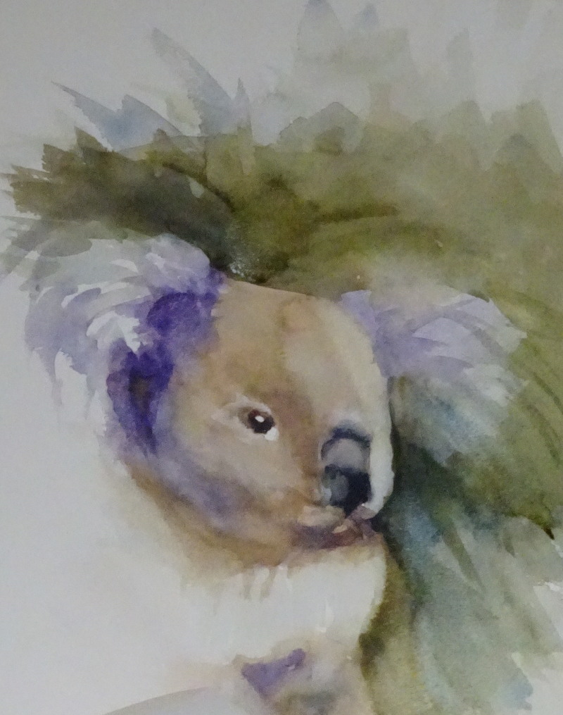
I thought the first attempt at a Koala had much going for it, but it didn’t look like a Koala, so I tried again.
 As you can see, I attempted the same loose style. This is the best way I know for learning how to judge the water/paint ratio. You start with a mark of strongly toned paint then use water to guide it where you want it to go. If the mark is in the wrong place, you can heavily dilute it to make it vanish, while the addition of more strongly toned paint will restore or increase the required contrast. The very visible brush marks add movement and continually dampening the edges softens them.
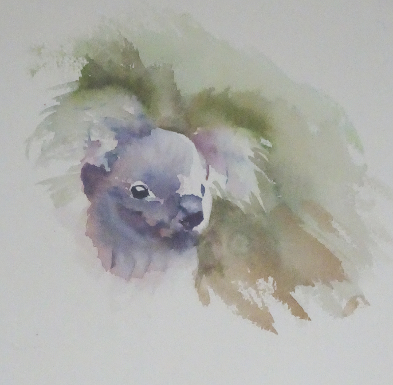 This painting does look more like a Koala, but it has lost the energy of the first attempt, repeated here for comparison. I know Koalas are reputed to be sleepy animals, though the first one I saw was galloping round its enclosure in a real strop! However, a painting needs its own energy to connect with the viewer. This is the perennial problem of repeating a painting. I rarely achieve a truly satisfying result at the second attempt. Correction – I never achieve a truly satisfying result at the second attempt.
There’s a better sense of the breadth of the forehead there, but I agree, there’s slightly less freedom about the marks. Heigh-ho!