Watercolour – back to basics

This term my classes will be looking at very basic watercolour techniques.  I’ve done this in the past, but mostly nervous students revert to painting between the lines as they did in their early years.  I want to see if I can break this barrier so that all my students will be able to use all watercolour’s advantages effectively.  About a third of this year’s group are new to watercolour, so I’m going to work more slowly, consolidating techniques as I go, and encouraging them to assess which technique will serve them best in each painting they do.

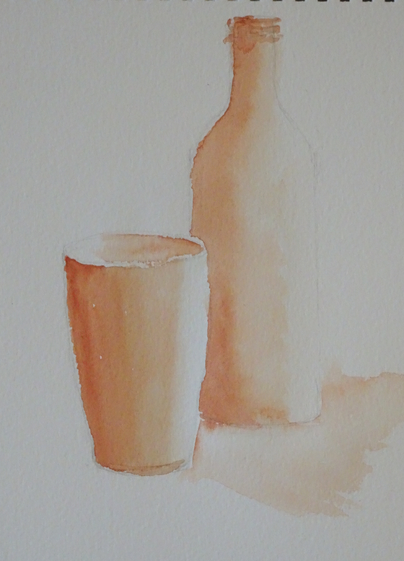
Last week we learnt how to hold the brush (not like a pencil, but more loosely and further up the haft) and how to gather paint into the brush  by twisting it gently in the mix.   We looked at how to create shapes by using differing pressures on the brush, using point and body as needed.  We also created 3D effects by painting the whole object with clear water then flooding in colour so that it crept across the surface getting more pale as it went.   So the first exercise this week is to repeat that.

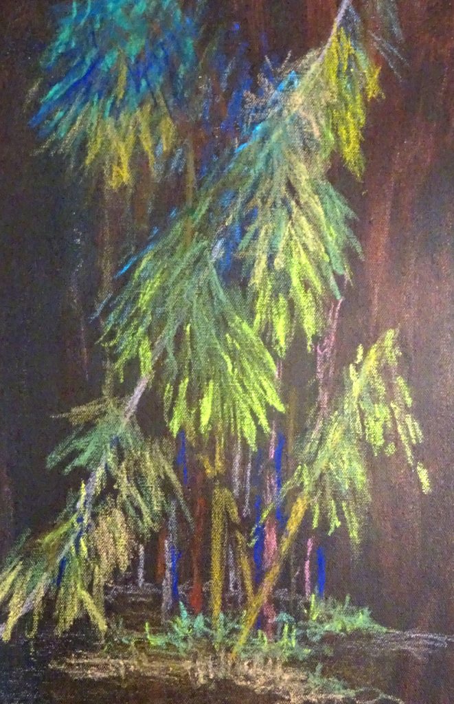
Then we turned to Dry brush and Rough paper.  By loading the brush with 
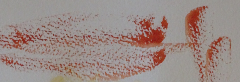
thick paint and moving quickly across the rough page, a broken effect is achieved.


So we tried that out on a generic tree aiming for an airy lightness of texture.  The initial laying of Aureolin does not show well on the white surface, and this ain’t any tree I know but the idea of what “dry brush” can do is there.

Next week we are aiming for a painting incorporating these techniques – big sky, distant hills, a lake, and a tree in the foreground.

Two English Roses

A very early piece from the 1970s – I remember battling with the wall, most of the problems being created by the angle of shot.  At the time it caused much heart ache, though I quite like it a a composition ploy now!

This was a lesson in not being wedded to the photograph.  The white (!) wall ran unchecked by plants in a strong diagonal, effectively cutting the picture in half.  This line was echoed by the dark earth, the even darker fence and the grass.  Luckily my tutor came to the rescue, solving the problems I didn’t know I had.

As instructed, I toned down the earth, the fence,  and grass, and blued the face of the wall so that they all came towards the same tonal value, created two vigorous “Snow in summer” plants tumbling over the ends of the wall, and played up the shadow of the child.  Her anatomy isn’t brilliant either, but I was thrilled with her hair – and I still am.


Tulip time

Just to remind us that Spring is on its way.

A rather free interpretation of tulips in Pot Sunlight – the Lady Lever Gallery overlooks the garden leading to the rather splendid War Memorial.

The building itself is sketched in using shadows create its shape.  It always surprised me how much of a likeness you can get just by painting a few shadows!  Anything more detailed would overpower the flowers,  the focus of the picture.  Using blue helps to push the building back, as does the largely blue green of the trees.

The flowers themselves were indicated by a mid-toned pink wash across the page which was allowed to dry.  Then I introduced  solid shapes made  in dark tones of Alizarin Crimson, some of them touch with blue, by pressing on the heel of the brush for each individual flower head.  Bluey green leaves and stems, randomly connected to flower heads provide the foliage.  There was an underplanting of forget-me-nots which I created by speckling blue paint using my finger running over an old toothbrush charged with a fairly thick paint.

This was something of an experiment at the time – an exercise in minimalism.

Another blue fan

One memory provokes another – this image, in true colour,  is from the same photo sequence as the last post.   Again, the dancer is poised momentarily in the dance – I must look up these photos again and try for some more of the action shots – so we can appreciate the long line of the pointing leg,  and the arrogant tilt of the head.  The fan is deployed, fully opened, to half-hide the nose and chin.

I have suggested, rather than defined the base of the wall.  This is one of those situations where a definite line would be too much information.  We know that people stand on flat surfaces and that walls rise behind them so there is no need to put them in.  Indeed such definition would draw the eye from the head and shoulders, where the burst of light behind her and the strong blue fan create a focus.

The great swirling skirt, firmly controlled on her left arm, provides wonderful soft folds created wet-in-wet, deep tone contrasting with the light catching the skirt over the extended leg.

The Blue Fan

I was looking for a watercolour to show you, since my painting performance is still under-functioning, when I came across this one.

My friend, responding to my request for dance movements to photograph, delighted me by performing flamenco, a discipline she knew well.  I was also lucky enough to attend the class she attended, so I have a wealth of images both of single dancers and of groups.  This particular dance contained a number of still poses where only the feet were in motion.

Just two colours were used to create the image, Ultramarine Blue and Burnt Sienna, quite enough to mirror the concentration of the dancer.  I began  by making a light outline sketch to isolate the shape, then wet the background only, flooding it with blues and browns.  Thus the highlights became immediately apparent as I worked on the figure.  A pale Burnt Sienna sufficed for the face and arms, shadow touched in  while the paint was still damp.  Using that shadow tint, the lower bodice and skirt were indicated, the rich deep mix of my chosen colours added wet in wet following the sweep of the material, and the shape of the hair.  When all was dry, Ultramarine Blue gave me the fan and the flower in her hair.

It’s good sometimes to contemplate past achievements!

More sunshine

Due to circumstance, I have not raised a brush since the end of November.  So I am using another painting from a few years ago as the subject for discussion this time.

This is another pastel – the drifts of colour are so appealing – of the ice house at Erddig, near Wrexham.  The shadow of the building in the foreground and the building itself frame the sunlit decorative kiosk and garden, concentrating attention there.  Most unusually for me, the focus is right in the centre of the painting.  There are diagonals but they all lead to the centre, and it is only the strong verticals of the trees  which encourage the eye to roam.   When I painted it, I was not aware that a central focus is difficult to pull off!  But I still think it is a satisfying composition, so my blissful innocence has not come back to haunt me.

It’s painted on velour paper which takes colour easily and makes  “lost and found” edges to easy to attain.  The warm greens and reds near the little house  ease out to the cooler greens, blues and browns.


Watergate Row, Chester

Just a reminder that the sun does shine!  Often strong sunlight makes for entrancing shadows, and this picture is really all about the shadows cast across the pavement of the Row.

For those of you who don’t know Chester, the Rows are walkways, sitting on top of the ground level shops, that have other shops opening on to them – highly convenient in wet weather but also useful places to sketch and paint in summer time too.  The sun is shining almost directly into the Row, and it’s the “almost” that makes the shadows attract the eye.  We have busy diagonals, the row edges and the shadows crossing each other again and again, all adding up to an active painting.

Looking through the open side of the row, you can see the other side of the street, shaded and painted in undemanding colour.  Most of the area within the Row is painted in dark tones, so the brightest tones are the girl’s trousers and the tops of the bushes.  It is the strong contrasts of tone highlighted with a few splashes of bright colour that tell you it’s a hot day.  Though the foot path is actually grey, but by playing up the sunlight using cream and creating the shadows on it in a complementary mauve,  I have made the day even hotter.  Memories are made of this!

Sketching

I attended MathsJam 2018 (mathsjam.com/gathering/) recently and thoroughly enjoyed the event – my companions were friendly and inclusive and the talks were fascinating, entertaining, puzzling (there were a lot of puzzles!) though many, even the entertaining ones,  were beyond me.  I gather that nobody at the event understands all the talks!

It had seemed a good opportunity to try sketching “in public”, an extension of my efforts to improve my drawing skills.  In fact,I did not  spend much time at it but was quite pleased at the results.

People move, of course,and images are jumbled.

I became interested in the lines and angles of corridors, pillars and stairs.

More people!

Bamboo continued

This week, having discovered a way of getting bright colour,  I continued my painting of bamboo.  I think it is growing well and now has more depth.  I am also becoming very aware of the difference between my two sets of oil pastels, one being rather greasy, giving dull colour and attaching to the surface in patches, and the other more crumbly, giving bright colour  and good attachment.  As always the quality of the equipment affects the quality of the work.

The blue stems are too bright – the intention was to have them fade into the background implying depth!  There is  light catching the edges of the foremost leaves, though the shapes of those in shadow needs more definition.  I haven’t tried using turps yet.  I may find the less crumbly set works better that way.

Another way forward may be to use the oil pastels in conjunction with acrylic underpainting, using them to add texture and definition after more exuberant brushwork.