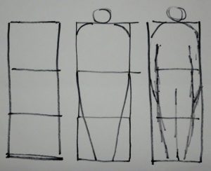
I was delighted to find an article in this month’s “Leisure Painter” about putting people in paintings. Somehow a person, however sketchy, near the focus of your picture, maybe going towards it, helps the viewer be in the scene.
Stephen Coates is the painter and author of the article, and his very simple construction has helped those of my students who were really struggling, to draw people effectively. I think most people know that carrot shapes make effective people, but he refined that idea. First he gave four rules for vital statistics. These are for “generic person”, some unknown person, male or female, walking down the street, but would make a good starting point even for a more detailed drawing.
So – the width of the shoulders = a third of the headless height;
the width of the head = a third of the width of the shoulders;
knees are a third of the body ‘s(headless!) height from the ground;
and the groin is about halfway up the body (see above).
But here’s the clever bit – if you sketch in three attached SQUARES arranged vertically on the page and draw your blunt-nosed “carrot” to fit the shape, you have the beginnings of your person.
 The rest of the article goes on to describe how to make this person walk, etc. It’s a great read, and if you are struggling with people, that article in “Leisure Painter” will certainly help. Just remember to make squares, not rectangles!

It’s astonishing how little you need for the brain to fill in and turn into a “real” person, isn’t it!