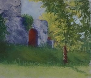
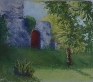
One of the advantages of a demonstration painting taken over two or three weeks is that the enforced separation of painting periods allows for quiet contemplation of progress or its opposite.
I was able to see the square tree mentioned last time but also how little grace my tree had compared with the original. There were also some things to insert, like the railings, useful to break up some areas and to send back even brightly lit ones.
 The grassy area had been started with a bluey green which was at variance with all the other greens in the painting. As I wanted, by this time to cover the paper well, I pushed some warmer greens in on top of the blue, the two blending to give a warm dark. The line between the shadow and sunlight on the grass was too definite. Again, very thin wavy lines suggesting long seed stalks softened it.
Strong patches of dark greens, strategically placed, began the bending of the tree. These had leaf like marks both on them and falling from the edge, giving variety of shape and contrast.
I was a bit unhappy about the line of sunlight straight across the page so I inserted a fictional plant. I think it makes for a better composition.
 I agree that this introduces a diagonal, but this one has a purpose, and is blocked by the bush so that the eye is directed into the painting. Similarly, the shadow of the trunk also directs the eye towards the door. The original diagonal in the photo did no more than cut off the right hand corner of the picture.

The bush made a huge difference, didn’t it!
It now entices one into the picture to explore.