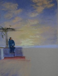
When faced with a containing image like this – all the action is under the pergola – the instinct is to draw in the pergola first, so as to set the parameters of the image. The same thing happens when the image is a vase of flowers. You put the vase in first. I don’t advise it! It is actually a very unhelpful thing to do.
The focus of the picture is the people (or the flowers), so you start with them and show only as much of the “container” as you need. If you do this you will find your picture comes under your hand more easily.
 I was interested in the negative shape between the figure and the pillar, so my first mark was the lower part of the pillar. The pillar base and his behind gave me the top of the wall, thence to his legs and the small step he has his feet on. These are strong marks with no attempt at modelling. There is light around but he is practically in silhouette. His height gave me the height of the pillar and the beginnings of the pergola. I have lightened the spar that is further away to lessen the impact of the two very straight lines across the paper, and “grown” the wisteria a little bit which also breaks up the line.
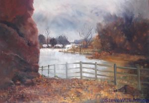
The very bright sunset will be framed by the figures, as his three friends are close to the other pillar, taking his photo. I intend to lighten, indeed may only partially insert, the spars of the pergola as they cross the bright sun. Looking directly at a bright light can have that effect, and it’s a useful way of dealing with a fence, wall, or hedge that is blocking access to the painting. I’ve done just that in one of the Bridges, the Holt/Farndon bypass.


This is an extremely helpful lesson in how to cope with difficult situations where the wrong decision about the focal point can destroy a painting’s composition. Your plans for how to stop the pergola being a dominant feature and spoiling the sky sound perfect.
Yes, I can see that it would be all too easy to put the pergola in (too dark, probably!) and then squeeze everything inside. This way, everything remains connected.