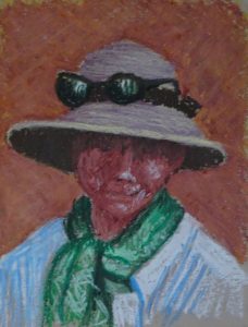
 I was quite taken with the effectiveness of the directional strokes in the last painting and they led me naturally to Vincent Van Gogh. I’ve attempted to copy his painting of the old peasant in his straw hat and blue smock twice, once in oils to try and work out how he painted (there is such vigour, such vitality in his brush strokes, and it’s not so easy to do as it looks), and once in watercolour (!) as part of my Meander Treasures (September 2017). And I had a photo of A Hat …….
This is yet another example of so little saying so much. Like Van Gogh, I have eliminated all background detail, and attempted no variation in tone either, the perfect foil for a simple image. The hat and sunglasses, face, scarf and blouse are all simple shapes in block colour. A warm, browny-red background thrusts the figure forward and sings beautifully with cool greens and blue/white. Lilac cream hat and green scarf frame the half shadowed face. Despite the eyes being lost in shadow (I didn’t even attempt them), there is no doubt she is looking at you in a friendly fashion.
The counter-change, the contrast of strongly dark and light tones invest the image with a presence of its own. It ate up a lot of oil pastel, but I’m not repining, for I find to my surprise that this is a good medium to work in.

Yes, even though her eyes are shadowed her mouth is smiling gently. She approves of your technique.
She does, indeed! Oil pastels seem to have struck a chord this time around…
The strange (and pleasing) thing is how clearly I can see the eyes she hasn’t got! You have caught the iridescent sunglasses well too. That can’t have been easy.