The threatening storm

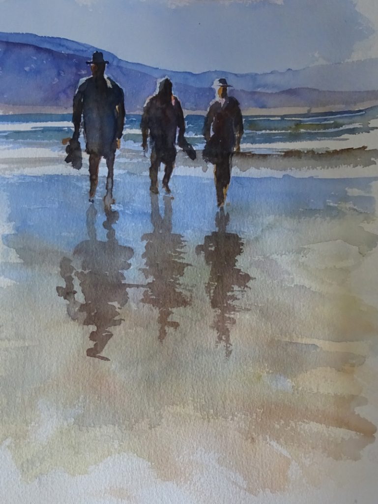
This is fun, just the job for a rainy afternoon.  It’s a bit of a mash up, derived from the third and final painting in the watercolour class and  from a DVD I have by Jean Haines, “Watercolour Passion”.    Both tutors were using very wet paint,  Mike to create an atmosphere and Jean to loosen the mind and hand/arm in watercolour exercises which might, or might not be useful later.

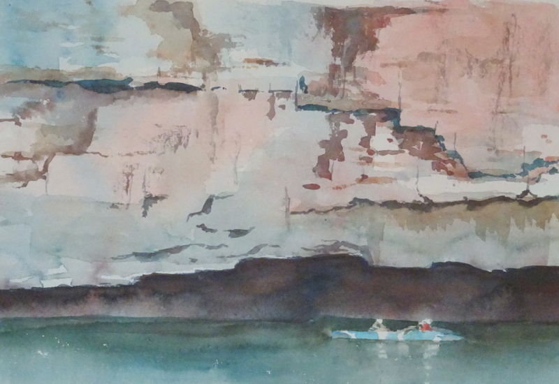
The image for the course painting was of Milford Sound in New Zealand, with steep slopes and lowering clouds, a bright sea and a small steamer.  Mike was mixing his colours on the palette to achieve his vision, but Jean’s use of intense neat colour in the presence of copious amounts of water appealed to the colourist in me.

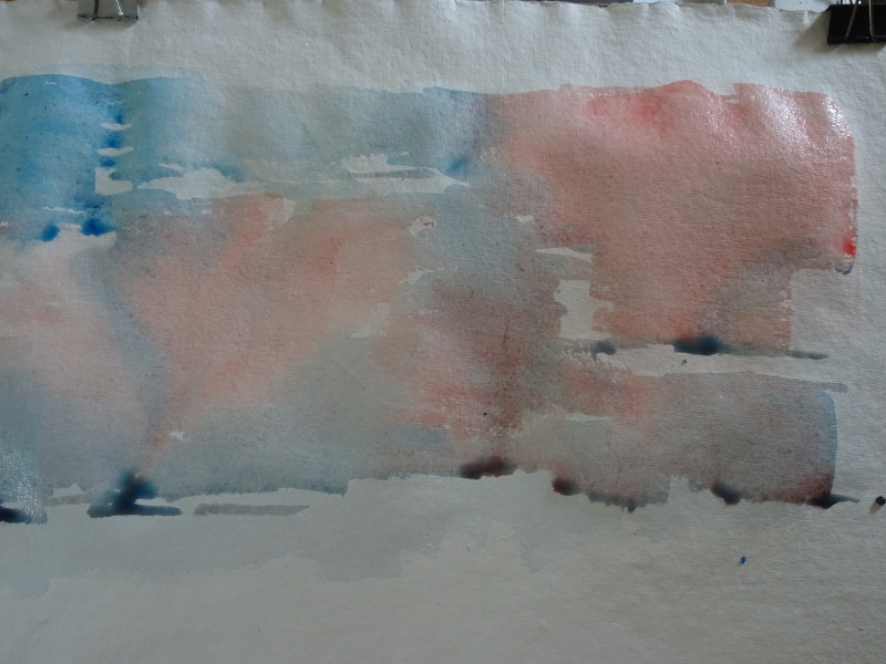
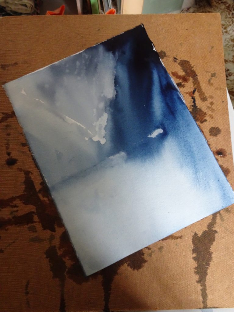
I set the board at an acute angle about 45 degrees, and the paper at an angle on the board, as you can see.  The intention is to encourage the paint to run diagonally down the paper.  Using my squirrel mop, I started in the top corner using neat Indigo,just a few strokes fanning out.  Then I loaded the cleaned brush with  clean water stroking some at the edge of my paint strokes and some in the dark wet Indigo so that it ran in varying strengths but always diagonally.   I had a picture to paint (!) so I stopped  the careering paint with a stroke of clean water in the opposite direction defending the dry paper behind it which  later had pale colour added.   About half way down the paper I needed to make room the sea,  so I laid a piece of clean cloth across the paper and mopped up the excess water.   I laid damp brush strokes of clean water across the sea horizontally, letting the mountains bleed a bit.  I did enjoy that!

Let it dry thoroughly.

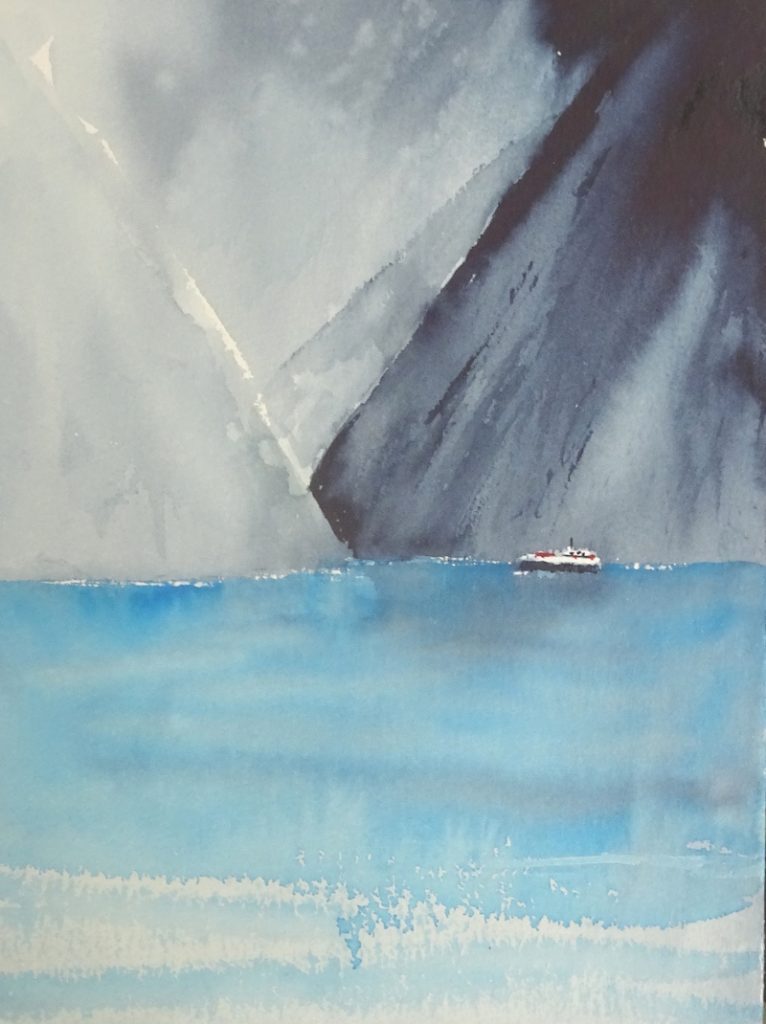
I used Manganese blue for the water, turning the paper to an upright position and using it quite intensely near the mountains, adding water as  I  approached the bottom of the paper.  At this board angle you don’t get cauliflowers!  Some dry brush strokes added craggy detail to the mountains.  Again let it dry thoroughly.   Finally I put in the steamer to give scale to the mountains and give humanity to the painting.  Though it’s not a masterpiece, it was exhilarating.  I think I prefer stage one to the finished result.

Waterfall – Brecon Beacons

This is a very busy scene with three waterfalls, a dark cave, spring sunshine and a very rock-strewn stream.  This is my third attempt – one, a disaster, two, Disneyland, three, flattered by the photograph!  From choice, I would have painted this in pastel, either soft pastel or oil ones giving help to the many textures.  But it was the subject of my second Zoom lesson, so watercolour it had to be.

In this one, I began with the sunlit rocky hillside, dropping in the ochres, siennas and muted greens.  Then I introduced more detail with stronger versions of those colours and finally laid in the darks to give form.   On the cave side, the introductory washes were darker, as you can see on the nearer rock face.   After it had dried, I re-wet the part where the cave was going to be, being careful to give a crisp edge on the right hand side.  At that point I dropped in very strong Indigo, letting it bleed into the wetted area and introducing Burnt Sienna, then Raw Sienna as the paint moved to the  left.

At this stage I thought I was heading for Attempt Four,  but before I despaired, I put in the water, and life got better.   The form of the central rock went in using ochres and Ultramarine Blue, the exposed stream bed  being muted tones of the same colours.  Dry brush strokes gave depth to the falls, and I will admit to white gouache to save the day in places.

Painting with Zoom

For the next three weeks I shall be attending an on line watercolour painting course on Zoom.  It’s always interesting to see how other artists tackle a subject and I wanted to get to know the teacher, or at least learn something about his methods, since I will be attending one of his courses in person soon.  That will be about “painting outside”, something I have very little experience of,  as circumstances have dictated that I work mainly from my own photographs.  It turns out that he paints very like I do, which means I only have to cope with “outside”!

Teaching via Zoom requires a different approach to face to face lessons. For one thing, he had 100 students from all over the world, some painting after a day’s work, and others up before breakfast.   Some were absolute  beginners while the rest had varying  painting skills.  With this  set up, the usual demo followed by personal advice as class members work at their own paintings would be impossible.  In the event, he painted a passage, then the students essayed the same (we were all working from the same photo). Then we proceeded to the next passage.

As you can see, it is a fairly simple image of three figures on a beach, backlit and with reflections on the watery shore.  We started with the sky and the distant hills, working through the sea onto the wet sand in the foreground strengthening the tones at the second pass.  The figures are virtually silhouettes, the light catching the shoulders thrown up by the darker background and the silhouetted shapes.  the reflections were placed on a damp surface.

The inevitable start-stop nature  of the lesson took some getting used to both for him and for me.  Working to someone else’s brief was a useful experience.  Next week we are painting a waterfall.


Back to oil painting

I’ve returned to oils for this painting.  It’s a view of the Yarra upstream of Melbourne and is the type of scene I enjoy painting in oils.

It never ceases to amaze me how much you can say with a  mishmash of colours and tones and stroke directions.  I do like to get the picture on the canvas as  soon as possible for after that,  you are only pulling out detail and refining strokes.  This took all of 15 minutes.    It is ” hold your breath and concentrate hard” sort of stuff.

The trees and bushes are laid in with scribbles of paint matching the tones in my source without worrying about what they represent, aiming for as much variation in colour as I can find, dark over light and vice versa.  When I arrived at the water line, brush strokes became strictly vertical, echoing the colours and tones above without being too pedantic about it.  Then the bright reeds and a couple of tree trunks were sketched in with a turpsy rag.  Reflections of the sky do strike across the water but that’s for a later date.

The secret is to be as loosely accurate (!) as you can with your tones.  You don’t have to be precise about the shapes of the tones, but they should be, broadly speaking, in the right place!

Canoeing – Katherine Gorge 2

The water makes such a difference, providing both context and contrast.

You can see the depth of the overhang and the scale of the cliff in comparison to the canoeists.  The overhang casts a very strong shadow, the counterchange with the cliff making it appear even stronger.  The water is in shadow too, the only relief there being the canoe itself.

The palette is very restricted, only Prussian Blue and Cadmium Red, their pale presence visible in the cliff face.  These two, mixed richly together give a vibrant black.  Dilute the mix and you get varying greys and browns.   The river was created by wetting the area, avoiding the canoe and people, then adding a strong Prussian Blue stroke where it meets the cliff.  The Prussian Blue bled into the watery glaze, lightening as it went.  Just before it dried, I ran strong Cadmium Red into the Strong Prussian Blue, that bled just enough to blacken the area under the cliff, but not advance into the lighter water.

Canoeing – Katherine Gorge

I’m back in Australia, where I was a year ago today, though this scene is from later in the holiday.

Part of the holiday was a train ride on The Ghan – my bucket list isn’t very big, but this trip was definitely on it.  We started in Alice Springs (see “the Red Desert” from January of this year) and The Ghan took us North, eventually  to Darwin.  On the way, we spent half a day gliding down Katherine Gorge, cool on the water.  Lots of Geology! and here is some of it.

I love the colours in the rock, this sheer cliff face faceted and patterned, crying out for watercolour.  I had an idea that the myriad undercuts would work well using the deeper colour which gathers at the base of a stroke as the defining technique.

As you can see, the idea had merit, but … there is always a but! I left the piece to dry unattended, the paper cockled, and my beautiful undercuts cauliflowered, every one.  “I think I’d better think this out again.”  The answer seemed to be to put in the deep undercuts by hand and run a wet brush underneath them when they were damp but not watery.  I hope that description makes sense.  It  probably will when you see the next photo.  Then I used dry brush to indicate the lesser variations .

If you look just above my painting you will see the photo I’m working from.  At the bottom of the painting you can just see the shape of the two canoeists passing a very deep overhang, and the water itself is still to come.

Sunset, Lisbon

The pergola does not dominate as I had feared it might.  Many things have contributed to this – the lamp , the wisteria, the clouds rising up from the sunset, and the faded central section, the strong tones of the figures.   There is a friendly atmosphere, the phone cameras make it very contemporary while the pergola and ornamental lamp offer an anchor in the past.

I’m not sure this is finished – a few more tweeks, perhaps, but nothing that materially alters the painting. Photographs can help one to see indiscretions that are missed in a bigger picture.   There is another option, of course, which would be to really go for the detail.  The wall tiles are beautiful, as is the characteristic paving of small stones.  Maybe pastel is not a good medium to use that way.

His friends

As you can see, his friends busy photographing him with their phones, have arrived.  If you look closely, you can see another person just beyond the group also busy with a phone.

First, I estimated how far the second pillar was from the first and drew a light line.  The top and bottom of the wall can also be indicated.  Then I wiped a line in the pastel with my finger to suggest where the spars of the pergola were.    That sited the group with the first girl half hidden by the pillar and the others in advance of her.    These figures have been sketched in and the walls extended.  There is a lovely curling wisteria to put in, climbing the  new pillar from this side of the nearer wall .  It has a lot more greenery on it, while beyond the far wall and to the right of the new pillar you will see the tops of bushes.  All these thing break up the very definite lines of the structure.

Sitting on the wall

When faced with a containing image like this – all the action is under the pergola – the instinct is to draw in the pergola first, so as to set the parameters of the image.  The same thing happens when the image is a vase of flowers.  You put the vase in first.  I don’t advise it!   It is actually a very unhelpful thing to do.

The focus of the picture is the people (or the flowers), so you start with them and show only as much of the “container” as you need.  If you do this you will find your picture comes under your hand more easily.

I was interested in the negative shape between the figure and the pillar, so my first mark was the lower part of the pillar.  The pillar base and his behind gave me the top of the wall, thence to his legs and the small step he has his feet on.  These are strong marks with no attempt at modelling.  There is light around but he is practically in silhouette.  His height gave me the height of the pillar and the beginnings of the pergola.  I have lightened the spar that is further away to lessen the impact of the two very straight lines across the paper, and “grown” the wisteria a little bit which also breaks up the line.

The very bright sunset will be framed by the figures, as his three friends are close to the other pillar, taking his photo.    I intend to lighten, indeed may only partially insert, the spars of the pergola as they cross the bright sun.  Looking directly at a bright light can have that effect,  and it’s a useful way of dealing with a fence, wall, or hedge that is blocking  access to the painting.    I’ve done just that in one of the Bridges, the Holt/Farndon   bypass.

Someone else’s pergola

I have been trying to make a satisfactory painting of this pergola for some time. 

I’ve cropped it in various ways.  I’ve tried watercolour.  I’ve tried soft pastel. I am unhappy with the results.  The atmosphere eludes me.   So I’m trying another tack.  I searched through my photos for a more active sky.  I don’t want it too active for that defeats the mood I’m trying to recall, but I can calm it down.  What I find difficult is creating an imaginary sky.

Here is one of my cropped images and my chosen sky.  I am working in Canson Moonstone with soft pastels.  I hope they will conspire to give me that dreamy, end-of-a-happy-day feeling.  This cropping is too severe, I think, but I’m going to start the sky first then ease up to the composition as I see how it goes.  What I won’t do is finish the sky before I start on the pergola, and if I like it I may not put the pergola in at all, just find another sky for it!  Below is my third attempt!

I have looked at the photo again and have cropped the image a bit wider to include the wisteria (it’s there but it’s a winter photo) and the decorative lamp post.  This is Lisbon, so there are all those decorative tiles and some of their decorative pavement.  How much of that detail will I show?  I don’t know.  Certainly the wisteria could grow a bit.