A portrait of Higgy

Rob Wareing’s book on portrait painting has arrived from SAA,  and it’s going to be useful.  it is a “How t0” book but discusses much more  about portraits than just paint on canvas – pose, lighting, using photographs or not, brush strokes, preliminary sketches, layout, paint selection, and, crucially,  aims and intentions of both sitter and artist.  In my innocence, I had assumed that the sitter wanted a likeness that showed them in a kindly light, and the artist wanted to paint a recognisable  human being!  The book needs careful study, but this fool wants to rush in!  When will I ever learn???

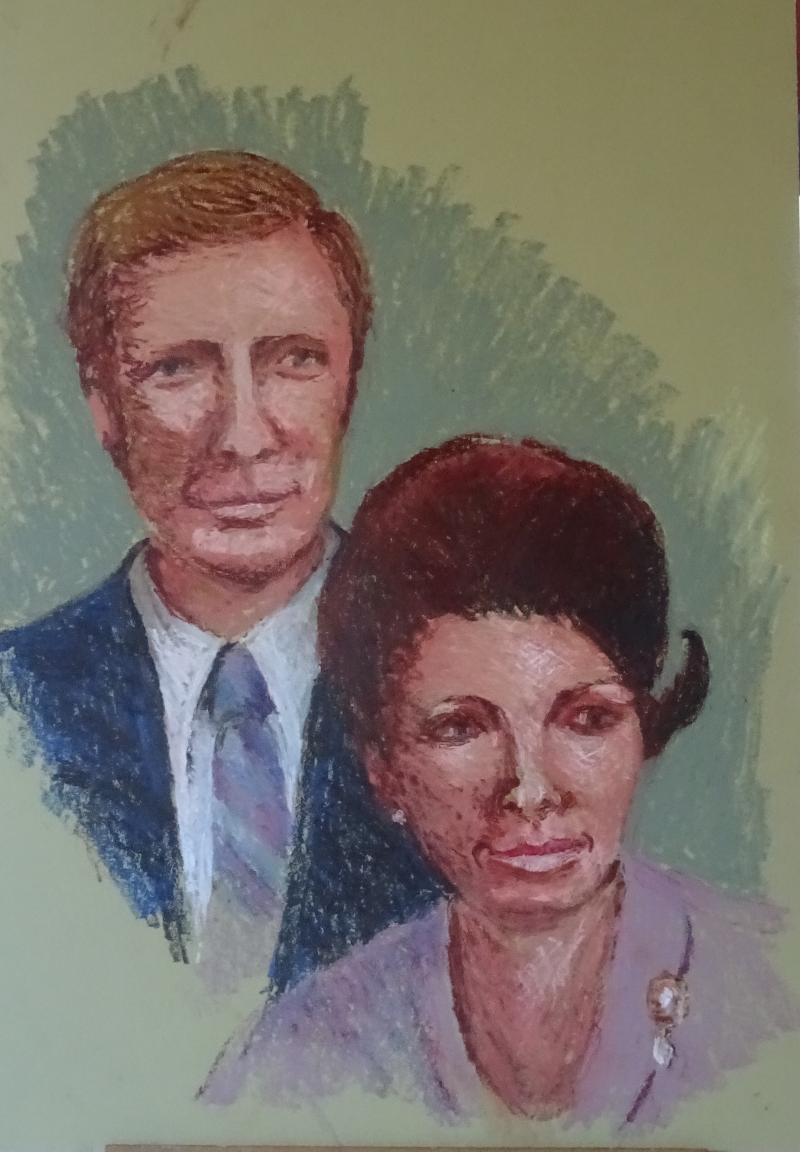
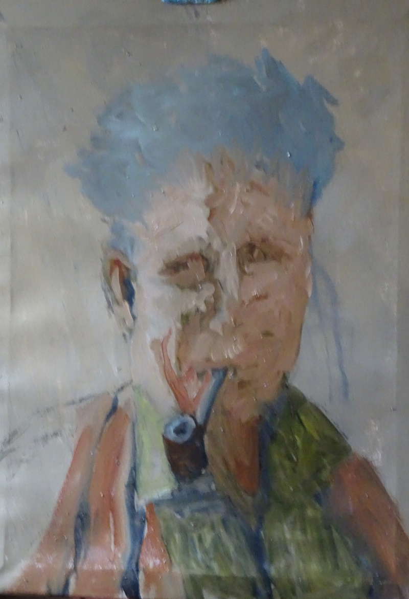
In this painting there is no dilemma as I’m working from an old and not very good snapshot. But Higgy of blessed memory had an interesting face and a plethora of expressions.  Needless to say I dived in without any sketching or close examination of the snap.  I did use charcoal, as suggested by Rob Wareing, to lay out the drawing on the toned canvas, and liked the ease of correction, then blocked in the main tonal areas.


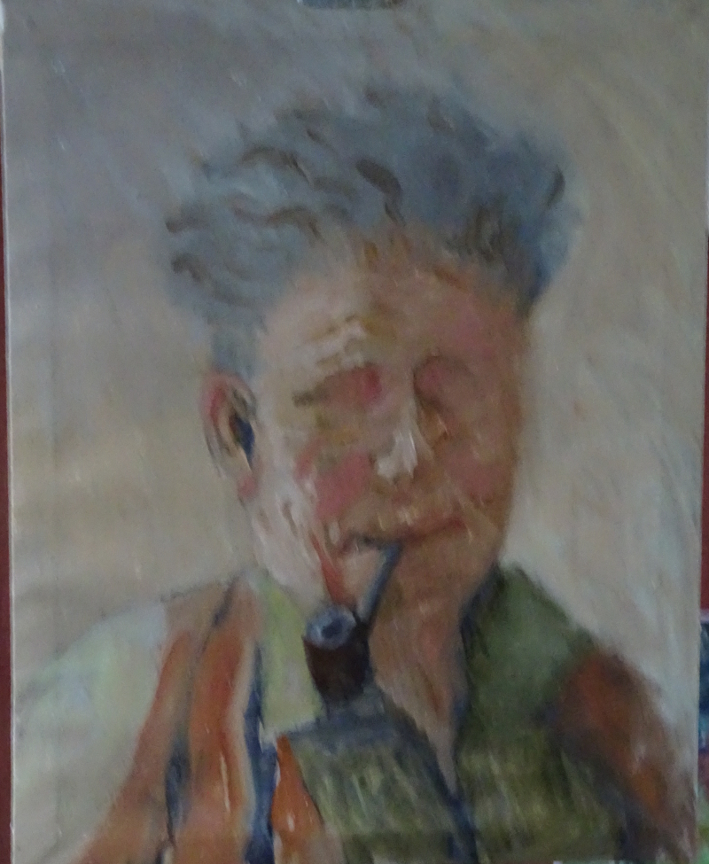
I stood well back to introduce more detail, trying not to blend too much, to have the courage to paint the light in stronger tones than the photo which was very lacklustre.  The warmer tones are helping too.


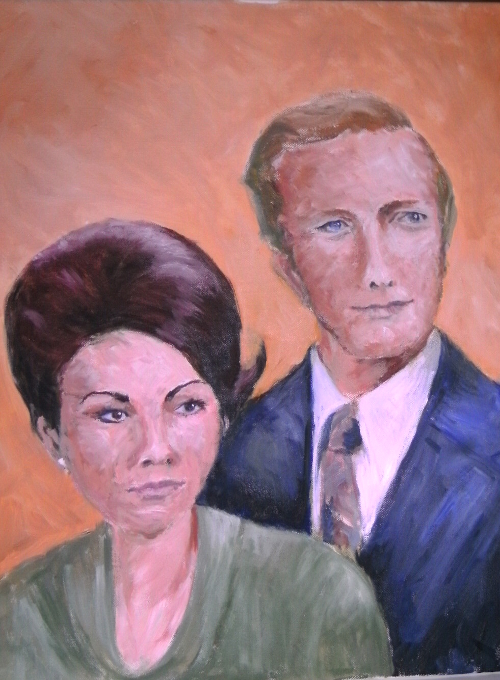
Well, it’s vigorous and sketchy.  The clothes are good!  The mouth is not too bad, but the heavy expression in not Higgy, a big generous man with an impish sense of humour.  His eyes have climbed up his face as I worked on them, and, I now realise that both eyes and nose are too far to the left.  There is no room for the side of his head.  The thing about oil paint is that you can scrape it down and start again.  Out came his eyes and nose!

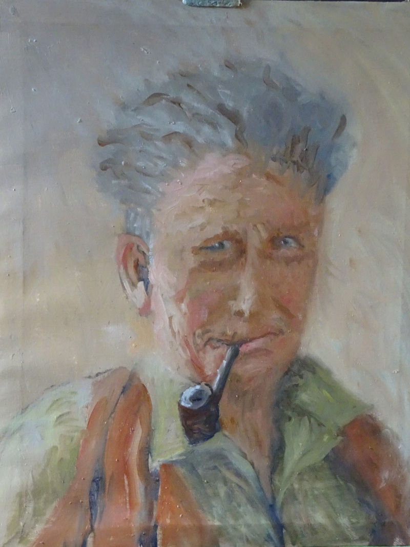
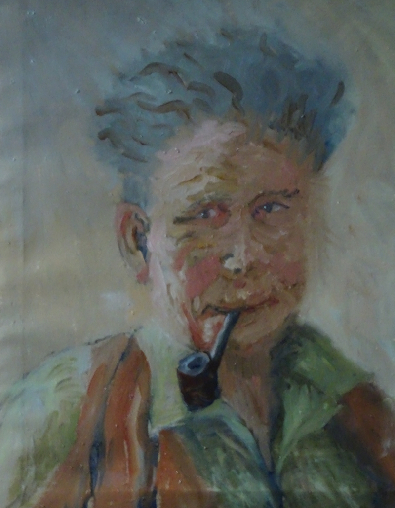
and I tried again.  This is better.  There is even amusement in his expression – how did I achieve that!?  There is a mountain to conquer here but I am enjoying the foot hills.

Oil Pastel Portraits

Since I had bought a portrait set of oil pastels, I thought I’d better try one (or two).  This is the second attempt to paint these two from two photos of them in their twenties before they even met.  The lighting on each was different, so some creative shading was required.  Having looked at both paintings, I’m sure this one is an improvement.  The overall colouring of the picture is more subtle, and the contouring of the faces is better.  He looks distinctly more human  – his head is such a weird shape in the oil painting.  I’ll show it here for comparison’s sake.

Putting him on the left has made for a better balance, and  the green background is less strident.  My observation of a face  shows improvement.   Both pictures were painted over several sessions.  I had a real problem with the need to remix tones in oil painting when returning to the canvas after a week, while the oil pastels didn’t change, but were waiting patiently for me when time allowed.  Incidently, the oil canvas now looks like this!

So, an improvement, but room of plenty more.  Even in the improved painting, the people are not vital, not alive.  More study required. But Hazel Soan is writing a book about portrait painting, and I have ordered Rob Wareing’s new book from saa!

More Oil pastels

Oil pastel and people seem to work well, but how about landscape? This painting is based on some rocks and a battered fence post in the wilds of Wales.

 Again, I worked on green mount board and lightly drew the outline of the lay of the land. These rocks are more rounded shapes, giving me something new to work on. I soon regretted using the lemon yellow pastel for drawing – it persisted in showing itself long after I needed it. The rocks are the focus so I began with them. I had more pastels to chose from this time as I had invested in the Sennelier Portrait Set, not because I was thinking of doing portraits but because there was very little overlap between the two sets, and the new colours gave added subtlety to the range.

 So I had a variety of grey blues, and an extra much needed white to describe the boulders, introducing purples and russets where needed. I kept the pastel strokes as far as I was able, but the pastel melts a little in a warm hand so some blending is inevitable. I included the grassy area between them so that the painting would grow from the starting place. It’s so easy to think, “I have the right colour for lots of areas in my painting so I’ll do them first” but the result is dispiriting as one’s efforts are like currants in a bun. Instead, I keep the pastels I’m using in a box lid, looking there first and only introducing a new pastel where no other will do.

The grass led to the stake, a very battered one, using a variety of browns, greys, blues and black to show weathering. The grasses lighten as we get higher in the painting. Again I put the greens and lemon over each other, allowing the brighter tones to predominate near the sky line. There are no strong shadows so the grey blue sky fits nicely with scene. The tree trunk on the right balances to post and echoes its colouring.

Moving to the foreground, we see a large blueish rock half hidden by the grass. Using the deeper blues here connects rock and sky, useful compositionally while the darker tones in the grasses anchor the rocks in the landscape. It was when I reached this point that I became aware of how clumsy the grass strokes were, and found by scribbling into them with my trusty old store card, I could influence their size and direction! I had found early on that mistakes could be scrapped out by the sharp edge of the plastic, but this was creative! Look at the grasses near the tree trunk, for instance.

There were just the nearer grasses to finish, and the skyline to vary then the painting was finished. This is a good way to take oil paints outside, or on holiday, provided it’s not too hot, without all the extra equipment that would involve. I’ve enjoyed exploring this medium which is new to me and am sure there are more surprises for me as I use it more.

Keswick – a final flourish

It wasn’t raining heavily on our final day, but a thick mist blanketed the landscape, and we had to paint indoors.

First we painted flowers in a glass vase.    You can’t see it but my flowers were too small at first.  This is easy to correct using a palette knife so my variable drawing skills are not too intrusive.  This is a good tool for both flowers and vase, as well as mountains.

Then I was back in my comfort zone, painting indoors from photos! and it shows!

These views are taken from postcards, so I needed to reduce the intense blue of the skies.  Photographers like the mirror image in the lake, but I don’t, so I have blurred it;  I created the mirror image, then swept the flat of the knife down from the water’s edge.  By using the flat rather than the edge, most of the applied paint remained on the canvas.  (I’d used the edge to scrap off disasters many times).

This one pleased me. I’d worked out how to use the direction of stroke with suitably applied tone and colour to give the distant slopes sweep and varied vegetation.  Inside, colour mixing  returned to normal – very strange.

More Keswick Paintings

Believe it or not, these two are more or less the same view of Crummock Water!    The little bay in painting one just wouldn’t come in painting two – trouble with the palette knife again.  This time I wasn’t cold or wet as I was wearing four layers underneath a waterproof.  Thus there was only the wind across the lake to contend with as well as the palette knife.  We were quite high above the lake and I was a little  nearer the lake in the second one.  The clouds have action but the form is strange.  The colours of the foreground again eluded me, but I was beginning to come to terms with the ever changing light, especially the tonal difference of sky and lake.  I still don’t understand why the colour mixes were so elusive.  The provided palette for the week was Ultramarine Blue, Cobalt, Cerulean Blue, Alizarin Crimson, Cadmium Red. Lemon Yellow, Cadmium Yellow and White, none of which are strange or new to me,  and while I missed my Burnt Sienna, it wasn’t crucial, especially for the greens.    The palette itself was white, but so was the canvas. so the mystery lives on.

The knife was beginning to be more controllable, the sweep of hills and mountains being easier to express with a single stroke.  I’m rather pleased with this mountain.  There is a sense of it sweeping down to the lake, with scree slopes, and wooded valleys.  But that wretched promontory, (another right-hander) just wouldn’t go right.

Monte Bianchi 3

One of the advantages of a demonstration painting taken over two or three weeks is that the enforced separation of painting periods allows for quiet contemplation of progress or its opposite.

I was able to see the square tree mentioned last time but also how little grace my tree had compared with the original.  There were also some things to insert,  like the railings, useful to break up some areas and to send back even brightly lit ones.

The grassy area had been started with a bluey green which was at variance with  all the other greens in the painting.  As I wanted, by this time to cover the paper well, I pushed some warmer greens in on top of the blue, the two blending to give a warm dark.  The line between the shadow and sunlight on the grass was too definite.  Again, very thin wavy lines suggesting long seed stalks softened it.

Strong patches of dark greens, strategically  placed, began the bending of the tree.  These had leaf like marks both on them and falling from the edge, giving variety of shape and contrast.

I was a bit unhappy about the line of sunlight straight across the page so I inserted a fictional plant.  I think it makes for a better composition.

I agree that this introduces a diagonal, but this one has a purpose, and is blocked by the bush so that the eye is directed into the painting.  Similarly, the shadow of the trunk also directs the eye towards the door.  The original diagonal in the photo did no more than cut off the right hand  corner of the picture.

Palette Knife again

I think this is a bit of a disaster compositionally speaking. It is two pictures,  neither of any great merit.  I did cope more successfully with the right hand promontory  but the flare of orange at the edge of the painting, the two dimensional mountains, and the jumble supplying the trees ….


This is the same view, but a better composition, and a better painting.  The clouds are a bit clunky, but the overall feeling is of a day full of sunshine and showers.  The colours in the distant trees is nearer to Autumn, and the light reflecting off the water is one aspect of the Lake District everyone loves.  I’ve made a bit more of the headland, and lapping water, as I’m beginning to understand what the knife can do in these circumstances.  Palette knives made good mountains once you get the hang of it.

Finally, as a break from wrestling with wind and water, I turned round and did a tree!

Monte Bianchi 02

First I needed to deal with the distant hillside.  The pastels I used are too bright though in a good part of the spectrum.   They are a pale blue green, so I chose a pale peach pastel from the other side of the colour wheel, and gently overlaid it, disturbing the underlayer a little so that the two blended.   Now we have a greeny blue hillside that is much reduced in intensity.

The tree in the foreground is an important part of the composition.  Unusually, the leaf shapes are quite distinct.  If you measure one of them against the width of the door, you will appreciate their size too.  Treating them all as “mass” would work, but it is an opportunity to try another way of showing trees.

I selected five greens of the same “family” and added a bright yellow.  My aim was to create some of the leaf shapes on the edge of the tree using differing pressures on the pastel to create the shapes I saw.  There is no need to follow the photo slavishly.  A joyous approximation will suffice.  Where the leaves mass, I have used more solid strokes and scribbles, but broken the edges with more definite shapes.

Looking at the photo of the painting, I notice I have a square tree behind my star performer!  That’s for next time.

Keswick paintings

Recently, I visited Keswick on an oil painting course, using a palette knife only, en plein air.  October can be beautiful, a sort of Indian Summer, but this October wasn’t so.  In fact it was very cold and somewhat rainy.  This was a transferred holiday from April this year (which was balmy) – a very strange year.

Behold my first effort.  Bearing in mind that my clothing (inexperience shows) wasn’t adequate, and that rain passed by intermittently, and the thin wind blew straight at us across the lake,  I didn’t do too badly.  It’s not what was in front of me,  and the tonal variation of the trees is poor, but it looks like a rainy mountain.

The new thing was doing landscape using a palette knife only.  I have painted townscapes in the studio using a palette knife, and one landscape impression used as a background for flowers, always with a brush handy for final details if necessary.  Manipulating the knife to say what I wanted involved some contortions at first.  For instance, this view was relatively friendly to a left-hander, not a problem I had to address using a brush.   The descending hillside met the lake where a left-hander could create the acute angle  comfortably.  Increasingly during the course there were “right-handed” views.

The other interesting “thing” was mixing the right colour and, more important, the right tone, proved surprisingly difficult.  This was partly because the chasing clouds changed the tone by the minute, and partly because the general light outside is different.  Mixes I confidently used in the studio, were near-misses in the open air.