Elephants again.

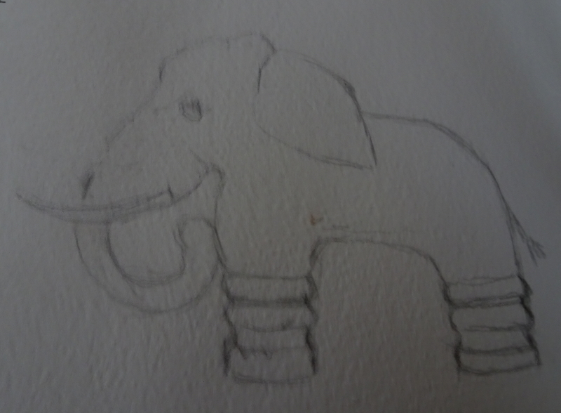
I have drawn and “excavated” my image of The Elephant Of No Distinction But Infinite Charm.  I decided to leave the elephant white and print the background.  This gives me greater printed area which is easier to manage while the unprinted elephant allows for more colourful decoration.

But the printing is not as easy as it sounds.  I had hoped to use acrylic inks, but they gave a very patchy response.

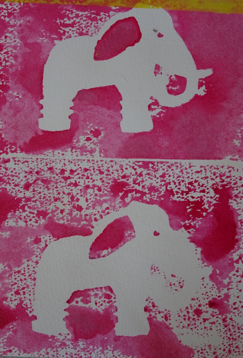
lino printing paints did better, but I now remember that I used a press to achieve a good print when I did the Christmas card last year.  
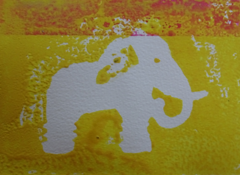
I can’t do that with this set of consecutive prints on a large sheet of paper.  So, I have cut out my elephant shape in thick card, attached a handle for lifting neatly, and am going to use it to mask the shape while I paint the background of each rectangle of my Meander Book.  I’m not going to complete this in time for this Christmas!  Maybe next year!

Riverside garden

I have been using my watercolour pencils again.  This is a much more complex drawing, and the fact that I even attempted it freehand speaks volumes about my new found confidence in line drawing.

The little garden is full of different levels, plants, and pots, with the reflecting water as an added complication.  It is also very green and I am having some difficulty with the varying greens, so I shall have to alter my approach.  To this point, I have used the watercolour pencils dry only adding water when I felt happy with the dry work.  This has had some splendid results – I love the potted bushes on the top level, and the accidental “cauliflower” on the left which gives a perfect bush shape to work into – and the steps are acceptable.  But the plants to the left of the steps are poorly shaped and too uniformly bright.

I am going to try mixing my colours on a scrap of paper then lifting them with a wet brush to see if I can find a subtle way to do this area.  Then again, the “cauliflower” reminds me of one way that Zoltan Szabo paints trees, so maybe I can explore this idea as well.


More Pencilwork

I was so pleased with the pencil work results that I finished the painting!  In fact, I liked it so much that I signed it.

I am enjoying the quiet, steady, progress of the painting technique – I can’t believe I wrote that – it fits so well with the time and place in which I can paint and I am discovering new  aspects of myself.  I had not thought that the prejudices I had overcome when painting for “The Bridges of Dee” would be followed so quickly by the collapse, the total collapse, of my fear of pencil drawing.  Looking back, I see that “fear” is the right word.  I am only in the foothills but this is  a mountain worth conquering.  Finally I can lay out in free hand a preparatory sketch  before painting, and I am sure that as I practise this new skill, that freedom will translate to my brush and pastel.

What have I learnt so far ?  If a pale wash is wanted, certainly on hot pressed paper, scrubbing the pencil on a spare bit of paper and lifting the colour on a wet brush is working satisfactorily (the sky); texture and detail can be indicated at will and either left to speak for itself or melded with the painting by a wash of water (the distant hill and the hay field); more graduation of tone came be achieved by mixing the wet paint on the paper  (the bushes); this can then be worked on to introduce more texture; very deep tones have come by working directly into wetted paper with  the pencil.


Watercolour pencils

To my absolute amazement, I am enjoying my expedition into pencils, overcoming a lifetime aversion to them.  I remember being pretty awful at drawing at school, blunt pencils, no idea what to look for, no idea how to begin, with others around me doing accurate, careful, BELIEVABLE drawings.   I there and then decided that I couldn’t draw and have been convinced of that ever since.

Our weekly “no peeking” drawing sessions were beginning  to beat down the barriers.  Without them, I would never have even considered painting with pencils. But the fortuitous publication of the article in “Leisure Painter” and my frustration that circumstances were cutting into painting time , galvanised me into action.  I have bought a box of 20 landscape watercolour pencils from Caran D’ Arche, giving me a good selection of related tones,  and the recommended  hot pressed paper pad.

This is my first attempt – a very simple landscape.  I did the drawing and dry colour over an hour and a half in comfortable companionship in the sitting room, adding the water to the painting while waiting for the dinner to cook!  There is a tendency to colour between the lines which I must guard against.  The direction and style of brush stroke informs the way the wetted paint reacts and I also discovered that much more intense colour is released if I work into the wet surface.

So I tried again with a more complicated view.    Here is the pencil work, again produced quietly over time.

And here I have added water.  The picture warms as the paint is released, but some of the textures are retained (intentionally!)  This is going to be an exciting project after all, not just a way of coping with circumstance.  Living is a wonderful thing.

Ruminations

You must be aware by now that I am bothered about my painting.  So much of what I do dissatisfies me, so much is just all right, and I feel I’m travelling backward, getting worse instead of better.  I have been casting around, first to identify the source of the malaise and then to cure it.  This is not a trawl through my emotions so that I can enjoy a good moan and maybe curry some sympathy.  I’m hoping by sharing this state, other artists recognise it with a sigh and even some suggestions, or that new artists will not be dismayed by it if it strikes them.

OK.  I know I’m not painting enough.  Constraints of time and place see to that.  And I’m not practising drawing enough either.  Indeed, I think this is the chief stumbling block to progress.  I have gone as far as I can using various drawing crutches and must use a pencil more to explore shape in detail, thereby freeing my brush to work spontaneously.  It makes you look hard at what you are trying to represent, at both positive and negative spaces. A recent article by David Bellamy in “Leisure Painter” suggested a way forward. Using watercolour pencils, he created beautiful atmospheric paintings.  This seems a way of encouraging the patience needed in pencil drawing while satisfying my love affair with fluid colour.  A new student of mine is using just this medium with great success, so it should not be impossible for me to make some progress within my constraints.

Maybe also I am missing the focus provided by “the Bridges of Dee”.  The five or so years involved in sourcing the images and painting them gave me a ready made theme for my paintings, without that I am unfocused.   Well, I can’t go on safari, or chase down another river to follow, but I have the garden to hand.  Right on cue, “The Artist” has an article by David Curtis on “The lure of the garden”, one by Judi Whitton on “Creepy-crawly drawing”, and another By Claire Harkess in which she exploits space in her wild life paintings.  When you add to that a thought provoking discussion of the motif by Andrew Marr, you will appreciate my resolve to follow the spider and “Try Again”.


More Elephants

Isn’t he a dear!  His ears are so big that I think he must be an African elephant, though babies do have big appendages.  But even he won’t do for my Meander book pockets.

Years ago we acquired a regal red-glazed elephant who was immediately named The Elephant Of Distinction (I like Kipling’s Capitals). He graced our room for some years in splendid isolation, and was then joined by one entirely other.  This elephant was bronze-glazed, caparisoned, schematic, dumpy, and was just as immediately dubbed The Elephant Of No Distinction But Infinite Charm.  My daughter has used this image for two embroideries,

http://www.blog.virtuosewadventures.co.uk/wordpress/elephant doorstop

and I thought he would be ideal for the effect I was seeking.  Here is a line drawing.

My intention is to make a lino print, excavating TEONDBIF but printing the background in various colours, then dressing him by hand.  Simple, colourful, satisfyingly repetitive but varied at the same time.


Elephants

I am thinking about making a Meander book as a Christmas present, containing paintings of photos my friend brought back from India.  The “pockets” need suitable decoration as well, so I thought Indian elephants might make an agreeable motif.  This is my first practice of that theme.

The first thing to say is that I actually enjoyed the process!  Thanks to all that drawing practice the basic sketches went down quickly and reasonably accurately – always a confidence builder.  I have limited my palette to Quinacridone Gold, Quinacridone Red and Indanthrene Blue which produced some wonderful mixes.  I think I need to be more bold in laying down colour =- some of the early washes were rather pasty!  But I am happy with these first attempts, and shall continue with more elephants just for fun.

However, I don’t think this motif will work for the project I have in mind.  Maybe more stylised images dressed overall may be more in keeping as a design.


Rhine Castle

I’m going back to basics in watercolour, using a photo of a Rhine castle.  I have limited my palette to four colours, Ultramarine Violet, Burnt Sienna,  Indian Yellow and Viridian.  I know from experience that these colours work well together, but if you think about it, I have the three primary colour in the mix.  Ultramarine Violet could be made from Ultramarine Blue and Permanent Rose,  Burnt Sienna is a Yellowy Red, and Viridian is a bluey Green which also has traces of yellow, and, of course, Indian Yellow itself!  I know that’s pushing it a bit, but I do find it helpful to think of the colours I use in terms of the primaries.  It seems to make mixing easier.

I started with a pale lavender sky – the sky is covered in light, high cloud, the late afternoon of a dull day – and intensified the colour for the most distant hills.


I washed the bottom of the valley lightly with clean water, Then painted the middle distance in a mid-tone mix of Viridian and Burnt Sienna.   The rising mist adds interest to the picture.  sorry the picture is so dark,  camera trouble again!

Now for the castle and its grounds.  I though a touch of autumn colouring might lighten the mood, which is why I included Indian Yellow in my selection.  Mixed with Viridian it gives an agreeable green;  Burnt Sienna, both neat and mixed with Viridian gives rusty tones and a dark green.  The roofs and details of the castle and the bluff on which it stands were painted in a dark mix of Burnt Sienna and Ultramarine Violet

Finally, I used I used this mix, loosened with water, to create interest in the river by moving the brush swiftly over the paper so leaving the white paper to sparkle.


More meandering

I enjoyed making my meander book and filling it with treasures.  But I think I can go further with this idea.  The construction of the book itself with its seven pockets gives the possibility of several surface designs.  My first one was constructed from a piece of marbled paper I had made many years ago, and represents the full page design. But the book gets its name from the meandering folds of construction.  All you need to start is a square of paper – size is unimportant, as the book is created by folding – and it is those folds which open up the design ideas.

The nearest of these squares represents the folds.  Each square is folded in half, wrong sides together, then each flap is folded back on itself so that the folded paper resembles a W in profile.  Open it up and repeat in the opposite direction.

The first square represents the cuts made, two outside ones from one direction and the middle one from the other.  If this has been done correctly the pages should fold naturally into a little “book” with lots of folds down one side.  This is the spine.  The pockets for the treasures are made using double sided sticky tape.

The decoration of this paper before the treasures are even considered is the stage I’m interested in.  Since each mini-square is a “page” in the book  there are possibilities, are there not?  The picture below demonstrates those possibilities.  The back drawing is one image covering the whole sheet, in effect that is what I did using my marbled paper.  The second one suggests one image on each mini-square.  This will probably work best if only one or two images were used.  It would look great if designs influenced by those wonderfully intricate tiles found in mosques were created, or, nearer home, medieval floor tiles, perhaps.  The orientation of each mini-square needs thinking about!  But I am going for option three.  Here the design is a continuous flow weaving its way round the cuts which help to form the book.  I’m going to design a dragon.  It’s going to take time so don’t look for a quick result!

Meander treasures 4

I have completed the final two “treasures”, so my Meander Book is now full.  I have used Impressionist artists as my inspiration, Degas and Van Gogh.

This well-known picture is renowned for its vigorous brush strokes, something hard to replicate especially as my painting is so small.  I’ve got the colouring reasonably well, even his very red face!  In fact, apart from the eyes, I think this is the best of the seven.  It’s certainly the most cheerful, well away from the black backgrounds of the first few.

This Lady is from an unfinished pastel by Degas, called “Combing the hair”.  It wasn’t just the colour of the background which attracted me.  I liked the simplicity, the economy of mark.  The red hair against a red background is unusual, but it doesn’t look hectic.  Maybe the pale mauve of her dress is a sufficient  counter-balance.


Here are my “treasures” and my book.