Flowers Plus

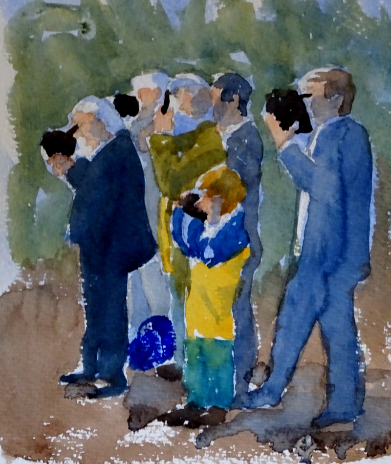
Painting is beginning to fill my thoughts – though it is still having to fight the garden for top place.  My new friend sent me flowers as a thank you for introducing her to Hazel Soan, and one of Hazel’s demonstrations was about painting flowers.  I felt impelled to try painting them even though flowers is not one of my usual subjects.  And I have to say I rather pleased with the result so far.

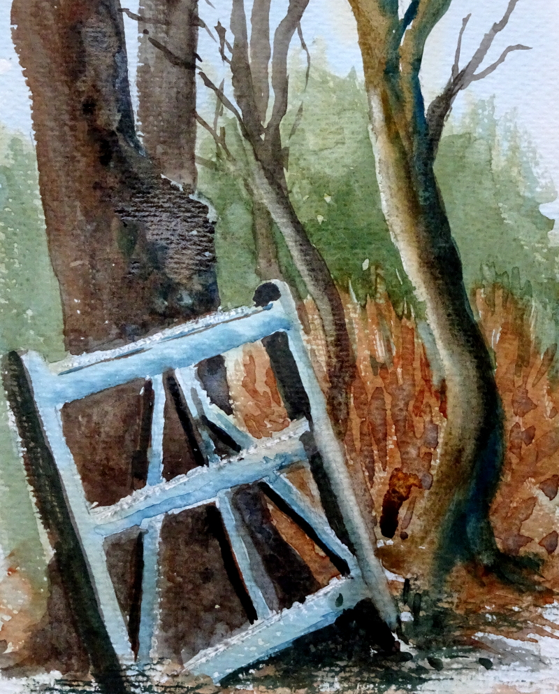
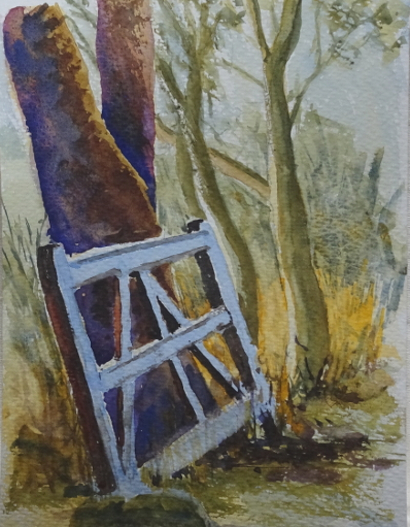
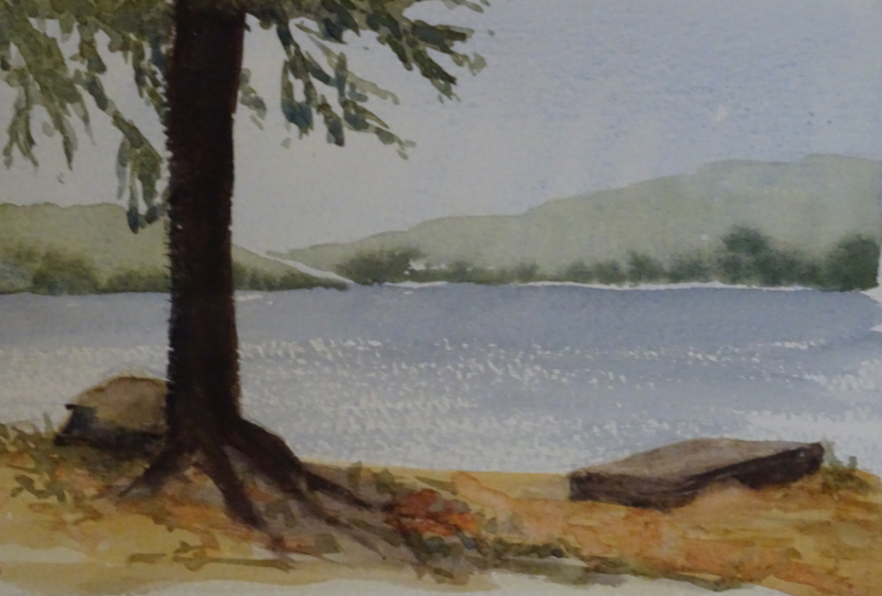
It really does leap off the page, not just in the photograph,which can sometimes happen – a really enjoyable quiet hour.  Unfortunately, that was just before Easter when family activities and beautiful weather meant I had to stop there.  I want to finish it and took a photo to that end, but that quiet time painting from life has made me want to try it more often.  Of course, I am fearful of ruining it.

The old gate

My classes will not be opening till next September, though we are having three full day outdoor painting and sketching meetings in May and June.  At the same time, two other pieces of work unrelated to painting are at an end and …….. Hazel Soan has a new DVD and book on Watercolour which will need careful study.  She is so inspiring, and I have just introduced her to a new painter friend.  All these circumstances have arrived together just as I am beginning to see things I want to paint.  I hope and trust the block is lifting.

Here are two efforts which are the first results of the above, both overworked, and therefore under-thought, but I can see my painting brain awakening as I progressed from  one to two.    The most that can be said for the first one is that I had a go and enjoyed it.  The drawing of the gate is Wrong, no perspective and the flaming bush has grown in size and dominance.  I like the high light on the slender tree.  The drawing in Two is better, so there is a progression into the painting, the bush is bright, smaller and less shouty.    There is more interest in the tree trunk is the foreground, but I think  gate one is better than gate two.

Added Effects

This is the final week of the term in which my class have been re-visiting watercolour basics –  it’s always good to revise, especially when, like me, you’re dissatisfied  with current efforts.  So we were examining what wax resist, different sizes of salt granules, using a natural sponge, scratching with a craft knife, and using the other end of the brush, can do for a painting. In the past, I have resisted such assistance, as I have resisted mixed media, being an delusional purist (if you can’t do it with a brush, you need to improve your brushwork!).  But that’s very silly, since tightens the work, and gives a totally false sense of superiority, and cuts down the fun.

I chose a collection of pebbles as the practise piece, as they have interesting textures, and colours.

You can see the wax resist – it’s just a candle – on the tops of the stones, giving a speckled effect.  What is less clear in the sponge work on the left pebble.  It was also a chance to practise wet-in-wet to make the pebbles seem rounded.  Quite a low key end to the term, but I think we all gained from a look at basic skills.

Fruit – joined up painting

Earlier on we saw what painting all shadowed areas in Ultramarine Blue could do to simplify painting even a complex picture (Light and Shade again – March 7th 2019).  This week we looked at another way into a painting by unifying the objects using a pale wash of Raw Sienna.  We were using fruit, so Raw Sienna is a good choice.  So much fruit has a yellow based hue, and it goes happily under other yellows, reds and blues, sometimes enhancing, sometimes creating secondary colours.  Above all, it creates unity.

The Raw Sienna wash swept (or crawled, depending on confidence!) over the fruit excepting only the strong highlights .  Next we washed in the appropriate colours of the given fruit, stopping short of those highlights, so that the previous wash acted a transition between the two washes. Shadows help the illusion of the third dimension, and you are now ready to titivate, or not, as your mood takes you.  Simples!


Persons

I was delighted to find an article in this month’s “Leisure Painter” about putting people in paintings.  Somehow a person, however sketchy, near the focus of your picture, maybe going towards it, helps the viewer be in the scene.

Stephen Coates is the painter and author of the article, and his very simple construction has helped those of my students who were really struggling, to draw people effectively.  I think most people know that carrot shapes make effective people, but he refined that idea.  First he gave four rules for vital statistics.  These are for “generic person”, some unknown person, male or female, walking down the street, but would make a good starting point even for a more detailed drawing.

So – the width of the shoulders = a third of the headless height;

the width of the head = a third of the width of the  shoulders;

knees are a third of the body ‘s(headless!) height from the ground;

and the groin is about halfway up the body (see above).

But here’s the clever bit –  if you sketch in three attached  SQUARES  arranged vertically on the page and draw your blunt-nosed “carrot” to fit the shape, you have the beginnings of your person.

The rest of the article goes on to describe how to make this person walk, etc.  It’s a great read, and if you are struggling with people, that article in “Leisure Painter” will certainly help.  Just remember to make squares, not rectangles!

Atmosphere

We looked at how few colours were needed to make many other ones last week.  Now I want to build on that to work out how colour choice creates atmosphere.  This is my source.

Now, there are various resonances drawing me to paint this scene.   It’s a lookout place in Lisbon where people gathered to enjoy the Spring weather and the view over the river Tagus.  We first came upon it at dusk with a clear sky, and it reminded me of Alma-Tadema’s paintings, and of the scene in Kenneth Branaugh’s “Much Ado” when the soldiers, returning triumphant at dusk, strip off and plunge into pools that were surrounded by marble pillars.  But my camera failed me – or rather I failed it, as it’s a new one I don’t understand yet.  We returned a few days later in different weather conditions but I was sure a photo would help me revive the memory.

I planned a varied wash over the whole page, using  Indian Yellow and Permanent Rose,  to re-create the golden evening, then the figures and superstructure were laid in (dilute Ultramarine Blue).   These blue areas mark out those parts that I will continue to refine.

The figures are in strong silhouette.  Next,  I need to decide how dark the light areas in shadow should be in relation to the people.  As you can see, I have begun to make such judgements, though as yet no modelling is defined.  It’s early days, but the atmosphere is beginning to appear.  The image is too clear cut as yet,  – more thought about shade and deep shadow,  maybe a cloud or two?   If I  do more work on the painting this week …..


Colour and tone

This week my class were looking at tonal value – how dark or light a feature was – and colour mixing.

This exercise is so much easier if you are using tubes of paint!  We started off with Prussian Blue.  He’s a bit of a big beast, a very intense colour where a very little pigment goes a very long way,  but I was keen to help my students create an intense watercolour.  A dob of paint with very little water added to create  a deep tone  mixes to a creamy consistency, giving a luscious, brooding, greeny blue.  More water gives a mid tone, always remembering to  take the water out of the brush before dipping into the mix so as not to dilute it further.  Pale tones are approached from the opposite direction – a dollop of water with a small amount of pigment  added.

In this set of three, we looked at Permanent Rose and Aureolin the same way, then we mixed them variously, creating scarlet, oranges, greens, violets, browns, and blacks.

Then we looked at Ultramarine Blue,  Indian Yellow and Quinacridone Red in the same way, creating different reds, oranges, greens etc.

Finally we tried the Siennas, Burnt and Raw, with both blues to achieve intense but different blacks and greys.

Next week, we will be using one of these sets to paint people in a cityscape or landscape.  Here is my source.

Light and shade again

This is a re-run of last week’s session with my class.  This is such an easy way of simplifying a given scene – taking one aspect of the image at a time.

A simple outline of this dainty lady with her parasol, face lifted to the sun, has all the shadowed area shaded in pale blue.  We are all told that achieving pale colours in watercolour is to have a high ratio of water to pigment.  The danger is that we have so much water swimming around that it becomes impossible to control.  The answer is to mix your pale colour on the palette,  remove excess water from the brush by resting it on a towel or tissue, then dipping it in the pale mix.  It works – it’s taken me a long time to work out,  but it has removed the hit and miss efforts of past years!

By doing this, the light has been “saved”, as have areas where “true” colour is needed, but the shadows are in, and the picture already reads.  Putting the colour on is sheer magic.  Here she is, dancing down the steps.


The Permanent Rose was washed over the whole of the skirt, and the light and shaded parts appeared without further effort.  The steps, after their colour wash,  had the shadows strengthened, and the dark background projects the figure forward.


It works for more complicated scenes, too.  Here are a group of railway enthusiasts, cameras at the ready, as the locomotive approaches.

It doesn’t read as well as the lady, but I think it is clear enough, especially with a photo crib to introduce colour.

Even is this unfinished state , the figures read well and you have time to devote to colour because the shadows are already worked out.


Light and shade

Reading an article by my favourite guru, Hazel Soan,  I was struck all of a heap by her remark that we paint shadows in watercolour to create light.  OK! OK! I’ve known this intellectually and attempted to practice it for years – I’ve even demonstrated it .  But coming to watercolour from oil painting where we create light in dark places, I have not truly understood it nor appreciated the implications.  It’s as if the mechanics have over-ridden the concept.  Have I finally arrived in a new place in watercolour painting?  Is this enlightenment what painting blocks are for?

Fortuitously, I had intended to consider watercolour shadows in the next stage of watercolour basics, so I’m keen to see if enlightenment makes a difference, and, much more important, can I export the concept to the class.

This is a much more difficult idea to get across than I at first realised.  I used the method of painting every part that is not a highlight in a soft Ultramarine Blue.  But even achieving a “soft” blue is fraught.  Pale watercolour consists of low pigment/ high water mix, but it’s essential to reduce the water held in the brush before picking up this dilute paint if the painted passage is not to pool and puddle or rush uncontrollably over the page.  Then painting shadows blue when they are patently red or brown seems obtuse.  Nevertheless, some students were beginning to understand, so we will try again next week, using figures as our image.

Back to basics continued

Consolidation is the name of the game, using recently learnt skills to create a painting. I suggested a simple theme, distant hills, a lake, and a tree in the foreground. There are some new ideas here of course, making picture for a start!

Wetting the shape, then introducing colour is a good way of painting a very simple sky.   While that was drying I mixed a dull green, Ultramarine Blue and Indian Yellow, for the hills to push them back suggesting distance.  It a strange fact that a warm blue and a warm yellow make a dull green, – well not really strange in you think about it because they both lean very slightly towards the red  thus the mix includes the three primary colours.  The trick in painting these distant hills is to start with the whole body of the brush level with the top of the hill, then draw the paint down, so a more interesting, believable edge is achieved.  A sweep of the brush following the hill top is just too smooth.  Now, watch the paint dry, and just as it loses the shine and turns dull,  touch in the trees edging the lake with darker green   (more pigment, less water).

The back of the lake is a sweep of the brush for this time we need a reasonably straight edge, while the front is dry brushed.  The foreground is begun with a wash of Raw Sienna, then titivated to suggest fallen leaves, rocks, etc., and a truly dark mix of Ultramarine and Burnt Sienna define the tree trunk and pushed the hills further away.  The leaves of that tree are tickled in with the point of the brush.

I’m not thrilled with the result, but I’m not ashamed of it either.  Maybe my painter’s block of the last four months is finally cracking!