Persons

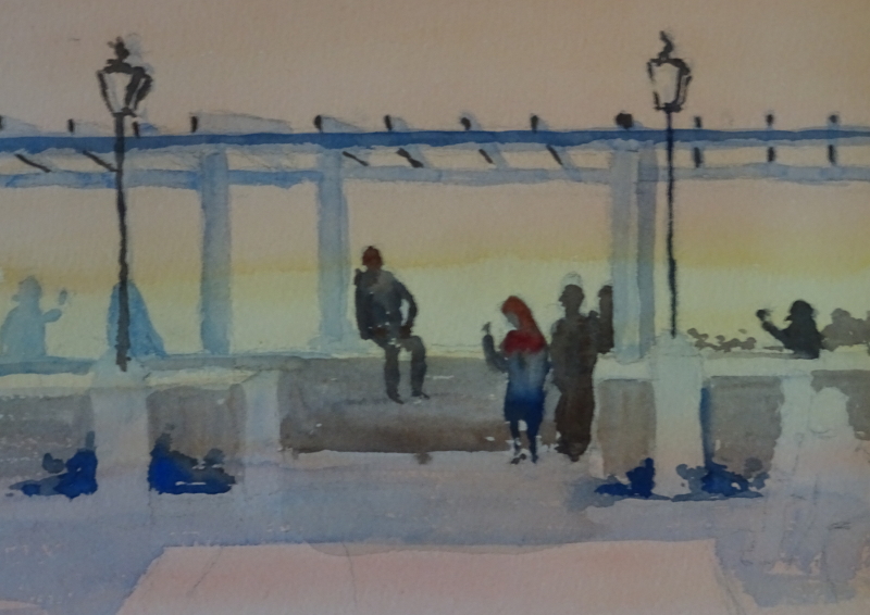
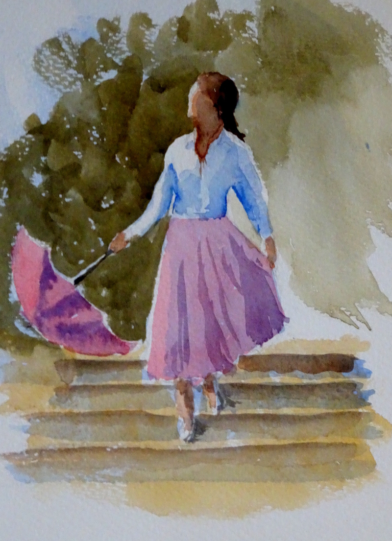
I was delighted to find an article in this month’s “Leisure Painter” about putting people in paintings.  Somehow a person, however sketchy, near the focus of your picture, maybe going towards it, helps the viewer be in the scene.

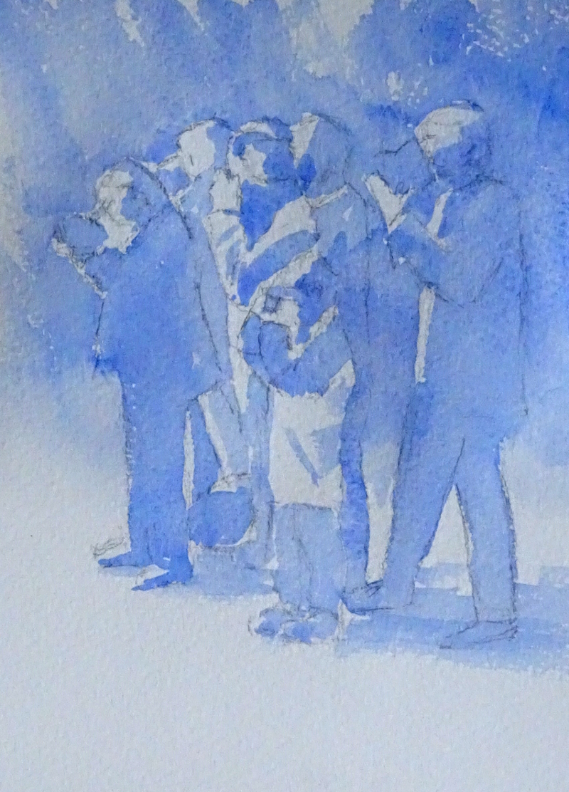
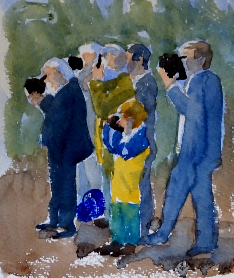
Stephen Coates is the painter and author of the article, and his very simple construction has helped those of my students who were really struggling, to draw people effectively.  I think most people know that carrot shapes make effective people, but he refined that idea.  First he gave four rules for vital statistics.  These are for “generic person”, some unknown person, male or female, walking down the street, but would make a good starting point even for a more detailed drawing.

So – the width of the shoulders = a third of the headless height;

the width of the head = a third of the width of the  shoulders;

knees are a third of the body ‘s(headless!) height from the ground;

and the groin is about halfway up the body (see above).

But here’s the clever bit –  if you sketch in three attached  SQUARES  arranged vertically on the page and draw your blunt-nosed “carrot” to fit the shape, you have the beginnings of your person.

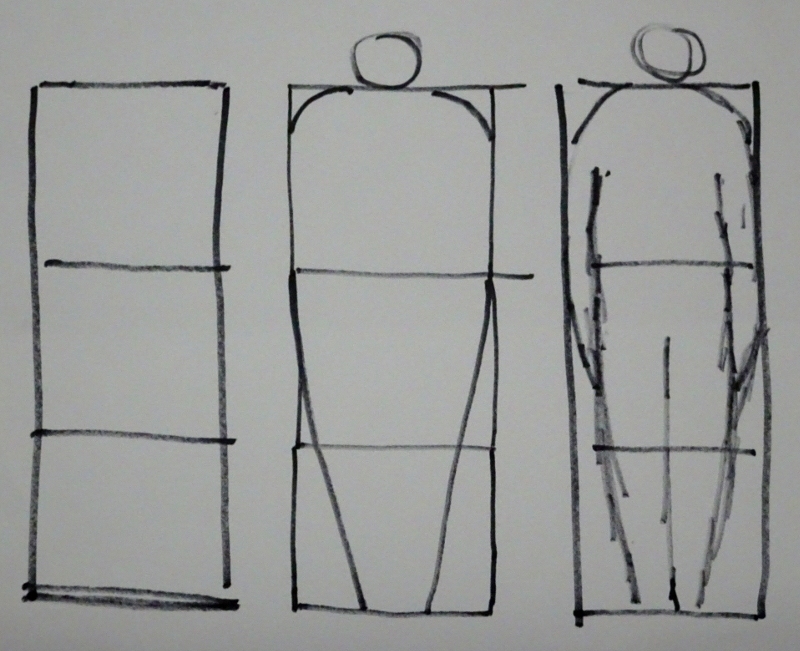
The rest of the article goes on to describe how to make this person walk, etc.  It’s a great read, and if you are struggling with people, that article in “Leisure Painter” will certainly help.  Just remember to make squares, not rectangles!

Atmosphere

We looked at how few colours were needed to make many other ones last week.  Now I want to build on that to work out how colour choice creates atmosphere.  This is my source.

Now, there are various resonances drawing me to paint this scene.   It’s a lookout place in Lisbon where people gathered to enjoy the Spring weather and the view over the river Tagus.  We first came upon it at dusk with a clear sky, and it reminded me of Alma-Tadema’s paintings, and of the scene in Kenneth Branaugh’s “Much Ado” when the soldiers, returning triumphant at dusk, strip off and plunge into pools that were surrounded by marble pillars.  But my camera failed me – or rather I failed it, as it’s a new one I don’t understand yet.  We returned a few days later in different weather conditions but I was sure a photo would help me revive the memory.

I planned a varied wash over the whole page, using  Indian Yellow and Permanent Rose,  to re-create the golden evening, then the figures and superstructure were laid in (dilute Ultramarine Blue).   These blue areas mark out those parts that I will continue to refine.

The figures are in strong silhouette.  Next,  I need to decide how dark the light areas in shadow should be in relation to the people.  As you can see, I have begun to make such judgements, though as yet no modelling is defined.  It’s early days, but the atmosphere is beginning to appear.  The image is too clear cut as yet,  – more thought about shade and deep shadow,  maybe a cloud or two?   If I  do more work on the painting this week …..


Colour and tone

This week my class were looking at tonal value – how dark or light a feature was – and colour mixing.

This exercise is so much easier if you are using tubes of paint!  We started off with Prussian Blue.  He’s a bit of a big beast, a very intense colour where a very little pigment goes a very long way,  but I was keen to help my students create an intense watercolour.  A dob of paint with very little water added to create  a deep tone  mixes to a creamy consistency, giving a luscious, brooding, greeny blue.  More water gives a mid tone, always remembering to  take the water out of the brush before dipping into the mix so as not to dilute it further.  Pale tones are approached from the opposite direction – a dollop of water with a small amount of pigment  added.

In this set of three, we looked at Permanent Rose and Aureolin the same way, then we mixed them variously, creating scarlet, oranges, greens, violets, browns, and blacks.

Then we looked at Ultramarine Blue,  Indian Yellow and Quinacridone Red in the same way, creating different reds, oranges, greens etc.

Finally we tried the Siennas, Burnt and Raw, with both blues to achieve intense but different blacks and greys.

Next week, we will be using one of these sets to paint people in a cityscape or landscape.  Here is my source.

Light and shade again

This is a re-run of last week’s session with my class.  This is such an easy way of simplifying a given scene – taking one aspect of the image at a time.

A simple outline of this dainty lady with her parasol, face lifted to the sun, has all the shadowed area shaded in pale blue.  We are all told that achieving pale colours in watercolour is to have a high ratio of water to pigment.  The danger is that we have so much water swimming around that it becomes impossible to control.  The answer is to mix your pale colour on the palette,  remove excess water from the brush by resting it on a towel or tissue, then dipping it in the pale mix.  It works – it’s taken me a long time to work out,  but it has removed the hit and miss efforts of past years!

By doing this, the light has been “saved”, as have areas where “true” colour is needed, but the shadows are in, and the picture already reads.  Putting the colour on is sheer magic.  Here she is, dancing down the steps.


The Permanent Rose was washed over the whole of the skirt, and the light and shaded parts appeared without further effort.  The steps, after their colour wash,  had the shadows strengthened, and the dark background projects the figure forward.


It works for more complicated scenes, too.  Here are a group of railway enthusiasts, cameras at the ready, as the locomotive approaches.

It doesn’t read as well as the lady, but I think it is clear enough, especially with a photo crib to introduce colour.

Even is this unfinished state , the figures read well and you have time to devote to colour because the shadows are already worked out.