Light and shade

Reading an article by my favourite guru, Hazel Soan,  I was struck all of a heap by her remark that we paint shadows in watercolour to create light.  OK! OK! I’ve known this intellectually and attempted to practice it for years – I’ve even demonstrated it .  But coming to watercolour from oil painting where we create light in dark places, I have not truly understood it nor appreciated the implications.  It’s as if the mechanics have over-ridden the concept.  Have I finally arrived in a new place in watercolour painting?  Is this enlightenment what painting blocks are for?

Fortuitously, I had intended to consider watercolour shadows in the next stage of watercolour basics, so I’m keen to see if enlightenment makes a difference, and, much more important, can I export the concept to the class.

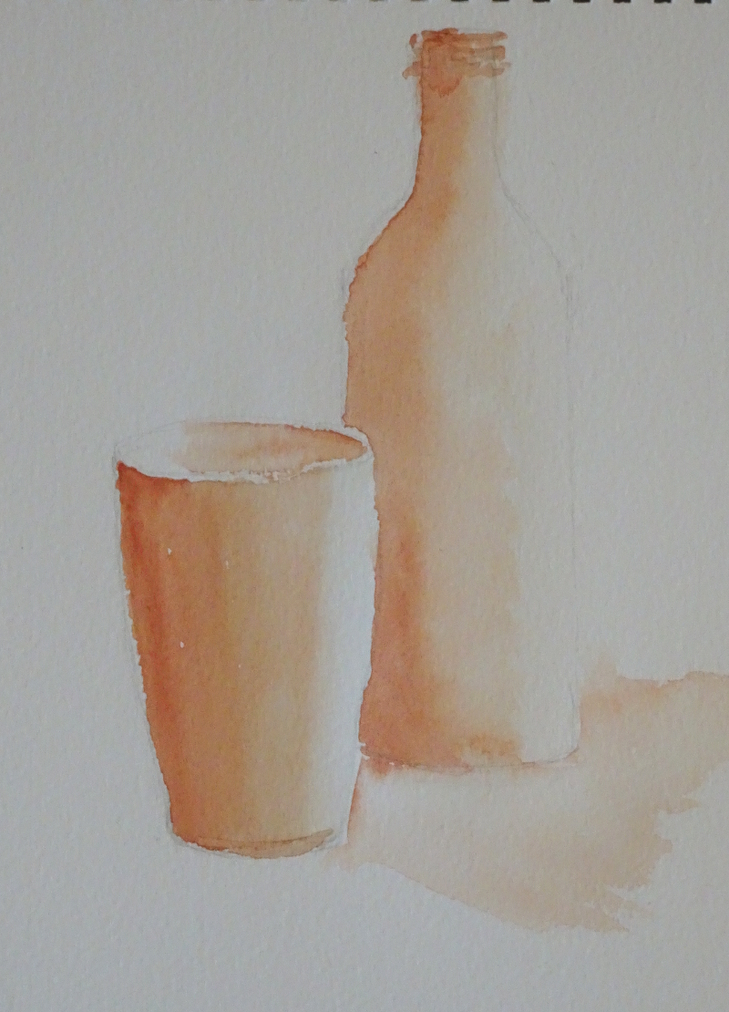
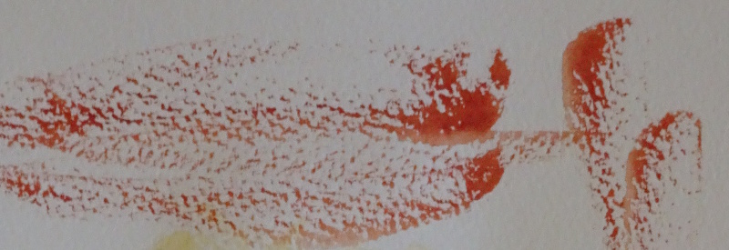
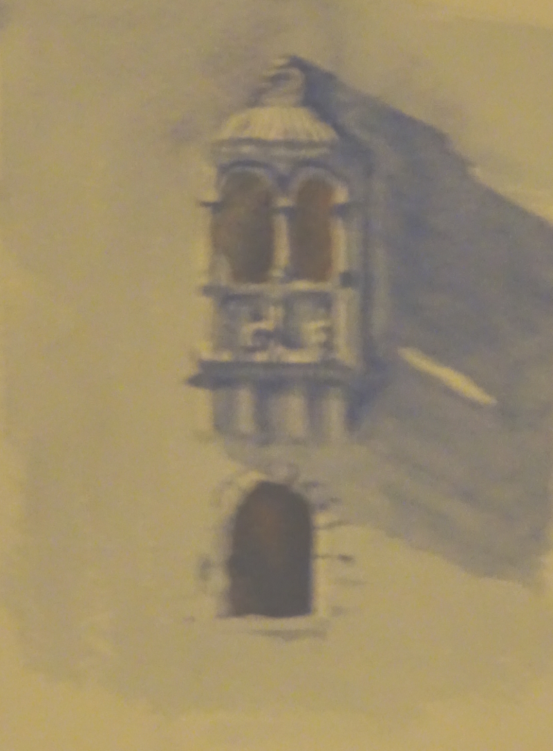
This is a much more difficult idea to get across than I at first realised.  I used the method of painting every part that is not a highlight in a soft Ultramarine Blue.  But even achieving a “soft” blue is fraught.  Pale watercolour consists of low pigment/ high water mix, but it’s essential to reduce the water held in the brush before picking up this dilute paint if the painted passage is not to pool and puddle or rush uncontrollably over the page.  Then painting shadows blue when they are patently red or brown seems obtuse.  Nevertheless, some students were beginning to understand, so we will try again next week, using figures as our image.

Back to basics continued

Consolidation is the name of the game, using recently learnt skills to create a painting. I suggested a simple theme, distant hills, a lake, and a tree in the foreground. There are some new ideas here of course, making picture for a start!

Wetting the shape, then introducing colour is a good way of painting a very simple sky.   While that was drying I mixed a dull green, Ultramarine Blue and Indian Yellow, for the hills to push them back suggesting distance.  It a strange fact that a warm blue and a warm yellow make a dull green, – well not really strange in you think about it because they both lean very slightly towards the red  thus the mix includes the three primary colours.  The trick in painting these distant hills is to start with the whole body of the brush level with the top of the hill, then draw the paint down, so a more interesting, believable edge is achieved.  A sweep of the brush following the hill top is just too smooth.  Now, watch the paint dry, and just as it loses the shine and turns dull,  touch in the trees edging the lake with darker green   (more pigment, less water).

The back of the lake is a sweep of the brush for this time we need a reasonably straight edge, while the front is dry brushed.  The foreground is begun with a wash of Raw Sienna, then titivated to suggest fallen leaves, rocks, etc., and a truly dark mix of Ultramarine and Burnt Sienna define the tree trunk and pushed the hills further away.  The leaves of that tree are tickled in with the point of the brush.

I’m not thrilled with the result, but I’m not ashamed of it either.  Maybe my painter’s block of the last four months is finally cracking!

Watercolour – back to basics

This term my classes will be looking at very basic watercolour techniques.  I’ve done this in the past, but mostly nervous students revert to painting between the lines as they did in their early years.  I want to see if I can break this barrier so that all my students will be able to use all watercolour’s advantages effectively.  About a third of this year’s group are new to watercolour, so I’m going to work more slowly, consolidating techniques as I go, and encouraging them to assess which technique will serve them best in each painting they do.

Last week we learnt how to hold the brush (not like a pencil, but more loosely and further up the haft) and how to gather paint into the brush  by twisting it gently in the mix.   We looked at how to create shapes by using differing pressures on the brush, using point and body as needed.  We also created 3D effects by painting the whole object with clear water then flooding in colour so that it crept across the surface getting more pale as it went.   So the first exercise this week is to repeat that.

Then we turned to Dry brush and Rough paper.  By loading the brush with thick paint and moving quickly across the rough page, a broken effect is achieved.


So we tried that out on a generic tree aiming for an airy lightness of texture.  The initial laying of Aureolin does not show well on the white surface, and this ain’t any tree I know but the idea of what “dry brush” can do is there.

Next week we are aiming for a painting incorporating these techniques – big sky, distant hills, a lake, and a tree in the foreground.

Two English Roses

A very early piece from the 1970s – I remember battling with the wall, most of the problems being created by the angle of shot.  At the time it caused much heart ache, though I quite like it a a composition ploy now!

This was a lesson in not being wedded to the photograph.  The white (!) wall ran unchecked by plants in a strong diagonal, effectively cutting the picture in half.  This line was echoed by the dark earth, the even darker fence and the grass.  Luckily my tutor came to the rescue, solving the problems I didn’t know I had.

As instructed, I toned down the earth, the fence,  and grass, and blued the face of the wall so that they all came towards the same tonal value, created two vigorous “Snow in summer” plants tumbling over the ends of the wall, and played up the shadow of the child.  Her anatomy isn’t brilliant either, but I was thrilled with her hair – and I still am.