Bangor Bridge again

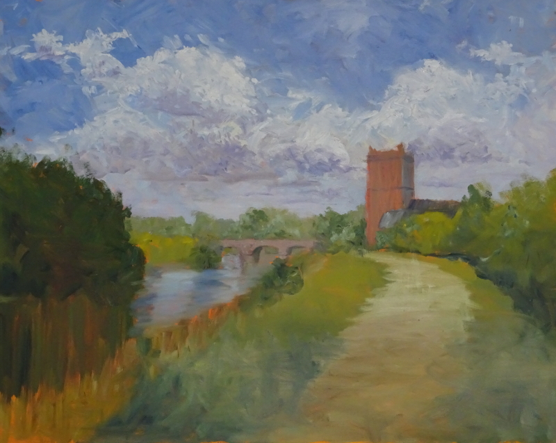
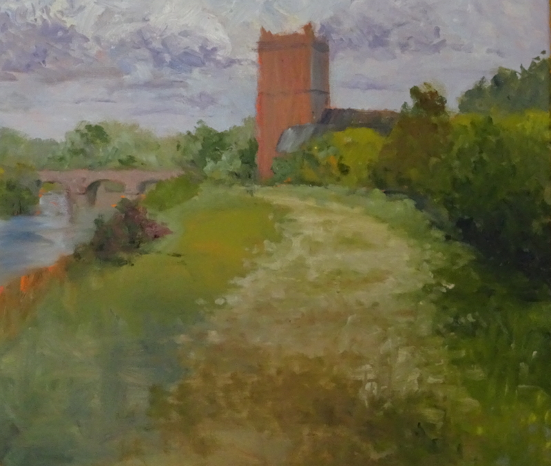
It doesn’t look as though a lot has changed, does it?  This time I’ve modified the hedge and path, so the scene has more depth.  For instance the trees on the far right of the painting now sit behind the hedge rather than being part of an amorphous mass of green, and the hedge itself there overhangs its base which in turn defines the edge of the ground.  I’ve used variations of the greens first applied to give form to the hedge trying to “grey off” the tones  as they  near the church.  Conversely I have sort to brighten and deepen the tones in the foreground – not too much as I don’t want them to take over the painting.

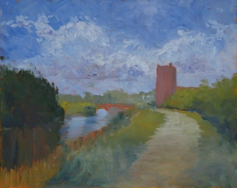
The same technique works on the path, too.  By intensifying the tones in the path in the foreground, I have made it “lie down”.  My photo tells me that there are flattened patches of grass down the middle, so painting these  (next time) will both vary the surface and add to the recession.

Next the river bank has  had some attention.  There’s a nice clump of bushes (or brambles ?) hiding the end of the bridge near the church, and the bank slopes sharply too.  Directional brush strokes help the illusion.  Then the  ground flattens as it nears the river, called to a halt by a beautiful dark bush which has Alizarin undertones.  That’s a piece of serendipity, as I can introduce the same undertones ( at some time in the future!) in the large dark area to the left of the picture.  I don’t really need an excuse to do that, but it’s nice to have one.

My classes have ended for the summer, but I am hoping to work on this painting at home and to post regularly about it, and about other paintings shouting for attention.  But “don’t cry for me, Argentina,”  I’ll probably be in the garden!

Bangor Bridge 2

This second pass has started to suggest the details in the painting.  The sky has lost some of its energy, but perhaps it was too dominating to be a secondary player in the scene.  I used a slightly smaller brush to calm it down, not changing the tones and colours just repeating some of them with smaller strokes.

Turning my attention to the trees beyond the bridge, I sought to differentiate them from each other.  After all, they are just beyond, not in the far distance.  Again, I didn’t want them to dominate, just to be there.  Natural progression then led me to the bridge itself.  Here big changes have be made.  I was looking for a good basic colour and tone for the red sandstone used in its construction, (there is yellow sandstone in there too, but that colour  is easier to find).  Red is a misnomer – it’s more brown than red – so I started with Burnt Sienna and added a touch of Alizarin and a touch of Raw Sienna.  Alizarin is fierce.  I usually tell my students to show the brush where the Alizarin is on the palette, and that is as close as you should get.  An exaggeration , true, but not far from the truth even so.  A small addition of white and we have success.  A tiny sweep of dark on the underside of the arch, and behold! the bridge appears.  Isn’t painting wonderful.  I have done a little bit on the church tower, given the church itself a roof and played with the adjacent bushes.

This second pass is when painting becomes the relaxing pastime the uninitiated think it is.  The first pass laid out the structure of the painting, so now I consult my reference photo less and less, and engage with the painting in front of me more and more.  I can stand back, using my arm and shoulder, holding the long handle of the brush near the end, gradually  developing my initial  inspiration.  It puts me in a happy place.  I know that somewhere in the painting will be a knotty problem that will have me in thrall – there always is –  but right now all is serene.

The old bridge, Bangor

Now you can see where I’m going.  Completing the first pass of painting is always satisfying.  The painting appears almost magically and since everything is approximate, there is nothing to irritate.   You can see how freely I have painted.  I like to stand back and use the arm and shoulder at this stage.  If the overall composition doesn’t work, now is the time to put it right.  However, I’m happy with this.  It works in monochrome too so I know that the tonal balance is sound.  Taking a black and white image is a good way of assessing tone – it is so easy to be seduced by colour, especially if colour is as important to you as it is to me.

I used the Ultramarine Blue in the sky to make my greens and darks in the rest of the painting thereby achieving colour harmony more easily.  So I’ve added Raw Sienna and Chrome Yellow to that blue, Raw Sienna and Burnt Umber for the reeds, and added the blue to my favourite dark green mix of Viridian and Burnt Umber for the darker bushes.  There is even a touch of the blue in the sandstone mix of Umber, Alizarin Crimson and Raw Sienna.  Vertical strokes for the reflective water and “shimmering” strokes for the reflecting sky complete this pass.  Now I can enjoy refining the image.


Oil painting again

Oil painting has always been my first love.  This time I’ve decided to do a big canvas, 24 inches by 36 inches, to be filled with exuberant brush strokes and lots of colour.  I tasked my students to paint a bridge, largely because I had been looking through my references for paintings in my book, “The Bridges of Dee”, and found some photos that I felt had potential.

The subject gives plenty of options for texture with stone or brickwork, water either still or flowing, greenery perhaps.  In the book, I showed the old bridge at Bangor looking up stream and against the sun.  This gave a lovely pearly quality to the appearance of the stonework and allowed the light reflecting off the water to illuminate the underside of the bridge – great fun!

This new painting is of the same bridge but painted from the other side with the sun is full on the face of the bridge and the Church Tower adjacent to it.  The sky is bright blue with fluffy clouds. In fact it’s a very traditional landscape and none the worse for that.

Before you ask, I often paint my canvas bright orange before I start the picture.  It is so invigorating! and a great foil for the blue of the sky.  As you can see, I’ve really enjoyed myself with the brush.