More Elephants

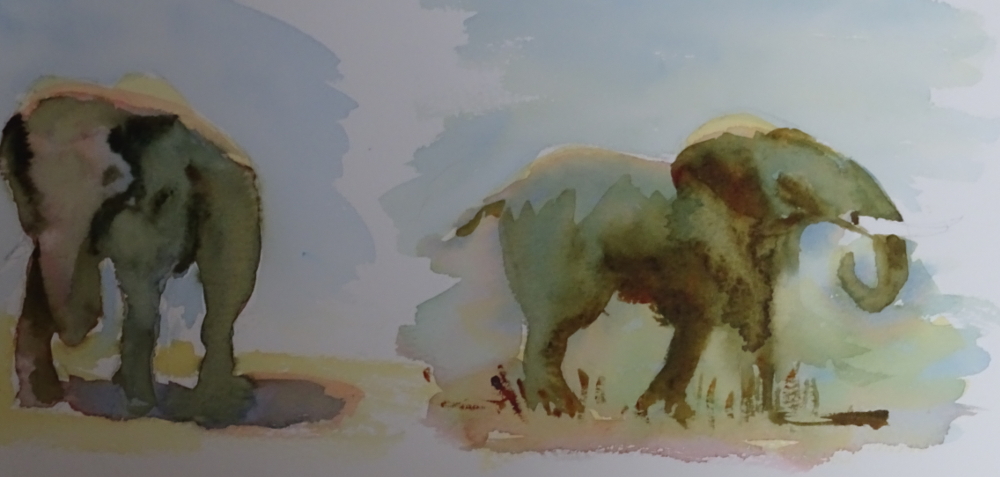
Isn’t he a dear!  His ears are so big that I think he must be an African elephant, though babies do have big appendages.  But even he won’t do for my Meander book pockets.

Years ago we acquired a regal red-glazed elephant who was immediately named The Elephant Of Distinction (I like Kipling’s Capitals). He graced our room for some years in splendid isolation, and was then joined by one entirely other.  This elephant was bronze-glazed, caparisoned, schematic, dumpy, and was just as immediately dubbed The Elephant Of No Distinction But Infinite Charm.  My daughter has used this image for two embroideries,

http://www.blog.virtuosewadventures.co.uk/wordpress/elephant doorstop

and I thought he would be ideal for the effect I was seeking.  Here is a line drawing.

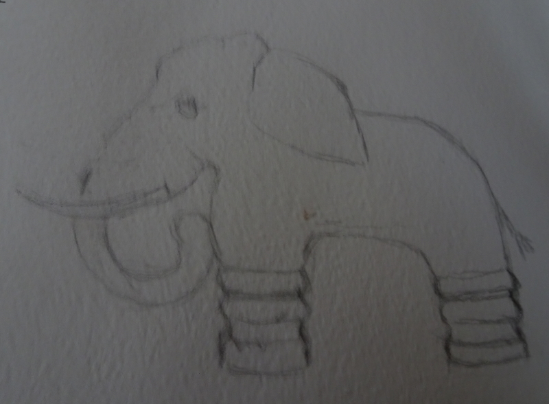
My intention is to make a lino print, excavating TEONDBIF but printing the background in various colours, then dressing him by hand.  Simple, colourful, satisfyingly repetitive but varied at the same time.


Elephants

I am thinking about making a Meander book as a Christmas present, containing paintings of photos my friend brought back from India.  The “pockets” need suitable decoration as well, so I thought Indian elephants might make an agreeable motif.  This is my first practice of that theme.

The first thing to say is that I actually enjoyed the process!  Thanks to all that drawing practice the basic sketches went down quickly and reasonably accurately – always a confidence builder.  I have limited my palette to Quinacridone Gold, Quinacridone Red and Indanthrene Blue which produced some wonderful mixes.  I think I need to be more bold in laying down colour =- some of the early washes were rather pasty!  But I am happy with these first attempts, and shall continue with more elephants just for fun.

However, I don’t think this motif will work for the project I have in mind.  Maybe more stylised images dressed overall may be more in keeping as a design.


Rhine Castle

I’m going back to basics in watercolour, using a photo of a Rhine castle.  I have limited my palette to four colours, Ultramarine Violet, Burnt Sienna,  Indian Yellow and Viridian.  I know from experience that these colours work well together, but if you think about it, I have the three primary colour in the mix.  Ultramarine Violet could be made from Ultramarine Blue and Permanent Rose,  Burnt Sienna is a Yellowy Red, and Viridian is a bluey Green which also has traces of yellow, and, of course, Indian Yellow itself!  I know that’s pushing it a bit, but I do find it helpful to think of the colours I use in terms of the primaries.  It seems to make mixing easier.

I started with a pale lavender sky – the sky is covered in light, high cloud, the late afternoon of a dull day – and intensified the colour for the most distant hills.


I washed the bottom of the valley lightly with clean water, Then painted the middle distance in a mid-tone mix of Viridian and Burnt Sienna.   The rising mist adds interest to the picture.  sorry the picture is so dark,  camera trouble again!

Now for the castle and its grounds.  I though a touch of autumn colouring might lighten the mood, which is why I included Indian Yellow in my selection.  Mixed with Viridian it gives an agreeable green;  Burnt Sienna, both neat and mixed with Viridian gives rusty tones and a dark green.  The roofs and details of the castle and the bluff on which it stands were painted in a dark mix of Burnt Sienna and Ultramarine Violet

Finally, I used I used this mix, loosened with water, to create interest in the river by moving the brush swiftly over the paper so leaving the white paper to sparkle.


More meandering

I enjoyed making my meander book and filling it with treasures.  But I think I can go further with this idea.  The construction of the book itself with its seven pockets gives the possibility of several surface designs.  My first one was constructed from a piece of marbled paper I had made many years ago, and represents the full page design. But the book gets its name from the meandering folds of construction.  All you need to start is a square of paper – size is unimportant, as the book is created by folding – and it is those folds which open up the design ideas.

The nearest of these squares represents the folds.  Each square is folded in half, wrong sides together, then each flap is folded back on itself so that the folded paper resembles a W in profile.  Open it up and repeat in the opposite direction.

The first square represents the cuts made, two outside ones from one direction and the middle one from the other.  If this has been done correctly the pages should fold naturally into a little “book” with lots of folds down one side.  This is the spine.  The pockets for the treasures are made using double sided sticky tape.

The decoration of this paper before the treasures are even considered is the stage I’m interested in.  Since each mini-square is a “page” in the book  there are possibilities, are there not?  The picture below demonstrates those possibilities.  The back drawing is one image covering the whole sheet, in effect that is what I did using my marbled paper.  The second one suggests one image on each mini-square.  This will probably work best if only one or two images were used.  It would look great if designs influenced by those wonderfully intricate tiles found in mosques were created, or, nearer home, medieval floor tiles, perhaps.  The orientation of each mini-square needs thinking about!  But I am going for option three.  Here the design is a continuous flow weaving its way round the cuts which help to form the book.  I’m going to design a dragon.  It’s going to take time so don’t look for a quick result!