
This week my class were looking at tonal value – how dark or light a feature was – and colour mixing.
This exercise is so much easier if you are using tubes of paint! We started off with Prussian Blue. He’s a bit of a big beast, a very intense colour where a very little pigment goes a very long way, but I was keen to help my students create an intense watercolour. A dob of paint with very little water added to create a deep tone mixes to a creamy consistency, giving a luscious, brooding, greeny blue. More water gives a mid tone, always remembering to take the water out of the brush before dipping into the mix so as not to dilute it further. Pale tones are approached from the opposite direction – a dollop of water with a small amount of pigment added.
In this set of three, we looked at Permanent Rose and Aureolin the same way, then we mixed them variously, creating scarlet, oranges, greens, violets, browns, and blacks.
Then we looked at Ultramarine Blue, Indian Yellow and Quinacridone Red in the same way, creating different reds, oranges, greens etc.
Finally we tried the Siennas, Burnt and Raw, with both blues to achieve intense but different blacks and greys.
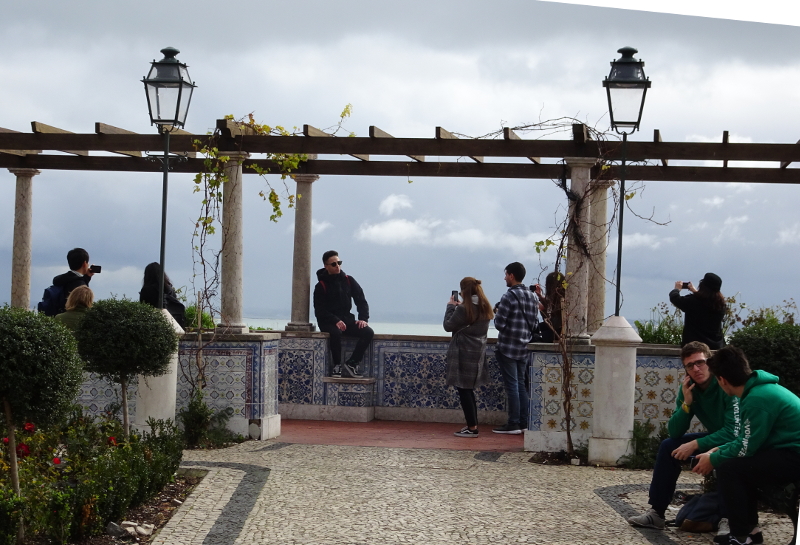
Next week, we will be using one of these sets to paint people in a cityscape or landscape. Here is my source.
Hmm.. We’re thinking Russell Flint or Alma Tadema, then!