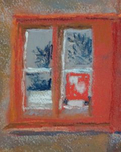
It’s detail time. Since it’s the window itself which sparked my interest, I’m starting there. I noticed as I went through the village that the reference photo I have is too red, both the bricks, and the window. One of the advantages for working on site is that the vagaries of the printer don’t distort colour, but that is not an option I have. In truth, I rarely pay much attention to the colouring in a photo. Usually it’s too dull. This time I had just renewed the colour cassette and the red was feeling its oats.
A quick pass of a browny orange over the brickwork proved useful in adjusting that. The bright scarlet I had used on the window was easily reduced by brushing it off. That didn’t move it all , but enough to restore the tooth to the paper. Indeed, I had used it hurriedly towards the end of the demonstration to stress that light and shade give the same colour different tones, sometimes amounting to different colours entirely, especially if the light is bright.
 Working more carefully I tried to delineate the intricacies of the moulded bricks, showing where they caught the light, almost pale blue on a reflective surface, and where recesses were enveloped in deep shadow. There is a bit of exaggeration here – I like that. The windows themselves were reflecting the sky and the surrounding trees, which is great because that varies each pane, and there were notices attached to the panes too; all grist to the mill. This is about half an hour’s painting, so there is a long way to go.

I love the idea of the printer feeling its oats!
Even allowing for the differences of screen colour, this looks a lot better, both in colour and in tonal balance. Onward and forward…