
My students have been working on tonal value this term. We started with a grey scale and a black and white print of a still life.
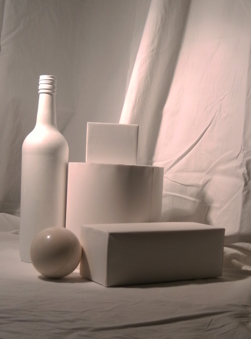 As you can see, there is a pleasing collection of simple shapes. All were white, but the varying depths of shadow gave a variety of tones. These we checked against the grey scale to assess just how dark a white surface can be! And painting the image wasn’t too easy either. It’s so hard to believe that “white” can be that dark.
The next part of the exercise was to reinterpret the image in any way possible. some turned the shapes into buildings, some selected one or two shapes to create their own design in colour, one even found ballerinas in the upper outline! I decided to cut the whole shape into “tiles”, rearrange them, and use colour to paint the tones on each segment.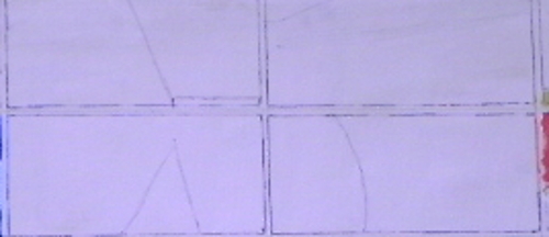 This gives you some idea of the guidelines I used. I had seen an image of an entirely white set of tiles mounted in sunlight, the varying raised lines on each tile caught the light, and the whole image changed as the sun passed over it. I was hoping to achieve something as interesting using colour. The lines you see show the top of the little box and the curve of the drum.
Tone can be terribly difficult to paint, even with a scale, can’t it. It’s really hard to have the courage to paint what you know you should!