
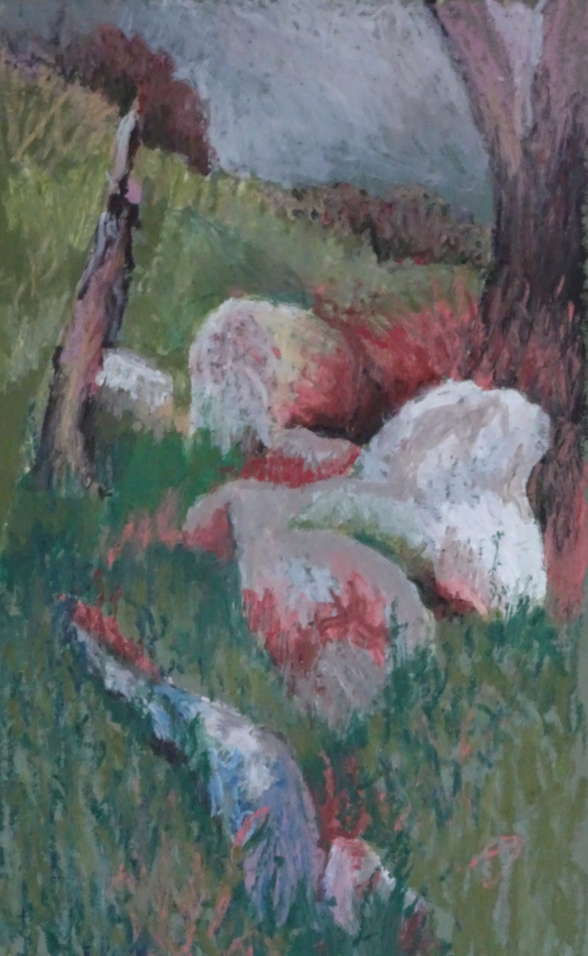
Oil pastel and people seem to work well, but how about landscape? This painting is based on some rocks and a battered fence post in the wilds of Wales.
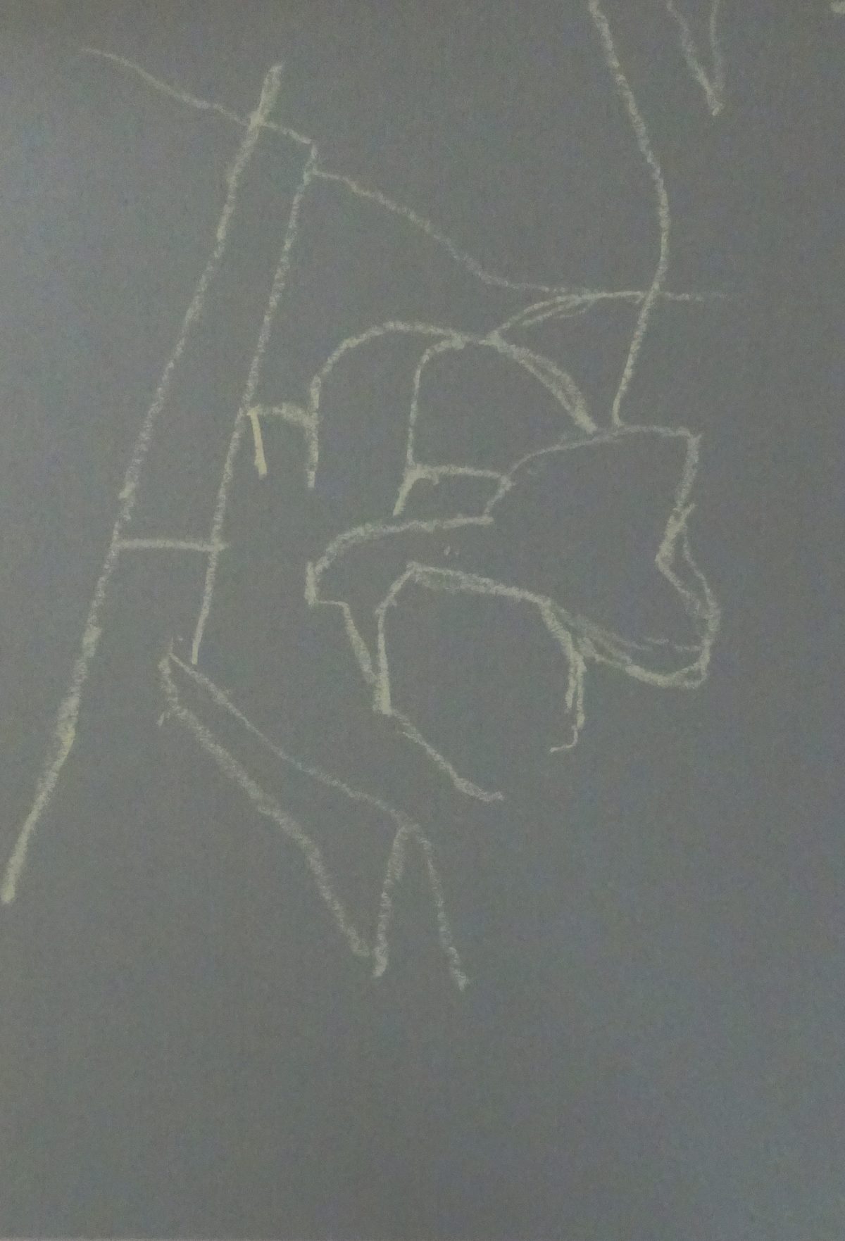 Again, I worked on green mount board and lightly drew the outline of the lay of the land. These rocks are more rounded shapes, giving me something new to work on. I soon regretted using the lemon yellow pastel for drawing – it persisted in showing itself long after I needed it. The rocks are the focus so I began with them. I had more pastels to chose from this time as I had invested in the Sennelier Portrait Set, not because I was thinking of doing portraits but because there was very little overlap between the two sets, and the new colours gave added subtlety to the range.
So I had a variety of grey blues, and an extra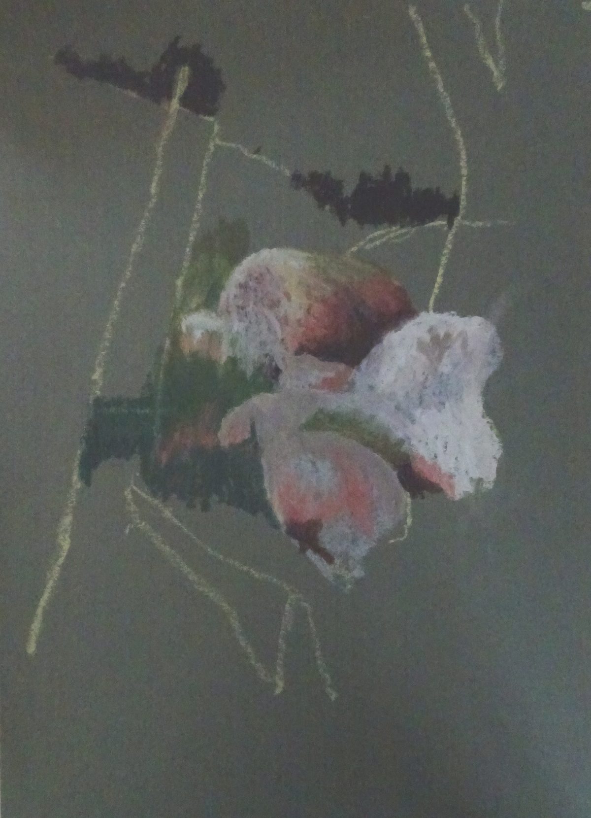 much needed white to describe the boulders, introducing purples and russets where needed. I kept the pastel strokes as far as I was able, but the pastel melts a little in a warm hand so some blending is inevitable. I included the grassy area between them so that the painting would grow from the starting place. It’s so easy to think, “I have the right colour for lots of areas in my painting so I’ll do them first” but the result is dispiriting as one’s efforts are like currants in a bun. Instead, I keep the pastels I’m using in a box lid, looking there first and only introducing a new pastel where no other will do.
 The grass led to the stake, a very battered one, using a variety of browns, greys, blues and black to show weathering. The grasses lighten as we get higher in the painting. Again I put the greens and lemon over each other, allowing the brighter tones to predominate near the sky line. There are no strong shadows so the grey blue sky fits nicely with scene. The tree trunk on the right balances to post and echoes its colouring.
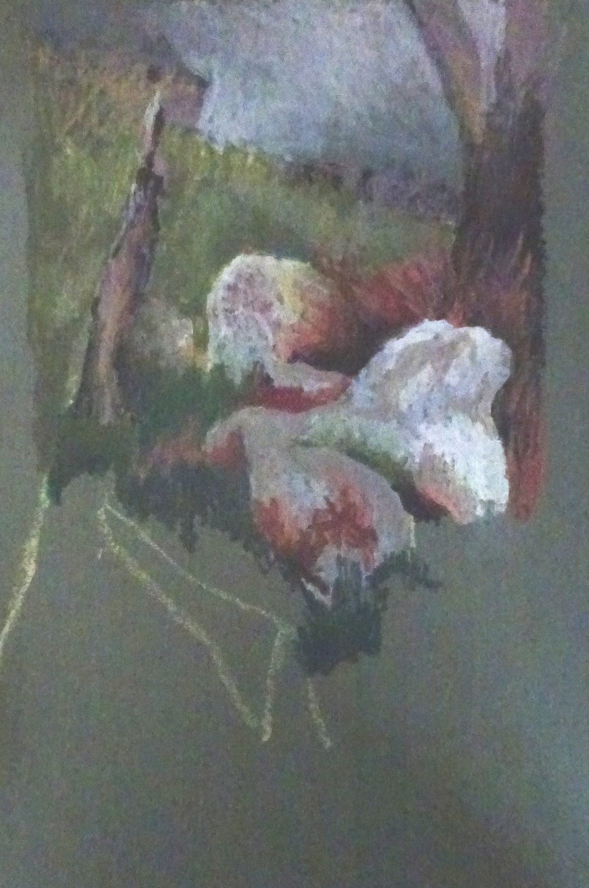
Moving to the foreground, we see a large blueish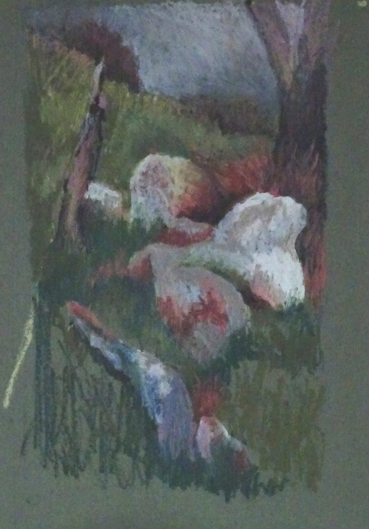 rock half hidden by the grass. Using the deeper blues here connects rock and sky, useful compositionally while the darker tones in the grasses anchor the rocks in the landscape. It was when I reached this point that I became aware of how clumsy the grass strokes were, and found by scribbling into them with my trusty old store card, I could influence their size and direction! I had found early on that mistakes could be scrapped out by the sharp edge of the plastic, but this was creative! Look at the grasses near the tree trunk, for instance.
 There were just the nearer grasses to finish, and the skyline to vary then the painting was finished. This is a good way to take oil paints outside, or on holiday, provided it’s not too hot, without all the extra equipment that would involve. I’ve enjoyed exploring this medium which is new to me and am sure there are more surprises for me as I use it more.
As always, an object lesson in how to cope when things don’t go immediately as you want them to. Experiment and never give up until it becomes what you want!
Ooh, I like that. The currents-in-a-bun thing is the reason I did the stems first on your coat. A spotty piece of work is unbelievably disheartening.